🔥 Today Only: Save 30% on Premium — Offer Ends Soon! - Upgrade Now!
Table

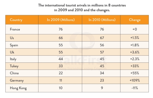
Band 6+: The table gives information about the numer of international tourist arrivals in eight countries in 2019 and 2010

Image for topic: The table gives information about the numer of international tourist arrivals in eight countries in 2019 and 2010
Our system will evaluate the answer based on this AI-generated description.
The image displays a table listing international tourist arrivals in millions across 8 countries for 2009 and 2010, alongside percentage changes: France had 76 million tourists in both 2009 and 2010 with a 0% change; US had 66 million in 2009 and 67 million in 2010, reflecting a +1.5% change; Spain received 55 million in 2009 and 56 million in 2010, showing a +1.8% increase; UK saw 55 million visitors in 2009 rising to 57 million in 2010, a +3.6% shift; Italy welcomed 44 million in 2009 and 45 million in 2010, a growth of +2.3%; Turkey had 33 million in 2009 climbing to 45 million in 2010, a +33% increase; China experienced 22 million in 2009 jumping to 34 million in 2010, marking a +55% change; Germany attracted 11 million tourists in 2009 and increased dramatically to 23 million in 2010, yielding +109% growth; Hong Kong saw a decrease from 10 million in 2009 to 9 million in 2010, a -11% change.
Given the complexity of the image, the above description may not be entirely accurate.
Note: Both the topic and the answer were created by one of our users.

The table indicates the arrivals in 8 different nations of tourists around the world in millions and the changes occured in 2 consecutive years, 2009 and 2010.

Overall, France was chosen the most from international tourist, whereas HongKong showed quite the opposite outcome. Moreover, Germany had the most positive changes, while Hong Kong was negative.

Throughout the given period, France dominated other nations with 76 millions tourists around the globe, which was followed by US with 66 millions in 2009 and 67 millions in the next year. Also China attained one-third the number of tourists in US at 22 millions in the first year, then increased by 12 millions after that. Furthermore, Spain was ranked third in the list with 11 millions tourists down compared to US in 2009 and 2010.

However, regarding the most numbers of tourists, France did not indicate changes, while Germany headed the list with over 100%. Another noticeable feature was China with half the percentage of Germany at 55%. With 10 millions tourists in 2009 and 9 millions in 2010, Hongkong was ranked last with minus 11%

Word Count: 182

Answers On The Same Topic:

The table gives information about the numer of international tourist arrivals in eight countries in 2019 and 2010

The given table shows the information about the tourist arrivals to top eight countries in 2009 and 2010 and the change. Figures are in millions and change is in percentage. Overall, the number of arriving tourists increased in all countries except for the France and Hong Kong. Interestingly, France stayed as a leader, even though […]

The table gives information about the numer of international tourist arrivals in eight countries in 2019 and 2010

The Table shows the data on the arrivals of international tourists in 8 Countries from 2009 to 2010. The first thing that standsout is the significant increase of tourist arrivals in Germany. The increase double from its 11 million visit from 2009 to 2010. While on the other end of the spectrum, the country Hong […]

The table gives information about the numer of international tourist arrivals in eight countries in 2019 and 2010

The table compares the international tourist arrivals in millions in 9 countries in 2009 and 2010 and the changes (in percentages). Summarise the information by selecting and reporting the main features, and make comparisons where relevant. The given table provides information about the international tourist arrivals in millions in 9 countries from 2009 to 2010 […]

The table gives information about the numer of international tourist arrivals in eight countries in 2019 and 2010

The table chart illustrates the international tourist arrivals in millions in 9 countries in 2009 and 2010 and the percentage changes . Overall, while the international tourist arrivals in millions in US,Spain,UK,Italy,Turkey ,China and Germany were increased ,it opposite was true for Hong Kong .Additionally , the figure for Hong Kong was consistently lowest during […]

See All

Other Topics:

The table below shows expenditures on advertising of four car companies in the UK in 2002.

The table gives a comparison of how four car businesses invested in different forms of advertising in the UK in 2002. Overall, while the budget for TV commercials made up the highest amount, outdoor promotion was the least popular advertising form across four companies. Regarding Renault business, the expense on TV advertisement dominated others, with […]

The first chart below shows the results of a survey which sampled a cross-section of 100,000people asking if they travelled abroad and why they travelled for the period 1994-98. The second chart shows their destinations over the same period.

The table compares the number of UK people who visited foreign countries for four different purposes, and the bar chart illustrates the number of British residents who visited three different destinations from 1994 to 1998. Overall, the highest number of people travelled abroad for holiday reason. It is also noticeable that the number of people […]

The chart below shows the percentage of households in a particular country that owned different types of household appliances in 2000, 2010 and 2020. Summarise the information by selecting and reporting the main features, and make comparisons where relevant.

The chart illustrates the percentage of households in a particular country that owned five different types of household appliances during the period from 2000 to 2020. Overall,the percentage of households appliance in five different types all showed increased over the period.The washing machine remained the most popular throughout,while robot vacuum cleaner recorded the lowest percentage […]

The table below shows passenger statistics reported by four cruise ship companies from 1985 to 2015. Summarise the information by selecting and reporting the main features, and make comparisons where relevant.

The table illustrates passenger statistics for four different cruise ship companies between 1985 and 2015. Overall, the leading company was Queen of Seas, whereas the lowest figure was demonstrated by the Caribbean Dream company. In 1985, Queen of Seas had the highest number of passengers, at 450,000, followed by Sunny Sail with 412,000. The figure […]

The tables show how many international students studied in Canada and the US.

The tables provide detailed information about the international students who studied in Canada and US by their country of origin, from 2002 to 2003 year. Overall, the number of international students increased in both Canada and United States between 2002 and 2003. However, China was the largest source of students in Canada, while India was […]

The table shows the amount of money given to developing countries by the USA,EU countries and other countries from 2006 to 2010(figures are in millions of dollars)

The table illustrates the amount of money that developed countries such as USA, EU and other countries provided to developing countries between 2006 to 2010. It can be clearly observed that the overall amount of money provided to developing countries increased from year to year. It was 15,7 million dollars in 2006 and was almost […]

See All
We have detected unusual activity on your device.
Please verify your identity to continue.
Note: This verification step won't sign you in. If you have a premium account, please log in to access the service as usual.
Google/Gmail Verification
Or verify using Email/Code
We've sent a verification code to:
youremail@gmail.com (Not your email?)
Enter it below to complete the verification process.
Ensure your email address is correct, your inbox is not full, and you check your spam folder. If no email arrives, consider using an alternative email.
You will need a Premium plan to perform your action!
Note: If you already have a premium account, please log in to access our services as usual.

Plans & Pricing

Our mission is to make quality education accessible for everyone.
However, to keep our hardworking team running and this service alive, we genuinely need your support!
By opting for a premium plan, not only do you sustain us in achieving the mission, but you also unlock advanced features to enrich your learning experience.

Free

For learners who aren't pressed for time

What's included on Free
100+ Cambridge IELTS Tests
Instant IELTS Writing Task 1 & 2 Evaluation (2 times/month)
Instant IELTS Speaking Part 1, 2, & 3 Evaluation (2 times/month)
Instant IELTS Writing Task 1 & 2 Essay Generator (2 times/month)
500+ Dictation & Shadowing Exercises
100+ Pronunciation Exercises
Flashcards
Other Advanced Tools

Premium

For those serious about advancing their English proficiency, and for IELTS candidates aspiring to boost their band score by 1-2 points (especially in writing & speaking) in just 30 days or less

What's included on Premium
Save Your IELTS Test Progress & Analyze Mistakes By Question Type
Save Your Own Flashcard Sets & Use Them On Any Device
Unlock All Courses, IELTS Tests, Section & Part Practice
Unlimited AI Conversations
Unlimited AI Writing Enhancement Exercises
Unlimited IELTS Writing Task 1 & 2 Evaluation
Unlimited IELTS Speaking Part 1, 2, & 3 Evaluation
Checked Answers Will Not Be Published
Unlimited IELTS Writing Task 1 & 2 Essay Generator
Unlimited IELTS Speaking Part 1, 2, & 3 Sample Generator
Unlimited Usage Of Advanced Tools & AI Features
Priority Support within 24h (12-month plan only)

Due to the nature of our service and the provided free trials, payments are non-refundable.