🔥 Today Only: Save 30% on Premium — Offer Ends Soon! - Upgrade Now!
Table

Band 5+: The three pie charts below show changes in annual spending at a public school in Canada in 1990, 2000, and 2010. Summarise the information by selecting and reporting the main features, and make comparisons where relevant.

Image for topic: The three pie charts below show changes in annual spending at a public school in Canada in 1990, 2000, and 2010. Summarise the information by selecting and reporting the main features, and make comparisons where relevant.
Our system will evaluate the answer based on this AI-generated description.
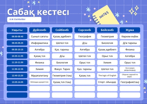
The image displays a school timetable titled "Сабақ кестесі" for "8 Ж СЫНЫБЫ". The schedule covers five days, with time slots from 08:00 to 14:05. Дүйсенбі (Monday) schedule: 08:00-08:40 Сынып сағаты, 08:45-09:25 Информатика, 09:35-10:15 Алгебра, 10:25-11:05 Қазақ тілі, 11:10-11:50 Физика, 11:55-12:35 Химия, 12:40-13:20 Мұқағалитану, 13:25-14:05 Жаһандық құзыреттілік. Сейсенбі (Tuesday) schedule: 08:00-08:40 Қазақ әдебиеті, 08:45-09:25 Шетел тілі, 09:35-10:15 Қаз. тарихы, 10:25-11:05 Д/ш, 11:10-11:50 Биология, 11:55-12:35 Факул. Тарих, 12:40-13:20 Геометрия (таң), 13:25-14:05 Қазақ тілі (таң). Сәрсенбі (Wednesday) schedule: 08:00-08:40 География, 08:45-09:25 Д/ш, 09:35-10:15 Алгебра, 10:25-11:05 Шетел тілі, 11:10-11:50 Орыс тілі, 11:55-12:35 Қаз. тарихы, 12:40-13:20 Қазақ тілі. Бейсенбі (Thursday) schedule: 08:00-08:40 Геометрия, 08:45-09:25 Биология, 09:35-10:15 Қазақ әдебиеті, 10:25-11:05 Орыс тілі, 11:10-11:50 Химия, 11:55-12:35 Шетел тілі, 12:40-13:20 The logic of English, 13:25-14:05 Спорт. ойындар. Жұма (Friday) schedule: 08:00-08:40 Көркем еңбек, 08:45-09:25 Д/ж тарихы, 09:35-10:15 Физика, 10:25-11:05 Алгебра, 11:10-11:50 Орыс тілі, 11:55-12:35 Эссе жазуға дайындандыру, 12:40-13:20 Сборник заданий по форм., 13:25-14:05 География(таң).
Given the complexity of the image, the above description may not be entirely accurate.
Note: Both the topic and the answer were created by one of our users.

The given Pie charts elucidate the yearly expenditure for various measures at a Government school in Canada between 1990 to 2010.

Overall, it is evident that the the highest spending on salary distribution throughout the period, whereas the least contribution fluctuated over the period. While, technology and maintenance costs increased and rest of the categories dropped during these years.

Turning to the data of teachers salary, which was 55% and remained at its peak in 1990. However, it fell by 5% after a decade and similarly declined to 45% in 2010.In contrast, the proportion for maintenance and facility costs was 15% initially which rose by % in every 10 years and reached to 25% in 2010.Nevertheless, one -tenth percentage was spent for learning resources such as books and it was constant during the given period.

In addition, the contribution for technology witnessed an upward trend during the period which surged from 5% in 1990 to 12% in the 2010.But contribution for other category decreased steadily from 15% 1990 and hit at its low point in 2010.

Word Count: 176

Answers On The Same Topic:

The three pie charts below show changes in annual spending at a public school in Canada in 1990, 2000, and 2010. Summarise the information by selecting and reporting the main features, and make comparisons where relevant.

The three pie charts given below illustrates the changes in annual expenditure at a government school in Canada in 1990, 2000, and 2010. Overall, total spending in all three year remained almost similar. Teacher’s salary was the highest paid while, technology seems to have the least spending in two years but in 2010 that increased […]

The three pie charts below show changes in annual spending at a public school in Canada in 1990, 2000, and 2010. Summarise the information by selecting and reporting the main features, and make comparisons where relevant.

The pie charts illustrate changes in the annual expenditure at a public school in Canada in three different years: 1990, 2000, and 2010. Overall, teachers’ salaries declined noticeably throughout the period; however, technology expenses increased significantly. Learning resources remained constant over the period. In 1990, teachers’ salaries accounted for more than half of expenditure at […]

The three pie charts below show changes in annual spending at a public school in Canada in 1990, 2000, and 2010. Summarise the information by selecting and reporting the main features, and make comparisons where relevant.

The three pie charts compares the difference in yearly expenditures in one of the pubic school in Canada in 1990, 2000, and 2010 under different headings. Overall, teachers salaries consumed the largest share of budget in all these years, while the percentage of spending on facilities and maintenance as well as technology grew steadily over […]

The three pie charts below show changes in annual spending at a public school in Canada in 1990, 2000, and 2010. Summarise the information by selecting and reporting the main features, and make comparisons where relevant.

The three pie charts compare the annual expenditure regarding- teacher’s salaries, facilities and management, learning resources, technology, and other categories at a Canadian public school in 1990, 2000 and 2010. Overall, spending at the facilities and management, and technology increased, while the teacher’s salaries, and other expenses decreased over the period. The learning resources remained […]

The three pie charts below show changes in annual spending at a public school in Canada in 1990, 2000, and 2010. Summarise the information by selecting and reporting the main features, and make comparisons where relevant.

The three pie illustrate the information about the modifications in total spending at a public school in Canada Between 1990 and 2010. Over a period of 20 year. the units measured by percentages. Overall, it is clear that the similer significant common point was the teacher’s huge salaries. Whereas, the technology sector follow the decreased […]

See All

Other Topics:

The table below shows the consumption of three basic foods (wheat, maize, rice) by people in four different countries.

The table illustrates the daily consumption of three staple foods (wheat, maize, and rice) in four different countries, measured in calories per person. “Overall, it can be seen that each country demonstrates a dominant preference for a specific staple food. Rice is by far the most consumed food in Cambodia, whereas wheat leads in Egypt […]

The table displays trends concerning the amounts of fast food consumed in Melbourne. Summarise the information by selecting and reporting the main features, and make comparisons where relevant You should write at least 150 words.

The given table provides information about five main types of fast food consumed in Melbourne including predictions to 2025. Overall, it is readily apparent from table that hamburger was most preferable choice and it maintains its dominance now, whereas units of noodles consumed by people stayed their lowest position from past to now. In fact, […]

The table shows the two age groups participating in the marathon from 2008 to 2012. Summarize the information by selecting and reporting the main features, and make comparisons where relevant.

The given table demonstrates that the two different age groups participating in the marathon from 2008 to 2012. This table indicates not only age groups, but also total participants over years. Overall, the tendency of participating a marathon was increased regulary. Therefore, the number of age group of 18-39 was always higher than age group […]

The table below compares actual and predicted figures for populations in three different cities.

The table gives data about the actual and predicted residents in three different urban cities-Shanghai, Jakarta and Sao Paulo between 1990 and 2000. Overall, it can be seen that SaoPaulo and Jakarta exhibited a general upward trajectory, while Shanghai showed a slight downward trend. Notably, the prediction of populace among three cities in 1990 and […]

The table illutrates the proportion of monthly household income five european countries spend on food and drink, housing, clothing and entertainment.

The table chart compares the percentage of household earnings per month spent on four categories in five European countries. In general, Housing and Food and drink account for largest share of household expenses in all five countries. However, it is clearly apparent that household spend less money on Clothing and Entertainment than on other categories […]

The chart below shows the primary hobbies of the adult residents in a small Tunisian town. Summarise the information by selecting and reporting the main features, and make comparisons where relevant.

The table compares the main hobbies of the adult inhabitants in a small Tunisian town throughout-40 years. Overall, the figure for TV and movies was the highest, whereas that for video games was the lowest at the end of this period. Moreover, the figures for TV and movies, book, and working out experienced an upward […]

See All
We have detected unusual activity on your device.
Please verify your identity to continue.
Note: This verification step won't sign you in. If you have a premium account, please log in to access the service as usual.
Google/Gmail Verification
Or verify using Email/Code
We've sent a verification code to:
youremail@gmail.com (Not your email?)
Enter it below to complete the verification process.
Ensure your email address is correct, your inbox is not full, and you check your spam folder. If no email arrives, consider using an alternative email.
You will need a Premium plan to perform your action!
Note: If you already have a premium account, please log in to access our services as usual.

Plans & Pricing

Our mission is to make quality education accessible for everyone.
However, to keep our hardworking team running and this service alive, we genuinely need your support!
By opting for a premium plan, not only do you sustain us in achieving the mission, but you also unlock advanced features to enrich your learning experience.

Free

For learners who aren't pressed for time

What's included on Free
100+ Cambridge IELTS Tests
Instant IELTS Writing Task 1 & 2 Evaluation (2 times/month)
Instant IELTS Speaking Part 1, 2, & 3 Evaluation (2 times/month)
Instant IELTS Writing Task 1 & 2 Essay Generator (2 times/month)
500+ Dictation & Shadowing Exercises
100+ Pronunciation Exercises
Flashcards
Other Advanced Tools

Premium

For those serious about advancing their English proficiency, and for IELTS candidates aspiring to boost their band score by 1-2 points (especially in writing & speaking) in just 30 days or less

What's included on Premium
Save Your IELTS Test Progress & Analyze Mistakes By Question Type
Save Your Own Flashcard Sets & Use Them On Any Device
Unlock All Courses, IELTS Tests, Section & Part Practice
Unlimited AI Conversations
Unlimited AI Writing Enhancement Exercises
Unlimited IELTS Writing Task 1 & 2 Evaluation
Unlimited IELTS Speaking Part 1, 2, & 3 Evaluation
Checked Answers Will Not Be Published
Unlimited IELTS Writing Task 1 & 2 Essay Generator
Unlimited IELTS Speaking Part 1, 2, & 3 Sample Generator
Unlimited Usage Of Advanced Tools & AI Features
Priority Support within 24h (12-month plan only)

Due to the nature of our service and the provided free trials, payments are non-refundable.