🔥 Today Only: Save 30% on Premium — Offer Ends Soon! - Upgrade Now!
Line Graph

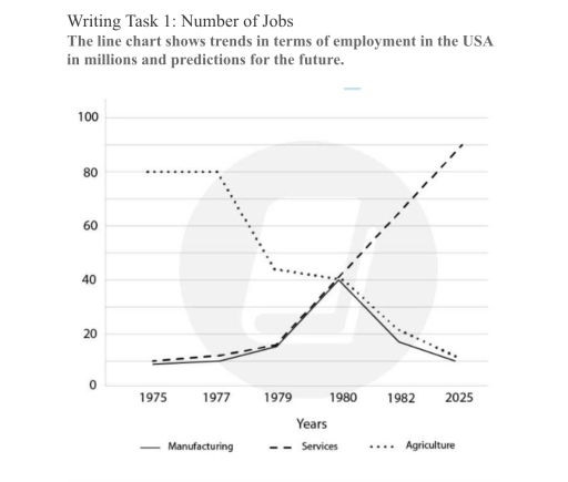
Band 7+: Writing Task 1: Number of Jobs The line chart shows trends in terms of employment in the USA in millions and predictions for the future.

Image for topic: Writing Task 1: Number of Jobs The line chart shows trends in terms of employment in the USA in millions and predictions for the future.
Our system will evaluate the answer based on this AI-generated description.
The image presents a line chart delineating employment data in millions for the USA across three sectors—manufacturing, services, and agriculture—over the years 1975, 1977, 1979, 1980, 1982, and projecting onto 2025; manufacturing commenced below 20 million in 1975, remained steady through 1979, peaked briefly at approximately 40 million around 1980, then sharply decreased to slightly above 20 million by 1982, forecasted to stabilize at the same level by 2025; services initiated slightly above 40 million in 1975, sustained minimal growth to near 50 million by 1980, observed a modest dip to below 50 million in 1982, and projected to ascend rapidly reaching 100 million by 2025; agriculture started slightly under 10 million in 1975, exhibited slight growth through 1979, dropped marginally below 10 million by 1980, continued a declining trajectory falling under 5 million by 2025.
Given the complexity of the image, the above description may not be entirely accurate.
Note: Both the topic and the answer were created by one of our users.

The line graph illustrates employment figurtes in the USA, measured in millions, from 1975 to 2025, including predictions for the future.

Overall, the number of jobs in the services sector increased significantly over the period, while employment in agriculture decreased considerably. Manufacturing employment rose sharply until 1980 before falling towards 2025.

Regarding the most noticable changes, the number of jobs in the services sector started at 15 million in 1975 and then increased to around 40 million in 1979, before rising further to approximately 90 million in 2025. In addition, employment in the agriculture sector decreased considerably, started at 80 million in 1977 to falling from around 42 million in 1979. It then declined further to approximately 20 million in 1982 and 10 million in 2025.

On the other hand, the number of jobs in the manufacturing sector fluctuated over the period. It stood at around 8 million in 1975 and increased slightly to approximately 15 million in 1979. This figure then rose sharply to 40 million in 1980, before falling to around 17 million in 1982 and approximately 10 million in 2025.

Word Count: 183

Answers On The Same Topic:

Writing Task 1: Number of Jobs The line chart shows trends in terms of employment in the USA in millions and predictions for the future.

The graph below illustrates four sectors of job in which economy of united state was involved during the period 1960-2020. Overall, there are four sectors in which manufacturing had the highest involvement followed by retail and agriculture where as healthcare was listed in lowest number of participant. In the beginning year, Manufacturing recorded the largest […]

Writing Task 1: Number of Jobs The line chart shows trends in terms of employment in the USA in millions and predictions for the future.

The line graph illustrates employment figures in the USA, measured in millions, from 1975 to 2025, including predictions for the future. Overall, the number of jobs in the services sector increased significantly over the period, while employment in agriculture decreased considerably. Manufacturing employment rose sharply until 1980 before falling towards 2025. Regarding the most noticeable […]

Writing Task 1: Number of Jobs The line chart shows trends in terms of employment in the USA in millions and predictions for the future.

The line graph demonstrates employees’ numbers in three spesific areas and prediction for future in USA over given period beginnin form 1975 to 2025. Overall, it is immediately apparent that working in agriculture led the graph initial years of the given timeframe and observed dramatical decline. Additionally, the number of manufacturing and services employees were […]

Writing Task 1: Number of Jobs The line chart shows trends in terms of employment in the USA in millions and predictions for the future.

The line chart illustrates trends in employment in the USA, showing changes in manufacturing, services, and agriculture between 1975 and 2025. Overall, it highlights the upward trend in services and the downward trends in agriculture and manufacturing, as well as key differences among the given data. Overall, it is clear that mixed trends can be […]

See All

Other Topics:

The graph below gives information about car ownership in one European country from 1975 to 2005.

Owerall, it’s clearly that ownership single car was the highest. In contras ownership 2 and 3 cars demonstrate lower result. Another notecebly feature is that people without cars was approximatly simular with singal car but also declined. Looking firs at single car and no car, stood approximatly 45 % in 1975 year. Single car owner […]

The line graph shows the AI and all capital firms from 1995 to 2017.

THE LINE GRAPH ELUCIDATES THE DATA FROM 1995 TO 2017 REGARDING THE ANNUAL FUNDING ON AI AND ALL CAPITAL FIRMS. CONSIDERING FROM AN OVERALL PERSPECTIVE, IN THE FUNDING OF ALL VENTURE INVESTMENT WAS HIGHEST THROUGHOUT THE YEARS. HOWEVER, THE FUNDING OF AI VENTURE INVESTMENT WAS LOWEST THROUGHOUT THE YEARS. TO BEGIN WITH, IN THE INITIAL […]

The line graph gives information about international tourist arrivals in five countries.

The line graph illustrates the number of international tourist arrivals in USA, France, Malaysia, Brazil, and Egypt over a 15-year period between 1995 and 2010. Overall, all five nations experienced an upward trend in tourism over the period. The USA and France consistently attracted the highest number of visitors, while France uniquely caught up with […]

The graph below shows the percentage of percentage of female members in five European countries from 2000 to 2012.

This graph illustrate the persentage of persentage members of female in five european countries from 2000 to 2012 .They are Belgium, UK, Italy ,Spain, and finally germany. We can discover that numerous countries increasing compared with the initial period. The first we can see countries with majority members of female , this countries are Belgium […]

tourists visiting caribbean island and their preference of staying on island or cruise ships

The line graph demonstrates the proportion of tourists visited a particular Caribbean island from 2010 to 2017. Overall, it is evident that tourists who were staying on island was higher than who were stayed on cruise ship and total number of visitors was significantly up surged in given period. To begin with, there were less […]

The graph below shows the average monthly temperatures in three major cities. summarize the information by selecting and reporting the main features and make comparison were relevant

The line graph gives information about temperature fluctuation in Paris, Boston and Melboume from in one year from January to the end of December. The most significant facts to emerge from the graph are that two cities temperature reached a high in August. Malboume has the opposite trend. Melboume is the warmest city in which […]

See All
We have detected unusual activity on your device.
Please verify your identity to continue.
Note: This verification step won't sign you in. If you have a premium account, please log in to access the service as usual.
Google/Gmail Verification
Or verify using Email/Code
We've sent a verification code to:
youremail@gmail.com (Not your email?)
Enter it below to complete the verification process.
Ensure your email address is correct, your inbox is not full, and you check your spam folder. If no email arrives, consider using an alternative email.
You will need a Premium plan to perform your action!
Note: If you already have a premium account, please log in to access our services as usual.

Plans & Pricing

Our mission is to make quality education accessible for everyone.
However, to keep our hardworking team running and this service alive, we genuinely need your support!
By opting for a premium plan, not only do you sustain us in achieving the mission, but you also unlock advanced features to enrich your learning experience.

Free

For learners who aren't pressed for time

What's included on Free
100+ Cambridge IELTS Tests
Instant IELTS Writing Task 1 & 2 Evaluation (2 times/month)
Instant IELTS Speaking Part 1, 2, & 3 Evaluation (2 times/month)
Instant IELTS Writing Task 1 & 2 Essay Generator (2 times/month)
500+ Dictation & Shadowing Exercises
100+ Pronunciation Exercises
Flashcards
Other Advanced Tools

Premium

For those serious about advancing their English proficiency, and for IELTS candidates aspiring to boost their band score by 1-2 points (especially in writing & speaking) in just 30 days or less

What's included on Premium
Save Your IELTS Test Progress & Analyze Mistakes By Question Type
Save Your Own Flashcard Sets & Use Them On Any Device
Unlock All Courses, IELTS Tests, Section & Part Practice
Unlimited AI Conversations
Unlimited AI Writing Enhancement Exercises
Unlimited IELTS Writing Task 1 & 2 Evaluation
Unlimited IELTS Speaking Part 1, 2, & 3 Evaluation
Checked Answers Will Not Be Published
Unlimited IELTS Writing Task 1 & 2 Essay Generator
Unlimited IELTS Speaking Part 1, 2, & 3 Sample Generator
Unlimited Usage Of Advanced Tools & AI Features
Priority Support within 24h (12-month plan only)

Due to the nature of our service and the provided free trials, payments are non-refundable.