🔥 Today Only: Save 30% on Premium — Offer Ends Soon! - Upgrade Now!
Line Graph

Band 4+: Writing Task 1: Number of Jobs The line chart shows trends in terms of employment in the USA in millions and predictions for the future.

Image for topic: Writing Task 1: Number of Jobs The line chart shows trends in terms of employment in the USA in millions and predictions for the future.
Our system will evaluate the answer based on this AI-generated description.
The image presents a line chart delineating employment data in millions for the USA across three sectors—manufacturing, services, and agriculture—over the years 1975, 1977, 1979, 1980, 1982, and projecting onto 2025; manufacturing commenced below 20 million in 1975, remained steady through 1979, peaked briefly at approximately 40 million around 1980, then sharply decreased to slightly above 20 million by 1982, forecasted to stabilize at the same level by 2025; services initiated slightly above 40 million in 1975, sustained minimal growth to near 50 million by 1980, observed a modest dip to below 50 million in 1982, and projected to ascend rapidly reaching 100 million by 2025; agriculture started slightly under 10 million in 1975, exhibited slight growth through 1979, dropped marginally below 10 million by 1980, continued a declining trajectory falling under 5 million by 2025.
Given the complexity of the image, the above description may not be entirely accurate.
Note: Both the topic and the answer were created by one of our users.

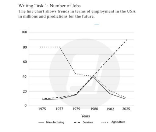
The chart gives information about careers in terms of employment in America in large numbers, as well as expectations for the upcoming era.

Overall, there was sharp growth in services over the period. Because it began below 20 in 1995, it will increase suddenly in 2025. Secondly, agriculture was the biggest sector for jobs, but there was a significant decline in farming, while manufacturing rose markedly to 40 in 1980, but it will drop gradually in 2025.

Looking at the details, firstly, there was a dramatic rise in services from 1975 to 1980; it will rocket to 80 in 2025. In addition, agriculture was the second source of jobs, but it will reduce considerably, because in 1975 it was 80, but in 2025 it will be 20. Finally, manufacturing was a career path; it surged dramatically to 40 in 1980, but after that, there will be a consistent fall in it.

Word Count: 151

Answers On The Same Topic:

Writing Task 1: Number of Jobs The line chart shows trends in terms of employment in the USA in millions and predictions for the future.

The line graph illustrates changes in the number of people employed in three sectors in the USA from 1975 to 1982, with projected figures reaching 2025. Overall, the data reveals a fundamental shift in the American labor market. While agriculture was the dominant employer in the mid-1970s, it is set to be overtaken by the […]

Writing Task 1: Number of Jobs The line chart shows trends in terms of employment in the USA in millions and predictions for the future.

The line chart illustrates changes in employment across three sectors – manufacturing, services, and agriculture – in the USA from 1975 to 1982, with a projection for 2025, measured in millions. Overall, employment in the services sector increased dramatically and is expected to continue rising, while agriculture experienced a significant decline. Manufacturing showed moderate growth […]

Writing Task 1: Number of Jobs The line chart shows trends in terms of employment in the USA in millions and predictions for the future.

The line graph details the different types of empolyments number. From 1975 to 1982, this graph shows employment record in the history and expects employment by 2025. Overall, employments in the services area has witnessed a skyrocketing increase since 1979. While the agriculture has shown a signigicant decline in the graph. On the one hand, […]

Writing Task 1: Number of Jobs The line chart shows trends in terms of employment in the USA in millions and predictions for the future.

The line graph below illustrates the number of employee in three sections, including manufacturing, services and agriculture, in the USA between 1975 and 2025. The units are measured in millions. Overall, agricultural workers’ number decreased, whereas the opposite is true for employees in services. Manufacture employment fluctuated. At the beginning of the period, agriculture’s figure […]

See All

Other Topics:

WRITING TASK 1 You should spend about 20 minutes on this task. The line graph below shows the percentage of households with internet access in three different countries between 2005 and 2015. Summarize the information by selecting and reporting the main features, and make comparisons where relevant. Write at least 150 words.

The given line graph illustrates the proportion of families who had internet access in three divergent nations ,from year 2005 to 2015. It is clearly visible that , Vietnam had lowest rate of internet users in 2005(15%) as compared to other countries.In contrast, Japan had recorded two-fifth figure in eartly year and showed some fluctuations […]

The chart below shows the percentage of female members of parliament in 5 European countries from 2000 to 2012. Summarise the information by selecting and reporting the main features and make comparisons where relevant.

The given line chart illustrates the data of women who were members of parliament for 12 years in five different European nations. It is clearly visible that German females were in lead from starting year 2000 to 2010 , that includes data of 32% in early years which inclined slightly in further years and recorded […]

The chart below shows the average cost of monthly contract for four different mobile (cell phones) in a European country from January to September 2002

The line graph illustrates the median monthly contract cost for four different mobile cell phones in a European country between January and September 2002, measured in Euros. Overall, the monthly cost of three mobile cell phones showed an upward trend, albeit to varying degrees, while Alpha experienced a decline by the end of the period. […]

The graph below gives information about the number of jobs in four sectors of the economy in the US between 1960 and 2020.

The given line graph illustrates information about the amount of jobs in four section( manufacturing, Retail, Agriculture and heathcare) of the economy in the US between 1960 and 2020. Overall, it is evident that the Retail and the Healthcare jobs represented a graduall increasing, while Manufacturing and Agriculture followed the opposite trend, that declined steady […]

The graph below shows the average house prices in three countries between the years 1997 and 2014. Summarise the information by selecting and reporting the main features, and make comparison where relevant.

The line graph provides the average house prices in three countries from 1997 and 2014. Overall, there were fluctations in the quantities of all the three countries. While Country A generally had higher housing costs, followed by Country B and Country C remain at the bottom, despite a grudual rise in the end of period. […]

The graph below shows the gross domestic products (GDP) in four selected countries between 2010 and 2015

The line chart illustrates how much Gross Domestics Products (GDP) was recorded in four different countries, including Japan, the USA, the UK and China from 2010 to 2015. Overall, Japan was the dominant figure over the period, in completely contrast to the UK’s GDP. Moreover, while both the USA and China witnessed an upward trend, […]

See All
We have detected unusual activity on your device.
Please verify your identity to continue.
Note: This verification step won't sign you in. If you have a premium account, please log in to access the service as usual.
Google/Gmail Verification
Or verify using Email/Code
We've sent a verification code to:
youremail@gmail.com (Not your email?)
Enter it below to complete the verification process.
Ensure your email address is correct, your inbox is not full, and you check your spam folder. If no email arrives, consider using an alternative email.
You will need a Premium plan to perform your action!
Note: If you already have a premium account, please log in to access our services as usual.

Plans & Pricing

Our mission is to make quality education accessible for everyone.
However, to keep our hardworking team running and this service alive, we genuinely need your support!
By opting for a premium plan, not only do you sustain us in achieving the mission, but you also unlock advanced features to enrich your learning experience.

Free

For learners who aren't pressed for time

What's included on Free
100+ Cambridge IELTS Tests
Instant IELTS Writing Task 1 & 2 Evaluation (2 times/month)
Instant IELTS Speaking Part 1, 2, & 3 Evaluation (5 times/month)
Instant IELTS Writing Task 1 & 2 Essay Generator (2 times/month)
500+ Dictation & Shadowing Exercises
100+ Pronunciation Exercises
Flashcards
Other Advanced Tools

Premium

For those serious about advancing their English proficiency, and for IELTS candidates aspiring to boost their band score by 1-2 points (especially in writing & speaking) in just 30 days or less

What's included on Premium
Save Your IELTS Test Progress
Unlock All Courses & IELTS Tests
Unlimited AI Conversations
Unlimited AI Writing Enhancement Exercises
Unlimited IELTS Writing Task 1 & 2 Evaluation
Unlimited IELTS Speaking Part 1, 2, & 3 Evaluation
Checked Answers Will Not Be Published
Unlimited IELTS Writing Task 1 & 2 Essay Generator
Unlimited IELTS Speaking Part 1, 2, & 3 Sample Generator
Unlimited Usage Of Advanced Tools
Priority Support within 24h (12-month plan only)

Due to the nature of our service and the provided free trials, payments are non-refundable.
Nếu bạn là người Việt Nam và không có hoặc không muốn trả bằng credit/debit cards, bạn có thể thanh toán bằng phương thức chuyển khoản:


Chọn gói:
419,000₫ 277,000 ₫ cho gói 1 tháng (chỉ 9,233₫/ngày)
1,239,000₫ 597,000 ₫ cho gói 3 tháng (chỉ 6,633₫/ngày)
2,469,000₫ 1,027,000 ₫ cho gói 6 tháng (chỉ 5,706₫/ngày)
4,929,000₫ 1,417,000 ₫ cho gói 12 tháng (chỉ 3,936₫/ngày)


Sau khi chuyển khoản, vui lòng đợi trình duyệt tự động điều hướng bạn trở lại Engnovate và bạn sẽ ngay lập tức nhận được mã kích hoạt tài khoản premium.
Nếu có lỗi xảy ra, bạn có thể liên hệ với team thông qua một trong các phương thức: email đến helloengnovate@gmail.com hoặc nhắn tin qua facebook.com/engnovate.
Vì toàn bộ công cụ trên website đều có thể sử dụng thử miễn phí, Engnovate không hỗ trợ hoàn tiền.