🔥 Today Only: Save 30% on Premium — Offer Ends Soon! - Upgrade Now!
Line Graph

Band 4+: You should spend about 20 minutes on this task. The graph below presents data on the number of job openings in six different occupations from 2021 to 2026. Summarise the information by selecting and reporting the main features, and make comparisons where relevant. Write at least 150 words.

Image for topic: You should spend about 20 minutes on this task. The graph below presents data on the number of job openings in six different occupations from 2021 to 2026. Summarise the information by selecting and reporting the main features, and make comparisons where relevant. Write at least 150 words.
Our system will evaluate the answer based on this AI-generated description.
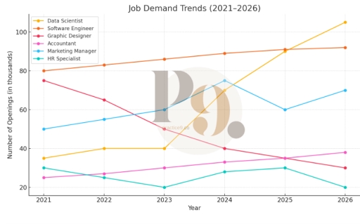
The image shows a line graph detailing projected job openings (in thousands) from 2021 to 2026 across six job categories: Data Scientist, Software Engineer, Graphic Designer, Accountant, Marketing Manager, and HR Specialist. In 2021, Data Scientist has 30, Software Engineer 80, Graphic Designer 25, Accountant 70, Marketing Manager 40, HR Specialist 50. In 2022, Data Scientist 40, Software Engineer 85, Graphic Designer 30, Accountant 65, Marketing Manager 42, HR Specialist 48. In 2023, Data Scientist 50, Software Engineer 90, Graphic Designer 35, Accountant 60, Marketing Manager 44, HR Specialist 46. In 2024, Data Scientist 60, Software Engineer 85, Graphic Designer 35, Accountant 55, Marketing Manager 46, HR Specialist 44. In 2025, Data Scientist 75, Software Engineer 80, Graphic Designer 40, Accountant 50, Marketing Manager 48, HR Specialist 42. In 2026, Data Scientist 90, Software Engineer 78, Graphic Designer 45, Accountant 45, Marketing Manager 50, HR Specialist 40.
Given the complexity of the image, the above description may not be entirely accurate.
Note: Both the topic and the answer were created by one of our users.

The data in the graphh displays the aomunt of jop oppertinnteis in 6 different places between 2021 and 2026. The units are mesured in prcentage value.

Overall , it is clear from th gragh that thers is jops witness a very big defrence ,however this diference Increase or decrease . For instance ,in the data scientist sector during two years only from 2023 to 2025 has increased around 50% so that is very huge change in small period ,Whereas , In graphic disigner jop has a dicline line it shows for us from 2021 to 2024 meaning only three years it is lose around half of it is occupation precentage .

According to what is showen in markting manger jop it has very various state not stable at all for exmple from 2021 to 2023 has a little incresed the prcentage points but in the 2023 it witness change simillar to the pravious three years in only one year , But whole this success lose it in one year also .

In additon somethings like accountant and software engineer it has the same state , That are increase is constat .

In the End the graph tell us that there is a lot of jops will disappers by time , But in the other hand there are new jops will be very required .

Word Count: 224

Answers On The Same Topic:

You should spend about 20 minutes on this task. The graph below presents data on the number of job openings in six different occupations from 2021 to 2026. Summarise the information by selecting and reporting the main features, and make comparisons where relevant. Write at least 150 words.

The line graph illustrates the projected job openings across six distinct occupations from 2021 through 2026. Overall, it is evident that while most occupations experience an upward trajectory in job openings, certain roles exhibit contrasting trends in their demand. In 2021, the Software Engineer category boasted the highest number of job openings, with approximately 80,000 […]

You should spend about 20 minutes on this task. The graph below presents data on the number of job openings in six different occupations from 2021 to 2026. Summarise the information by selecting and reporting the main features, and make comparisons where relevant. Write at least 150 words.

The line graph illustrates data on the number of jobs available in six different sectors, namely data scientist, software engineer, graphic designer, accountant, marketing manager, and HR specialist, from 2021 to 2026. Overall, it is clear that software engineers have a high vacancy rate; however, other occupations are fluctuating significantly, and the number of accountant […]

You should spend about 20 minutes on this task. The graph below presents data on the number of job openings in six different occupations from 2021 to 2026. Summarise the information by selecting and reporting the main features, and make comparisons where relevant. Write at least 150 words.

The line chart shows the quantity of work opportunities between 2021 and 2026, in six different jobs. Overall, four openings have risen between 2021 and 2026 (Accountant, Data Scientist, Marketing Manager and Software Engineer), and two have dropped (HR Specialist and Graphic Designer). Accountant and Software Engineer have seen a steady evolution, while HR Specialist […]

You should spend about 20 minutes on this task. The graph below presents data on the number of job openings in six different occupations from 2021 to 2026. Summarise the information by selecting and reporting the main features, and make comparisons where relevant. Write at least 150 words.

The line graph illustrates the number of job openings, measured in thousands, for six different occupations between 2021 and 2026. Overall, the demand for Data Scientists increased sharply, while openings for Graphic Designers declined steadily. Software Engineers remained consistently high in demand throughout the period. In 2021, Software Engineers had the highest number of openings […]

You should spend about 20 minutes on this task. The graph below presents data on the number of job openings in six different occupations from 2021 to 2026. Summarise the information by selecting and reporting the main features, and make comparisons where relevant. Write at least 150 words.

The line graph illustrates the number of openings (in thousands) in six different careers within the timeframe of 2021 to 2025, with a projection for 2026 as well. Overall, it is clear that the number of openings in the majority of jobs has increased, with data scientist experiencing the steepest growth. However, the remaining two, […]

See All

Other Topics:

The graph below gives information about the main purposes of overseas residents' visit to China between 2000 and 2016. Summarise the information by selecting and reporting the main features, and make comparisons where relevant.

The line graph illustrates information about several reasons why overseas residents visit China between 2000 and 2016.Overall, most categories increased over the period. Holidays remained the dominant purpose of visiting China, while miscellaneous reasons showed relatively little change compared with the other categories. At the beginning, business trips were the second most common reason for […]

the line graph shows the number of mobile phone subscriptions in three countries

the line graph provided information about the number of mobile phone subscriptions in three different countries between 2000 and 2020 it is clear that all countries experienced growth over the period shown.overall although three figures increased,the figure of country A showed a significant upward trend.the second figure rose considerably while the country C increased marginally […]

WRITING TASK 1 You should spend about 20 minutes on this task. The graph below gives information on the usage of water for agricultural purposes in two different countries between 2000 to 2010. Summarise the information by selecting and reporting the main features, and make comparisons where relevant. Write at least 150 words.

The line graph compares the consumption of water for agricultural reasons between Australia and Russia over a ten-year period from 2000 to 2010. Overall, it is evident that both countries had a substantial increased usage at the end of the period. But Russia had increased slightly more than the opposing nation. To begin with, in […]

the graph shows the average trip length(in miles) in US children aged 5 to 15 years old.

The provided line graph represents the the average distance traveled during several types of trips for kids between 5 and 15, from 1970 till 2020. The x-axis represents period, whereas the y-axis represents miles traveled. Generally speaking, throughout the period thelongest distance was covered by bus trip, while the shortest one by walking adventure. Furthermore, […]

The graph below gives information about one company's unit sales of 5 different types of jam from 2009 to 2014. Summarise the information by selecting and reporting the main features, and make comparisons where relevant.

Given is a graph demonstrating the unit sales of a company from 2009 to 2014 which concentrates on 5 different types of jam. A glance at the graph reveals that the revenues coming from most of the types of jam products followed an upward trajectory while plum jam was the only exception which underwent a […]

the line graph below shows changees in the amount and type of fast food consumed by Australian teenagers from 1975 to 2000.

The supplied illustration of the line graph demonstrates the frequency of consumed fast food by Australian teenagers,such as pizza,hamburgers,fish and chips over the period of 25 years between 1975 and 2000. Overall,it is obvious that the frequency of (consumer fast food in Australia )consumed pizza and hamburgers rose gradually ,while the frequency consumed fish and […]

See All
We have detected unusual activity on your device.
Please verify your identity to continue.
Note: This verification step won't sign you in. If you have a premium account, please log in to access the service as usual.
Google/Gmail Verification
Or verify using Email/Code
We've sent a verification code to:
youremail@gmail.com (Not your email?)
Enter it below to complete the verification process.
Ensure your email address is correct, your inbox is not full, and you check your spam folder. If no email arrives, consider using an alternative email.
You will need a Premium plan to perform your action!
Note: If you already have a premium account, please log in to access our services as usual.

Plans & Pricing

Our mission is to make quality education accessible for everyone.
However, to keep our hardworking team running and this service alive, we genuinely need your support!
By opting for a premium plan, not only do you sustain us in achieving the mission, but you also unlock advanced features to enrich your learning experience.

Free

For learners who aren't pressed for time

What's included on Free
100+ Cambridge IELTS Tests
Instant IELTS Writing Task 1 & 2 Evaluation (2 times/month)
Instant IELTS Speaking Part 1, 2, & 3 Evaluation (5 times/month)
Instant IELTS Writing Task 1 & 2 Essay Generator (2 times/month)
500+ Dictation & Shadowing Exercises
100+ Pronunciation Exercises
Flashcards
Other Advanced Tools

Premium

For those serious about advancing their English proficiency, and for IELTS candidates aspiring to boost their band score by 1-2 points (especially in writing & speaking) in just 30 days or less

What's included on Premium
Save Your IELTS Test Progress
Unlock All Courses & IELTS Tests
Unlimited AI Conversations
Unlimited AI Writing Enhancement Exercises
Unlimited IELTS Writing Task 1 & 2 Evaluation
Unlimited IELTS Speaking Part 1, 2, & 3 Evaluation
Checked Answers Will Not Be Published
Unlimited IELTS Writing Task 1 & 2 Essay Generator
Unlimited IELTS Speaking Part 1, 2, & 3 Sample Generator
Unlimited Usage Of Advanced Tools
Priority Support within 24h (12-month plan only)

Due to the nature of our service and the provided free trials, payments are non-refundable.
Nếu bạn là người Việt Nam và không có hoặc không muốn trả bằng credit/debit cards, bạn có thể thanh toán bằng phương thức chuyển khoản:


Chọn gói:
419,000₫ 277,000 ₫ cho gói 1 tháng (chỉ 9,233₫/ngày)
1,239,000₫ 597,000 ₫ cho gói 3 tháng (chỉ 6,633₫/ngày)
2,469,000₫ 1,027,000 ₫ cho gói 6 tháng (chỉ 5,706₫/ngày)
4,929,000₫ 1,417,000 ₫ cho gói 12 tháng (chỉ 3,936₫/ngày)


Sau khi chuyển khoản, vui lòng đợi trình duyệt tự động điều hướng bạn trở lại Engnovate và bạn sẽ ngay lập tức nhận được mã kích hoạt tài khoản premium.
Nếu có lỗi xảy ra, bạn có thể liên hệ với team thông qua một trong các phương thức: email đến helloengnovate@gmail.com hoặc nhắn tin qua facebook.com/engnovate.
Vì toàn bộ công cụ trên website đều có thể sử dụng thử miễn phí, Engnovate không hỗ trợ hoàn tiền.