🔥 Today Only: Save 30% on Premium — Offer Ends Soon! - Upgrade Now!
Line Graph

Band 8+: The graph below gives information on the sales of six essential products in WeBuy in the first half of 2020. Summarise the information by selecting and reporting the main features, and make comparisons where relevant.

Image for topic: The graph below gives information on the sales of six essential products in WeBuy in the first half of 2020. Summarise the information by selecting and reporting the main features, and make comparisons where relevant.
Our system will evaluate the answer based on this AI-generated description.
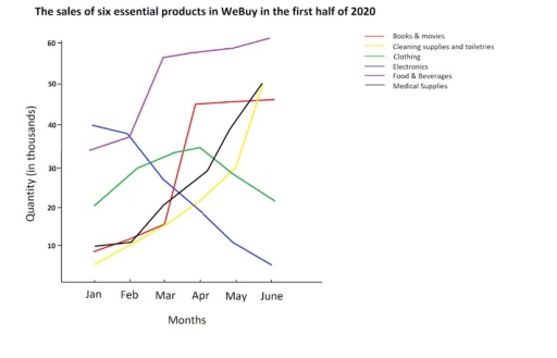
The image shows a line graph titled "The sales of six essential products in WeBuy in the first half of 2020" with quantities in thousands on the y-axis ranging from 0 to 60 and months from January to June on the x-axis. There are six lines representing different products: Books & movies start at 10 in January, peak at 20 in February, drop to 10 in March, rise slightly to 15 in April and May, and drop to 5 in June; Cleaning supplies and toiletries begin at 15 in January, jump to 50 in February, fall to 30 in March, 20 in April, 25 in May, and 10 in June; Clothing starts at 30 in January, drops to 25 in February, rises sharply to 60 in March, then plummets to 20 in April, 10 in May, and 5 in June; Electronics starts at 5 in January, rises to 10 in February and March, surges to 55 in April, falls to 40 in May, and plunges to 5 in June; Food & Beverages starts at 15 in January, rises to 35 in February, peaks at 40 in March, drops to 10 in April, soars to 45 in May, and falls to 25 in June; Medical Supplies start at 15 in January, rapidly ascend to 60 in February, remain at 60 in March, fall to 35 in April, 25 in May, and 10 in June.
Given the complexity of the image, the above description may not be entirely accurate.
Note: Both the topic and the answer were created by one of our users.

The line graph compares the sales of six important products at WeBuy over a period of 6 months, from January to June 2020.

In detail, the most popular product during the period was food and beverages, whose sales skyrocketed within the first two months, reaching around 55 thousand in March. The figure continued growing and peaked at 60 thousand in June. Similarly, the sales of books and movies increased considerably between March and April, but leveled off in June. Moreover, medical and cleaning supplies rose steadily every month, with a peak of just under 50 thousand.

In the next quarter, sales of food, medical supplies, and cleaning supplies and toiletries peaked at 50 and 60 thousand, respectively, while books and movies stood at just over 40 thousand. Conversely, clothing sales significantly dropped after the first quarter.

Overall, it is evident from the graph that there was an increase in sales, except for clothing. Additionally, food and beverages was the most popular category among the others. However, electronics sales dropped off month by month.

Word Count: 173

Answers On The Same Topic:

The graph below gives information on the sales of six essential products in WeBuy in the first half of 2020. Summarise the information by selecting and reporting the main features, and make comparisons where relevant.

The information concerning the data about six indispensable products were sold in WEBUY in the first six months of 2020.It has been manifested that, the sales of clothing witnessed fluctuation trend throughout the given period of time. To commence with,33000 food and beverages being sold in the January month in the 2020.Moreover, the sales of […]

The graph below gives information on the sales of six essential products in WeBuy in the first half of 2020. Summarise the information by selecting and reporting the main features, and make comparisons where relevant.

The line graph shows the sales of six essential products in WeBuy from January to June 2020, measured in thousands. Overall, electronics saw the most significant growth, while clothing experienced a notable decline. Sales of other products, such as food and beverages, cleaning supplies, medical supplies, and books & movies, varied over the six months. […]

The graph below gives information on the sales of six essential products in WeBuy in the first half of 2020. Summarise the information by selecting and reporting the main features, and make comparisons where relevant.

The line graph gives information about the sales of six various essential products in WeBuy in the first half of 2020. Overall, what can be immediately surmised from the data is that there was an upward trend in the number of books & movies, cleaning supplies and toiletries, food & beverage, and medical supplies. While […]

The graph below gives information on the sales of six essential products in WeBuy in the first half of 2020. Summarise the information by selecting and reporting the main features, and make comparisons where relevant.

The line graph illustrates the sales quantities of six essential products at WeBuy in the first half of 2020, measured in thousands. Overall, sales of “food and beverages” showed the largest increase, while “electronics” experienced the steepest decline. “Medical supplies” and “cleaning supplies and toiletries” saw considerable growth, whereas “clothing” remained relatively stable throughout this […]

The graph below gives information on the sales of six essential products in WeBuy in the first half of 2020. Summarise the information by selecting and reporting the main features, and make comparisons where relevant.

The line graph gives details about the trades of six important goods in WeBuy within the first six months of 2020. Overall,the sales of books,movies,cleaning supplies,toiletries,food,beverages and medical supplies experienced a remarkable upward trend over the period,while the dealing of the electronics and clothing witnessed a decrase. In January, the quantities of books,movies, medical supplies […]

See All

Other Topics:

The graph below shows average carbon dioxide (CO2) emissions per person in the Uk, sweden, portugal and italy

The line graph demonstrates the average carbon footprint per individual in the United Kingdom, Sweden, Italy and Portugal in 1967 to 2007. Overview, United Kingdom was releasing CO2 most over the years but after a decade, emission got decreased as year passed. Whereas Portugal was ejecting CO2 gas comparatively low than other countries. Initially, Portugal […]

The graph below shows the number of international tourists visiting three different regions (Asia, Europe, and America) between 2000 and 2020. Summarize the information by selecting and reporting the main features, and make comparisons where relevant.

In this graph we can observe the fluctuations between the years 2000 and 2020 in international tourism over three different regions, them being Asia, Europe and America. It is noticeable that the number of international tourists in america has grown significantly, going from less than a hundred million vistors at the start of the century, […]

The line graph shows the average number of deaths during the second wave of covid-19 in the UK, US, EU-27, and Brazil in 2021.

The line graph illustrates the average number of deaths during the second wave of covid-19 in the four countries between january and april. Overall, the UK shown the biggest fluctuations thoroughout the period, As a result, Uk had been the lowest deaths in April. While, Brazil was the highest number in the end. By contrast, […]

The line graph below shows changing patterns of business communication in New Stratford from 1980 to 2005. Summarise the information by selecting and reporting the main features, and make comparisons where relevant. Write at least 150 words.

The graph illustrates the business communication trend from 1980 to 2005 in New Standford. In general, landline phone was the most popular communication media in 25 years. On the other hand, the email usage related to business communication improved significantly from 1980 to 2005. Particularly, many companies utilized the cell phone, e-mail, and other internet […]

The line chart below shows the percentage of people in different age groups who played video games more than ten hours a week between 2010 and 2015

The data presents the percentage of different ages people, who spent more than 10 hours per week by playing video games. In general, the category of people who are from 16 to 24 dominated the graph over the provided period. On the contrary, seniors registered fairly low figures.Those aged from 25 to 64 occupied the […]

he graph below shows the number of immigrants to there countries from 1990 to 2001. Summarise the information by selecting and reporting the main features, and make comparisons where relevant.

The line graph illustrates the persantages of immigrants came in 1990 and 2001. overall USA experienced an upward trend by domanating, whereas Canada and Australia stay stable over the period . in the first year in USA the figure for people came from another country climbed from about 1300 to 1800 in 1992 . however […]

See All
We have detected unusual activity on your device.
Please verify your identity to continue.
Note: This verification step won't sign you in. If you have a premium account, please log in to access the service as usual.
Google/Gmail Verification
Or verify using Email/Code
We've sent a verification code to:
youremail@gmail.com (Not your email?)
Enter it below to complete the verification process.
Ensure your email address is correct, your inbox is not full, and you check your spam folder. If no email arrives, consider using an alternative email.
You will need a Premium plan to perform your action!
Note: If you already have a premium account, please log in to access our services as usual.

Plans & Pricing

Our mission is to make quality education accessible for everyone.
However, to keep our hardworking team running and this service alive, we genuinely need your support!
By opting for a premium plan, not only do you sustain us in achieving the mission, but you also unlock advanced features to enrich your learning experience.

Free

For learners who aren't pressed for time

What's included on Free
100+ Cambridge IELTS Tests
Instant IELTS Writing Task 1 & 2 Evaluation (2 times/month)
Instant IELTS Speaking Part 1, 2, & 3 Evaluation (5 times/month)
Instant IELTS Writing Task 1 & 2 Essay Generator (2 times/month)
500+ Dictation & Shadowing Exercises
100+ Pronunciation Exercises
Flashcards
Other Advanced Tools

Premium

For those serious about advancing their English proficiency, and for IELTS candidates aspiring to boost their band score by 1-2 points (especially in writing & speaking) in just 30 days or less

What's included on Premium
Save Your IELTS Test Progress
Unlock All Courses & IELTS Tests
Unlimited AI Conversations
Unlimited AI Writing Enhancement Exercises
Unlimited IELTS Writing Task 1 & 2 Evaluation
Unlimited IELTS Speaking Part 1, 2, & 3 Evaluation
Checked Answers Will Not Be Published
Unlimited IELTS Writing Task 1 & 2 Essay Generator
Unlimited IELTS Speaking Part 1, 2, & 3 Sample Generator
Unlimited Usage Of Advanced Tools
Priority Support within 24h (12-month plan only)

Due to the nature of our service and the provided free trials, payments are non-refundable.
Nếu bạn là người Việt Nam và không có hoặc không muốn trả bằng credit/debit cards, bạn có thể thanh toán bằng phương thức chuyển khoản:


Chọn gói:
419,000₫ 277,000 ₫ cho gói 1 tháng (chỉ 9,233₫/ngày)
1,239,000₫ 597,000 ₫ cho gói 3 tháng (chỉ 6,633₫/ngày)
2,469,000₫ 1,027,000 ₫ cho gói 6 tháng (chỉ 5,706₫/ngày)
4,929,000₫ 1,417,000 ₫ cho gói 12 tháng (chỉ 3,936₫/ngày)


Sau khi chuyển khoản, vui lòng đợi trình duyệt tự động điều hướng bạn trở lại Engnovate và bạn sẽ ngay lập tức nhận được mã kích hoạt tài khoản premium.
Nếu có lỗi xảy ra, bạn có thể liên hệ với team thông qua một trong các phương thức: email đến helloengnovate@gmail.com hoặc nhắn tin qua facebook.com/engnovate.
Vì toàn bộ công cụ trên website đều có thể sử dụng thử miễn phí, Engnovate không hỗ trợ hoàn tiền.