🔥 Today Only: Save 30% on Premium — Offer Ends Soon! - Upgrade Now!
Multiple Graphs

Band 8+: The graph below shows population figures for India and China since the year 2000 and predicted population growth up until 2050. Summarise the information by selecting and reporting the main features, and make comparisons where relevant

Image for topic: The graph below shows population figures for India and China since the year 2000 and predicted population growth up until 2050. Summarise the information by selecting and reporting the main features, and make comparisons where relevant
Our system will evaluate the answer based on this AI-generated description.
The image presents a graph delineating population growth projections for India and China from 2000 through 2050, with the population measured in billions. In 2000, China's population is approximately 1.27 billion, which slightly increases to around 1.40 billion by 2025 before peaking at approximately 1.45 billion by 2050. India's population, starting at approximately 1.05 billion in 2000, exhibits a continual rise reaching about 1.45 billion by 2040, eventually peaking at an estimated 1.60 billion by 2050. An intersection point between India and China is predicted around the year 2030, when both populations are expected to be about 1.40 billion. Each curve signifies population increments over each significant time interval, showcasing a relatively steady trajectory for India and a more gradual increment for China throughout the 50-year metric delineated by the half-century timeline.
Given the complexity of the image, the above description may not be entirely accurate.
Note: Both the topic and the answer were created by one of our users.

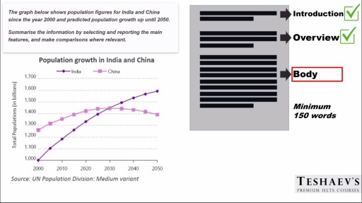
Demographic changes in China and India since the beginning of the century, as well as expected changes for the next three decades, are illustrated by the given line chart.

Overall, both the Chinese and Indian population has been growing steadily since the 2000s, although it is anticipated that the growth rate in the former one will slow down in the future.

More specifically, the Indian population accounted for 1 billion people in 2000, and this index increased constantly to 1.33 billion during the next twenty years. Similarly, the figure for China rose moderately from 1.25 billion to 1.42 billion within these years.

In terms of future projections, the number of Chinese people will grow further to a peak of 1.44 billion in 2030, when it crosses with that of India. Over the following two decades, it is forecast that the quantity of Indian population will rise to a level of 1.6 billion. By contrast, the indicator for China is anticipated to go down by 50 million people during the same period.

Word Count: 171

Answers On The Same Topic:

The graph below shows population figures for India and China since the year 2000 and predicted population growth up until 2050. Summarise the information by selecting and reporting the main features, and make comparisons where relevant

The line graph illustrates information about the changes in population for two countries, namely India and China over the from 2000 to predicted population growth up until 2050. Overall, it is immediately apparent that population in India experienced a significant upward trend, whereas population in China showed a gradual decline. Additionally, India overtook China in […]

The graph below shows population figures for India and China since the year 2000 and predicted population growth up until 2050. Summarise the information by selecting and reporting the main features, and make comparisons where relevant

The line graph illustrates information about the population datas for India and China since the year 2000 and forecast population increase until 2050. As can be seen from the graph, over the 50-year period, India is going to grow up significantly and its population will overtake China. In 2000, the people lived in China was […]

See All

Other Topics:

The pie charts below show the percentage of five kinds of books sold by a bookseller between 1972 and 2012. Summarize the information by selecting and reporting the main features, and make comparisons where relevant.

The provided pie charts compare the proportion of five kinds of books sold by a bookseller in three separate years, 1972, 1992, 2012. Overall, what stands out is that, the percentage of Adult Fiction and Children’s Fiction experienced an increase throughout the given timeframe, whereas that of Travel, Others, Biography saw a significant decline over […]

The table below shows how many people visited the Memphis Museum during the year before and the year after its refurbishment. The charts illustrate survey results on how visitors experienced their visit to the museum during those two periods. Summarise the information by selecting and reporting the main features, and make comparisons where relevant.

The table and pie charts illustrate the total number of visitors to the Memphis Museum during the year before and after refurbishment, along with visitor satisfaction survey results. Overall, before refurbishment, the majority of visitors gave negative feedback, with relatively few positive responses. After the refurbishment, this trend reversed, as most visitors reported positive experiences, […]

The table below shows how many people visited the Memphis Museum during the year before and the year after its refurbishment. The charts illustrate survey results on how visitors experienced their visit to the museum during those two periods. Summarise the information by selecting and reporting the main features, and make comparisons where relevant.

The table and pie charts illustrate the total number of visitors to the memphis museum during the year before and after refurbishment, with visitor’s satisfaction conducted by surveys. Overall, before refurbishment, majority visitors’ responses were negative, with a few positive attitudes. After being refurbished, most people responded positively, whereas the smallest number of visitors responded […]

Dairy Production in Metric Tonnes - Top Three Producers, 2012

The chart below gives data about dairy factoring , for example: milk powder, butter , cheese and milk in 2012. In addition, it demonstrates three world leaders in manufacturing these products. Overall, milk factoring was the greatest success in the European Union with 142,970, while in the United States it took the smallest amount in […]

The charts below show the percentage of time used for different activities in the office in the US in 1980 and 2000.

The table compares one development country [ US ] in terms of their time used for kind of activities seven various of sectors [ computer, paper document, meeting, phone, other activities, email, face-to-face communication] in the office 1980 and 2000. Units are measured in percentages. Overall, it is a clear that computer and phone showed […]

The chart below show the percentage of their food budget the average family spent on restaurant meals in different years. The graph shows the number of meals eaten in fast food restaurants and sit-down restaurants. Summarize the information by selecting and reporting the main features, and make comparisons where relevant.

The pie chart provides data regarding the percentages of food budget spent by the average household on restaurant or homemade meals from 1979 to 2000. Overall, it is clear that at the beginning of the period, the vast majority of families cooked at home, while at the end, the proportions for home and restaurant meals […]

See All
We have detected unusual activity on your device.
Please verify your identity to continue.
Note: This verification step won't sign you in. If you have a premium account, please log in to access the service as usual.
Google/Gmail Verification
Or verify using Email/Code
We've sent a verification code to:
youremail@gmail.com (Not your email?)
Enter it below to complete the verification process.
Ensure your email address is correct, your inbox is not full, and you check your spam folder. If no email arrives, consider using an alternative email.
You will need a Premium plan to perform your action!
Note: If you already have a premium account, please log in to access our services as usual.

Plans & Pricing

Our mission is to make quality education accessible for everyone.
However, to keep our hardworking team running and this service alive, we genuinely need your support!
By opting for a premium plan, not only do you sustain us in achieving the mission, but you also unlock advanced features to enrich your learning experience.

Free

For learners who aren't pressed for time

What's included on Free
100+ Cambridge IELTS Tests
Instant IELTS Writing Task 1 & 2 Evaluation (2 times/month)
Instant IELTS Speaking Part 1, 2, & 3 Evaluation (5 times/month)
Instant IELTS Writing Task 1 & 2 Essay Generator (2 times/month)
500+ Dictation & Shadowing Exercises
100+ Pronunciation Exercises
Flashcards
Other Advanced Tools

Premium

For those serious about advancing their English proficiency, and for IELTS candidates aspiring to boost their band score by 1-2 points (especially in writing & speaking) in just 30 days or less

What's included on Premium
Save Your IELTS Test Progress
Unlock All Courses & IELTS Tests
Unlimited AI Conversations
Unlimited AI Writing Enhancement Exercises
Unlimited IELTS Writing Task 1 & 2 Evaluation
Unlimited IELTS Speaking Part 1, 2, & 3 Evaluation
Checked Answers Will Not Be Published
Unlimited IELTS Writing Task 1 & 2 Essay Generator
Unlimited IELTS Speaking Part 1, 2, & 3 Sample Generator
Unlimited Usage Of Advanced Tools
Priority Support within 24h (12-month plan only)

Due to the nature of our service and the provided free trials, payments are non-refundable.
Nếu bạn là người Việt Nam và không có hoặc không muốn trả bằng credit/debit cards, bạn có thể thanh toán bằng phương thức chuyển khoản:


Chọn gói:
419,000₫ 277,000 ₫ cho gói 1 tháng (chỉ 9,233₫/ngày)
1,239,000₫ 597,000 ₫ cho gói 3 tháng (chỉ 6,633₫/ngày)
2,469,000₫ 1,027,000 ₫ cho gói 6 tháng (chỉ 5,706₫/ngày)
4,929,000₫ 1,417,000 ₫ cho gói 12 tháng (chỉ 3,936₫/ngày)


Sau khi chuyển khoản, vui lòng đợi trình duyệt tự động điều hướng bạn trở lại Engnovate và bạn sẽ ngay lập tức nhận được mã kích hoạt tài khoản premium.
Nếu có lỗi xảy ra, bạn có thể liên hệ với team thông qua một trong các phương thức: email đến helloengnovate@gmail.com hoặc nhắn tin qua facebook.com/engnovate.
Vì toàn bộ công cụ trên website đều có thể sử dụng thử miễn phí, Engnovate không hỗ trợ hoàn tiền.