🔥 Today Only: Save 30% on Premium — Offer Ends Soon! - Upgrade Now!
Bar Chart

Band 8+: The given bar chart illustrates the population of Jakarta, Shanghai and Sao Paulo in 1990, as well as the estimated and actual figures of the populations in 2000

Image for topic: The given bar chart illustrates the population of Jakarta, Shanghai and Sao Paulo in 1990, as well as the estimated and actual figures of the populations in 2000
Our system will evaluate the answer based on this AI-generated description.
The image shows a bar graph titled 'Population size (1990 - 2000)' depicting the populations of Jakarta, Shanghai, and Sao Paulo between 1990 and 2000 in 5 million increment scale, measured in millions. For Jakarta, the 1990 population bar almost reaches the 10 million mark, the 2000 prediction bar surpasses the 15 million mark by a small margin, and the 2000 actual figures bar reaches almost the 20 million mark. Shanghai's 1990 population bar is slightly shorter than Jakarta's 1990 bar, its 2000 prediction bar is approximately half a million shorter than Jakarta's 2000 prediction, while its 2000 actual figures bar is almost identical in length to Jakarta's 2000 prediction bar. Sao Paulo's 1990 population bar is the longest, surpassing the 15 million mark, its 2000 prediction bar reaches the 20 million mark and its 2000 actual figures bar is the shortest of the 2000 actual figures but still surpasses the 15 million mark.
Given the complexity of the image, the above description may not be entirely accurate.
Note: Both the topic and the answer were created by one of our users.

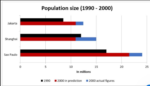
The bar chart gives information about the population sizes of three cities, namely Jakarta, Shanghai, and Sao Paulo, in 1990 and the projections for 2000, alongside the actual figures for the latter year.

Overall, for each city, the real numbers in 2000 surpassed the forecasted ones, with Shanghai having been the only citu expected to decrease in population. In addition, Sao Paulo consistently stayed ahead of other cities in population, at nearly double the figures for Jakarta.

Looking at Sao Paulo and Jakarta, in 1990, the former had a population of 17 million, which was more than double the 8 million of the latter. By 2000, Sao Paulo’s population was predicted to rise significantly to 22 million, while the actual figure exceed expectations, at 24 million. Jakarta followed a similar upward trend, with its predicted population being 11 million and the final result frowing to 12 million.

In contrast, Shanghai was the only city that did not follow the prediction. Staring with a population of 12 million in 1990, it was predicted to decline to 11 million by 2000. This forecast, however, was contradicted by the actual results, as an unexpected rise to 15 million was recorded.

Word Count: 197

Answers On The Same Topic:

The given bar chart illustrates the population of Jakarta, Shanghai and Sao Paulo in 1990, as well as the estimated and actual figures of the populations in 2000

The bar chat delineates the actual and expected figures of residents of three cities, Jakarta, Sao Paulo, and Shanghai. Overall, the data reveals significant nation disparaties in the population size for different periods, with Sao Paulo generally include more population size in all periods, while Jakarta and Shanghai has lower level than Sao Paulo A […]

The given bar chart illustrates the population of Jakarta, Shanghai and Sao Paulo in 1990, as well as the estimated and actual figures of the populations in 2000

The chart illustrates the population sizes of three cities, namely Jakarta, Shanghai, and Sao Paolo, in 1990 and 2000, including both predicted and actual figures. Overall, all cities experienced growth over the period, with Sao Paulo being the largest and Jakarta the smallest. Forecasts underestimated the actual figures, and remarkably, Shanghai was predicted to decline, […]

The given bar chart illustrates the population of Jakarta, Shanghai and Sao Paulo in 1990, as well as the estimated and actual figures of the populations in 2000

The bar chart provides data on the actual and forecasted population size in three cities, namely: Jakarta, Shanghai, and Sao Paulo, in 1990 and 2000. Overall, while all three cities experienced an increase in citizen size, the actual figure in 2000 was slightly different from the predicted figure. Sao Paulo had the highest population compared […]

The given bar chart illustrates the population of Jakarta, Shanghai and Sao Paulo in 1990, as well as the estimated and actual figures of the populations in 2000

The bar chart compares the actual and projected population volumes among three distinct conurbations, Jakarta, Shanghai and Sao Paulo, in 1990 and 2000. Overall, readily discernible in the chart is that three cities experienced an upward trend in population sizes from 1990 to 2000, with Sao Paulo remaining its supremity throughout 10 years. The actual […]

See All

Other Topics:

The chart below gives information about the adults with education at high school level in six countries in 2010. Summarize the information by selecting and reporting the main features, and make the comparisons where relevant.

The table bellow illustrates data about the adults with education in senior high school levels in 6 countries in 2010. Overall, it’s clear that China has underperformed in everything. Seniors between 25-34 year olds in Germany had supreme amounts in South Korea. And 55-64 year old band had their highest numbers in USA. The 55-64 […]

The bar chart below shows the number of students enrolled in three different courses (Math, English, and Science) at a college between 2015 and 2025. Summarise the information by selecting and reporting the main features, and make comparisons where relevant.

The bar chart shows the number of students that registered in three different courses (Math, English, and Science at a college between 2015 and 2025 Overall, it is clear that all three courses experienced an upward trend. English take the highest position as the most popular subject while Science represents as the lowest course among […]

The chart below shows the percentage of people who chose different kinds of transport to get to work in Melbourne and Sydney in 2006 and 2011.Summarise the information by selecting and reporting the main features, and make comparisons where relevant.

The column chart illustrates the proportion of people who chose three categories of transport to get to work in Melbourne and Sydney in 2006 and 2011. Overall, it is clear that private transport had dominant figures among these three types of transport in 2006 and 2011. In addition, the percentages of public transport increased in […]

The bar chart shows information about annual consumption of meat, fish and vegetables per capita in three european countries in 2020.

The bar chart shows how much meat, fish, and vegetables were consumed per capita in Germany, France, and Spain in 2020. Overall, vegetable consumption accounted for the highest number in the three capitals, whereas the amount of fish consumption was the least. Additionally, Germany and France show similar patterns, while Spain recorded noticeably lower figures […]

The chart below gives information about the most common sports played in the UK in 2008

The given chart illustrates the data about the famale and male played most common games in the UK in 2008. From an overall perspective it is consipcuous that most common games played in UK. About 30% female play netball commonly in UK in 2008. And about 24% male mostly play soccer in 2008. On the […]

The chart below shows the changes in the percentage of households with cars in one European country between 1971 and 2001. Summarise the information by selecting and reporting the main features, and make comparison where relevant.

The chart demonstrates the changes in the percentage of people owning a car from 1971 to 2001. The proportion of people who did not have a car was 48% in 1971. Reaching 45% in 1981 and 31% in 1991, the percentage decreased to 28% in 2001. The share of people who had one car was […]

See All
We have detected unusual activity on your device.
Please verify your identity to continue.
Note: This verification step won't sign you in. If you have a premium account, please log in to access the service as usual.
Google/Gmail Verification
Or verify using Email/Code
We've sent a verification code to:
youremail@gmail.com (Not your email?)
Enter it below to complete the verification process.
Ensure your email address is correct, your inbox is not full, and you check your spam folder. If no email arrives, consider using an alternative email.
You will need a Premium plan to perform your action!
Note: If you already have a premium account, please log in to access our services as usual.

Plans & Pricing

Our mission is to make quality education accessible for everyone.
However, to keep our hardworking team running and this service alive, we genuinely need your support!
By opting for a premium plan, not only do you sustain us in achieving the mission, but you also unlock advanced features to enrich your learning experience.

Free

For learners who aren't pressed for time

What's included on Free
100+ Cambridge IELTS Tests
Instant IELTS Writing Task 1 & 2 Evaluation (2 times/month)
Instant IELTS Speaking Part 1, 2, & 3 Evaluation (5 times/month)
Instant IELTS Writing Task 1 & 2 Essay Generator (2 times/month)
500+ Dictation & Shadowing Exercises
100+ Pronunciation Exercises
Flashcards
Other Advanced Tools

Premium

For those serious about advancing their English proficiency, and for IELTS candidates aspiring to boost their band score by 1-2 points (especially in writing & speaking) in just 30 days or less

What's included on Premium
Save Your IELTS Test Progress
Unlock All Courses & IELTS Tests
Unlimited AI Conversations
Unlimited AI Writing Enhancement Exercises
Unlimited IELTS Writing Task 1 & 2 Evaluation
Unlimited IELTS Speaking Part 1, 2, & 3 Evaluation
Checked Answers Will Not Be Published
Unlimited IELTS Writing Task 1 & 2 Essay Generator
Unlimited IELTS Speaking Part 1, 2, & 3 Sample Generator
Unlimited Usage Of Advanced Tools
Priority Support within 24h (12-month plan only)

Due to the nature of our service and the provided free trials, payments are non-refundable.
Nếu bạn là người Việt Nam và không có hoặc không muốn trả bằng credit/debit cards, bạn có thể thanh toán bằng phương thức chuyển khoản:


Chọn gói:
419,000₫ 277,000 ₫ cho gói 1 tháng (chỉ 9,233₫/ngày)
1,239,000₫ 597,000 ₫ cho gói 3 tháng (chỉ 6,633₫/ngày)
2,469,000₫ 1,027,000 ₫ cho gói 6 tháng (chỉ 5,706₫/ngày)
4,929,000₫ 1,417,000 ₫ cho gói 12 tháng (chỉ 3,936₫/ngày)


Sau khi chuyển khoản, vui lòng đợi trình duyệt tự động điều hướng bạn trở lại Engnovate và bạn sẽ ngay lập tức nhận được mã kích hoạt tài khoản premium.
Nếu có lỗi xảy ra, bạn có thể liên hệ với team thông qua một trong các phương thức: email đến helloengnovate@gmail.com hoặc nhắn tin qua facebook.com/engnovate.
Vì toàn bộ công cụ trên website đều có thể sử dụng thử miễn phí, Engnovate không hỗ trợ hoàn tiền.