Our system will evaluate the answer based on this AI-generated description.
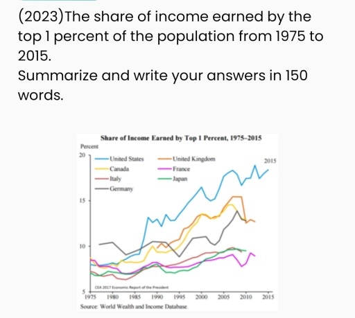
The image features a line graph displaying the share of income earned by the top 1 percent of the population in six different countries (United States, United Kingdom, Canada, France, Italy, Germany, and Japan) from 1975 to 2015. The plot lines for each country show fluctuations over the 40-year period. The United States starts just above 10% in 1975, peaks at nearly 20% around 2015. The United Kingdom begins around 5%, rising to peaks of over 15% in the early 2000s, stabilizes slightly below 15% by 2015. Canada's line starts near 8%, peaks at just under 15% by 2015. France begins slightly below 10%, increasing to approximately 10% by 2015. Italy starts under 10%, peaking slightly above 10% in the early 2000s then declines back near initial values. Germany appears to begin under 10%, reaching upwards nearer to 10% by 2015. Japan starts near 5%, increases to just above 10% around 2000, then declines to above 5% by 2015. The data points range from below 5% to nearly 20% across different countries and years.
Given the complexity of the image, the above description may not be entirely accurate.
Skyrocket your IELTS band score by 1-2 points in under a month with our premium plan!
Note: Both the topic and the answer were created by one of our users.
The line graph gives data about the money earned by the top 1% from 1975 to 2005 in several countries.
In general, the graph experienced an upward trend over the period. It was also considered that Americans had the highest income. Moreover, Italy, France and Japan rose more steadily than the others.
Looking at the details, it was noticed that the income from Germany started at 10% in 1975, after which it experienced a significant fluctuation to around 13% in 2010, before ending the period at 12%. Similar trend can be seen in the figure for Canada and the United Kingdom, which fluctuated and ended at over 12%. The United States was at 7%, followed by a dramatic increase and had a peak at 18%.
Regarding the figure for France, the chart witnessed a beginning at about 8%, then experienced a slight drop of 3% in 1983. The proportion gradually increased to under 9%, however, it fell to around 6% before finishing the period at 8%. Besides, the percentages of Japan and Italy saw the same trend which increased from about 6% in 1975 to 8% in 2010.
Word Count: 188
