🔥 Today Only: Save 30% on Premium — Offer Ends Soon! - Upgrade Now!
Bar Chart

Band 4+: The chart below gives information about how families in one country spent their weekly income in 1968 and 2018. Summarize the information by selecting and reporting the main features, and make comparisons wherever relevant. 1968 and 2018: average weekly spending by families

Image for topic: The chart below gives information about how families in one country spent their weekly income in 1968 and 2018. Summarize the information by selecting and reporting the main features, and make comparisons wherever relevant. 1968 and 2018: average weekly spending by families
Our system will evaluate the answer based on this AI-generated description.
The image presents a bar chart comparing average weekly spending by families in percentages of weekly income on different categories for the years 1968 and 2018. In 1968, the expenditure percentages for various categories are as follows: Food (approximately 23%), Housing (roughly 7%), Fuel and power (close to 5%), Clothing and footwear (about 8%), Household goods (nearly 4%), Personal goods (around 2%), Transport (just over 5%), and Leisure (slightly more than 2%). For the year 2018, the spending percentages for the same categories are: Food (approximately 8%), Housing (about 30%), Fuel and power (close to 2%), Clothing and footwear (around 3%), Household goods (nearly 3%), Personal goods (approximately 3%), Transport (about 15%), and Leisure (roughly 10%). The chart illustrates a significant decrease in the percentage of income spent on food, fuel, and power from 1968 to 2018, with an increase in spending on housing, transport, and leisure in the same period.
Given the complexity of the image, the above description may not be entirely accurate.
Note: Both the topic and the answer were created by one of our users.

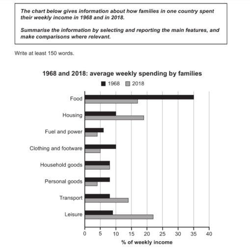
The bar chart illustrate how families in one nation spent their weekly income in the years 1968 and 2018. The units are measured in percentages.

Overall, in 1968 the highest expenditure of families was on Food accounted for 35 percent and in 2018 families spent around 6 per cent on Fuel and Power. However, in 2018 families almost of their income went to Leisure with 22%, while the lowest spent on Fuel and Personal goods.

According to what is shown Foods in both years had high number at 18% and 35% respectively. in 2018 most of people concentrate on Housing at almost 20 percent while in 1968 families just spent 10 per cent. Transportaion and leisure in 2018 around 14% and 22% meanwhile, in the other year families expenditure was 8 percent and 9 percent.

In terms of Household goods both years spent the same number, which is 8%, but in other sectors had flctuated numbers Fuel and power just 4% and 6% respectively. and Clothing was in 1968 at 10% and in 2018 accounted for just 5%. Therefore, personal goods in 1968 nearly 10 percent. On the other hand in 2018 at just only 4 percent.

Word Count: 197

Answers On The Same Topic:

The chart below gives information about how families in one country spent their weekly income in 1968 and 2018. Summarize the information by selecting and reporting the main features, and make comparisons wherever relevant. 1968 and 2018: average weekly spending by families

The bar chart ilustrates the information about how families in one country spent their weekly income between 1968 and 2018. Overall, in 1968, food was the type that accounted for the most percentage average weekly spending by families at all, while in 2018, leisure had the largest percen. Moreover, whereas food, fuel and power, clothing […]

The chart below gives information about how families in one country spent their weekly income in 1968 and 2018. Summarize the information by selecting and reporting the main features, and make comparisons wherever relevant. 1968 and 2018: average weekly spending by families

The given bar graph indicates the average weekly spending of families in one country, in percentages of weekly income, on different categories for the years 1968 and 2018. Overall, it is evident that while food consumption dominated in the earlier year, later periods witnessed an increased focus on leisure activities and housing. In 1968, families […]

The chart below gives information about how families in one country spent their weekly income in 1968 and 2018. Summarize the information by selecting and reporting the main features, and make comparisons wherever relevant. 1968 and 2018: average weekly spending by families

The bar chart compares the percentage of weekly income that families spent on various categories in 1968 and 2018. Overall, families spent a higher proportion of their income on housing, transport, and leisure in 2018 than in 1968, while spending on food, clothing, fuel and power, and personal goods declined. The proportion spent on household […]

The chart below gives information about how families in one country spent their weekly income in 1968 and 2018. Summarize the information by selecting and reporting the main features, and make comparisons wherever relevant. 1968 and 2018: average weekly spending by families

The given bar chart compares how the average household in one particular nation spent their weekly income in 1968 and 2018. Overall, it can be seen that the families used more their income on food in 1968 while housing and leisure had overtaken food as the largest areas of expenditure in 2018. Although, all sources […]

See All

Other Topics:

The charts below give information about workplace injuries in one country in 2018.

The bar chart compares how injuries occurred in four age cohorts across four different types of workplace in 2018. What stands out is that the proportions of injuries among those aged 50 and above was significantly high across all areas, particularly in education and health, and leisure and hospitality, where they topped the chart. Interestingly, […]

The bar chart below shows the production of the world’s oil in OPEC and non-OPEC countries. Write a short report for a university lecturer describing the information shown below.

The bar graph illustrate the number of oil barrel produced per day by OPEC and non-OPEC nations over 40 years period from 1980 to 2020. Overall, non-OPEC countries made up the marjority of the world’s oil production at the begining; however, their figures experienced a sharp decline over the period in question, similar to that […]

The bar chart gives information about the annual average spending on clothes per person in the USA in 1985, 1995 and 2005.

The bar chart illustrates th average amount of money spent on clothes in the USA in 1985, 1995 and 2005. Overall, women’s clothing accounted for the highest expenditure throughout the period, while spending on children’s clothes was much lower. In general, clothing expenditure increased over time, although spending on men’s clothes decreased slightly in 2005. […]

the graph below shows the amount of energy generated wind in four countries in the period 1980-2000

The bar chart illustrates the amount of energy generated by wind in four countries – India, Denmark, Germany and the United States – between 1985 and 2000, measured in megawatts. Overall, wind energy generation increased in all countries over the period, with the exception of the US, where the figure declined slightly at the end. […]

The graph below gives information about the common activities children of different ages in the United States do as part of their bedtime routines.

The bar chart illustrates the number of children who engaged in common activities, namely reading, brushing teeth, having a bath, watching TV, eating, before going to bed at three different ages in the USA in 2015. Overall, reading was the most popular activity among all given ages groups, while eating was the least common activity […]

The graph below shows the amount of tea and coffee imported by four different countries in tonnes. Summarize the information by selecting and reporting the main points and make comparions where relevant.

The bar chart gives the information about amount of tea and coffee transffered by four countries in 2007, in tonnes. Overall, UK and USA transported more amount of tea, while other two countries conveyed more amount of coffee. Moreover the UK led in top of the largest importer of tea than other states. Tea standed […]

See All
We have detected unusual activity on your device.
Please verify your identity to continue.
Note: This verification step won't sign you in. If you have a premium account, please log in to access the service as usual.
Google/Gmail Verification
Or verify using Email/Code
We've sent a verification code to:
youremail@gmail.com (Not your email?)
Enter it below to complete the verification process.
Ensure your email address is correct, your inbox is not full, and you check your spam folder. If no email arrives, consider using an alternative email.
You will need a Premium plan to perform your action!
Note: If you already have a premium account, please log in to access our services as usual.

Plans & Pricing

Our mission is to make quality education accessible for everyone.
However, to keep our hardworking team running and this service alive, we genuinely need your support!
By opting for a premium plan, not only do you sustain us in achieving the mission, but you also unlock advanced features to enrich your learning experience.

Free

For learners who aren't pressed for time

What's included on Free
100+ Cambridge IELTS Tests
Instant IELTS Writing Task 1 & 2 Evaluation (2 times/month)
Instant IELTS Speaking Part 1, 2, & 3 Evaluation (5 times/month)
Instant IELTS Writing Task 1 & 2 Essay Generator (2 times/month)
500+ Dictation & Shadowing Exercises
100+ Pronunciation Exercises
Flashcards
Other Advanced Tools

Premium

For those serious about advancing their English proficiency, and for IELTS candidates aspiring to boost their band score by 1-2 points (especially in writing & speaking) in just 30 days or less

What's included on Premium
Save Your IELTS Test Progress
Unlock All Courses & IELTS Tests
Unlimited AI Conversations
Unlimited AI Writing Enhancement Exercises
Unlimited IELTS Writing Task 1 & 2 Evaluation
Unlimited IELTS Speaking Part 1, 2, & 3 Evaluation
Checked Answers Will Not Be Published
Unlimited IELTS Writing Task 1 & 2 Essay Generator
Unlimited IELTS Speaking Part 1, 2, & 3 Sample Generator
Unlimited Usage Of Advanced Tools
Priority Support within 24h (12-month plan only)

Due to the nature of our service and the provided free trials, payments are non-refundable.
Nếu bạn là người Việt Nam và không có hoặc không muốn trả bằng credit/debit cards, bạn có thể thanh toán bằng phương thức chuyển khoản:


Chọn gói:
419,000₫ 277,000 ₫ cho gói 1 tháng (chỉ 9,233₫/ngày)
1,239,000₫ 597,000 ₫ cho gói 3 tháng (chỉ 6,633₫/ngày)
2,469,000₫ 1,027,000 ₫ cho gói 6 tháng (chỉ 5,706₫/ngày)
4,929,000₫ 1,417,000 ₫ cho gói 12 tháng (chỉ 3,936₫/ngày)


Sau khi chuyển khoản, vui lòng đợi trình duyệt tự động điều hướng bạn trở lại Engnovate và bạn sẽ ngay lập tức nhận được mã kích hoạt tài khoản premium.
Nếu có lỗi xảy ra, bạn có thể liên hệ với team thông qua một trong các phương thức: email đến helloengnovate@gmail.com hoặc nhắn tin qua facebook.com/engnovate.
Vì toàn bộ công cụ trên website đều có thể sử dụng thử miễn phí, Engnovate không hỗ trợ hoàn tiền.