🔥 Today Only: Save 30% on Premium — Offer Ends Soon! - Upgrade Now!
Line Graph

Band 7+: IELTS Academic Writing Task 1: You should spend about 20 minutes on this task. The graph below gives information about the percentage of the population in four Asian countries living in cities from 1970 to 2020, with predictions for 2030 and 2040. Summarise the information by selecting and reporting the main features, and make comparisons where relevant.

Image for topic: IELTS Academic Writing Task 1: You should spend about 20 minutes on this task. The graph below gives information about the percentage of the population in four Asian countries living in cities from 1970 to 2020, with predictions for 2030 and 2040. Summarise the information by selecting and reporting the main features, and make comparisons where relevant.
Our system will evaluate the answer based on this AI-generated description.
The image displays the urban population percentage from 1970 to 2040 for four countries: Philippines, Malaysia, Thailand, and Indonesia. In 1970, the Philippines had about 30%, Malaysia 25%, Thailand 15%, and Indonesia 10%. By 1980, the Philippines reached approximately 35%, Malaysia 35%, Thailand 20%, and Indonesia 15%. By 1990, the Philippines climbed to about 44%, Malaysia held steady around 45%, Thailand about 25%, and Indonesia around 25%. In 2000, Malaysia peaked at approximately 55%, Philippines 48%, Thailand 30%, and Indonesia 30%. By 2010, Malaysia reached roughly 63%, Philippines around 50%, Thailand 34%, and Indonesia 40%. In 2020, Malaysia's figure was around 70%, Philippines 53%, Thailand 38%, and Indonesia 50%. The projection for 2030 suggests Malaysia will be at about 75%, the Philippines at 58%, Thailand at 42%, and Indonesia at 55%. By 2040, Malaysia is expected to be at approximately 80%, Philippines 63%, Thailand about 46%, and Indonesia about 60%.
Given the complexity of the image, the above description may not be entirely accurate.
Note: Both the topic and the answer were created by one of our users.

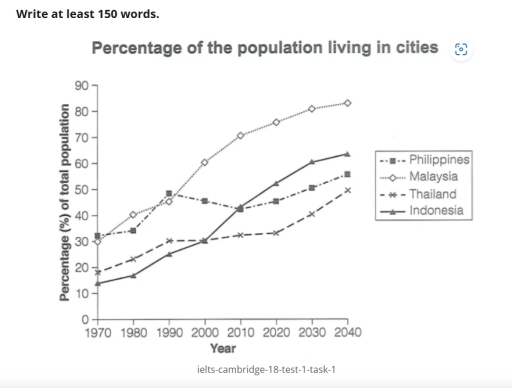
The line chart depicts how the populations of urban areas have changed from 1970 to 2020, with the predictions for 2030 and 2040 among four Asian countries.

Overall, it is evident that city residents in all Asian countries experienced an upward trend, and it will continue into the forecasted year. While Malaysia will be the dominant country for city residents, Thailand will remain the lowest among others.

In terms of the Malaysian city dwellers, which will witness the most dramatic increase, it started from approximately 30% in 1970 to around 75% in 2020 before reaching a peak of nearly 80% in the projected final year. In addition, Indonesia’s urban population growth rate began increasing from only about 14% in 1970 before witnessing a dramatic increase of approximately 46 % in the final year.

Moreover, the Philippines’ city resident experienced a gradual growth for two decades, which rose from just above 30% in 1970 to around 48% before further falling to roughly 42% and eventually will meet a steady increase in the forecasted final year. Meanwhile, Thailand’s urban population increase rate witnessed an incline of approximately 11% in 2020, and it will grow to around 48% in the predicted year.

Word Count: 199

Answers On The Same Topic:

IELTS Academic Writing Task 1: You should spend about 20 minutes on this task. The graph below gives information about the percentage of the population in four Asian countries living in cities from 1970 to 2020, with predictions for 2030 and 2040. Summarise the information by selecting and reporting the main features, and make comparisons where relevant.

Overall, urbanisation increased in all four countries over the period. In addition, one country had the highest urban population throughout, while another remained the least urbanised despite steady growth. In 1970, around 30% of the population in Country A lived in cities, compared to about 20% in Country B. Both countries experienced gradual growth over […]

IELTS Academic Writing Task 1: You should spend about 20 minutes on this task. The graph below gives information about the percentage of the population in four Asian countries living in cities from 1970 to 2020, with predictions for 2030 and 2040. Summarise the information by selecting and reporting the main features, and make comparisons where relevant.

The line graph provides key information about the level of the population in Philippines,Malaysia,Thailand and Indonesia living in cities between 1970 and 2020 . Overall,it is clear from the graph that Malaysia and Indonesia are showed increasing trend over the period.However,Philippines and Thailand are showed decreasing trend. In the beginning Malaysia was lower, but than […]

IELTS Academic Writing Task 1: You should spend about 20 minutes on this task. The graph below gives information about the percentage of the population in four Asian countries living in cities from 1970 to 2020, with predictions for 2030 and 2040. Summarise the information by selecting and reporting the main features, and make comparisons where relevant.

The illustration below provides some data about the demography of four countries located in Asia; how it has changed from 1970 to 2020 and how it may change until 2040. Overall, It can be clearly seen that the population in every country will increase by 2040. In addition, Malaysia is the most populated in comparison […]

IELTS Academic Writing Task 1: You should spend about 20 minutes on this task. The graph below gives information about the percentage of the population in four Asian countries living in cities from 1970 to 2020, with predictions for 2030 and 2040. Summarise the information by selecting and reporting the main features, and make comparisons where relevant.

The line graph illustrate the percentage of population living in cities at four countries over eight years periode. Overall, the proportion of population living in the town represented the figure will increase in all countries. The highest percentage of residents inhabit the city is Malaysia, decline Thailand is the lowest country with the proportion of […]

See All

Other Topics:

summarise the information by selecting and reporting the main features, and make comparisons where relevante

The line graph compares the number of people attending various activities at one social center in Melbourne, Australia, from 2000 to 2020. Overall, film club dominated the number of participants over the period. Additionally, amateur dramatics showed decrease, while table tennis saw a increase. Moreover, a new activity arised, called musical performances for given years. […]

The graph below gives historical information and projections about changes in population in the United States, Nigeria and Japan.

The provided line graph presents data regarding changes in population in the US, Nigeria and Japan from 1950 to 2050. Overall, all nations are expected to witness an upward trajectory in their population; however, Nigeria is anticipated to experience the most pronounced growth, surpassing the other two countries, as opposed to a slight rise in […]

The graph shows information about the number of people in Australia who used Chinese, Arabic, Italian, and Greek as their first language.

The line graph illustrates the amount of native speakers of Chinese,Arabic,Italian and Greek in Australia. Overall, the number of Chinese and Arabic language speakers increased significantly over the period,while the figure for Greek and Italian first language speakers dropped. The number of Chinese speakers stood out other categories showing the highest number in last years. […]

The chart below shows the percentage of Australian people who were born in different places of the world.

Tha graph illustrate the data about percentage of Australian flok where were born in different areas of the world in the given period which is from 1976 to 2011 Overall, there are four places where Australians were born, which is uk, asia, total amount of borns and other areas. There are three places in the […]

The line graph below shows the number of overseas tourists (in millions) who visited France, Spain, and Japan between 1990 and 2020. Summarise the information by selecting and reporting the main features, and make comparisons where relevant.

The provided line graph illustrates the total number of tourists exploring three different foreign countries over the period of 30 years, from 1990 to 2020. Overall, the number of visitors in Spain and France surged significantly, whereas Japan increased slightly until 2000 and then declined throughout the period. Furthermore, France remained the dominant destination over […]

See All
We have detected unusual activity on your device.
Please verify your identity to continue.
Note: This verification step won't sign you in. If you have a premium account, please log in to access the service as usual.
Google/Gmail Verification
Or verify using Email/Code
We've sent a verification code to:
youremail@gmail.com (Not your email?)
Enter it below to complete the verification process.
Ensure your email address is correct, your inbox is not full, and you check your spam folder. If no email arrives, consider using an alternative email.
You will need a Premium plan to perform your action!
Note: If you already have a premium account, please log in to access our services as usual.

Plans & Pricing

Our mission is to make quality education accessible for everyone.
However, to keep our hardworking team running and this service alive, we genuinely need your support!
By opting for a premium plan, not only do you sustain us in achieving the mission, but you also unlock advanced features to enrich your learning experience.

Free

For learners who aren't pressed for time

What's included on Free
100+ Cambridge IELTS Tests
Instant IELTS Writing Task 1 & 2 Evaluation (2 times/month)
Instant IELTS Speaking Part 1, 2, & 3 Evaluation (5 times/month)
Instant IELTS Writing Task 1 & 2 Essay Generator (2 times/month)
500+ Dictation & Shadowing Exercises
100+ Pronunciation Exercises
Flashcards
Other Advanced Tools

Premium

For those serious about advancing their English proficiency, and for IELTS candidates aspiring to boost their band score by 1-2 points (especially in writing & speaking) in just 30 days or less

What's included on Premium
Save Your IELTS Test Progress
Unlock All Courses & IELTS Tests
Unlimited AI Conversations
Unlimited AI Writing Enhancement Exercises
Unlimited IELTS Writing Task 1 & 2 Evaluation
Unlimited IELTS Speaking Part 1, 2, & 3 Evaluation
Checked Answers Will Not Be Published
Unlimited IELTS Writing Task 1 & 2 Essay Generator
Unlimited IELTS Speaking Part 1, 2, & 3 Sample Generator
Unlimited Usage Of Advanced Tools
Priority Support within 24h (12-month plan only)

Due to the nature of our service and the provided free trials, payments are non-refundable.
Nếu bạn là người Việt Nam và không có hoặc không muốn trả bằng credit/debit cards, bạn có thể thanh toán bằng phương thức chuyển khoản:


Chọn gói:
419,000₫ 277,000 ₫ cho gói 1 tháng (chỉ 9,233₫/ngày)
1,239,000₫ 597,000 ₫ cho gói 3 tháng (chỉ 6,633₫/ngày)
2,469,000₫ 1,027,000 ₫ cho gói 6 tháng (chỉ 5,706₫/ngày)
4,929,000₫ 1,417,000 ₫ cho gói 12 tháng (chỉ 3,936₫/ngày)


Sau khi chuyển khoản, vui lòng đợi trình duyệt tự động điều hướng bạn trở lại Engnovate và bạn sẽ ngay lập tức nhận được mã kích hoạt tài khoản premium.
Nếu có lỗi xảy ra, bạn có thể liên hệ với team thông qua một trong các phương thức: email đến helloengnovate@gmail.com hoặc nhắn tin qua facebook.com/engnovate.
Vì toàn bộ công cụ trên website đều có thể sử dụng thử miễn phí, Engnovate không hỗ trợ hoàn tiền.