24 Hours Only: Get 39% OFF on Our Premium Plan - Check Out Now!
Line Graph

Band 5+: The line graph below shows the international student enrolment numbers at De Salle University from 1980 to 2020. Summarise the information by selecting and reporting the main features, and make comparisons where relevant

Image for topic: The line graph below shows the international student enrolment numbers at De Salle University from 1980 to 2020. Summarise the information by selecting and reporting the main features, and make comparisons where relevant
Our system will evaluate the answer based on this AI-generated description.
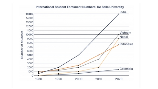
The image is a line graph showing International Student Enrollment Numbers at De Salle University from 1980 to 2020 for five different countries. India starts at roughly 1000 in 1980, rises to approximately 2000 in 1990, then surges to around 11,000 in 2000, before escalating to just over 14,000 by 2020. Vietnam starts at about 350 in 1980, increases moderately to nearly 500 in 1990, jumps to over 2000 in 2000, and peaks at around 9000 by 2020. Nepal begins at approximately 300 in 1980, remains stable until 2000 at around 300, and climbs to just below 4000 by 2020. Indonesia initiates at nearly 250 in 1980, progresses to about 400 in 1990, sees a significant rise to over 3000 in 2000, and reaches almost 6000 by 2020. Colombia starts at around 200 in 1980, shows a slight increase to nearly 350 in 1990, grows to about 1000 in 2000, and attains nearly 1500 by 2020. Note: All numbers are approximate estimations, as the graph does not provide precise figures.
Given the complexity of the image, the above description may not be entirely accurate.
Note: Both the topic and the answer were created by one of our users.

This line graph illustrates the number of students, in thousands, from five countries, India, Vietnam, Nepal, Indonesia and Colombia who are enrolled at De Salle University from 1980 to 2020. Overall, there was a dramatic increase in the enrollment number of Indian students whereas Colombian students had a steady rise at all time.

Indian students made up the highest number of students among all other countries as there was a dramatic increase numbers of student enrollment from 1980 until 2020. Indonesia, and Vietnam had a similar number of students enrolled at De Salle University at the first 40 years until 2010 whereas the number of Vietnamese students rose sharply to 10000 students becoming the second highest number of enrollment but still lower than India with about 5000 people.

At the same year in 2010, Nepal had a big change and the number of students climbed up to 9000 which there was a zero in 1080. Although the students from Colombia were increasing steadily. They were still the lowest number of enrollment among all other countries at all time which was the highest number still lower than Indian student about 13500.

Word Count: 190

Answers On The Same Topic:

The line graph below shows the international student enrolment numbers at De Salle University from 1980 to 2020. Summarise the information by selecting and reporting the main features, and make comparisons where relevant

The provided line graph illustrates, in thousands, the number of international students enrolled at De Salle University, between 1980 and 2020. As can be seen clearly from the graph, the most notable feature is the rapid increase of Indian students over the years. More specifically, in 1980 only about 1,000 Indians enrolled in De Salle […]

The line graph below shows the international student enrolment numbers at De Salle University from 1980 to 2020. Summarise the information by selecting and reporting the main features, and make comparisons where relevant

The following line chart illustrates the number of overseas students enrolled at De Salle University from five countries: India, Vietnam, Nepal, Indonesia, and Colombia, from 1980 to 2020. The numbers are measured in thousands. At a glance, the most significant growth was shown by Indian students over the given period, while Colombian students had the […]

The line graph below shows the international student enrolment numbers at De Salle University from 1980 to 2020. Summarise the information by selecting and reporting the main features, and make comparisons where relevant

This line graph illustrates the number of international students enrolled in De salle University from five different countries in the years between 1980 and 2020. Overall, the number of Indian students enrolled increased significantly to surpass all other countries, whereas Colombian students continuously accounted for the least number of enrollments. Indian students had the most […]

The line graph below shows the international student enrolment numbers at De Salle University from 1980 to 2020. Summarise the information by selecting and reporting the main features, and make comparisons where relevant

The line graph compared the numbers of international students, who are from five various countries including India, Nepal, Indonesia, Colombia, and Vietnam enrolled in De Salle university during for decades. Overall, the university experienced a significant increase in enrolment of all international students. In 1980, a large number of student population were from India, Vietnam, […]

The line graph below shows the international student enrolment numbers at De Salle University from 1980 to 2020. Summarise the information by selecting and reporting the main features, and make comparisons where relevant

The line graph given illustrates the number of international students enrolled at De Salle University between 1980 to 2020. Overall, the number of student enrollment from India has been the maximum during the period 1980 to 2020. Vietnam holds the second most number of enrollment at university followed by Nepal then comes Indonesia and the […]

See All

Other Topics:

The graph shows monthly trends of three product of tablets, laptop, desktop.

The line graph illustrates information concerning the number of products which produced by month. Overall,it is clear that the number of tablets increased dramatically during the months,while desktops saw a significant decrease.In contrast,laptops experienced a temporary fluctuation. According to the line graph,on January tablets produced 10 tablets,however the next months escalated to roughly 100 table […]

the graph below gives information about sugar production and consumption in India from 2001 to 2011

The line chart delineates the amount of sugar consumed and produced across India, categorized by tons, between 2001 and 2011. What is most striking when looking at the data is that both the sugar usage and production in India experienced noticeable upticks, albeit to varying degrees, throughout a decade. Notably, despite showing remarkable fluctuation during […]

The graph below shows the results of a survey among online adults on their use of various social media in the USA between 2012 and 2015.

The illustration presents the results of a survey among adult people regarding their use of different social media from 2012 to 2015. Overall, the most used social media during that period was Facebook, while other websites had approximately equal numbers of online adults. In 2012, Facebook had an overwhelmingly larger number of online adults than […]

The graph below shows the results of a survey among online adults on their use of various social media in the USA between 2012 and 2015.

The illustration present the results of a survey among adult people in their use of different social media from 2012 to 2015. Overall, the most used social media during that period was Facebook, while other websites had approximately equal amount of online adults. In 2012 the Facebook had overwhelmingly larger amount of online adults peoplr […]

You should spend about 20 minutes on this task The chart below gives information on the amount of time needed to manufacture a vehicle by four US car producers between 1998 and 2002. Summarise the information by selecting and reporting the main features and make comparisons where relevant. Write at least 150 words.

The line graph compares the hours per vehicle needed to manufacture by four US producers from 1998 to 2002. Overall, it is evident that Nissan had the highest time around them, while Ford had the least. However, at the end Nissan became the least. In 1998, Nissan was needed approximately 37 hours for manufacture a […]

The graph shows data about the annual earnings of three bakeries in Calgary, 2000-2010. Summarize the information by selecting and reporting the main features, and make comparisons where relevant.

The graph illustrates data about annual earnings of Amandine Bakery, Mari Bakeshop and Bolo Cakery in Calgary from 2000 to 2010. Annual earnings data of the of Amandine Bakery and Bolo Cakery showed a significant rise over the periods, while data about annual earnings waste in Mari Bakeshop exprienced a downard trend. In 2000 annual […]

See All
We have detected unusual activity on your device.
Please verify your identity to continue.
Note: This verification step won't sign you in. If you have a premium account, please log in to access the service as usual.
Google/Gmail Verification
Or verify using Email/Code
We've sent a verification code to:
youremail@gmail.com (Not your email?)
Enter it below to complete the verification process.
Ensure your email address is correct, your inbox is not full, and you check your spam folder. If no email arrives, consider using an alternative email.
You will need a Premium plan to perform your action!
Note: If you already have a premium account, please log in to access our services as usual.

Plans & Pricing

Our mission is to make quality education accessible and free for everyone.
However, to keep our hardworking team running and this service alive, we genuinely need your support!
By opting for a premium plan, not only do you sustain us in achieving the mission, but you also unlock advanced features to enrich your learning experience.

Free

For learners who aren't pressed for time

What's included on Free
1000+ IELTS Tests & Samples
Instant IELTS Writing Task 1 & 2 Evaluation (2 times/month)
Instant IELTS Speaking Part 1, 2, & 3 Evaluation (5 times/month)
Instant IELTS Writing Task 1 & 2 Essay Generator (2 times/month)
500+ Dictation & Shadowing Exercises
100+ Pronunciation Exercises
Flashcards
Other Advanced Tools

Premium

For those serious about advancing their English proficiency, and for IELTS candidates aspiring to boost their band score by 1-2 points (especially in writing & speaking) in just 30 days or less

What's included on Premium
Save Your IELTS Test Progress
Unlock All Courses & Content
Unlimited AI Conversations
Unlimited AI Writing Enhancement Exercises
Unlimited IELTS Writing Task 1 & 2 Evaluation
Unlimited IELTS Speaking Part 1, 2, & 3 Evaluation
Checked Answers Will Not Be Published
Unlimited IELTS Writing Task 1 & 2 Essay Generator
Unlimited IELTS Speaking Part 1, 2, & 3 Sample Generator
Unlimited Usage Of Advanced Tools

Due to the nature of our service and the provided free trials, payments are non-refundable.
Nếu bạn là người Việt Nam và không có hoặc không muốn trả bằng credit/debit cards, bạn có thể thanh toán bằng phương thức chuyển khoản:


Chọn gói:
279,000₫ 157,000 ₫ cho gói 1 tháng (chỉ 5,233₫/ngày)
819,000₫ 397,000 ₫ cho gói 3 tháng (chỉ 4,411₫/ngày)
1,649,000₫ 667,000 ₫ cho gói 6 tháng (chỉ 3,706₫/ngày)
3,299,000₫ 857,000 ₫ cho gói 12 tháng (chỉ 2,381₫/ngày)


Sau khi chuyển khoản, vui lòng đợi trình duyệt tự động điều hướng bạn trở lại Engnovate và bạn sẽ ngay lập tức nhận được mã kích hoạt tài khoản premium.
Nếu có lỗi xảy ra, bạn có thể liên hệ với team thông qua một trong các phương thức: email đến helloengnovate@gmail.com hoặc nhắn tin qua facebook.com/engnovate.
Vì toàn bộ công cụ trên website đều có thể sử dụng thử miễn phí, Engnovate không hỗ trợ hoàn tiền.