🔥 Today Only: Save 30% on Premium — Offer Ends Soon! - Upgrade Now!
Line Graph

Band 8+: The graph below shows the consumption of fish and some different kinds of meat in a European country between 1979 and 2004. Summarize the information by selecting and reporting the main features and make comparisons

Image for topic: The graph below shows the consumption of fish and some different kinds of meat in a European country between 1979 and 2004. Summarize the information by selecting and reporting the main features and make comparisons
Our system will evaluate the answer based on this AI-generated description.
The image contains a line graph tracking consumption of chicken, beef, lamb, and fish in grams per person per week from 1979 to 2004. Chicken starts at around 150g, dips to just below 150g in 1985, then rises sharply to almost 250g in 1990 before leveling off and ending just below 250g. Beef begins just over 200g, oscillating slightly but steadily decreases to slightly over 100g by 2004. Lamb starts at approximately 150g, gradually declining to around 50g in 1999 and remains steady till 2004. Fish consumption starts at about 50g, slightly increases and fluctuates around 60g, with a small spike to around 80g in 1989, and descends to below the starting point, ending just under 50g. The graph's Y-axis is labeled "Grams per person per week" and spans from 0 to 300, while the X-axis represents years from 1979 to 2004 at five-year intervals.
Given the complexity of the image, the above description may not be entirely accurate.
Note: Both the topic and the answer were created by one of our users.

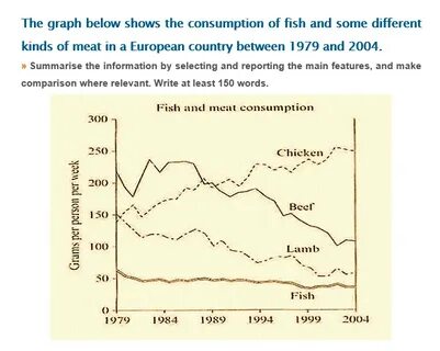
The provided line graph illustrates the consumption trends of fish, lamb, beef, and chicken in a European country over the period from 1979 to 2004.

Overall, the consumption of fish, lamb, and beef experienced a decline, while chicken consumption steadily increased, surpassing beef to become the most consumed meat from 1989 onward.

Initially, the consumption of beef per person in the surveyed country began at approximately 210 grams, with fluctuations observed until 1989, decreasing to around 100 grams by 2004. In contrast, chicken consumption started at roughly 140 grams, rising consistently to surpass 200 grams and peaking at 250 grams in the final year.

Regarding fish consumption, the initial amount stood at about 50 grams in 1979, exhibiting minor fluctuations throughout the period and declining to under 50 grams by 2004. Conversely, the consumption of lamb decreased from 150 grams to about 125 grams in 1989, further dropping to approximately 80 grams by the end of the analyzed timeframe.

Word Count: 159

Answers On The Same Topic:

The graph below shows the consumption of fish and some different kinds of meat in a European country between 1979 and 2004. Summarize the information by selecting and reporting the main features and make comparisons

The line graph illustrates the consumption of fish and three types of meat in Europe between 1979 and 2004. Overall, chicken became the most widely consumed meat over the period. By contrast, fish was consistently the least consumed and remained relatively stable. Meanwhile, the consumption of both beef and lamb declined significantly. In 1979, beef […]

The graph below shows the consumption of fish and some different kinds of meat in a European country between 1979 and 2004. Summarize the information by selecting and reporting the main features and make comparisons

The line chart compares weekly consumption of four different types of food, in grams, in a specific nation in Europe from 1979 to 2004. Overall, it is evident that the importance of beef and lamb in the average diet gradually diminished, while chicken had an increasing influence throughout. In contrast, fish remained the least favourable […]

The graph below shows the consumption of fish and some different kinds of meat in a European country between 1979 and 2004. Summarize the information by selecting and reporting the main features and make comparisons

The given line graph illustrates the amount of fish and various types of meat consumed in a European nation over the 25-year period from 1979 to 2004. Overall, it is evident that the quantity of beef, fish and lamb meat consumption witnessed a downward trend, whereas a reverse pattern can be observed in the figure […]

The graph below shows the consumption of fish and some different kinds of meat in a European country between 1979 and 2004. Summarize the information by selecting and reporting the main features and make comparisons

The given line graph illustrates the production of fish and some different kinds of meat in European country between the period of 1978 and 2004. Overall, it is clear that the trends decreased dramatically, whereas one of them increased significantly. Focusing first on the decrease – Lamb , Beef,and Fish. Initially, trends for Beef meat […]

The graph below shows the consumption of fish and some different kinds of meat in a European country between 1979 and 2004. Summarize the information by selecting and reporting the main features and make comparisons

The line graph compares the weekly per capita consumption in terms of fish, chicken, beef and lamb in a single country in Europe from 1979 to 2004. Overall, the consumption of chicken witnessed a significant increase throughout the period, whereas a reverse was true for the consumption of beef and lamp. By contrast, fish consumption […]

See All

Other Topics:

The chart below shows the percentage of Australian people who were born in different places of the world.

Tha graph illustrate the data about percentage of Australian flok where were born in different areas of the world in the given period which is from 1976 to 2011 Overall, there are four places where Australians were born, which is uk, asia, total amount of borns and other areas. There are three places in the […]

The line graph below shows the number of overseas tourists (in millions) who visited France, Spain, and Japan between 1990 and 2020. Summarise the information by selecting and reporting the main features, and make comparisons where relevant.

The provided line graph illustrates the total number of tourists exploring three different foreign countries over the period of 30 years, from 1990 to 2020. Overall, the number of visitors in Spain and France surged significantly, whereas Japan increased slightly until 2000 and then declined throughout the period. Furthermore, France remained the dominant destination over […]

The graph below shows the percentage of people who accessed news in the USA between 2012 and 2015.

The line graph illustrates the percentage of people in the USA who accessed news through four types of media, namely websites, TV, print newspapers and social media, between 2012 and 2015. Overall, online news had the highest percentage throughout the period, while TV news remained relatively stable. By contrast, print news declined significantly, whereas social […]

The chart below shows the number of four different species of fish between 1982 and 2007. Summarize the information by selecting and reporting the main features, and make comparisons where relevant.

The line graph illustates four different types of fishes from 1982 to 2007. In general, while the figure for Atlantic Cod and Yellow fin Tuna showed great competition, others two did not demonstrated changes. Focusing first on bigger numbers, the number of Atlantic Cod was around 2,25,000 in 1982, and this was followed by considerable […]

The graph below gives information about the percentage of people living in Australia who were born in Asia, the UK, and other regions.

This graph shows description about The proportion of citizen living in Australia who were born and growth in Asia, UK & other regions. As we can see, Asian in Australia has been increased significantly from 1976 until 2011. The increase reached 15 percent in 2011. Data reveals a high interest among the Asian population in […]

the line graph shows the percentage of people who used five different communication methods between 1998 and 2008.

The line graph delineates the proportions of individuals utilizing five distinct communication methods over a decade, from 1998 to 2008. In summary, while all communication methods, barring landline services, experienced a notable increase in usage, cellular phone services emerged as the predominant choice by the end of the period. In 1998, the proportion of individuals […]

See All
We have detected unusual activity on your device.
Please verify your identity to continue.
Note: This verification step won't sign you in. If you have a premium account, please log in to access the service as usual.
Google/Gmail Verification
Or verify using Email/Code
We've sent a verification code to:
youremail@gmail.com (Not your email?)
Enter it below to complete the verification process.
Ensure your email address is correct, your inbox is not full, and you check your spam folder. If no email arrives, consider using an alternative email.
You will need a Premium plan to perform your action!
Note: If you already have a premium account, please log in to access our services as usual.

Plans & Pricing

Our mission is to make quality education accessible for everyone.
However, to keep our hardworking team running and this service alive, we genuinely need your support!
By opting for a premium plan, not only do you sustain us in achieving the mission, but you also unlock advanced features to enrich your learning experience.

Free

For learners who aren't pressed for time

What's included on Free
100+ Cambridge IELTS Tests
Instant IELTS Writing Task 1 & 2 Evaluation (2 times/month)
Instant IELTS Speaking Part 1, 2, & 3 Evaluation (5 times/month)
Instant IELTS Writing Task 1 & 2 Essay Generator (2 times/month)
500+ Dictation & Shadowing Exercises
100+ Pronunciation Exercises
Flashcards
Other Advanced Tools

Premium

For those serious about advancing their English proficiency, and for IELTS candidates aspiring to boost their band score by 1-2 points (especially in writing & speaking) in just 30 days or less

What's included on Premium
Save Your IELTS Test Progress
Unlock All Courses & IELTS Tests
Unlimited AI Conversations
Unlimited AI Writing Enhancement Exercises
Unlimited IELTS Writing Task 1 & 2 Evaluation
Unlimited IELTS Speaking Part 1, 2, & 3 Evaluation
Checked Answers Will Not Be Published
Unlimited IELTS Writing Task 1 & 2 Essay Generator
Unlimited IELTS Speaking Part 1, 2, & 3 Sample Generator
Unlimited Usage Of Advanced Tools
Priority Support within 24h (12-month plan only)

Due to the nature of our service and the provided free trials, payments are non-refundable.
Nếu bạn là người Việt Nam và không có hoặc không muốn trả bằng credit/debit cards, bạn có thể thanh toán bằng phương thức chuyển khoản:


Chọn gói:
419,000₫ 277,000 ₫ cho gói 1 tháng (chỉ 9,233₫/ngày)
1,239,000₫ 597,000 ₫ cho gói 3 tháng (chỉ 6,633₫/ngày)
2,469,000₫ 1,027,000 ₫ cho gói 6 tháng (chỉ 5,706₫/ngày)
4,929,000₫ 1,417,000 ₫ cho gói 12 tháng (chỉ 3,936₫/ngày)


Sau khi chuyển khoản, vui lòng đợi trình duyệt tự động điều hướng bạn trở lại Engnovate và bạn sẽ ngay lập tức nhận được mã kích hoạt tài khoản premium.
Nếu có lỗi xảy ra, bạn có thể liên hệ với team thông qua một trong các phương thức: email đến helloengnovate@gmail.com hoặc nhắn tin qua facebook.com/engnovate.
Vì toàn bộ công cụ trên website đều có thể sử dụng thử miễn phí, Engnovate không hỗ trợ hoàn tiền.