🔥 Today Only: Save 30% on Premium — Offer Ends Soon! - Upgrade Now!
Multiple Graphs

Band 6+: changes in percent in ownership of electrical appliances and hours of housework

Image for topic: changes in percent in ownership of electrical appliances and hours of housework
Our system will evaluate the answer based on this AI-generated description.
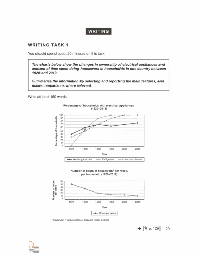
The image contains two line graphs. The first graph shows the percentage of households with electrical appliances from 1920 to 2019. In 1920, washing machines were at 40%, refrigerators at 0%, and vacuum cleaners at 30%. By 1940, washing machines increased to 60%, refrigerators to 55%, and vacuum cleaners to 45%. In 1960, washing machines decreased slightly to 70%, refrigerators increased to 90%, and vacuum cleaners to 70%. By 1980, washing machines remained at 80%, refrigerators reached 100%, and vacuum cleaners also at 90%. In 2000, washing machines remained steady at around 95%, while refrigerators and vacuum cleaners maintained 100%. By 2019, all appliances hit 100%. The second graph displays the number of hours spent on housework per household per week from 1920 to 2019. In 1920, the number was about 50 hours, decreasing to 30 hours by 1960. By 1980, it reduced further to 20 hours and continued a slight decline to about 10 hours in 2000, remaining stable through 2019.
Given the complexity of the image, the above description may not be entirely accurate.
Note: Both the topic and the answer were created by one of our users.

The two line charts illustrate how the ownership of three types of electrical equipment and the habit of doing household chores has altered from 1920 to 2019 in a nation.

Overall, while number of hours spending on housework per week of each family decreased dramatically, a steep upward trend was seen in the percentage of households with electrical appliances. A striking acceleration was seen in not only refrigerator but also vacuum cleaner consumers.

At the outset, washing machine was applied the least among all with 40% in 1920 and over 70% at the end of the given period, despite a slight growth in a first few years. Meanwhile, the number of people equipped refrigerator skyrocketed from 0% to 90% between 1920 and 1960, peaking at 100% in 1980. Likewise, percentage of households with vacuum cleaner commenced with 30%, after which, it witnessed a steady growth straightforward to 100% in 2000.

That said, amount of housework time accounted for 50 hours initially, through a significant downward trajectory to over 15 hours, it underwent a final decline to 10 hours in 2019

Word Count: 180

Answers On The Same Topic:

changes in percent in ownership of electrical appliances and hours of housework

Task 1 The line graph provides information about percentage of households electrical appliances and numbers of hours spent at housework per week, per household works in one country between 1920 and 2019. Overall, it is evident that the ownership of all three electrical appliance increased, whereas the numbers of hour spent on house work deceased […]

changes in percent in ownership of electrical appliances and hours of housework

The first given line graph demonstrates the percentage of households in which own electrical appliances (washing machine, refridgerator, vacuum cleaner), while another graph illustrates the number of hours spent doing housework (washing clothes, preparing meals, cleaning). Both charts depict comparisons in one country between 1920 and 2019. Overall, the percentage of households’ electrical appliance ownership […]

changes in percent in ownership of electrical appliances and hours of housework

The line graph below illustrates the conversion in ownship of electrical appliances and the amount of time spent doing housework in households in single country from between 1920 and 2019. As you can see in the first graph, the percentage household of refrigulator in 1920 has started at the zero or lower than the percentage […]

changes in percent in ownership of electrical appliances and hours of housework

The given charts illustrate the changes in ownership of electrical appliances as well as the amount of time spent doing housework in households in a single country from 1920 to 2019. The figures for appliance ownership are shown in percentages, while housework is measured in hours per week. Considering the first chart, the proportion of […]

changes in percent in ownership of electrical appliances and hours of housework

The set of chart illustrates that differences in proprietorship of electronic machines as well as the time invested doing housekeeping in homes in single nation from 1920 to 2019. The units are in percentage (%). Considering the former chart, the highest proportion of washing machine usage in 1920 which accounted for 40%. This appliance was […]

See All

Other Topics:

the first pia chart shows the percentage of water used for six products in 2004. the second chart illustrates the percentage of total income from production

The pie charts compare the proportions of water usage and total profit from products in 2004. Overall, vegetables and fruits were the most significant products in terms of both water usage and income generation. It is worth mentioning that while vegetables required the largest amount of water, fruits brought in the highest percentage of total […]

The charts below show the favourite takeaways of people in the UK and the number of Indian restaurants in the UK between 1960 and 2015. Summarise the information by selecting and reporting the main features, and make comparisons where relevant.

The pie graph and pie chart below visualizes the statistics regarding individuals’ tastes in restaurants, from preferences of takeaways and the quantity of Indian restaurants within the UK throughout a 55 year period. Chinese and Indian restaurants dominate the market with 3/5ths of the share where Indian restaurants started skyrocketing in locations by 1980 and […]

amounts of added sugar, saturated fat and sodium if 4 different meals

The three pie charts illustrate the average proportions of sodium, saturated fat and added sugar contained in four types of meals – breakfast, lunch, dinner and snacks – consumed in the USA. Overall, dinner accounts for the largest proportion of sodium and saturated fat, whereas snacks are by far the main source of added sugar. […]

The line graph shows the cost for watching films. The pie charts show the change in the percentage of market share represented by the three forms.

The line graph illustrates the cost in the market for watching a film in various formats, whereas pie charts show changes (in per cent) for three main shares between 2005 and 2011. Overall, all three formats increased in their cost, with cinema tickets having the most expensive price. However, almost all shares witnessed a downward […]

The line graph shows the cost for watching films. The pie charts show the change in the percentage of market share represented by the three forms.

The line graph illustrates the cost in the market for watching a film in various formats, whereas pie charts show changes (in per cent) for three main shares between 2005 and 2011. Overall, all three formats increased in their cost, with cinema tickets having the most expensive price. However, almost all shares witnessed a downward […]

The bar charts display the results from a 2009 survey regarding people's automobile in a European country.

The bar charts illustrate the car-buying behaviour of people in a European country. Overall, most respondents changed their cars relatively infrequently, with replacing a vehicle every five years or more being the most common response. In terms of purchasing preferences, second-hand cars were by far the most popular choice, whereas far fewer people bought new […]

See All
We have detected unusual activity on your device.
Please verify your identity to continue.
Note: This verification step won't sign you in. If you have a premium account, please log in to access the service as usual.
Google/Gmail Verification
Or verify using Email/Code
We've sent a verification code to:
youremail@gmail.com (Not your email?)
Enter it below to complete the verification process.
Ensure your email address is correct, your inbox is not full, and you check your spam folder. If no email arrives, consider using an alternative email.
You will need a Premium plan to perform your action!
Note: If you already have a premium account, please log in to access our services as usual.

Plans & Pricing

Our mission is to make quality education accessible for everyone.
However, to keep our hardworking team running and this service alive, we genuinely need your support!
By opting for a premium plan, not only do you sustain us in achieving the mission, but you also unlock advanced features to enrich your learning experience.

Free

For learners who aren't pressed for time

What's included on Free
100+ Cambridge IELTS Tests
Instant IELTS Writing Task 1 & 2 Evaluation (2 times/month)
Instant IELTS Speaking Part 1, 2, & 3 Evaluation (2 times/month)
Instant IELTS Writing Task 1 & 2 Essay Generator (2 times/month)
500+ Dictation & Shadowing Exercises
100+ Pronunciation Exercises
Flashcards
Other Advanced Tools

Premium

For those serious about advancing their English proficiency, and for IELTS candidates aspiring to boost their band score by 1-2 points (especially in writing & speaking) in just 30 days or less

What's included on Premium
Save Your IELTS Test Progress & Analyze Mistakes By Question Type
Save Your Own Flashcard Sets & Use Them On Any Device
Unlock All Courses, IELTS Tests, Section & Part Practice
Unlimited AI Conversations
Unlimited AI Writing Enhancement Exercises
Unlimited IELTS Writing Task 1 & 2 Evaluation
Unlimited IELTS Speaking Part 1, 2, & 3 Evaluation
Checked Answers Will Not Be Published
Unlimited IELTS Writing Task 1 & 2 Essay Generator
Unlimited IELTS Speaking Part 1, 2, & 3 Sample Generator
Unlimited Usage Of Advanced Tools & AI Features
Priority Support within 24h (12-month plan only)

Due to the nature of our service and the provided free trials, payments are non-refundable.