🔥 Today Only: Save 30% on Premium — Offer Ends Soon! - Upgrade Now!
Line Graph

Band 5+: Cinema visits for all age groups. Summarize the information by selecting and reporting the main features, and make comparisons where relevant.

Image for topic: Cinema visits for all age groups. Summarize the information by selecting and reporting the main features, and make comparisons where relevant.
Our system will evaluate the answer based on this AI-generated description.
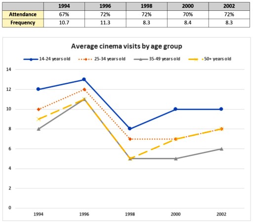
The image displays a graph showing average cinema visits by age group from 1994 to 2002, as well as attendance frequency percentages and average visit frequency per person for those years. In 1994, attendance frequency was 67% with 10.7 average visits; in 1996, it rose to 72% and 11.3 visits; in 1998, it remained at 72% but average visits dropped to 8.3; in 2000, attendance frequency decreased to 70% with 8.4 visits; and in 2002, it returned to 72% with 8.3 visits. The graph lines show fluctuations in cinema visits, with the 14-24 age group having the highest attendance, peaking at 12 visits in 1996 before dropping to below 10 in 2002; the 25-34 age group had less dramatic fluctuations, ranging between 8-10 visits; the 35-49 age group's attendance peaked at 8 visits in 1996 before declining to around 5 in 2002; and the 50+ age group consistently had the lowest attendance, with a slight peak at 5 visits in 1996 and declining to just above 2 visits in 2002.
Given the complexity of the image, the above description may not be entirely accurate.
Note: Both the topic and the answer were created by one of our users.

The graph illustrates the average cinema visitors divided into different age groups.

Overall, attendance reached its peak at the years 1996, 1998, and 2002. Moreover, cinemas were mostly popular among 14 to 24 year old individuals during this 8 year period.

During 1994, the big screen attendance reached its lowest point at only 67% and the frequency stood at 10.7. During the next 4 years, this number increased by a number of 5 percent and reached its peak at 72% in 1998. In contrast, the frequency reached its lowest point during the same year and dropped to 8.3 visits per year. In addition, From 1998 to 2002, the graph witnessed some fluctuations and remained at 72% in 2002 after a drop of 2% in the final year. However, the frequency did not experience any considerable change and stayed at the same number as the statistics in 1998.

During the initial 4 years, all the graphs experienced a dramatic fall after an incline between 1994 and 1996. To illustrate, from 1994 to 1998, the times 14 to 24 year old people visited the cinema during a year decreased by 4. A similar trend happened for people older than 50 years old and their visits to movie theatres dropped by 4 visits per year. A drop of 3 was experienced by both 25 to 34 years old and 35 to 49 years old.

Word Count: 231

Answers On The Same Topic:

Cinema visits for all age groups. Summarize the information by selecting and reporting the main features, and make comparisons where relevant.

The table compares the attendance and frequency of watching cinema from 1994 to 2002, wheares the line chart illustrates the average cinema visits by four different age groups in the same period. Overall, it is evident that the frequency of cinema visits was the highest in 1996. In addition, watching cinema was the most popular […]

Cinema visits for all age groups. Summarize the information by selecting and reporting the main features, and make comparisons where relevant.

The given table and line graph illustrate information about cinema visits in terms of attendance percentage, overall frequency, and average visits by different age groups between 1994 and 2002. Overall, the percentage of cinema attendance remained relatively stable throughout the period, fluctuating around 70%. Meanwhile, the average cinema visits for all age groups experienced a […]

Cinema visits for all age groups. Summarize the information by selecting and reporting the main features, and make comparisons where relevant.

The graph illustrates cinema attendance trends in the UK between 1994 and 2002 across various age brackets. Overall, younger individuals visited cinemas far more frequently than their older counterparts. Although the proportion of the population attending screenings was relatively consistent throughout the period, the average number of annual visits experienced notable fluctuations. In 1994, 67% […]

Cinema visits for all age groups. Summarize the information by selecting and reporting the main features, and make comparisons where relevant.

The graph illustrates cinema-going patterns in the UK between 1994 and 2002 across different age groups. Overall, younger individuals were considerably more likely to go to the cinema, whereas older people showed lower levels of participation. While the proportion of people attending cinemas remained relatively stable, the frequency of trips fluctuated noticeably throughout the period. […]

Cinema visits for all age groups. Summarize the information by selecting and reporting the main features, and make comparisons where relevant.

The line graph illustrates the average number of cinema visits per year made by four different age groups between 1994 and 2002, while the table shows the overall attendance and frequency during the same period. Overall, cinema attendance was highest among the 14-24 age group throughout the period, whereas people aged 50 and above visited […]

See All

Other Topics:

The graph below shows the number of overseas visitors to three different areas of a European country between 1987 and 2007.

The line graph illustrates the number of overseas visitors to three different areas in a European country between 1987 and 2007. Overall, the number of visitors to the coast and lakes increased over the period given, while the number for mountains remained unchanged. At the start of the period, the coast was the most popular […]

The line graph below shows the percentage of Internet users by population in the USA, Canada and Mexico between 1999 and 2009. Summarise the information by selecting and reporting the main features and make comparisons where relevant.

The report is generay rfer to the internet users in USA, Canada and Mexico and in this report we analyze how internet user increase or decrease in those countries. As we get a graph which shows that how internet users grow or decrease in the USA, Canada and Mexico.Firs we talk about Mexico, in Mexico […]

The graph below shows the number of international tourists (in millions) visiting three different countries between 1995 and 2015. Summarize the information by selecting and reporting the main features, and make comparisons where relevant.

The line chart illustrates the number of foreign tourists visiting France, Brazil and Egypt between 1995 and 2015. Overall, the number of international tourists in France and Brazil had an upward trend. Meanwhile the number in Egypt tended to be the opposited. The number of foreign tourists visiting France was 30 million in 1995. It […]

The graph below shows average carbon dioxide (CO₂) emissions per person in Ireland, Sweden, France, and Spain between 1970 and 2010. Summarise the information by selecting and reporting the main features, and make comparisons where relevant.

The line graph illustrates the average carbon dioxide (CO₂) emissions produced per person in four countries, namely Ireland, Sweden, France, and Spain between 1970 and 2010. Overall, while CO₂ emissions in Spain experienced an upward trend, remaining countries saw a decline over the period. In 1970, Sweden had the highest emissions at 14 metric tonnes […]

The line graph below shows the percentage of households in Singapore owned in four different consumer items (computer, car, air conditioning, washing machine) between 1973 and 2008.

The line graph compares percentages of four different household items in terms of their ownership rate in Singaporean houses from 1973 to 2008. Overall, all items showed an increase in the ownership percentages, with cars being purchased 15 years later than its counterparts. It is also notable that despite starting with the lowest trends, noticeable […]

The graph below shows the rate of smoking per 1000 people in Someland from 1960 to 2000.

The line graph illustrates the rate of smoking per 1,000 people in Someland from 1960 to 2000. Overall, the rate of male smokers decreased, while the figure for female smokers showed a fluctuation over the period. In addition, the rate of smoking for men was the highest throughout the period. Turning first to male smokers […]

See All
We have detected unusual activity on your device.
Please verify your identity to continue.
Note: This verification step won't sign you in. If you have a premium account, please log in to access the service as usual.
Google/Gmail Verification
Or verify using Email/Code
We've sent a verification code to:
youremail@gmail.com (Not your email?)
Enter it below to complete the verification process.
Ensure your email address is correct, your inbox is not full, and you check your spam folder. If no email arrives, consider using an alternative email.
You will need a Premium plan to perform your action!
Note: If you already have a premium account, please log in to access our services as usual.

Plans & Pricing

Our mission is to make quality education accessible for everyone.
However, to keep our hardworking team running and this service alive, we genuinely need your support!
By opting for a premium plan, not only do you sustain us in achieving the mission, but you also unlock advanced features to enrich your learning experience.

Free

For learners who aren't pressed for time

What's included on Free
100+ Cambridge IELTS Tests
Instant IELTS Writing Task 1 & 2 Evaluation (2 times/month)
Instant IELTS Speaking Part 1, 2, & 3 Evaluation (2 times/month)
Instant IELTS Writing Task 1 & 2 Essay Generator (2 times/month)
500+ Dictation & Shadowing Exercises
100+ Pronunciation Exercises
Flashcards
Other Advanced Tools

Premium

For those serious about advancing their English proficiency, and for IELTS candidates aspiring to boost their band score by 1-2 points (especially in writing & speaking) in just 30 days or less

What's included on Premium
Save Your IELTS Test Progress & Analyze Mistakes By Question Type
Save Your Own Flashcard Sets & Use Them On Any Device
Unlock All Courses, IELTS Tests, Section & Part Practice
Unlimited AI Conversations
Unlimited AI Writing Enhancement Exercises
Unlimited IELTS Writing Task 1 & 2 Evaluation
Unlimited IELTS Speaking Part 1, 2, & 3 Evaluation
Checked Answers Will Not Be Published
Unlimited IELTS Writing Task 1 & 2 Essay Generator
Unlimited IELTS Speaking Part 1, 2, & 3 Sample Generator
Unlimited Usage Of Advanced Tools & AI Features
Priority Support within 24h (12-month plan only)

Due to the nature of our service and the provided free trials, payments are non-refundable.