🔥 Today Only: Save 30% on Premium — Offer Ends Soon! - Upgrade Now!
Line Graph

Band 7+: Online shopping by time of day 2015, split by age

Image for topic: Online shopping by time of day 2015, split by age
Our system will evaluate the answer based on this AI-generated description.
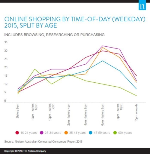
The image illustrates online shopping activity during weekdays in 2015 segmented by age: 16-24 years (magenta), 25-34 years (orange), 35-44 years (purple), 45-59 years (blue), and 60+ years (green) across time slots. Before 9 am: 16-24 years (6.5), 25-34 years (8), 35-44 years (7.5), 45-59 years (10), 60+ years (1). 9 am-12 pm: 16-24 years (13 average), 25-34 years (17), 35-44 years (12), 45-59 years (20), 60+ years (3 average). 12 pm-2 pm: 16-24 years (13), 25-34 years (9), 35-44 years (18), 45-59 years (14), 60+ years (9). 2 pm-4 pm: 16-24 years (14), 25-34 years (19), 35-44 years (not charted), 45-59 years (14), 60+ years (8). 4 pm-6 pm: 16-24 years (24.75 average), 25-34 years (29.5), 35-44 years (30), 45-59 years (25), 60+ years (10.5). 6 pm-8 pm: 16-24 years (31), 25-34 years (33 average), 35-44 years (30), 45-59 years (35), 60+ years (19). 8 pm-10 pm: 16-24 years (29), 25-34 years (31), 35-44 years (27), 45-59 years (29), 60+ years (15). 10 pm onwards: 16-24 years (15), 25-34 years (12), 35-44 years (10), 45-59 years (11), 60+ years (6).
Given the complexity of the image, the above description may not be entirely accurate.
Note: Both the topic and the answer were created by one of our users.

The following line graph illustrates the percentage of online shopping by five different age groups across a 24 hour period in 2015. Overall, the proportion of sales for most users steadily increased throughout the day, except for people over 60.

The first thing worth noting is that the proportion of sales for users over 60 were highest during the late morning and mid afternoon. Their sales percentage peaked at 20% between 9am and 12pm. It then dipped down to 10% in the next 2 hours before recovering to approximately 15% at 2pm to 4pm. Overall shopping activity fell after 4pm.

On the other hand, shopping activity for customers between 24-34 years old increased at a steady rate throughout the day. There was a constant increase in sales from early morning to about 6pm, where it went from 5% to roughly 20%. Afterwards, it rose and reached its peak of 30% by 8pm before eventually slowing down and declining after 10pm.

Word Count: 160

Answers On The Same Topic:

Online shopping by time of day 2015, split by age

The given line chart illustrates the information about online shopping by the age group for the different times in day of year 2005. Overall, sales of online shopping for people of different ages increased mostly with varying degrees of given period. Having a closer look at details, sales from people’s age ranges between 35-44 and […]

Online shopping by time of day 2015, split by age

The line graph illustrates the percentages of online shopping including browsing, researching and purchasing by time-of-day in a weekday in 2015, which divided by different age. Overall, highest number of digital shopping was at 6pm-before 8pm except 60+years and lowest was at before 9am. However, 60+ years old used e-shopping most at 9am-before 12pm. The […]

Online shopping by time of day 2015, split by age

The provided line chart illustrates the information about the proportion of online shopping in different times of the day categorized by age groups in 2015. Overall, it can be seen from the diagram that the percentage of people aged in 65 and over saw an overall downward trend, whereas that of the others had a […]

See All

Other Topics:

The chart below shows the average cost of a monthly contract from four different mobile phone providers in a European country

The mutiple line chart brings the information of the average cost of a monthly from four different mobile phone suppliers in a European country. Overall, it is clear that figures for Lex and Alpha increased over the period, while the opposite trend was seen in Domo and Sim TX. In addition, Alpha remained the highest […]

The graph below describes the use of fixed telephone lines, mobile phones, and internet between 1994 and 2005 in China. Summarise the information by selecting and reporting the main features, and make comparisons where relevant.

The given line graph illustrates the changes in the use of different means of communication – fixed telephone lines, mobile phones, and the internet – in China between 1994 and 2005. Overall, the use of diverse communication channels adhered to rising trends, albeit to varying degrees. While mobile phones generally had the highest number of […]

The line graph shows the percentage of New Zealand population from 1950 to 2050. Summarize the information by selecting and reporting the main features and make comparisons where relevant.

The line graph illustrates the proportion of the population in New Zealand in a century between 1950 and 2050. Overall, people in the age of 0 to 14 years old and 38 to 45 years old recorded an upward trend, while the remaining groups experienced the opposite. In details, the elderly was and will be […]

The chart below shows the percentage of households in a city with access to four types of modern technology from 2000 to 2020. Summarize the information by selecting and reporting the main features, and make comparisons where relevant.

The line graph compares the percentages of households in a country that had access to the internet, mobile phones and landline phones between 2000 and 2020. Overall, access to the internet and mobile phones increased substantially over the period, whereas the proportion of households with landline phones declined. By 2020, mobile phones were the most […]

The graph below shows the rate of smoking per 1000 people in Someland from 1960 to 2000.

The provided line chart illustrates the number of males and females smoking in a university in Someland, with a survey of 1000 people, from 1960 to 2000. Overall, it is evident that the figure for males experienced a downward trend, while the opposite was true for females. Such a contrasting pattern narrowed the gap between […]

The given graph shows the nitrogen oxide emissions produced by four vehicles. Summarise the information by selecting and reporting the main features, and make comparisons where relevant.

The nitrogen oxide emissions released by four different vehicles are depicted in the line chart. As clearly seen, the x-axis shows the speed of the vehicles and its represented in kph, while the y-axis illustrates nitogen oxide symbolized in g/km. To begin with, buses running between the speed of 10 kph to 90 kph emitted […]

See All
We have detected unusual activity on your device.
Please verify your identity to continue.
Note: This verification step won't sign you in. If you have a premium account, please log in to access the service as usual.
Google/Gmail Verification
Or verify using Email/Code
We've sent a verification code to:
youremail@gmail.com (Not your email?)
Enter it below to complete the verification process.
Ensure your email address is correct, your inbox is not full, and you check your spam folder. If no email arrives, consider using an alternative email.
You will need a Premium plan to perform your action!
Note: If you already have a premium account, please log in to access our services as usual.

Plans & Pricing

Our mission is to make quality education accessible for everyone.
However, to keep our hardworking team running and this service alive, we genuinely need your support!
By opting for a premium plan, not only do you sustain us in achieving the mission, but you also unlock advanced features to enrich your learning experience.

Free

For learners who aren't pressed for time

What's included on Free
100+ Cambridge IELTS Tests
Instant IELTS Writing Task 1 & 2 Evaluation (2 times/month)
Instant IELTS Speaking Part 1, 2, & 3 Evaluation (2 times/month)
Instant IELTS Writing Task 1 & 2 Essay Generator (2 times/month)
500+ Dictation & Shadowing Exercises
100+ Pronunciation Exercises
Flashcards
Other Advanced Tools

Premium

For those serious about advancing their English proficiency, and for IELTS candidates aspiring to boost their band score by 1-2 points (especially in writing & speaking) in just 30 days or less

What's included on Premium
Save Your IELTS Test Progress & Analyze Mistakes By Question Type
Save Your Own Flashcard Sets & Use Them On Any Device
Unlock All Courses, IELTS Tests, Section & Part Practice
Unlimited AI Conversations
Unlimited AI Writing Enhancement Exercises
Unlimited IELTS Writing Task 1 & 2 Evaluation
Unlimited IELTS Speaking Part 1, 2, & 3 Evaluation
Checked Answers Will Not Be Published
Unlimited IELTS Writing Task 1 & 2 Essay Generator
Unlimited IELTS Speaking Part 1, 2, & 3 Sample Generator
Unlimited Usage Of Advanced Tools & AI Features
Priority Support within 24h (12-month plan only)

Due to the nature of our service and the provided free trials, payments are non-refundable.