🔥 Today Only: Save 30% on Premium — Offer Ends Soon! - Upgrade Now!
Bar Chart

Band 6+: The Bar Chart below gives information about the percentage of the population living in urban areas in the whole world and in different parts of the world.

Image for topic: The Bar Chart below gives information about the percentage of the population living in urban areas in the whole world and in different parts of the world.
Our system will evaluate the answer based on this AI-generated description.
The image presents a bar chart showing the percentages of populations living in urban areas across different world regions and global averages in the years 1950, 2015, and projected for 2050. The percentages for each respective year and region are as follows: World (1950 - 29%, 2015 - 49%, 2050 - 60%), Africa (1950 - 15%, 2015 - 37%, 2050 - 51%), Asia (1950 - 17%, 2015 - 41%, 2050 - 54%), Europe (1950 - 51%, 2015 - 72%, 2050 - 78%), Latin America (1950 - 42%, 2015 - 64%, 2050 - 79%), and North America (1950 - 64%, 2015 - 79%, 2050 - 87%). The chart displays substantial growth in all regions, with Europe and North America starting at higher urbanization levels in 1950 and still showing significant projected increases by 2050. Meanwhile, regions with initially lower percentages like Africa and Asia display dramatic rises over the century, reflecting accelerated urbanization trends.
Given the complexity of the image, the above description may not be entirely accurate.
Note: Both the topic and the answer were created by one of our users.

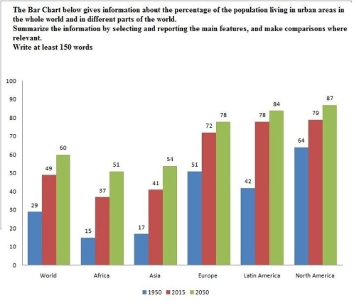
The given bar graph provides information concerning the proportion of urban population across five countries, including a worldwide trend, from 1950 to estimated 2050.

Overall, it can be seen that North and Latin America had by far the largest percentages of cities population, which is expected to continue by 2050.

Looking at the chart on 1950, it is evident that North America led with the highest figure, at 64%, whose share more than doubled that of world at 29%. Europe and Latin America followed at 51 and 42%, respectively. The percentages of Asia and Africa were significantly lower, each at 17 and 15%.

Turning to the 2015 data set, it generally reflected aforementioned trend. Again, the figure for North Amerca was the highest, at 79%, followed by Latin America at 78 and Europe at 72%. Likewise, both Africa and Asia had lower figures, falling the range 37 to 41%. When it comes to the predicted 2050, it is also expected to mirror the pattern. With North America being the highest at 87, Latin America, Europe, Asia, and Africa are projected to follow. It is notable that the urban popluation of world surged by 20 in 2015, and 11% in 2050.

Word Count: 200

Answers On The Same Topic:

The Bar Chart below gives information about the percentage of the population living in urban areas in the whole world and in different parts of the world.

The bar chart illustrates information about the percentages of the population living in the urban areas in the whole world and in diverse parts of the planet in different years. Overall, it can be seen that in the past it was included little population living in the whole world, while in the future this trend […]

The Bar Chart below gives information about the percentage of the population living in urban areas in the whole world and in different parts of the world.

The bar chart presents the percentage of the population living in cities worldwide and in different countries of the world in three different years: 1950, 2025, and 2025. Overall, while the urban population has risen across all regions and is projected to increase further, particularly in North America, Latin America, and Europe, which represent the […]

The Bar Chart below gives information about the percentage of the population living in urban areas in the whole world and in different parts of the world.

The bar chart compares the proportion of people who lived in cities worldwide and in five different continents (Africa, Asia, Europe, Latin America, and North America) in 1950, 2015, and with a projection for 2050. Overall, most individuals lived in urban areas in North America. However, the urban population of Africa was the lowest, and […]

The Bar Chart below gives information about the percentage of the population living in urban areas in the whole world and in different parts of the world.

The presented bar chart provides the data about the number of the urban population in different parts of the world. The comparisons are made in percentages and reveal the information about 1950 and 2015 years. Moreover, there is an assumption about the approximate number of city residents in 2050. It can be observed that only […]

The Bar Chart below gives information about the percentage of the population living in urban areas in the whole world and in different parts of the world.

The bar chart compares the proportions of people who live in urban areas in the whole world and different parts of it. Overall, it is evident that the number of people preferring to live in urban areas showed an upward trend in the all areas of the world. In-depth analysis reveals that 64% of population […]

See All

Other Topics:

The chart below shows the top eight honeymoon destinationsfor newlyweds British couples in 2010. The results come from a survey of 5000 couples.

The bar chart illustrates the eight most popular honeymoon destinations for newlyweds British couples in 2010, based on a survey of 5000 couples. Overall, the bart chart makes it clear that Thailand and Bali were the most chosen as honeymoon destinations by British couples in 2010, while the Lake District and Spain were the least […]

The chart shows students' monthly expenditure in percentage over a three-year period in the United Kingdom. Summarise the information by selecting and reporting the main features, and make comparisons where relevant.

The given line graph illustrates the data about students’ spending on the different things over a period from 1996 to 1999 in the United Kingdom. Overall, most students expend a lot of money on entertainment. However, on the child is the lowest expenses. All units are measured in percentages. At the beginning, in 1996, fun […]

The chart below shows the spending by 18-20 year-olds in one country on five different products in 2010 and 2014. Provide an overview of the information by identifying and describing the key details, and include comparisons where appropriate

The bar char illustrates how much money were spent by the adults for five different products in 2010 and 2014. Overall, it can be seen that the needs for food, smartphone, and toiletries were increased from 2010 to 2014. It also shows that food was the top spending for the grown-ups. In contrast, adults spending […]

percentage of male and female teachers in 6 types of educational setting in UK, in 2010

The chart compares the percentage of male and female teachers in six different type of educational setting in the UK in 2010. Overall, men accounted for the majority of workers in university and private training institute throughout the period, whereas women were represented in nursery and primary school. In general, gender distribution was balanced in […]

The bar chart below illustrates five different industries’ percentage share of Brazil’s economy in 2009 and 2019 with a forecast for 2029. Summarise the information by selecting and reporting the main features, and make comparisons where relevant.

The bar chart presents a comparative analysis of the percentage share of five distinct industries within Brazil’s economy, covering the years 2009, 2019, and forecasts for 2029. Overall, the data indicates a significant shift in the contributions of various industries, with finance witnessing a drastic decline, whilst food processing and oil, coal, and gas exhibit […]

people eating five portionson of fruit and vegetables per day

The bar chart illustrates the percentage of male, female and children’s consumption of fruits and vegetables per day between 2001 and 2008 in the UK. Overall, it can be observed that women had more percentage of eating fruits and vegetables each year in contrast to other gender. Both the men and children began the year […]

See All
We have detected unusual activity on your device.
Please verify your identity to continue.
Note: This verification step won't sign you in. If you have a premium account, please log in to access the service as usual.
Google/Gmail Verification
Or verify using Email/Code
We've sent a verification code to:
youremail@gmail.com (Not your email?)
Enter it below to complete the verification process.
Ensure your email address is correct, your inbox is not full, and you check your spam folder. If no email arrives, consider using an alternative email.
You will need a Premium plan to perform your action!
Note: If you already have a premium account, please log in to access our services as usual.

Plans & Pricing

Our mission is to make quality education accessible for everyone.
However, to keep our hardworking team running and this service alive, we genuinely need your support!
By opting for a premium plan, not only do you sustain us in achieving the mission, but you also unlock advanced features to enrich your learning experience.

Free

For learners who aren't pressed for time

What's included on Free
100+ Cambridge IELTS Tests
Instant IELTS Writing Task 1 & 2 Evaluation (2 times/month)
Instant IELTS Speaking Part 1, 2, & 3 Evaluation (5 times/month)
Instant IELTS Writing Task 1 & 2 Essay Generator (2 times/month)
500+ Dictation & Shadowing Exercises
100+ Pronunciation Exercises
Flashcards
Other Advanced Tools

Premium

For those serious about advancing their English proficiency, and for IELTS candidates aspiring to boost their band score by 1-2 points (especially in writing & speaking) in just 30 days or less

What's included on Premium
Save Your IELTS Test Progress
Unlock All Courses & IELTS Tests
Unlimited AI Conversations
Unlimited AI Writing Enhancement Exercises
Unlimited IELTS Writing Task 1 & 2 Evaluation
Unlimited IELTS Speaking Part 1, 2, & 3 Evaluation
Checked Answers Will Not Be Published
Unlimited IELTS Writing Task 1 & 2 Essay Generator
Unlimited IELTS Speaking Part 1, 2, & 3 Sample Generator
Unlimited Usage Of Advanced Tools
Priority Support within 24h (12-month plan only)

Due to the nature of our service and the provided free trials, payments are non-refundable.
Nếu bạn là người Việt Nam và không có hoặc không muốn trả bằng credit/debit cards, bạn có thể thanh toán bằng phương thức chuyển khoản:


Chọn gói:
419,000₫ 277,000 ₫ cho gói 1 tháng (chỉ 9,233₫/ngày)
1,239,000₫ 597,000 ₫ cho gói 3 tháng (chỉ 6,633₫/ngày)
2,469,000₫ 1,027,000 ₫ cho gói 6 tháng (chỉ 5,706₫/ngày)
4,929,000₫ 1,417,000 ₫ cho gói 12 tháng (chỉ 3,936₫/ngày)


Sau khi chuyển khoản, vui lòng đợi trình duyệt tự động điều hướng bạn trở lại Engnovate và bạn sẽ ngay lập tức nhận được mã kích hoạt tài khoản premium.
Nếu có lỗi xảy ra, bạn có thể liên hệ với team thông qua một trong các phương thức: email đến helloengnovate@gmail.com hoặc nhắn tin qua facebook.com/engnovate.
Vì toàn bộ công cụ trên website đều có thể sử dụng thử miễn phí, Engnovate không hỗ trợ hoàn tiền.