Our system will evaluate the answer based on this AI-generated description.
The image presents a bar chart showing the percentages of populations living in urban areas across different world regions and global averages in the years 1950, 2015, and projected for 2050. The percentages for each respective year and region are as follows: World (1950 - 29%, 2015 - 49%, 2050 - 60%), Africa (1950 - 15%, 2015 - 37%, 2050 - 51%), Asia (1950 - 17%, 2015 - 41%, 2050 - 54%), Europe (1950 - 51%, 2015 - 72%, 2050 - 78%), Latin America (1950 - 42%, 2015 - 64%, 2050 - 79%), and North America (1950 - 64%, 2015 - 79%, 2050 - 87%). The chart displays substantial growth in all regions, with Europe and North America starting at higher urbanization levels in 1950 and still showing significant projected increases by 2050. Meanwhile, regions with initially lower percentages like Africa and Asia display dramatic rises over the century, reflecting accelerated urbanization trends.
Given the complexity of the image, the above description may not be entirely accurate.
Skyrocket your IELTS band score by 1-2 points in under a month with our premium plan!
Note: Both the topic and the answer were created by one of our users.
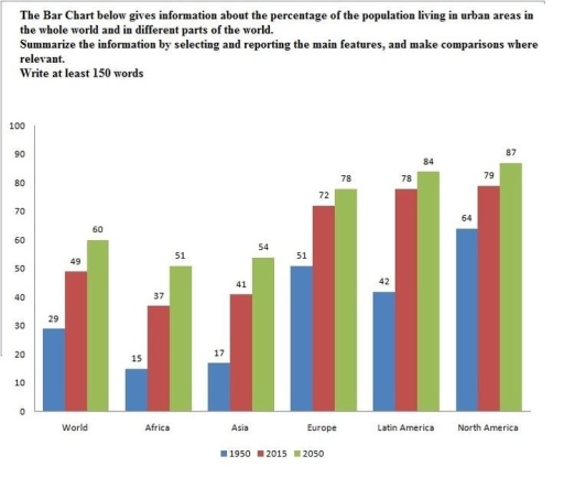
The bar chart illustrates information about the percentages of the population living in the urban areas in the whole world and in diverse parts of the planet in different years.
Overall, it can be seen that in the past it was included little population living in the whole world, while in the future this trend will increase in every continents.
In the top of continents in 2050 are North America, Latin America and Europe with fluctuates around 78-87% of population, while Asia and Africa are almost included the same figures around 51% and 54%
On the other hand, in the past, in 1950 it was sharply less than in the future. The top category group fluctuated around 42-64%, while Asia and Africa had approximately 15-17%. It is clearly seen, that changes between 1950 and 2025 were significant.
Word Count: 137