🔥 Today Only: Save 30% on Premium — Offer Ends Soon! - Upgrade Now!
Bar Chart

Band 5+: The bar chart below provides information on the monthly visitor attendance figures across three museums in the UK between 2013-2014, while the table indicates the total number visitors in the same period. Summarize the information by selecting and reporting the main features, and make comparisons where relevant.

Image for topic: The bar chart below provides information on the monthly visitor attendance figures across three museums in the UK between 2013-2014, while the table indicates the total number visitors in the same period. Summarize the information by selecting and reporting the main features, and make comparisons where relevant.
Our system will evaluate the answer based on this AI-generated description.
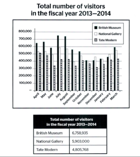
The image displays a bar chart and a table detailing visitor numbers for British Museum, National Gallery, and Tate Modern during the fiscal year 2013-2014. British Museum had visitors in millions by months: April (680,000), May (660,000), June (700,000), July (670,000), August (730,000), September (690,000), October (650,000), November (610,000), December (530,000), January (530,000), February (500,000), March (610,000). National Gallery's numbers in hundreds of thousands: April (620,000), May (640,000), June (650,000), July (590,000), August (660,000), September (620,000), October (570,000), November (520,000), December (510,000), January (490,000), February (520,000), March (590,000). Tate Modern's figures reading: April (580,000), May (600,000), June (590,000), July (550,000), August (600,000), September (550,000), October (530,000), November (480,000), December (500,000), January (450,000), February (460,000), March (510,000). Cumulative visitor totals show British Museum, 6,758,935; National Gallery, 5,903,000; Tate Modern, 4,805,768.
Given the complexity of the image, the above description may not be entirely accurate.
Note: Both the topic and the answer were created by one of our users.

The graph above shows the data of tuorists in a certain period 2013-2014. The vertical line indicates the number of people and the horizontal line is each month. This graph includes each number of visitors of British Museum, National Gallery, and Tate Modern.

We can see that British Mueseum is steady occupied the first place throughout the year. It’s standed out especially in July and August. Although it is constantly decreased from November to Feburary. However, it get back their momentum in March. The below table which represents sum of the number of tuorits in the year. British Museum is ranked in first with the number “67758.935”.

The others, National Gallery and Tate Modern doesn’t show any big changes over the year. National Gallery outweigh Tate Modern, and it has more than 1.000.000 difference in the number of visitors. Looking in to the detail both National Gallery and Tate Modern shows slight fluctuate such as in September it went down little bit.

Word Count: 162

Answers On The Same Topic:

The bar chart below provides information on the monthly visitor attendance figures across three museums in the UK between 2013-2014, while the table indicates the total number visitors in the same period. Summarize the information by selecting and reporting the main features, and make comparisons where relevant.

The bar chart demonstrates information on the monthly visitor count in the British Museum, National Gallery and Tate Modern from April 2013 to March 2014. Whereas the table shows total visitors numbers for indicates period. The data of the bar chart clearly indicates that the most of the monthly attendance is seen in the British […]

The bar chart below provides information on the monthly visitor attendance figures across three museums in the UK between 2013-2014, while the table indicates the total number visitors in the same period. Summarize the information by selecting and reporting the main features, and make comparisons where relevant.

The chart displayed gives data on the total visitors in three different museums inside Uk per month from 2013 to 2014, while the table provides the number of tourist in 3 particular museums. Overall, British museum had the most amount of visitors even after a series of fluctuation, National Gallery lies just a little below […]

The bar chart below provides information on the monthly visitor attendance figures across three museums in the UK between 2013-2014, while the table indicates the total number visitors in the same period. Summarize the information by selecting and reporting the main features, and make comparisons where relevant.

The bar chart illustrates monthly visitor numbers to three major museums in the UK—the British Museum, the National Gallery, and the Tate Modern—over the fiscal year 2013–2014, while the table provides the total number of visitors to each museum during this period. Overall, the British Museum consistently attracted the highest number of visitors throughout the […]

See All

Other Topics:

The chart shows the changes in car ownership in a counrty between 1971 and 2001

the provided bar chart delineates the evolution of car ownership in a specific country over a thirty-year period from 1971 to 2001. Overall, there is a notable decline in the percentage of non-car owners, alongside an increase in individuals possessing two or more cars by the end of the period. In 1971, 48% of the […]

The bar graph below shows the stock price of four different technology companies from 2011 to 2016. Summarise the information by selecting and reporting the main features and make comparisons where relevant.

The illustration presents the stock cost of Facebook, Google, Apple, and Yahoo between 2011 and 2016. Overall, the numbers for Facebook increased steadily, whilst that of Yahoo increased. Apple company experienced dramatic fluctuations. Google stocks remained stable. In 2011, Facebook and Yahoo started off at approximately the same price at around 5500. Both companies exhibited […]

The chart below shows the proportions of the world's oil resources held in different areas, together with the proportions consumed annually in the same areas. Summarise the information by selecting and reporting the main features, and make comparisons where relevant. Write at least 150 words.

The provided chart displays information regarding the percentage of total world oil resources and annual oil consumption. Overall, it is clear that the Middle East is the highest in oil resources, far outstripping its oil consumption. Moreover, in oil consumption, Asia is the highest, while Australia and New Zealand are the lowest in both oil […]

The graph shows the sales of five types items in four different seasons at a departmental store in the US in 2011 Summarize the information by selecting and reporting the main features, and make comparisons where relevant.

The graph shows the sale of five different types of items in different seasons. In winter the women’s clothes clocked 40000 US dollars. The sports equipment had 30000 usd dollars whereas men’s clothes had 25000usd followed by cosmetics and lastly jewellery with 20000 usd. All this was winter sales. In Spring women’s clothes rose in […]

The bar graph shows the average hours of daily sunshine throughout the year in two cities of Australia. Summarise the information by selecting and reporting the main features, and make comparisons where relevant.

The bar chart compares the average hours of daily sunshine throughout the year in Sydney and Perth. Overall, Perth had the highest number of sunshine hour in january and december, while it was the lowest number of sunshine hour in june and september. In terms of sunshine, Perth had the highest number of sunshine in […]

The graph below shows the number of three types of visitors to a museum between 1997 and 2012.

The bar chart presents data on the number of three categories of visitors – adults, visitors aged under 15 and special exhibition visitors – who attended a museum over a 15-year period, spanning from 1997 to 2012. Overall, the majority of museum visitors were adults throughout the period, while special exhibition visitors represented a relatively […]

See All
We have detected unusual activity on your device.
Please verify your identity to continue.
Note: This verification step won't sign you in. If you have a premium account, please log in to access the service as usual.
Google/Gmail Verification
Or verify using Email/Code
We've sent a verification code to:
youremail@gmail.com (Not your email?)
Enter it below to complete the verification process.
Ensure your email address is correct, your inbox is not full, and you check your spam folder. If no email arrives, consider using an alternative email.
You will need a Premium plan to perform your action!
Note: If you already have a premium account, please log in to access our services as usual.

Plans & Pricing

Our mission is to make quality education accessible for everyone.
However, to keep our hardworking team running and this service alive, we genuinely need your support!
By opting for a premium plan, not only do you sustain us in achieving the mission, but you also unlock advanced features to enrich your learning experience.

Free

For learners who aren't pressed for time

What's included on Free
100+ Cambridge IELTS Tests
Instant IELTS Writing Task 1 & 2 Evaluation (2 times/month)
Instant IELTS Speaking Part 1, 2, & 3 Evaluation (5 times/month)
Instant IELTS Writing Task 1 & 2 Essay Generator (2 times/month)
500+ Dictation & Shadowing Exercises
100+ Pronunciation Exercises
Flashcards
Other Advanced Tools

Premium

For those serious about advancing their English proficiency, and for IELTS candidates aspiring to boost their band score by 1-2 points (especially in writing & speaking) in just 30 days or less

What's included on Premium
Save Your IELTS Test Progress
Unlock All Courses & IELTS Tests
Unlimited AI Conversations
Unlimited AI Writing Enhancement Exercises
Unlimited IELTS Writing Task 1 & 2 Evaluation
Unlimited IELTS Speaking Part 1, 2, & 3 Evaluation
Checked Answers Will Not Be Published
Unlimited IELTS Writing Task 1 & 2 Essay Generator
Unlimited IELTS Speaking Part 1, 2, & 3 Sample Generator
Unlimited Usage Of Advanced Tools
Priority Support within 24h (12-month plan only)

Due to the nature of our service and the provided free trials, payments are non-refundable.
Nếu bạn là người Việt Nam và không có hoặc không muốn trả bằng credit/debit cards, bạn có thể thanh toán bằng phương thức chuyển khoản:


Chọn gói:
419,000₫ 277,000 ₫ cho gói 1 tháng (chỉ 9,233₫/ngày)
1,239,000₫ 597,000 ₫ cho gói 3 tháng (chỉ 6,633₫/ngày)
2,469,000₫ 1,027,000 ₫ cho gói 6 tháng (chỉ 5,706₫/ngày)
4,929,000₫ 1,417,000 ₫ cho gói 12 tháng (chỉ 3,936₫/ngày)


Sau khi chuyển khoản, vui lòng đợi trình duyệt tự động điều hướng bạn trở lại Engnovate và bạn sẽ ngay lập tức nhận được mã kích hoạt tài khoản premium.
Nếu có lỗi xảy ra, bạn có thể liên hệ với team thông qua một trong các phương thức: email đến helloengnovate@gmail.com hoặc nhắn tin qua facebook.com/engnovate.
Vì toàn bộ công cụ trên website đều có thể sử dụng thử miễn phí, Engnovate không hỗ trợ hoàn tiền.