🔥 Today Only: Save 30% on Premium — Offer Ends Soon! - Upgrade Now!
Bar Chart

Band 5+: The bar chart below shows the number of employed persons by job type and sex for Australia last year Summarise the information by selecting and reporting the main features, and make comparisons where relevant. You should write at least 150 words.

Image for topic: The bar chart below shows the number of employed persons by job type and sex for Australia last year Summarise the information by selecting and reporting the main features, and make comparisons where relevant. You should write at least 150 words.
Our system will evaluate the answer based on this AI-generated description.
The image depicts a bar chart showing the number of employed persons by job type and sex for Australia last year. The chart has seven categories: Managers, Professionals, Semi-professionals, Tradespeople, Production, Clerical, Labourers. For Managers, there are approximately 700 male and 300 female employed persons. For Professionals, there are about 600 male and 400 female employed persons. For Semi-professionals, there are around 500 male and 500 female employed persons. For Tradespeople, there are approximately 600 male and 200 female employed persons. For Production, there are about 600 male and 400 female employed persons. For Clerical, there are around 200 male and 800 female employed persons. For Labourers, there are approximately 800 male and 200 female employed persons. The chart is measured in 1000s on the x-axis, with a range from 0 to 1000.
Given the complexity of the image, the above description may not be entirely accurate.
Note: Both the topic and the answer were created by one of our users.

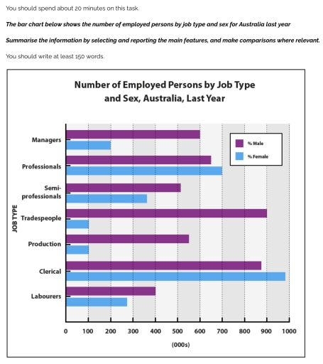
The bar graph provides the information about the number of Australian citizens in different job types by sex in the past year.

Overall, clerical job was the most popular job category among both gender. While considerably less number of males were employed as labourers,job types such as, tradespeople and production were the least common among females.

With regard to male, exactly 900,000 individuals were employed as tradespersons; the figure was slightly higher than the males involved in clerical professions. These two works are the most popular among them. In contrast, only 400,000 men were labourers. The professions like managers, professionals, semi-professionals and production were also common as more than 500,000 male population were involved in each of them.

However, among females, clerical jobs was the most prominent one, with almost a million women working as clerks. Notably, only around 100,000 females, each, had joined in production business and working as tradespeople, making both of them the least common professions across female population.

Word Count: 162

Answers On The Same Topic:

The bar chart below shows the number of employed persons by job type and sex for Australia last year Summarise the information by selecting and reporting the main features, and make comparisons where relevant. You should write at least 150 words.

The image depicts a bar graph showing the number of employees working in Australia with respect to gender and job type in the last year. Overall, the graph suggests 7 job categories, in which the male are dominant in almost all the sectors when compared to woman, with one exclusion in the clerical category where […]

The bar chart below shows the number of employed persons by job type and sex for Australia last year Summarise the information by selecting and reporting the main features, and make comparisons where relevant. You should write at least 150 words.

The bar chart illustrates the number of employed persons in different jobs in Australia in the previous year. Overall, it is clear that the ratio of female clerical employees was the most dominant throughout the timeframe, while male employment was the least significant in trades and production. In terms of managers, the female employment rate […]

The bar chart below shows the number of employed persons by job type and sex for Australia last year Summarise the information by selecting and reporting the main features, and make comparisons where relevant. You should write at least 150 words.

The bar chart illustrates the proportion of employees based on their gender and job type in Australia Overall, while only professionals and clerical men had the highest percentages compared to other jobs, women dominated in other jobs last year. The figure of males working in a clerical section reached its peak to almost 1000%. While […]

The bar chart below shows the number of employed persons by job type and sex for Australia last year Summarise the information by selecting and reporting the main features, and make comparisons where relevant. You should write at least 150 words.

The bar graph above provides information pertaining to the rate of employment based on factors such as job type and sex across Australia last year. Overall, Tradesmen comprise the highest share of employment, while Clerical jobs are mostly occupied by female employees. Highest number of male employment was recorded as Tradespeople and Clericals with 900 […]

The bar chart below shows the number of employed persons by job type and sex for Australia last year Summarise the information by selecting and reporting the main features, and make comparisons where relevant. You should write at least 150 words.

The chart illustrates the number of employees by occupation and gender in Australia last year. There are 7 types of occupattions, such as manager, professional, semi-professionals, trades people, production, clerical, and labourers. The bar chart shows that females made more majorities in the each of given jobs. Five of seven jobs are dominated by number […]

See All

Other Topics:

The charts below give information about the price of tickets on one airline between Sydney and Melbourne, Australia, over a two-week period in 2013.

The bar charts below demonstrate two week period data about price for tickets on airplane on the line between Sydney and Melbourne, Australia in 2013. Overall,three days in both weeks on airline, Tuesday, Wednesday, and Thursday was most stable. In contrast, on Monday price of tickets fell dramatically, while on the rest of the days […]

The graph below presents the information about Nathan's Hot Dog Eating Contest in Brooklyn's Coney Island, USA.

The chart illustrates the current record of Nathan’s hot dog eating contest which is 68 hot dogs and buns consumed in 15 minutes. This contest is held in Brooklyn’s coney island every 4th of July by American Joey Chestnut, where Takeru of Japan won 6 years in a row. Overall, the US citizens won most […]

The charts below show the marriage and divorce rates in the UK, Sweden, and Italy for the years 2000 and 2020. Summarise the information by selecting and reporting the main features, and make comparisons where relevant.

The bar charts below give a comparison in marriage and divorce rate within UK, sweden, and italy for the years 2000 and 2020. Overall, the rate of marriages in the following three countries appears to experience a significant decline ( especially in the UK and italy where it decreased by approximately half ), meanwhile sweden […]

The chart below shows information about Heart attacks by ages and genders in the USA

The bar chart compares the number of heart attacks among men and women in different age groups in the USA. In general, it is evident that males are at higher risk of suffering heart attacks than females in all age groups. In addition, the figure of heart attacks increases significantly with age for both genders. […]

The graph below shows information about the activities that New Zealand children enjoy doing the most in 2007.

the chart illustrates the proportion of teenage boys and girls in Vietnam engaging in different pastimes in 2010. Overall, while boys generally enjoyed outdoor activities the most, girls seemed to join indoor ones. It is also clear that dramatic differences were not seen in the figures for teenagers of both genders playing video games or […]

The chart below gives Information about the percentage of the adult population who were overweight in four different countries in 1980, 1990 and 2000.

The congnizance pertaning to the percentage of the adults population in four specific nations in years,1980,1990,2000 has been illustrated by the bar graph. Overall,it can be clearly seen that the higher proportion of adults population in 2000 in USA,however the least percentage of adults population in Japan in whole periods. Looking into details,in 1980 and […]

See All
We have detected unusual activity on your device.
Please verify your identity to continue.
Note: This verification step won't sign you in. If you have a premium account, please log in to access the service as usual.
Google/Gmail Verification
Or verify using Email/Code
We've sent a verification code to:
youremail@gmail.com (Not your email?)
Enter it below to complete the verification process.
Ensure your email address is correct, your inbox is not full, and you check your spam folder. If no email arrives, consider using an alternative email.
You will need a Premium plan to perform your action!
Note: If you already have a premium account, please log in to access our services as usual.

Plans & Pricing

Our mission is to make quality education accessible for everyone.
However, to keep our hardworking team running and this service alive, we genuinely need your support!
By opting for a premium plan, not only do you sustain us in achieving the mission, but you also unlock advanced features to enrich your learning experience.

Free

For learners who aren't pressed for time

What's included on Free
100+ Cambridge IELTS Tests
Instant IELTS Writing Task 1 & 2 Evaluation (2 times/month)
Instant IELTS Speaking Part 1, 2, & 3 Evaluation (2 times/month)
Instant IELTS Writing Task 1 & 2 Essay Generator (2 times/month)
500+ Dictation & Shadowing Exercises
100+ Pronunciation Exercises
Flashcards
Other Advanced Tools

Premium

For those serious about advancing their English proficiency, and for IELTS candidates aspiring to boost their band score by 1-2 points (especially in writing & speaking) in just 30 days or less

What's included on Premium
Save Your IELTS Test Progress & Analyze Mistakes By Question Type
Save Your Own Flashcard Sets & Use Them On Any Device
Unlock All Courses, IELTS Tests, Section & Part Practice
Unlimited AI Conversations
Unlimited AI Writing Enhancement Exercises
Unlimited IELTS Writing Task 1 & 2 Evaluation
Unlimited IELTS Speaking Part 1, 2, & 3 Evaluation
Checked Answers Will Not Be Published
Unlimited IELTS Writing Task 1 & 2 Essay Generator
Unlimited IELTS Speaking Part 1, 2, & 3 Sample Generator
Unlimited Usage Of Advanced Tools & AI Features
Priority Support within 24h (12-month plan only)

Due to the nature of our service and the provided free trials, payments are non-refundable.