🔥 Today Only: Save 30% on Premium — Offer Ends Soon! - Upgrade Now!
Bar Chart

Band 4+: The bar graph shows the global sales (in billions of dollars) of different types of digital games between 2000 and 2006. Write a report for a university, lecturer describing the information shown below. Summarise the information by selecting and reporting the main features and make comparisons where relevant.

Image for topic: The bar graph shows the global sales (in billions of dollars) of different types of digital games between 2000 and 2006. Write a report for a university, lecturer describing the information shown below. Summarise the information by selecting and reporting the main features and make comparisons where relevant.
Our system will evaluate the answer based on this AI-generated description.
The image depicts a bar chart illustrating sales data for different categories of games, measured in billions of dollars, from 2000 to 2006. Mobile phone games are depicted in blue, online games in red, console games in green, and handheld games in orange. In 2000, mobile phone games, online games, console games, and handheld games generated sales of approximately 0, 8, 10, and 12 billion dollars, respectively. In 2001, the corresponding figures climbed to 2, 10, 12, and 14 billion dollars. In 2002, the sales for mobile phone games soared to 4 billion, online games to 12 billion, console games slightly dipped to 11 billion, while handheld games leaped to 16 billion dollars. 2003 saw a similar trend, with mobile phone games rising to 6 billion, online games to 14 billion, console games reaching the highest peak at 18 billion, and handheld games remaining steady at 16 billion dollars. The upward trajectory continued in 2004, with mobile phone games reaching 8 billion, online games 16 billion, and both console and handheld games accruing 18 billion dollars each. By 2005, mobile phone games attained 10 billion, online games 16 billion, and both console and handheld games plateaued at 18 billion dollars. Finally, in 2006, the sales for all categories remained unchanged from the previous year.
Given the complexity of the image, the above description may not be entirely accurate.
Note: Both the topic and the answer were created by one of our users.

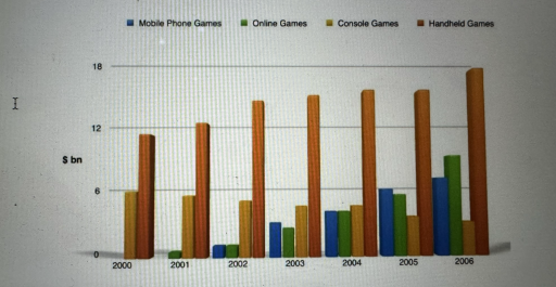
The given bar chart illustrates the world’s selling of digital games from 2000 to 2006. There are four types of games: mobile phone, online, console and handheld. Units are shown in billions of dollars.

Overall, there were only two categories of units in 2000 which were handheld and console games. Handheld game’s sale increased significantly in 6 years from 10 billions to 16 billions.

To begin with, there were no mobile phone or online games’ selling in 2000. Online games arisen in 2001 whereas mobile phone games appeared a year later. Both selling started to rise. Phone game’s sales made up 7 billions of dollars, in comparison with online, that was 3 billions less.

However, console games have diminished. In 2006, their selling compiled 3 billions, that was only a half of fortune in 2000. In 2004, mobile phone, online and console games’ selling was similar approximately 4 billions of dollars. Unlike handheld, they made up 14 billions in that year.

Word Count: 161

Answers On The Same Topic:

The bar graph shows the global sales (in billions of dollars) of different types of digital games between 2000 and 2006. Write a report for a university, lecturer describing the information shown below. Summarise the information by selecting and reporting the main features and make comparisons where relevant.

The bar chart illustrates global revenues from video game sales across four platforms – mobile phones, online services, home consoles, and handheld devices – between 2000 and 2006. Overall, total revenue rose steadily throughout the period, driven primarily by strong growth in handheld, mobile, and online games. Home console sales, however, showed a continuous decline. […]

The bar graph shows the global sales (in billions of dollars) of different types of digital games between 2000 and 2006. Write a report for a university, lecturer describing the information shown below. Summarise the information by selecting and reporting the main features and make comparisons where relevant.

The bar graph shows the global sales of different types of digital games such as mobile phone, online games, console games and handheld games between 2000 and 2006. start in 2000s handheld games was the most salling wich is 10 billions dollars, beside handheld games there was a console games that popular too, their sales […]

The bar graph shows the global sales (in billions of dollars) of different types of digital games between 2000 and 2006. Write a report for a university, lecturer describing the information shown below. Summarise the information by selecting and reporting the main features and make comparisons where relevant.

The bar chart illustrates data on worldwide revenue (in billions of dollars) for different types of digital games, such as mobile phone games, online games, console games, and handheld games, between the years 2000 and 2006. Overall, it is estimated that global sales increased over time, and the most significant progress is shown in the […]

The bar graph shows the global sales (in billions of dollars) of different types of digital games between 2000 and 2006. Write a report for a university, lecturer describing the information shown below. Summarise the information by selecting and reporting the main features and make comparisons where relevant.

The bar chart provides data on the worldwide revenue of four distinct types of video games from 2000 to 2006. The figures are shown in billions of dollars. Overall, the amount of money spent by gamers on buying games increased significantly over the 6-year period, globally. The most noticeable change can be observed in the […]

The bar graph shows the global sales (in billions of dollars) of different types of digital games between 2000 and 2006. Write a report for a university, lecturer describing the information shown below. Summarise the information by selecting and reporting the main features and make comparisons where relevant.

The bar chart provides data about worldwide revenue of four distinct types of video games from 2000 to 2006. The figures are shown in billions of dollars. Overall, the amount of money spent by gamers for buying games increased significantly over the 6-year period, globally. The most noticeable change can be observed in the figures […]

See All

Other Topics:

Task Description The chart below shows computer usage by age group in Estonia, Latvia, and Türkiye. The data compares three age groups (16-24, 25-54, and 55-74) across the three countries. Requirements Summarize the information by selecting and reporting the main features, and make comparisons where relevant.

The provided bar chart illustrates the prevalence of computer usage among three distinct age groups in Estonia, Latvia, and Türkiye. A notable feature of the data is the uniformly high computer usage among younger individuals aged 16 to 24 across all three countries. Conversely, the older cohort, specifically individuals aged 55 to 74, demonstrates significantly […]

Task Description The chart below shows computer usage by age group in Estonia, Latvia, and Türkiye. The data compares three age groups (16-24, 25-54, and 55-74) across the three countries. Requirements Summarize the information by selecting and reporting the main features, and make comparisons where relevant.

The bar chart compares computer usage by three different age groups in three different countries, such as Estonia, Latvia, and Turkey. Overall, what stands out from the graph is that there were considerable downward trends in the usage of computers of both age groups from 16 to 24 and from 55 to 74, while the […]

The bar chart below shows the average number of visitors who went to six types of attractions in Canberra, on a weekday and on the weekend, in 2019.

The bar chart give information about the number of vistors, who visit six different places in Canberra, during a weekday or weekend in 2019. Overall, the majority of peoples visits Cafes and Restaurants on a weekday and weekend. while the least figure shows for Libraries. The highest proportion of vistors went to the Cafes and […]

The chart below gives information about how families in one country spent their weekly income in 1968 and 2018. Summarise the information by selecting and reporting the main features, and make comparisons where relevant.

The bar chart illustrates how families in one country allocated their weekly income across eight categories in 1968 and 2018. Overall, it is evident that spending on food declined substantially over time, while expenditure on leisure, housing and transport increased. Additionally, some categories experienced only minor changes or remained relatively stable. In 1968, food accounted […]

The graph shows the figures for imprisonment in five countries between 19930 and 1980

The bar chat compares the number of people in prison in five different countries over a period of 50 years from 1930 to 1980.It is clear that the number of people in prison experienced considerable growth in Canada and the United States in comparison with other countries over the period shown. In 1930,people who in […]

The bar chart illustrates the changes in the proportion of individuals in the UK

The bar chart illustrates the changes in the proportion of individuals in the UK consuming five portions of fruits and vegetables daily from 2001 to 2008. As seen, women occupies the highest proportion of eating five portions of fruit and vegetables per day throughout the period. Specifically, the percentage of women has risen steadily since […]

See All
We have detected unusual activity on your device.
Please verify your identity to continue.
Note: This verification step won't sign you in. If you have a premium account, please log in to access the service as usual.
Google/Gmail Verification
Or verify using Email/Code
We've sent a verification code to:
youremail@gmail.com (Not your email?)
Enter it below to complete the verification process.
Ensure your email address is correct, your inbox is not full, and you check your spam folder. If no email arrives, consider using an alternative email.
You will need a Premium plan to perform your action!
Note: If you already have a premium account, please log in to access our services as usual.

Plans & Pricing

Our mission is to make quality education accessible for everyone.
However, to keep our hardworking team running and this service alive, we genuinely need your support!
By opting for a premium plan, not only do you sustain us in achieving the mission, but you also unlock advanced features to enrich your learning experience.

Free

For learners who aren't pressed for time

What's included on Free
100+ Cambridge IELTS Tests
Instant IELTS Writing Task 1 & 2 Evaluation (2 times/month)
Instant IELTS Speaking Part 1, 2, & 3 Evaluation (5 times/month)
Instant IELTS Writing Task 1 & 2 Essay Generator (2 times/month)
500+ Dictation & Shadowing Exercises
100+ Pronunciation Exercises
Flashcards
Other Advanced Tools

Premium

For those serious about advancing their English proficiency, and for IELTS candidates aspiring to boost their band score by 1-2 points (especially in writing & speaking) in just 30 days or less

What's included on Premium
Save Your IELTS Test Progress
Unlock All Courses & IELTS Tests
Unlimited AI Conversations
Unlimited AI Writing Enhancement Exercises
Unlimited IELTS Writing Task 1 & 2 Evaluation
Unlimited IELTS Speaking Part 1, 2, & 3 Evaluation
Checked Answers Will Not Be Published
Unlimited IELTS Writing Task 1 & 2 Essay Generator
Unlimited IELTS Speaking Part 1, 2, & 3 Sample Generator
Unlimited Usage Of Advanced Tools
Priority Support within 24h (12-month plan only)

Due to the nature of our service and the provided free trials, payments are non-refundable.
Nếu bạn là người Việt Nam và không có hoặc không muốn trả bằng credit/debit cards, bạn có thể thanh toán bằng phương thức chuyển khoản:


Chọn gói:
419,000₫ 277,000 ₫ cho gói 1 tháng (chỉ 9,233₫/ngày)
1,239,000₫ 597,000 ₫ cho gói 3 tháng (chỉ 6,633₫/ngày)
2,469,000₫ 1,027,000 ₫ cho gói 6 tháng (chỉ 5,706₫/ngày)
4,929,000₫ 1,417,000 ₫ cho gói 12 tháng (chỉ 3,936₫/ngày)


Sau khi chuyển khoản, vui lòng đợi trình duyệt tự động điều hướng bạn trở lại Engnovate và bạn sẽ ngay lập tức nhận được mã kích hoạt tài khoản premium.
Nếu có lỗi xảy ra, bạn có thể liên hệ với team thông qua một trong các phương thức: email đến helloengnovate@gmail.com hoặc nhắn tin qua facebook.com/engnovate.
Vì toàn bộ công cụ trên website đều có thể sử dụng thử miễn phí, Engnovate không hỗ trợ hoàn tiền.