🔥 Today Only: Save 30% on Premium — Offer Ends Soon! - Upgrade Now!
Line Graph

Band 5+: The below line graph shows the percentage of population living in cities.

Image for topic: The below line graph shows the percentage of population living in cities.
Our system will evaluate the answer based on this AI-generated description.
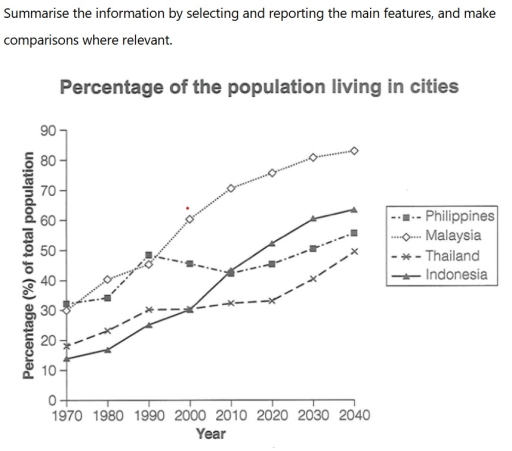
The image displays a line graph titled "Percentage of the population living in cities" with a y-axis for "Percentage (%) of total population" from 0 to 90 and an x-axis for "Year" from 1970 to 2040. Data points for the four countries depicted are: Philippines - 1970 (approx. 32%), 1980 (approx. 34%), 1990 (approx. 49%), 2000 (approx. 46%), 2010 (approx. 43%), 2020 (approx. 46%), 2030 (approx. 51%), 2040 (approx. 56%); Malaysia - 1970 (approx. 29%), 1980 (approx. 41%), 1990 (approx. 46%), 2000 (approx. 61%), 2010 (approx. 71%), 2020 (approx. 76%), 2030 (approx. 81%), 2040 (approx. 83%); Thailand - 1970 (approx. 19%), 1980 (approx. 23%), 1990 (30%), 2000 (approx. 31%), 2010 (approx. 33%), 2020 (approx. 34%), 2030 (approx. 42%), 2040 (50%); Indonesia - 1970 (approx. 14%), 1980 (approx. 17%), 1990 (25%), 2000 (30%), 2010 (approx. 43%), 2020 (approx. 53%), 2030 (approx. 61%), 2040 (approx. 64%).
Given the complexity of the image, the above description may not be entirely accurate.
Note: Both the topic and the answer were created by one of our users.

The line graph shows the percentage of the population living in cities in four different countries, Phillipins, Malaysia, Thailand, and Indonesia.

Overall, we can observe a growing tendency of all the four countries from 1970 to 2040, despite small decreases during the observing period

In Malaysia, the percentage of total population gradually increases and to 2040 reaches the highest point as 80 percentages. Similar growing patterns also has Indonesia, but unlike Malaysia, in predictions for 2040 it only reaches a number 60.

Phillipins had a great potential in the period from 1970 to 1990 and got to 50 percentages, but had a drop in 2010, reaching number of 41 percentages, from then on have a steady growth. In 1970, Thailand had one of the lowest positions, but already to 1990 started escalation and got to figure 30, remained on that numbers for thirty years and in 2020 started it’s growth again.

In conclusion, we can say that in predictions for 2040, Malaysia still remain on the highest position, when other countries continue their upward trend.

Word Count: 175

Answers On The Same Topic:

The below line graph shows the percentage of population living in cities.

The data presents proportions of residents in four Asian countries living in cities between 1970 and 2020, with estimates for 2030 and 2040. Overall, it is clear that Indonesia and Malaysia grew rapidly. However, Thailand and the Philippines increased slowly. To begin with, the figure for Malaysia was third in 1970, and over time it […]

The below line graph shows the percentage of population living in cities.

The data presents proportions of residents in four Asian countries living in city between 1970 and 2020, with guesses for 2030 and 2040. Overall, it is clear that Indonesia and Malaysia rapidly grew. However, Thailand and the Philippines increased slowly. To begin with, the figure for Malaysia was number three in 1970, and after time […]

The below line graph shows the percentage of population living in cities.

The data presents proportions of residents in four Asian countries living in city life between 1970 and 2020, with guesses for 2030 and 2040. Overall, it is clear that Indonesia and Malaysia rapidly grew. However, Thailand and the Philippines increased slowly. To begin with, Malaysia was number three in 1970, and after time it overtook […]

The below line graph shows the percentage of population living in cities.

The line graph compares the increase in the total proportion of people who live in cities of four different Asian countries (Philippines, Malaysia, Thailand, and Indonesia) from 1970 to the present with the prediciton of the next two decades. It is clear that while the urban population of all four countries increased and expected to […]

See All

Other Topics:

The line graph shows the average cost of mobile phones.

The illustration provides the avarege cost of four different types of mobile phones in nine months. Overall, the price of mobile phones shows euros. Every month the number of price increases and decreases. On the one hand, the most essential phone type Domo accounted for high cost between January and August. Especially, Domo has the […]

the graph below gives information about sugar production and consumption in India from 2001 to 2011

The line graph illustrates the number of consumtion and production of sugar in India from 2001 till 2011 Overall, the sugar production in India was declining in over the period,whereas the sugar consumption showed a litte rose steadly. Although production was generally higer than consumption there were some years when consumptions moderately grow up. In […]

The charts shows the sales of five different kinds of jam from 2009 to 2014

The graph illustrates the sales of five different kinds of jam between 2009 and 2014. Overall, it is clear from the graph that strawberry, raspberry and grape jam increased over the period, with strawberry reaching the highest point in the graph. By contrast, plum sales declined steadily, while cherry sales fluctuated before ending slightly higher […]

The line graph shows the average daily smartphone use for four different age groups between 2015 and 2025

The line graph illustrates the average daily time spent using smartphones among four age groups between 2015 and 2025. Overall, it is clear that all four age groups experienced an upward trend. Among them, the youngest group consistently recorded the highest levels, whereas the oldest group remained the lowest throughout the period shown. The youngest […]

Task 1: You have approximately 20 minutes to complete this task. The chart below gives information on the amount of time taken to manufacture a vehicle by four US-based car producers between 1998 and 2002. Provide an overview of the information by identifying and describing the key details, and include comparisons where appropriate,

The line graph illustrates information about the amount of time to manufacture a vehicle by four various US manufacturers within four years between 1998 and 2002. Overall, it is celar that there were slight fluctuating trends in DC and Ford, while Nissan and General Motors witnessed sharp declines during the years in question. Another important […]

The graph shows the percentage of five free time activities in elderly in the US

The line graph depicts the proportion of five leisure activities – reading, hiking, theatre, watching TV, and surfing the internet – of the elderly in the United States between 1980 and 2010. Overall, watching TV was initially the most favoured activity among these people, while surfing the internet recorded the least share. However, the trends […]

See All
We have detected unusual activity on your device.
Please verify your identity to continue.
Note: This verification step won't sign you in. If you have a premium account, please log in to access the service as usual.
Google/Gmail Verification
Or verify using Email/Code
We've sent a verification code to:
youremail@gmail.com (Not your email?)
Enter it below to complete the verification process.
Ensure your email address is correct, your inbox is not full, and you check your spam folder. If no email arrives, consider using an alternative email.
You will need a Premium plan to perform your action!
Note: If you already have a premium account, please log in to access our services as usual.

Plans & Pricing

Our mission is to make quality education accessible for everyone.
However, to keep our hardworking team running and this service alive, we genuinely need your support!
By opting for a premium plan, not only do you sustain us in achieving the mission, but you also unlock advanced features to enrich your learning experience.

Free

For learners who aren't pressed for time

What's included on Free
100+ Cambridge IELTS Tests
Instant IELTS Writing Task 1 & 2 Evaluation (2 times/month)
Instant IELTS Speaking Part 1, 2, & 3 Evaluation (5 times/month)
Instant IELTS Writing Task 1 & 2 Essay Generator (2 times/month)
500+ Dictation & Shadowing Exercises
100+ Pronunciation Exercises
Flashcards
Other Advanced Tools

Premium

For those serious about advancing their English proficiency, and for IELTS candidates aspiring to boost their band score by 1-2 points (especially in writing & speaking) in just 30 days or less

What's included on Premium
Save Your IELTS Test Progress
Unlock All Courses & IELTS Tests
Unlimited AI Conversations
Unlimited AI Writing Enhancement Exercises
Unlimited IELTS Writing Task 1 & 2 Evaluation
Unlimited IELTS Speaking Part 1, 2, & 3 Evaluation
Checked Answers Will Not Be Published
Unlimited IELTS Writing Task 1 & 2 Essay Generator
Unlimited IELTS Speaking Part 1, 2, & 3 Sample Generator
Unlimited Usage Of Advanced Tools
Priority Support within 24h (12-month plan only)

Due to the nature of our service and the provided free trials, payments are non-refundable.
Nếu bạn là người Việt Nam và không có hoặc không muốn trả bằng credit/debit cards, bạn có thể thanh toán bằng phương thức chuyển khoản:


Chọn gói:
419,000₫ 277,000 ₫ cho gói 1 tháng (chỉ 9,233₫/ngày)
1,239,000₫ 597,000 ₫ cho gói 3 tháng (chỉ 6,633₫/ngày)
2,469,000₫ 1,027,000 ₫ cho gói 6 tháng (chỉ 5,706₫/ngày)
4,929,000₫ 1,417,000 ₫ cho gói 12 tháng (chỉ 3,936₫/ngày)


Sau khi chuyển khoản, vui lòng đợi trình duyệt tự động điều hướng bạn trở lại Engnovate và bạn sẽ ngay lập tức nhận được mã kích hoạt tài khoản premium.
Nếu có lỗi xảy ra, bạn có thể liên hệ với team thông qua một trong các phương thức: email đến helloengnovate@gmail.com hoặc nhắn tin qua facebook.com/engnovate.
Vì toàn bộ công cụ trên website đều có thể sử dụng thử miễn phí, Engnovate không hỗ trợ hoàn tiền.