24 Hours Only: Get 39% OFF on Our Premium Plan - Check Out Now!
Multiple Graphs

Band 7+: The chart and graph below give information about three categories of workers in Australia and the unemployment levels within those categories

Image for topic: The chart and graph below give information about three categories of workers in Australia and the unemployment levels within those categories
Our system will evaluate the answer based on this AI-generated description.
The image contains a pie chart and a line graph with two keys (ESC and NESC) explaining that ESC refers to workers born in English-speaking countries other than Australia and NESC refers to workers born in non-English-speaking countries. The pie chart shows the workforce in Australia by place of birth in 2003 with percentage values showing Born in Australia 76%, ESC 10%, and NESC 14%. The line graph shows the unemployment in Australia by place of birth from 1993-2003 with percentages on the y-axis ranging from 0 to 8 and years on the x-axis. The graph lines show the unemployment percentage of Australia with a dashed line, ESC with a green line, and NESC with a red line. The unemployment rate in 1993 was approximately 2% for ESC, 2% for Australia, and 6% for NESC. In 1995, ESC had around 3%, Australia had 4%, and NESC had 8%. In 1997, ESC decreased to 2%, Australia went slightly above 2%, and NESC decreased to 6%. In 1999, ESC maintained 2%, Australia increased to 4%, and NESC decreased below 6%. In 2001, all three had around 2%, with NESC showing a slight increase compared to ESC and Australia. In 2003, ESC had just over 2%, Australia had just under 2%, and NESC had around 4%.
Given the complexity of the image, the above description may not be entirely accurate.
Note: Both the topic and the answer were created by one of our users.

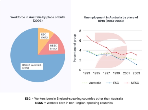
The given chart illustrates the percentage of three sectors of workers in Australia in 2003: ESC, NESC, and those born in Australia while the graph depicts the unemployment rates within these groups over a decade from 1993.

Overall, it can be seen that a number of workers born in Australia were dominant in the Australia’s workforce among three categories, whereas the opposite was true for the ESC. In addition, three categories experienced a notable decline in the unemployment ratios throughout the period

Following the chart, the proportion of workers born in Australia accounted for more than three-quarters among the Australia’s work population in 2003. In contrast, the ESC and NESC were much less, at 10% and 14% respectively in the same period.

However, according to the given graph, the scale of joblessness was the least in the ESC, decreasing from about 4% in 1993 to just 1% in 2003, followed by that of the Australian workers, just approximately about 2% higher than the ESC in the end of the period. Although the NESC did not make up for the lowest proportion of the labor force, they recorded the highest level of joblessness in Australia compared with the two others, starting at nearly 8% in 1993 and then declined by around 4% in 2003.

Word Count: 213

Answers On The Same Topic:

The chart and graph below give information about three categories of workers in Australia and the unemployment levels within those categories

The given bar chart delinates different kinds of worker in Austrlia in 2003. Meanwhile, the line graph depicts information about the porportion of unemployment in three groups by birthplace. Overall, the percentage of native Australian workers took the lion’s share in both categorys. Furthermore, unemployment level experienced a downward trend. However, english-speaking countries still remained […]

The chart and graph below give information about three categories of workers in Australia and the unemployment levels within those categories

The diagrams illustrates the distribution of the Australian workforce by place of birth in 2003, and the unemployment trends from 1993 to 2003 among three groups: those born in Australia, in English-speaking countries (ESC), and in non English-speaking countries (NESC). It is evident that most of the workforce in 2003 was made up of people […]

The chart and graph below give information about three categories of workers in Australia and the unemployment levels within those categories

The pie chart illustrates the percentage of workers in terms of place of birth in the year of 2003 while the line chart compares the proportion of the jobless in the 10-year period, starting at 1993 in Australia Overall, it is apparent that the Australian workers took up the majority . Moreover, despite experiencing a […]

The chart and graph below give information about three categories of workers in Australia and the unemployment levels within those categories

The pie-chart and line-graph give information about three types of workers in Australia in 2003 and the unemployment rate within those groups in a period from 1993 to 2003. Overall, workers who were born in Australia dominate the workforce in Australia. The unemployment percentage experienced a downward trend throughout the period, non-English speaking country had […]

See All

Other Topics:

The charts below show the percentage of time used for different activities in the office in the US in 1980 and 2000.

The charts illustrate the priority of spending time on different activities in the office in the US in 1980 and 2000. Overall, computer-related activities are increasingly popular and have become the dominant activities, replacing the paper ones . Meanwhile, handling emails has become a new activity in people’s daily work routine. In 1980, people mainly […]

The charts below show the percentage of time used for different activities in the office in the US in 1980 and 2000.

The charts illustrate the priority of spending time on different activities in the office in the US in 1980 and 2000. Overall, computer-related activities are increasingly popular and become the most major activities; replace the paper ones . Meanwhile, handling emails has become a new activity of people’s daily work routine. In 1980, people mainly […]

The two bar charts show the proportion of 14-16 year-old students studying a modern foreign language in an English Speaking country and the top three popular foreign languages

The two tables represent the percentage of pupils aged from 14 to 16 learning a contemporary overseas language in an English Speaking country and the top three favoured non-native languages. In essence, the first chart notably delineates that female students were more interested and committed to learning a new language. Nevertheless, while the first patterns […]

The pie chart below shows the main reasons why students chose to study at a particular UK university in 1987 and in 2007. Summarize the information by selecting and reporting the main features, and make comparisons where relevant.

The pie charts show the main reasons why students chose a particular UK university in 1987 and 2007. Overall, suitable degree courses were the most important reason in both years. In addition, the percentage of students choosing universities for sports and social activities decreased significantly, while the figure for being close to home increased. In […]

This chat given information about cultural and leisure time activites of youth.

The charts show boys and girls activities’ time, and isullated that by presenting their cultural and leisure persentages. Overall boys time was more spending on playing computer games, while dancing is the more activity attracting girls. Computer games, basketball, and soccer are the more activities children doing on their free time, which they recorded 34, […]

You should spend about 20 minutes on this task. The charts below show the results of a survey of adult education. The first chart shows the reasons why adults decide to study. The pie chart shows how people think the costs of adult education should be shared. Write a report for a university lecturer, describing the information shown below. You should write at least 150 words.

The charts illustrate the data recover from an adult education survey. The bar chart represents the multiple reasons why adults decide to study. The pie chart shows the distribution of costs depending on people’s opinions. Overall, most percentage of adult people decided to study thanks to their interest in the choosen subject. Meanwhile, the least […]

See All
We have detected unusual activity on your device.
Please verify your identity to continue.
Note: This verification step won't sign you in. If you have a premium account, please log in to access the service as usual.
Google/Gmail Verification
Or verify using Email/Code
We've sent a verification code to:
youremail@gmail.com (Not your email?)
Enter it below to complete the verification process.
Ensure your email address is correct, your inbox is not full, and you check your spam folder. If no email arrives, consider using an alternative email.
You will need a Premium plan to perform your action!
Note: If you already have a premium account, please log in to access our services as usual.

Plans & Pricing

Our mission is to make quality education accessible and free for everyone.
However, to keep our hardworking team running and this service alive, we genuinely need your support!
By opting for a premium plan, not only do you sustain us in achieving the mission, but you also unlock advanced features to enrich your learning experience.

Free

For learners who aren't pressed for time

What's included on Free
1000+ IELTS Tests & Samples
Instant IELTS Writing Task 1 & 2 Evaluation (2 times/month)
Instant IELTS Speaking Part 1, 2, & 3 Evaluation (5 times/month)
Instant IELTS Writing Task 1 & 2 Essay Generator (2 times/month)
500+ Dictation & Shadowing Exercises
100+ Pronunciation Exercises
Flashcards
Other Advanced Tools

Premium

For those serious about advancing their English proficiency, and for IELTS candidates aspiring to boost their band score by 1-2 points (especially in writing & speaking) in just 30 days or less

What's included on Premium
Save Your IELTS Test Progress
Unlock All Courses & Content
Unlimited AI Conversations
Unlimited AI Writing Enhancement Exercises
Unlimited IELTS Writing Task 1 & 2 Evaluation
Unlimited IELTS Speaking Part 1, 2, & 3 Evaluation
Checked Answers Will Not Be Published
Unlimited IELTS Writing Task 1 & 2 Essay Generator
Unlimited IELTS Speaking Part 1, 2, & 3 Sample Generator
Unlimited Usage Of Advanced Tools

Due to the nature of our service and the provided free trials, payments are non-refundable.
Nếu bạn là người Việt Nam và không có hoặc không muốn trả bằng credit/debit cards, bạn có thể thanh toán bằng phương thức chuyển khoản:


Chọn gói:
279,000₫ 157,000 ₫ cho gói 1 tháng (chỉ 5,233₫/ngày)
819,000₫ 397,000 ₫ cho gói 3 tháng (chỉ 4,411₫/ngày)
1,649,000₫ 667,000 ₫ cho gói 6 tháng (chỉ 3,706₫/ngày)
3,299,000₫ 857,000 ₫ cho gói 12 tháng (chỉ 2,381₫/ngày)


Sau khi chuyển khoản, vui lòng đợi trình duyệt tự động điều hướng bạn trở lại Engnovate và bạn sẽ ngay lập tức nhận được mã kích hoạt tài khoản premium.
Nếu có lỗi xảy ra, bạn có thể liên hệ với team thông qua một trong các phương thức: email đến helloengnovate@gmail.com hoặc nhắn tin qua facebook.com/engnovate.
Vì toàn bộ công cụ trên website đều có thể sử dụng thử miễn phí, Engnovate không hỗ trợ hoàn tiền.