🔥 Today Only: Save 30% on Premium — Offer Ends Soon! - Upgrade Now!
Multiple Graphs

Band 6+: The chart and graph below give information about three categories of workers in Australia and the unemployment levels within those categories

Image for topic: The chart and graph below give information about three categories of workers in Australia and the unemployment levels within those categories
Our system will evaluate the answer based on this AI-generated description.
The image contains a pie chart and a line graph with two keys (ESC and NESC) explaining that ESC refers to workers born in English-speaking countries other than Australia and NESC refers to workers born in non-English-speaking countries. The pie chart shows the workforce in Australia by place of birth in 2003 with percentage values showing Born in Australia 76%, ESC 10%, and NESC 14%. The line graph shows the unemployment in Australia by place of birth from 1993-2003 with percentages on the y-axis ranging from 0 to 8 and years on the x-axis. The graph lines show the unemployment percentage of Australia with a dashed line, ESC with a green line, and NESC with a red line. The unemployment rate in 1993 was approximately 2% for ESC, 2% for Australia, and 6% for NESC. In 1995, ESC had around 3%, Australia had 4%, and NESC had 8%. In 1997, ESC decreased to 2%, Australia went slightly above 2%, and NESC decreased to 6%. In 1999, ESC maintained 2%, Australia increased to 4%, and NESC decreased below 6%. In 2001, all three had around 2%, with NESC showing a slight increase compared to ESC and Australia. In 2003, ESC had just over 2%, Australia had just under 2%, and NESC had around 4%.
Given the complexity of the image, the above description may not be entirely accurate.
Note: Both the topic and the answer were created by one of our users.

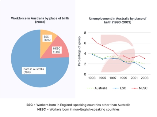
The diagrams illustrates the distribution of the Australian workforce by place of birth in 2003, and the unemployment trends from 1993 to 2003 among three groups: those born in Australia, in English-speaking countries (ESC), and in non English-speaking countries (NESC).

It is evident that most of the workforce in 2003 was made up of people born in Australia. Over the ten year period, unemployement declined across all groups, but NESC group consistently experienced the highest unployement rates.

In detail, the pie chart shows that in 2003, 76% of the workforce was Australian-born. Workers from non-English-speaking countries accounted for 14%, while from English-speaking countries, the figure was just 10%.

The line graph reveales that in 1993, unemployment was highest among NESC group, at around 7%, and after four years in 1997 it fell to apporximately 5%, while the ESC group had the lowest rate at 4% in 1993. By 2003, the rate for australians workers dropped to about 4%, the ESC group at 1.5%, and the NESC group at 3%.

Word Count: 169

Answers On The Same Topic:

The chart and graph below give information about three categories of workers in Australia and the unemployment levels within those categories

The given bar chart delinates different kinds of worker in Austrlia in 2003. Meanwhile, the line graph depicts information about the porportion of unemployment in three groups by birthplace. Overall, the percentage of native Australian workers took the lion’s share in both categorys. Furthermore, unemployment level experienced a downward trend. However, english-speaking countries still remained […]

The chart and graph below give information about three categories of workers in Australia and the unemployment levels within those categories

The given chart illustrates the percentage of three sectors of workers in Australia in 2003: ESC, NESC, and those born in Australia while the graph depicts the unemployment rates within these groups over a decade from 1993. Overall, it can be seen that a number of workers born in Australia were dominant in the Australia’s […]

The chart and graph below give information about three categories of workers in Australia and the unemployment levels within those categories

The pie chart illustrates the percentage of workers in terms of place of birth in the year of 2003 while the line chart compares the proportion of the jobless in the 10-year period, starting at 1993 in Australia Overall, it is apparent that the Australian workers took up the majority . Moreover, despite experiencing a […]

The chart and graph below give information about three categories of workers in Australia and the unemployment levels within those categories

The pie-chart and line-graph give information about three types of workers in Australia in 2003 and the unemployment rate within those groups in a period from 1993 to 2003. Overall, workers who were born in Australia dominate the workforce in Australia. The unemployment percentage experienced a downward trend throughout the period, non-English speaking country had […]

See All

Other Topics:

You should spend about 20 minutes on this task. The pie charts below show how dangerous waste products are dealt with in three countries. Summarise the information by selecting and reporting the main features, and make comparisons where relevant. Write at least 150 words.

The pie charts compare how countries such as the United Kingdom, the Republic of Korea and Sweden manage harmful waste materials using five different methods. Overall, disposing waste by underground, by fire and recyling are the most common ways among five methods used to dispose waste. The United Kingdom prefers incineration method whereas, Sweden buries […]

Task 1: The charts show how satisfied students were with several types of facilities at a university in the UK in the year 2007. Provide an overview of the information by identifying and describing the key details, and include comparisons where appropriate.

The given pie charts illustrate percentage of satisfied students in several types of facilities at a university in the United Kingdom in the year 2007. As an overall trend, the per cent of very satisfied in all facilites including undergraduates and postgraduates represent highest value than other criterias. According to the data, school rooms at […]

The charts below show information about the average spending of a typical household in four different countries in the year 2020.

The pie charts compare the average household spending in four different countries, namely Vietnam, Singapore, the USA, and Bangladesh, in 2020. Overall, food accounts for the largest proportion of expenditure in Vietnam and Bangladesh, whereas in the USA, the biggest share is spent on entertainment. Singapore shows a more balanced distribution across categories. In Vietnam, […]

The graph and table details the information about proportion of graduates in Australia who worked full-time after university in the period between 2004 and 2012

The line graph and table provides information on the proportion of people with a degree working in Australia and compares the average salary of math and other graduates between 2004 and 2012.Overall, less people worked with a university degree throughout the year, with those who had a math degree remaining unchanged. Additionally, while the average […]

The charts show the percentage of volunteers by organizations in 2008-2014. Summarise the information by selecting and reporting the main features, and make comparisons where relevant.

The pie charts illustrate the percentage of facilitating organization such as volunteers over the period from 2008 to 2014. Overall, while all figures experienced changes at different rates, the number of Health Care organizations was the only one that remained stable. It is also clear that the proportions of Sport and and Environmental organizations became […]

The first chart below shows the percentage of school-aged girls and boys who were at secondary school in four regions of the world in 2000. The second chart shows the percentages of college-aged men and women in higher education in the same year.

The two charts compare the proportions of school-aged boys and girls attending secondary school and the percentages of men and women in higher education across four world regions in 2000. Overall, participation in both secondary and higher education varied significantly by region, with developed regions showing higher enrolment rates. In addition, gender disparities were more […]

See All
We have detected unusual activity on your device.
Please verify your identity to continue.
Note: This verification step won't sign you in. If you have a premium account, please log in to access the service as usual.
Google/Gmail Verification
Or verify using Email/Code
We've sent a verification code to:
youremail@gmail.com (Not your email?)
Enter it below to complete the verification process.
Ensure your email address is correct, your inbox is not full, and you check your spam folder. If no email arrives, consider using an alternative email.
You will need a Premium plan to perform your action!
Note: If you already have a premium account, please log in to access our services as usual.

Plans & Pricing

Our mission is to make quality education accessible for everyone.
However, to keep our hardworking team running and this service alive, we genuinely need your support!
By opting for a premium plan, not only do you sustain us in achieving the mission, but you also unlock advanced features to enrich your learning experience.

Free

For learners who aren't pressed for time

What's included on Free
100+ Cambridge IELTS Tests
Instant IELTS Writing Task 1 & 2 Evaluation (2 times/month)
Instant IELTS Speaking Part 1, 2, & 3 Evaluation (5 times/month)
Instant IELTS Writing Task 1 & 2 Essay Generator (2 times/month)
500+ Dictation & Shadowing Exercises
100+ Pronunciation Exercises
Flashcards
Other Advanced Tools

Premium

For those serious about advancing their English proficiency, and for IELTS candidates aspiring to boost their band score by 1-2 points (especially in writing & speaking) in just 30 days or less

What's included on Premium
Save Your IELTS Test Progress
Unlock All Courses & IELTS Tests
Unlimited AI Conversations
Unlimited AI Writing Enhancement Exercises
Unlimited IELTS Writing Task 1 & 2 Evaluation
Unlimited IELTS Speaking Part 1, 2, & 3 Evaluation
Checked Answers Will Not Be Published
Unlimited IELTS Writing Task 1 & 2 Essay Generator
Unlimited IELTS Speaking Part 1, 2, & 3 Sample Generator
Unlimited Usage Of Advanced Tools
Priority Support within 24h (12-month plan only)

Due to the nature of our service and the provided free trials, payments are non-refundable.
Nếu bạn là người Việt Nam và không có hoặc không muốn trả bằng credit/debit cards, bạn có thể thanh toán bằng phương thức chuyển khoản:


Chọn gói:
419,000₫ 277,000 ₫ cho gói 1 tháng (chỉ 9,233₫/ngày)
1,239,000₫ 597,000 ₫ cho gói 3 tháng (chỉ 6,633₫/ngày)
2,469,000₫ 1,027,000 ₫ cho gói 6 tháng (chỉ 5,706₫/ngày)
4,929,000₫ 1,417,000 ₫ cho gói 12 tháng (chỉ 3,936₫/ngày)


Sau khi chuyển khoản, vui lòng đợi trình duyệt tự động điều hướng bạn trở lại Engnovate và bạn sẽ ngay lập tức nhận được mã kích hoạt tài khoản premium.
Nếu có lỗi xảy ra, bạn có thể liên hệ với team thông qua một trong các phương thức: email đến helloengnovate@gmail.com hoặc nhắn tin qua facebook.com/engnovate.
Vì toàn bộ công cụ trên website đều có thể sử dụng thử miễn phí, Engnovate không hỗ trợ hoàn tiền.