Our system will evaluate the answer based on this AI-generated description.
The image presents a bar chart comparing average weekly spending by families in percentages of weekly income on different categories for the years 1968 and 2018. In 1968, the expenditure percentages for various categories are as follows: Food (approximately 23%), Housing (roughly 7%), Fuel and power (close to 5%), Clothing and footwear (about 8%), Household goods (nearly 4%), Personal goods (around 2%), Transport (just over 5%), and Leisure (slightly more than 2%). For the year 2018, the spending percentages for the same categories are: Food (approximately 8%), Housing (about 30%), Fuel and power (close to 2%), Clothing and footwear (around 3%), Household goods (nearly 3%), Personal goods (approximately 3%), Transport (about 15%), and Leisure (roughly 10%). The chart illustrates a significant decrease in the percentage of income spent on food, fuel, and power from 1968 to 2018, with an increase in spending on housing, transport, and leisure in the same period.
Given the complexity of the image, the above description may not be entirely accurate.
Skyrocket your IELTS band score by 1-2 points in under a month with our premium plan!
Note: Both the topic and the answer were created by one of our users.
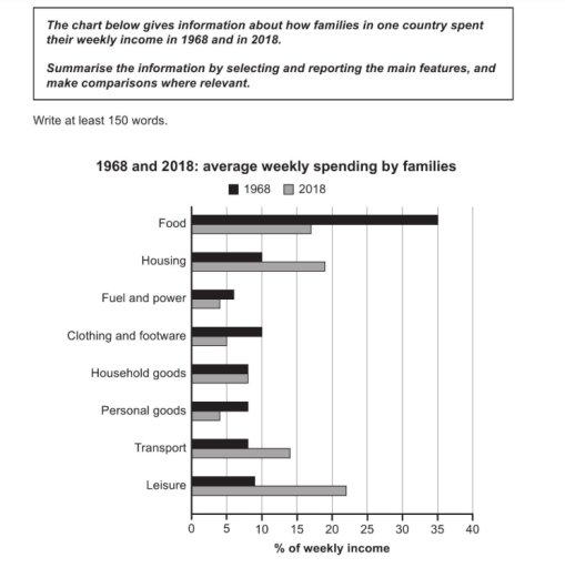
The bar chart compares how families in one country spent their weekly income on various items in 1968 and in 2018.
Overall, it is clear that spending patterns changed significantly over the 50-year period. In 1968, families spent the largest proportion of their income on food, while in 2018, housing became the biggest expense. Spending on leisure and transport also increased, whereas food and clothing saw a decrease.
In 1968, food took up the highest percentage of weekly income, at around 35%. This dropped sharply to just under 20% in 2018. Housing was the second-largest expense in 1968, at about 10%, but rose to over 15% in 2018, making it the top category in that year. Similarly, spending on leisure increased from around 8% to nearly 22%, showing the greatest rise among all categories.
Transport spending also went up slightly, from just under 8% to around 14%. On the other hand, the percentage spent on clothing and footwear dropped from about 10% to less than 5%, and household goods also fell slightly. Spending on fuel and power and personal goods remained quite similar over the years, with only small changes.
Word Count: 190