🔥 Today Only: Save 30% on Premium — Offer Ends Soon! - Upgrade Now!
Bar Chart

Band 4+: The chart below shows how frequently people in the USA ate in fast food restaurants between 2003 and 2013. Summarize the information by selecting and reporting the main features, and make comparisons where relevant.

Image for topic: The chart below shows how frequently people in the USA ate in fast food restaurants between 2003 and 2013. Summarize the information by selecting and reporting the main features, and make comparisons where relevant.
Our system will evaluate the answer based on this AI-generated description.
The image shows a bar chart comparing the frequency of eating at fast food restaurants among people in the USA from 2003 to 2013. The percentages of people who ate fast food everyday decreased from 5% in 2003 to 3% in 2013. The number of people who ate several times a week increased from 20% in 2003 to around 26% in 2013. The percentage of people eating fast food once a week saw a slight decrease from 30% in 2003 to around 28% in 2013. The number of people eating fast food once or twice a month remained relatively stable at around 20%. The percentage of people eating fast food a few times a year increased from around 18% in 2003 to 25% in 2013. Lastly, the number of people who never ate fast food dropped from around 10% in 2003 to around 4% in 2013. Overall, there seems to be a shift towards eating fast food more frequently, but less frequently than every day.
Given the complexity of the image, the above description may not be entirely accurate.
Note: Both the topic and the answer were created by one of our users.

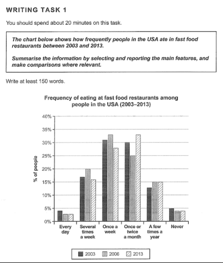
The chart illustrates the frequency of population who ate in fast food companies in 2003, 2006 and 2013 in USA.

Overall, the trend is almost the same in the different years and the 80 percent of people ate in fast food at least once a month.

The only 4 percent of population never ate to fast food restaurants in 2003, this value showed small decreased in 2006 and 2013 at 3 percent. In contrast, the 4 percent of people in 2003 went to fast food every day, the percentage showed moderate reduce at 3 percent in 2006 and 2013.

However, there is a considerably percentage of USA population who went to fast food at least once a week. In 2003, the 31 percent of USA’s citiziens went to fast food once a week and the 17 percent visited these places several times a week. The both groups showed a gradually rise in 2006, rispectively 33 percent for category of people went to fast food once a week and 20 percent for other group. In 2013 these groups showed the decrease of percentage at 5 percent. Finally, the last category is the people come to fast food chain a few times a year and that was composed by 13 percent of population in 2003 and 15 percent in 2006 and 2013.

Word Count: 220

Answers On The Same Topic:

The chart below shows how frequently people in the USA ate in fast food restaurants between 2003 and 2013. Summarize the information by selecting and reporting the main features, and make comparisons where relevant.

The bar chart provides information about the frequency of fast food consumption among people in the United States from 2003 and 2013. Overall, it is clear that the majority of people in the USA ate fast food either once a week or once or twice a month. By contrast, eating fast food every day or […]

The chart below shows how frequently people in the USA ate in fast food restaurants between 2003 and 2013. Summarize the information by selecting and reporting the main features, and make comparisons where relevant.

The bar chart illustrates the frequency of eating at fast food restaurants among people in the USA in 2003, 2006, and 2013. The data is categorized into six groups based on how often people ate fast food, ranging from “Every day” to “Never.” Overall, the most common frequency of eating fast food was “Once a […]

The chart below shows how frequently people in the USA ate in fast food restaurants between 2003 and 2013. Summarize the information by selecting and reporting the main features, and make comparisons where relevant.

The bar chart illustrates the frequency with which people consumed fast food between 2003 and 2013. Overall, the most common frequencies for fast food consumption were once a week and once or twice a month. In contrast, the smallest proportions of people either ate fast food every day or completely avoided it. Both the “several […]

The chart below shows how frequently people in the USA ate in fast food restaurants between 2003 and 2013. Summarize the information by selecting and reporting the main features, and make comparisons where relevant.

The bar chart illustrates how often Americans visited fast food restaurants over a decade from 2003 to 2013. Overall, the most common frequencies of eating at fast food restaurants were “once a week” and “a few times a month,” while the least common were “every day” and “never.” There were noticeable changes in these patterns […]

See All

Other Topics:

The chart below shows the percentage of Australian children in three groups taking part in four kinds of activities in 2018

The bar chart illustrates the percentages of Australian children in three age groups who participated in four different activities in 2012. Overall, children aged 5-8 years ranked first in art, while most children in the 9-11-year-old category took part in reading. Additionally, those between the ages of 12 and 14 recorded the highest shares of […]

Results of a survey of 1000 adolescents in five different countries and their believe in age of certain rights and responsibilities

The bar graph illustrates a survey in which a thousand adolescents from five countries were asked about the right age to get married, vote and take criminal responsabilies. Overall, Japaneses believe that duties should be taken when young people are 16 years old or older, while the other four places understand that teenagers can accept […]

The bar chart shows the percentage of self-employed workers in five countries in 1998 and 2008

The bar chart compares different categories of data over the period between 1998 and 2008, making it on percentage. Overall, it is evident that Turkey was the highest category from 1998 to 2008, whereas Russian Federation was vise verso. Another interesting point is that Turkey reached the highest peak at the begining. In 1998, Russian […]

The chart below shows the percentage of Australian children in three groups taking part in four kinds of activities in 2018

The bar chart shows the percentage of Australian children participating in four kinds of activities – art, reading, riding a bicycle, and watching TV – in 2012. Overall, watching TV was the most common activity among all three age demographics, with participation increasing slightly with age. Similarly, participation in cycling rose as children grew older, […]

Writing Task 1 You should spend about 20 minutes on this task. The chart below shows the percentage of a drug company's total sales, by region, from 2002 to 2006.Summarise the information by selecting and reporting the main features, and make comparisons where relevant. You should write at least 150 words.

The bar chart compares the percentage of total sales of a drug company in America, Europe, and Asia, between 2002 and 2006. Overall, America and Europe experienced a downward trend in the percentage of the drug company’s total sales, while Asia had the opposite tendency. Besides, Asia became the region that generated the highest sales […]

the bar chart below shows the number of students who chose certain subjects in 2005

The bar chart illustrates the number of students choosing eight different university subjects, divided into males and females, in 2005. Overall, the bar chart compares information about men and women. In addition, men had a large portion in Applied Sciences and Mathematics, while women reached a peak in Social Sciences and Languages. Besides, Languages and […]

See All
We have detected unusual activity on your device.
Please verify your identity to continue.
Note: This verification step won't sign you in. If you have a premium account, please log in to access the service as usual.
Google/Gmail Verification
Or verify using Email/Code
We've sent a verification code to:
youremail@gmail.com (Not your email?)
Enter it below to complete the verification process.
Ensure your email address is correct, your inbox is not full, and you check your spam folder. If no email arrives, consider using an alternative email.
You will need a Premium plan to perform your action!
Note: If you already have a premium account, please log in to access our services as usual.

Plans & Pricing

Our mission is to make quality education accessible for everyone.
However, to keep our hardworking team running and this service alive, we genuinely need your support!
By opting for a premium plan, not only do you sustain us in achieving the mission, but you also unlock advanced features to enrich your learning experience.

Free

For learners who aren't pressed for time

What's included on Free
100+ Cambridge IELTS Tests
Instant IELTS Writing Task 1 & 2 Evaluation (2 times/month)
Instant IELTS Speaking Part 1, 2, & 3 Evaluation (5 times/month)
Instant IELTS Writing Task 1 & 2 Essay Generator (2 times/month)
500+ Dictation & Shadowing Exercises
100+ Pronunciation Exercises
Flashcards
Other Advanced Tools

Premium

For those serious about advancing their English proficiency, and for IELTS candidates aspiring to boost their band score by 1-2 points (especially in writing & speaking) in just 30 days or less

What's included on Premium
Save Your IELTS Test Progress
Unlock All Courses & IELTS Tests
Unlimited AI Conversations
Unlimited AI Writing Enhancement Exercises
Unlimited IELTS Writing Task 1 & 2 Evaluation
Unlimited IELTS Speaking Part 1, 2, & 3 Evaluation
Checked Answers Will Not Be Published
Unlimited IELTS Writing Task 1 & 2 Essay Generator
Unlimited IELTS Speaking Part 1, 2, & 3 Sample Generator
Unlimited Usage Of Advanced Tools
Priority Support within 24h (12-month plan only)

Due to the nature of our service and the provided free trials, payments are non-refundable.
Nếu bạn là người Việt Nam và không có hoặc không muốn trả bằng credit/debit cards, bạn có thể thanh toán bằng phương thức chuyển khoản:


Chọn gói:
419,000₫ 277,000 ₫ cho gói 1 tháng (chỉ 9,233₫/ngày)
1,239,000₫ 597,000 ₫ cho gói 3 tháng (chỉ 6,633₫/ngày)
2,469,000₫ 1,027,000 ₫ cho gói 6 tháng (chỉ 5,706₫/ngày)
4,929,000₫ 1,417,000 ₫ cho gói 12 tháng (chỉ 3,936₫/ngày)


Sau khi chuyển khoản, vui lòng đợi trình duyệt tự động điều hướng bạn trở lại Engnovate và bạn sẽ ngay lập tức nhận được mã kích hoạt tài khoản premium.
Nếu có lỗi xảy ra, bạn có thể liên hệ với team thông qua một trong các phương thức: email đến helloengnovate@gmail.com hoặc nhắn tin qua facebook.com/engnovate.
Vì toàn bộ công cụ trên website đều có thể sử dụng thử miễn phí, Engnovate không hỗ trợ hoàn tiền.