🔥 Today Only: Save 30% on Premium — Offer Ends Soon! - Upgrade Now!
Bar Chart

Band 6+: The chart below shows how frequently people in the USA ate in fast food restaurants between 2003 and 2013. Summarize the information by selecting and reporting the main features, and make comparisons where relevant.

Image for topic: The chart below shows how frequently people in the USA ate in fast food restaurants between 2003 and 2013. Summarize the information by selecting and reporting the main features, and make comparisons where relevant.
Our system will evaluate the answer based on this AI-generated description.
The image shows a bar chart comparing the frequency of eating at fast food restaurants among people in the USA from 2003 to 2013. The percentages of people who ate fast food everyday decreased from 5% in 2003 to 3% in 2013. The number of people who ate several times a week increased from 20% in 2003 to around 26% in 2013. The percentage of people eating fast food once a week saw a slight decrease from 30% in 2003 to around 28% in 2013. The number of people eating fast food once or twice a month remained relatively stable at around 20%. The percentage of people eating fast food a few times a year increased from around 18% in 2003 to 25% in 2013. Lastly, the number of people who never ate fast food dropped from around 10% in 2003 to around 4% in 2013. Overall, there seems to be a shift towards eating fast food more frequently, but less frequently than every day.
Given the complexity of the image, the above description may not be entirely accurate.
Note: Both the topic and the answer were created by one of our users.

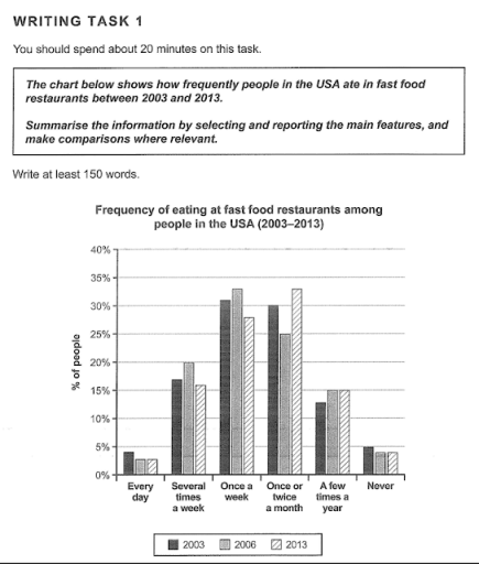
The bar chart illustrates how often American citizens went to junk food restaurant in the 3 period of time (2003, 2006 and 2013).

It is clear that almost half the Americans eat fast foods at restaurants either a few times or once a week between 2003 and 2013. The only exception to this pattern is not eating fast food, which declined.

Looking first of all, in the start of the period, people having fast food once a week stood at just over 30% and rose by 3% in 2006, after which it experienced a drop to approximately 5% in 2013. In contrast, the group comprised of people who went to restaurants once or twice a month witnessed a decline of 10% between 2003 and 2006. Following this, it surpassed people eating fast food weekly by rising to roughly speaking 33% in the final year of the period. Whereas, in none of the three years were more than 5% of individuals who never ate fast food. The consumers of eating junk food daily slightly declined through the years.

177 words

Word Count: 179

Answers On The Same Topic:

The chart below shows how frequently people in the USA ate in fast food restaurants between 2003 and 2013. Summarize the information by selecting and reporting the main features, and make comparisons where relevant.

The bar chart provides information about the frequency of fast food consumption among people in the United States from 2003 and 2013. Overall, it is clear that the majority of people in the USA ate fast food either once a week or once or twice a month. By contrast, eating fast food every day or […]

The chart below shows how frequently people in the USA ate in fast food restaurants between 2003 and 2013. Summarize the information by selecting and reporting the main features, and make comparisons where relevant.

The bar chart illustrates the frequency of eating at fast food restaurants among people in the USA in 2003, 2006, and 2013. The data is categorized into six groups based on how often people ate fast food, ranging from “Every day” to “Never.” Overall, the most common frequency of eating fast food was “Once a […]

The chart below shows how frequently people in the USA ate in fast food restaurants between 2003 and 2013. Summarize the information by selecting and reporting the main features, and make comparisons where relevant.

The bar chart illustrates the frequency with which people consumed fast food between 2003 and 2013. Overall, the most common frequencies for fast food consumption were once a week and once or twice a month. In contrast, the smallest proportions of people either ate fast food every day or completely avoided it. Both the “several […]

The chart below shows how frequently people in the USA ate in fast food restaurants between 2003 and 2013. Summarize the information by selecting and reporting the main features, and make comparisons where relevant.

The bar chart illustrates how often Americans visited fast food restaurants over a decade from 2003 to 2013. Overall, the most common frequencies of eating at fast food restaurants were “once a week” and “a few times a month,” while the least common were “every day” and “never.” There were noticeable changes in these patterns […]

See All

Other Topics:

The chart shows components of GDP in Australia from 2012 to 2020.

The bar chart presents the percentage of Australian GDP constituents from finance and automotive domains between 2012 and 2020. Overall, the proportion of GDP from automotive and finance markedly increased over the period, with the former rising more moderately than the later. GDP gaps between these two sectors witnessed a gradual shrank before the year […]

The bar chart shows the number of homes,each worth 5 million US dollars or more,sold in eight cities

The bar chart illustrates the number of houses, costing 5 million dollars each, sold in eight distinct cities between 2009 and 2014. Overall, the highest sales figures belonged to London in both years, while the reverse was true for Dubai. Additionally, although all the rates underwent noticeable rises, that for Singapore dropped markedly. To begin […]

• Task 1: The chart below compares the percentage of time Australian mothers and fathers spent helping their children with four activities in 2013.

The bar chart compares how much time that parents in Australia spent assisting their children with various activities in 2013. Overall, mothers spent most of their time helping their children get dressed and doing homework, while playing games and preparing for bed made up the most time for both parents. Notably, the fathers spent the […]

The bar chart below shows numbers of seals, whales and dolphins recorded in the Gormez Straits from 2006 to 2018. Summarise the information by selecting and reporting the main features, and make comparisons where relevant. Write at least 150 words.

The given bar chart illustrates the numbers of sea creatures, namely seals, whales, as well as dolphins, registered in the Gormez Straits over a 12-year period from 2006 to 2018. Overall, it is readily apparent that the population of dolphins increased sharply throughout the period, whereas the numbers of seals and whales remained relatively stable […]

The diagram below shows the number of landline telephones per 1000 people in different countries over a five-year period

The diagram illustrates the usage of telephones per 1000 people in Asian countries over early 20s In 2000 Brunei Darussallam had over 200 landline telephone, however in 2002 this number reached of it’s peak 250 landline telephones, according to diagram in 2004 thing start to get off trend as the number of users drop slightly […]

You should spend about 20 minutes on this task.Write atleast1o0 words The charts below give information on the location and types of dance classes young people in a town in Australia arecurrently attending. Summarise the information by selecting and reporting the main features, and make comparisons where relevant

The pie chart and the bar chart provide data about the locations and variety of dance classes among adolescents and children in a particular town in Australia are currently attending. 1Overall, observing the pie chart, it is noticeable that private studios include almost half of all attending locations. Looking on the bar chart, the biggest […]

See All
We have detected unusual activity on your device.
Please verify your identity to continue.
Note: This verification step won't sign you in. If you have a premium account, please log in to access the service as usual.
Google/Gmail Verification
Or verify using Email/Code
We've sent a verification code to:
youremail@gmail.com (Not your email?)
Enter it below to complete the verification process.
Ensure your email address is correct, your inbox is not full, and you check your spam folder. If no email arrives, consider using an alternative email.
You will need a Premium plan to perform your action!
Note: If you already have a premium account, please log in to access our services as usual.

Plans & Pricing

Our mission is to make quality education accessible for everyone.
However, to keep our hardworking team running and this service alive, we genuinely need your support!
By opting for a premium plan, not only do you sustain us in achieving the mission, but you also unlock advanced features to enrich your learning experience.

Free

For learners who aren't pressed for time

What's included on Free
100+ Cambridge IELTS Tests
Instant IELTS Writing Task 1 & 2 Evaluation (2 times/month)
Instant IELTS Speaking Part 1, 2, & 3 Evaluation (5 times/month)
Instant IELTS Writing Task 1 & 2 Essay Generator (2 times/month)
500+ Dictation & Shadowing Exercises
100+ Pronunciation Exercises
Flashcards
Other Advanced Tools

Premium

For those serious about advancing their English proficiency, and for IELTS candidates aspiring to boost their band score by 1-2 points (especially in writing & speaking) in just 30 days or less

What's included on Premium
Save Your IELTS Test Progress
Unlock All Courses & IELTS Tests
Unlimited AI Conversations
Unlimited AI Writing Enhancement Exercises
Unlimited IELTS Writing Task 1 & 2 Evaluation
Unlimited IELTS Speaking Part 1, 2, & 3 Evaluation
Checked Answers Will Not Be Published
Unlimited IELTS Writing Task 1 & 2 Essay Generator
Unlimited IELTS Speaking Part 1, 2, & 3 Sample Generator
Unlimited Usage Of Advanced Tools
Priority Support within 24h (12-month plan only)

Due to the nature of our service and the provided free trials, payments are non-refundable.
Nếu bạn là người Việt Nam và không có hoặc không muốn trả bằng credit/debit cards, bạn có thể thanh toán bằng phương thức chuyển khoản:


Chọn gói:
419,000₫ 277,000 ₫ cho gói 1 tháng (chỉ 9,233₫/ngày)
1,239,000₫ 597,000 ₫ cho gói 3 tháng (chỉ 6,633₫/ngày)
2,469,000₫ 1,027,000 ₫ cho gói 6 tháng (chỉ 5,706₫/ngày)
4,929,000₫ 1,417,000 ₫ cho gói 12 tháng (chỉ 3,936₫/ngày)


Sau khi chuyển khoản, vui lòng đợi trình duyệt tự động điều hướng bạn trở lại Engnovate và bạn sẽ ngay lập tức nhận được mã kích hoạt tài khoản premium.
Nếu có lỗi xảy ra, bạn có thể liên hệ với team thông qua một trong các phương thức: email đến helloengnovate@gmail.com hoặc nhắn tin qua facebook.com/engnovate.
Vì toàn bộ công cụ trên website đều có thể sử dụng thử miễn phí, Engnovate không hỗ trợ hoàn tiền.