🔥 Today Only: Save 30% on Premium — Offer Ends Soon! - Upgrade Now!
Table

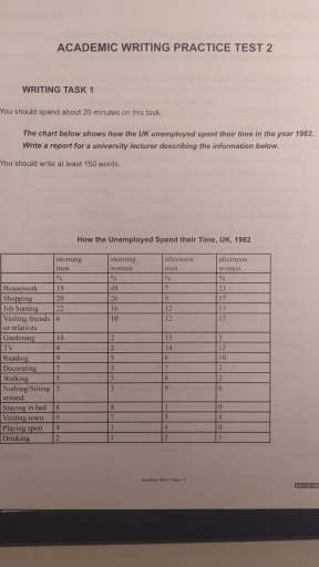
Band 4+: The chart below shows how the UK unemployed spent their time in the year 1982.

Image for topic: The chart below shows how the UK unemployed spent their time in the year 1982.
Our system will evaluate the answer based on this AI-generated description.
The image presents a table detailing how the unemployed spent their time in the UK in 1982, divided into morning, afternoon, and evening activities. Housework: 20 (morning), 16 (afternoon), 19 (evening); Shopping: 26 (morning), 10 (afternoon), 17 (evening); Job Hunting: 22 (morning), 19 (afternoon), 12 (evening); Visiting friends: 29 (morning), 24 (afternoon), 13 (evening); Writing/Broadcasting: 2 (morning), 11 (afternoon), 17 (evening); Car repairs/DIY: 16 (morning), 13 (afternoon), 7 (evening); Gardening: 17 (morning), 18 (afternoon), 7 (evening); Reading: 5 (morning), 8 (afternoon), 18 (evening); Sports: 9 (morning), 15 (afternoon), 6 (evening); Hobbies: 9 (morning), 7 (afternoon), 8 (evening); Watching TV: 4 (morning), 9 (afternoon), 22 (evening); Resting: 4 (morning), 7 (afternoon), 6 (evening); Eating: 0 for all three periods; Playing: 9 (morning), 6 (afternoon), 0 (evening); Socializing: 2 (morning), 0 (afternoon), 8 (evening); Talking: 0 (morning), 8 (afternoon), 9 (evening); Doing nothing: 10 (morning), 17 (afternoon), 10 (evening); Drinking: 0 for all three periods.
Given the complexity of the image, the above description may not be entirely accurate.
Note: Both the topic and the answer were created by one of our users.

The table chart demonstrates that how the unemployed individuals of United Kingdom distribute their time during the year of 1982. Overall, it can be seen that morning women and afternoon men had highest share in the form of housework. However, job hunting men had largest proportion in morning time. Whereas, drinking made up lowest figure in both categories.

Initially, almost 19% morning men spend their time in housework activities but this figure drop around 7% in afternoon. While, morning women account for 49%. Moreover, this percentage declined about 21%. Mostly, 20%, 22% morning person utilize their time in shopping and job hunting. In contrast, morning women represent 49% share for housework and afternoon women just 21%. Furthermore, morning women involved in shopping and hunting almost 26%, 18%.

Following this, morning men spend limited periods in sitting, playing sport and drinking approximately 3%, 4% and only 2%. Actually, this pattern repeat in morning women, account for around 1%, 3% in playing and drinking and 3% in sitting around.

Word Count: 167

Answers On The Same Topic:

The chart below shows how the UK unemployed spent their time in the year 1982.

The chart illustrates the information about how the UK unemployed spent their times in the 1982. Overall, there are 14 types of pursuits that the unemployed British did, from which housework was popular among men and women, and drinking experienced the lowest demand. To begin with women, they had a tendency for shopping and household […]

The chart below shows how the UK unemployed spent their time in the year 1982.

The table compares how unemployed females and males in the UK spent their time in 1982. The data includes both genders’ morning and afternoon routines. Overall, it is evident that the percentage of women who did housework, shopping, or visited relatives or friends was significantly higher than the rate for men. Meanwhile, the proportion of […]

The chart below shows how the UK unemployed spent their time in the year 1982.

The figure illustrates how jobless people utilized their time in the UK in the year 1982. The units of measurement are given in percentages. Overall, men mostly spent their morning hours searching for jobs and only a few spent that time drinking, sitting around and playing sports. As far as women were concerned, majority concentrated […]

The chart below shows how the UK unemployed spent their time in the year 1982.

The chart provides us with a statistic about unemployed people in the UK and how they spend their time. As shown at the table, we have the information on how people prefer to spend their leisure time. Both women and men actually have the criteria, like morning and afternoon. For example, the data shows as […]

See All

Other Topics:

The chart below shows the percentage of people who used different types of transportation in a city in 2010 and 2020. Transportation types: Car Bus Train Bicycle Data (for your reference): Transport 2010 2020 Car 45% 40% Bus 25% 30% Train 20% 22% Bicycle 10% 8% Write a summary of the information. You should write 150-170 words.

The tabular chart illustrates the proportion of individuals using four different kind of transportation in a particular city during 2010 to 2020. Overall, it can be clearly seen that private cars were dominated way of transport in both years, while least people perfered travelling by bicycle. Turning into the details, vast majority of traveller choose […]

The graph below shows the percentage of people unemployed in the total labour workforce across 9 countries between 1994 and 2004. Summarize the graph by selecting and reporting the main features, and make comparisons where relevant.

The table above shows the percentage of unemployment in the total labour workforce of Ireland, Poland, Italy, Canada, The UK, Germany, The USA, Australia and Japan in 1994 and 2004 A noticeable pattern in 9 of these countries is that most of them had decreased in 2004 compared to 1994. In 1994, Ireland was the […]

The table shows questionnaires about the opinions of club members and the general public for the new theatre in one town in 2012. Summarise the information by selecting and reporting the main features, and make comparisons where relevant.

It is shown by a given table investigations related to the views of the public and members of club towards the brand-new theatre in a certain town in the year 2012. Overall, it is crystal clear that information of the theatre obtained higher proportions of poor opinion between club members and public, compared with those […]

The table below provides information on the projected changes in energy consumption from renewable and non-renewable sources across ten different regions of the world, from 2010 to 2050.

The table indicates statistical data related to energy consumption across ten different regions of the world in 2010 and 2020, with estimations for 2050. Overall, it is apparent that energy consumption is expected to increase in most regions, but the most distinctive feature is that Asia is forecast to experience the most dramatic upward trend […]

The table below shows the production of milk annually in four countries in 1990, 2000 and 2010. Summarise the information by selecting and reporting the main features and make comparisons where relevant.

The table illustrates how much milk was produced annually in four various nations between 1990 and 2010. Overall, it is evident that the majority of countries witnessed an upward trend, with the exception of Australia. Notably, the Netherlands consistently recorded the highest figure throughout the entire period. In the initial year, the production of milk […]

The table shows the two age groups participating in the marathon from 2008 to 2012. Summarize the information by selecting and reporting the main features, and make comparisons where relevant.

The table shows two different age groups range from 18 to 39 and the other one going from 40 and above both participated in the marathon in the period from 2008 to 2012 and the total of both groups in each year. In the year 2008 the total of participants are 2000 the age group […]

See All
We have detected unusual activity on your device.
Please verify your identity to continue.
Note: This verification step won't sign you in. If you have a premium account, please log in to access the service as usual.
Google/Gmail Verification
Or verify using Email/Code
We've sent a verification code to:
youremail@gmail.com (Not your email?)
Enter it below to complete the verification process.
Ensure your email address is correct, your inbox is not full, and you check your spam folder. If no email arrives, consider using an alternative email.
You will need a Premium plan to perform your action!
Note: If you already have a premium account, please log in to access our services as usual.

Plans & Pricing

Our mission is to make quality education accessible for everyone.
However, to keep our hardworking team running and this service alive, we genuinely need your support!
By opting for a premium plan, not only do you sustain us in achieving the mission, but you also unlock advanced features to enrich your learning experience.

Free

For learners who aren't pressed for time

What's included on Free
100+ Cambridge IELTS Tests
Instant IELTS Writing Task 1 & 2 Evaluation (2 times/month)
Instant IELTS Speaking Part 1, 2, & 3 Evaluation (2 times/month)
Instant IELTS Writing Task 1 & 2 Essay Generator (2 times/month)
500+ Dictation & Shadowing Exercises
100+ Pronunciation Exercises
Flashcards
Other Advanced Tools

Premium

For those serious about advancing their English proficiency, and for IELTS candidates aspiring to boost their band score by 1-2 points (especially in writing & speaking) in just 30 days or less

What's included on Premium
Save Your IELTS Test Progress & Analyze Mistakes By Question Type
Save Your Own Flashcard Sets & Use Them On Any Device
Unlock All Courses, IELTS Tests, Section & Part Practice
Unlimited AI Conversations
Unlimited AI Writing Enhancement Exercises
Unlimited IELTS Writing Task 1 & 2 Evaluation
Unlimited IELTS Speaking Part 1, 2, & 3 Evaluation
Checked Answers Will Not Be Published
Unlimited IELTS Writing Task 1 & 2 Essay Generator
Unlimited IELTS Speaking Part 1, 2, & 3 Sample Generator
Unlimited Usage Of Advanced Tools & AI Features
Priority Support within 24h (12-month plan only)

Due to the nature of our service and the provided free trials, payments are non-refundable.