🔥 Today Only: Save 30% on Premium — Offer Ends Soon! - Upgrade Now!
Multiple Graphs

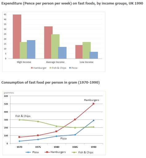
Band 9: The chart below shows the amount of money per week spent on fast foods in Britain. The graph shows the trends in consumption of fast foods.

Image for topic: The chart below shows the amount of money per week spent on fast foods in Britain. The graph shows the trends in consumption of fast foods.
Our system will evaluate the answer based on this AI-generated description.
The image contains two graphs related to fast food consumption in the UK. The first graph, "Expenditure (Pence per person per week) on fast foods, by income groups, UK 1990" shows three income groups: High Income, Average Income, Low Income, with their expenditure on three types of fast foods: Hamburger, Fish & Chips, Pizza. High Income spends around 40 on Hamburgers, 25 on Fish & Chips, and 15 on Pizza. Average Income spends around 25 on Hamburgers, 30 on Fish & Chips, and 15 on Pizza. Low Income spends around 15 on Hamburgers, 20 on Fish & Chips, and 10 on Pizza. The second graph, "Consumption of fast food per person in gram (1970-1990)" is a line graph with three lines representing Pizza, Hamburgers, and Fish & Chips from 1970 to 1990. In 1970, Pizza is around 25 grams, Hamburgers 50 grams, and Fish & Chips 300 grams. In 1975, Pizza is around 50 grams, Hamburgers 150 grams, and Fish & Chips 375 grams. In 1980, Pizza is around 100 grams, Hamburgers 200 grams, and Fish & Chips 375 grams. In 1985, Pizza is around 200 grams, Hamburgers 325 grams, and Fish & Chips 350 grams. In 1990, Pizza is around 300 grams, Hamburgers 475 grams, and Fish & Chips 300 grams.
Given the complexity of the image, the above description may not be entirely accurate.
Note: Both the topic and the answer were created by one of our users.

The bar chart compares weekly expenditure on three types of fast food among different income groups in the UK in 1990, while the line graph shows changes in the consumption of these foods between 1970 and 1990 in the same country.

Overall, hamburgers were the most popular fast food, particularly among high-income groups, and their consumption increased significantly over time. In contrast, fish and chips became less popular, while pizza consumption rose steadily during the period.

In terms of expenditure, people with higher incomes spent the most on hamburgers, at around 40-45 pence per person per week. Spending on fish and chips and pizza was much lower, both remaining below 20 pence. For average earners, hamburgers were still the most purchased item, whereas among low-income groups fish and chips slightly exceeded hamburger spending.

Regarding consumption trends, the amount of hamburgers eaten rose dramatically from about 80 grammes in 1970 to over 500 grammes in 1990, becoming the most consumed fast food by the end of the period. By contrast, fish and chips consumption fell from roughly 300 grammes to around 200 grammes. Pizza, on the other hand, showed the opposite pattern, increasing gradually from a very low level to approximately 250-300 grammes in 1990.

Word Count: 204

Answers On The Same Topic:

The chart below shows the amount of money per week spent on fast foods in Britain. The graph shows the trends in consumption of fast foods.

The line graph demonstrates the quantity of budget for one week spent on Fast Food to Britain people. As an overall trend,the indicator of consumption of fast food in the UK were very differences. According to the graph each line was in various level which illustrates their level after. It can be clearly seen that […]

The chart below shows the amount of money per week spent on fast foods in Britain. The graph shows the trends in consumption of fast foods.

The bar chart illustrates the weekly expenditure of British people on fast foods, while the line chart depicts the number of fast foods consumed between 1970 and 1990 in grammes. People with average and high incomes prefer to consume expensive hamburgers rather than pizza and fish and chips. They are willing to spend approximately 34 […]

The chart below shows the amount of money per week spent on fast foods in Britain. The graph shows the trends in consumption of fast foods.

The bar chart highlights data on the amount of money in pence per person per week that people at different income levels in the UK spent on different fast foods in the year 1990, while the line graph illustrates the amount of the same fast foods eaten by the British over a twenty-year period between […]

The chart below shows the amount of money per week spent on fast foods in Britain. The graph shows the trends in consumption of fast foods.

The charts illustrate the amount of money spent on fast food each week in Britain. The graph depicts trends in fast food consumption. To begin with, the expenditure on fast food varies by income group, specifically for hamburgers, fish and chips, and pizza. This graph shows how much each person spends per week on these […]

See All

Other Topics:

You should spend about 20 minutes on this task. The charts below give information about a public library in a town called Little Chalfont. Summarise the information by selecting and reporting the main features, and make comparisons where relevant. Write at least 150 words

The charts provide an overview of Little Chalfont Library, showcasing the age distribution of its members and a breakdown of book loans by category in 2016, alongside the total number of items borrowed between 2007 and 2016. Overall, the library’s membership was heavily dominated by adults aged 18 to 64, while fictional material for both […]

The two graphs below show the average hours of daily sunshine and temperature throughout the year in two cities in Australia.

The given line graphs illustrate the average daytime sunshine hours and the average temperature within one year in two particular cities in Australia. Overall, it is evident that the average temperature was by far higher in Darwin compared to Melbourne. Notably, both cities’ temperatures increased gradually during the summer and declined in winter. Moreover, while […]

The line graph shows how much money overseas visitors spent in the UK from 1980 - 2010 and the pie charts show the reasons for their visits in 1980 and 2010. Summarise the information by selecting and reporting the main features and make comparisons where relevant. Write at least 150 words.

The line graph describes how much overseas tourists spent their cash between 1980 and 2010 and the pie charts describes readon for their trip. There is major difference from 1980 to 2010. The amount of cash the visitors spent was grown not gradually in 30 years. There was peak of the money, which was given […]

The pie chart below shows the proportion of staff employed by age

The two pie charts show the percentage of public sector workers in the UK by age. The data is from two years 2015 and 2020. Overall, we can see that the age of workers changed between 2015 and 2020. In 2015 the workforce was more balanced. However, in 2020, there were many more younger workers […]

The charts below give information on the location and types of dance classes young people in a town in Australia are currently attending. Summarise the information by selecting and reporting the main features, and make comparisons where relevant. Write at least 150 words. Location of dance classes Community halls & other 18% 目 Private -studios 48% School halls (after-school) 24% College-based studios 10% Types of dance classes (by age group) Under 11 11-16 Ballet Tap Modern 100 200 96 →p. 136 300 400 Number of students 500 600 700

The two different charts provide information about the location of dance classes and their types by age brackets. Overall, the share of private studios accounted for nearly half of the total, while the gaps between the two age groups in the types of dance classes were large. As you can see, the percentage of private […]

You should spend about 20 minutes on this task. The pie charts show the first place Germans and Nigerians go to in order to access the news in a typical week. Summarise the information by selecting and reporting the main features, and make comparisons where relevant. Write at least 150 words

The pai charts compare the proportion of people going first to a certain source to check the news, broked douwn by nation. Overall, in Germany, a majority of people who start with newspaper were seen, in contrast to the other sources, where only a minority of individuals were recorded. As for Nigerland, the primary source […]

See All
We have detected unusual activity on your device.
Please verify your identity to continue.
Note: This verification step won't sign you in. If you have a premium account, please log in to access the service as usual.
Google/Gmail Verification
Or verify using Email/Code
We've sent a verification code to:
youremail@gmail.com (Not your email?)
Enter it below to complete the verification process.
Ensure your email address is correct, your inbox is not full, and you check your spam folder. If no email arrives, consider using an alternative email.
You will need a Premium plan to perform your action!
Note: If you already have a premium account, please log in to access our services as usual.

Plans & Pricing

Our mission is to make quality education accessible for everyone.
However, to keep our hardworking team running and this service alive, we genuinely need your support!
By opting for a premium plan, not only do you sustain us in achieving the mission, but you also unlock advanced features to enrich your learning experience.

Free

For learners who aren't pressed for time

What's included on Free
100+ Cambridge IELTS Tests
Instant IELTS Writing Task 1 & 2 Evaluation (2 times/month)
Instant IELTS Speaking Part 1, 2, & 3 Evaluation (5 times/month)
Instant IELTS Writing Task 1 & 2 Essay Generator (2 times/month)
500+ Dictation & Shadowing Exercises
100+ Pronunciation Exercises
Flashcards
Other Advanced Tools

Premium

For those serious about advancing their English proficiency, and for IELTS candidates aspiring to boost their band score by 1-2 points (especially in writing & speaking) in just 30 days or less

What's included on Premium
Save Your IELTS Test Progress
Unlock All Courses & IELTS Tests
Unlimited AI Conversations
Unlimited AI Writing Enhancement Exercises
Unlimited IELTS Writing Task 1 & 2 Evaluation
Unlimited IELTS Speaking Part 1, 2, & 3 Evaluation
Checked Answers Will Not Be Published
Unlimited IELTS Writing Task 1 & 2 Essay Generator
Unlimited IELTS Speaking Part 1, 2, & 3 Sample Generator
Unlimited Usage Of Advanced Tools
Priority Support within 24h (12-month plan only)

Due to the nature of our service and the provided free trials, payments are non-refundable.
Nếu bạn là người Việt Nam và không có hoặc không muốn trả bằng credit/debit cards, bạn có thể thanh toán bằng phương thức chuyển khoản:


Chọn gói:
419,000₫ 277,000 ₫ cho gói 1 tháng (chỉ 9,233₫/ngày)
1,239,000₫ 597,000 ₫ cho gói 3 tháng (chỉ 6,633₫/ngày)
2,469,000₫ 1,027,000 ₫ cho gói 6 tháng (chỉ 5,706₫/ngày)
4,929,000₫ 1,417,000 ₫ cho gói 12 tháng (chỉ 3,936₫/ngày)


Sau khi chuyển khoản, vui lòng đợi trình duyệt tự động điều hướng bạn trở lại Engnovate và bạn sẽ ngay lập tức nhận được mã kích hoạt tài khoản premium.
Nếu có lỗi xảy ra, bạn có thể liên hệ với team thông qua một trong các phương thức: email đến helloengnovate@gmail.com hoặc nhắn tin qua facebook.com/engnovate.
Vì toàn bộ công cụ trên website đều có thể sử dụng thử miễn phí, Engnovate không hỗ trợ hoàn tiền.