🔥 Today Only: Save 30% on Premium — Offer Ends Soon! - Upgrade Now!
Bar Chart

Band 5+: The chart below shows the ampunt spent on six consumer goods in four Europian countries

Image for topic: The chart below shows the ampunt spent on six consumer goods in four Europian countries
Our system will evaluate the answer based on this AI-generated description.
The image presents a horizontal bar chart comparing the amount spent on six consumer goods in Britain, France, Italy, and Germany. Britain has the highest expenditure in 'Photographic film' at about 175 units, 'Toys' at approximately 155 units, and 'Perfumes' close to 168 units. France leads spending on 'Personal stereos' at just over 160 units and 'CDs' at around 147 units, while Italy tops in 'Tennis racquets' at nearly 138 units. For 'Photographic film,' France, Italy, and Germany spend roughly 165, 158, and 145 units, respectively. 'Toys' expenditure is about 145 units in France, 145 units in Italy, and 140 units in Germany. Italy spends around 145 units on 'CDs,' and Germany spends approximately 140 units. 'Perfumes' see France, Italy, and Germany spending in the vicinity of 155, 153, and 143 units, respectively. In 'Tennis racquets,' Britain expends close to 135 units, France about 125 units, and Germany around 123 units. Lastly, 'Personal stereos' expenses are approximately 155 units in Britain, 148 units in Italy, and 130 units in Germany. Scale measurement is unmarked, but units range from 130 to 175, divided into increments of 5.
Given the complexity of the image, the above description may not be entirely accurate.
Note: Both the topic and the answer were created by one of our users.

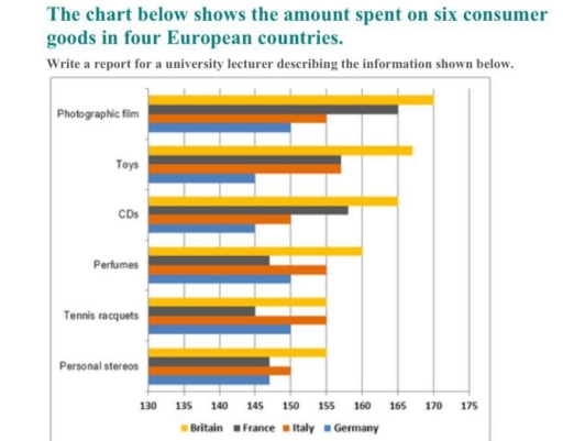
The report illustrates the difference between 4 European countries in the sector of different consumer goods.

We can conclude that Britain Has he highest amount of consumer goods in most of the catagories. Even though , the amount of tennis racquets of Britain and Italy is exactly the same. Still , this make Britain still the highest overall.

Italy is also one of the highest countries listed in the chart. It’s competitive France but is considered fairly more high on consuming goods.

Consequently, Germany showcase least amount spent on consumer good between the other European countries, it is reported that Germany is the lowest in Photographic Films and CD’s and personal Steros . Whilst France is also fairly low, as France shares a few similar rates with Italy and Germany in various Goods and is the least country to consume perfumes, tennis racquets as well as personal steros.

Word Count: 148

Answers On The Same Topic:

The chart below shows the ampunt spent on six consumer goods in four Europian countries

The chart illustrates the expenditures on six consumer goods across four European countries. Overall, it is obvious that the volume spent the most money on photographic film. Additionally, while Britain spends more on consumer goods, Germany spends the least except for perfumes. To begin with, 170 millions dollars was spent by on photographic, film and […]

The chart below shows the ampunt spent on six consumer goods in four Europian countries

The chart illustrates the expenditure on six consumer goods across four European countries. Overall, it is obvious that the volume spent the most money on photographic film. Additionally, while Britain spends more on consumer goods, Germany spends the least except for perfumes. To begin with, 170 millions dollars of Britain spent for photographic film and […]

The chart below shows the ampunt spent on six consumer goods in four Europian countries

The supplied bar char displays the number spent on six consumer comodity in four Europian states such as Britain, Germany, France and Italy. As an overall trend that Britain the coutry with the highest consumption in all outgoing items such as Photographic cinematic records, Infant’s things for playing , CDs although Porfumes, Tennis racquets, prived […]

See All

Other Topics:

The chart shows the changes in car ownership in a counrty between 1971 and 2001

the provided bar chart delineates the evolution of car ownership in a specific country over a thirty-year period from 1971 to 2001. Overall, there is a notable decline in the percentage of non-car owners, alongside an increase in individuals possessing two or more cars by the end of the period. In 1971, 48% of the […]

The bar graph below shows the stock price of four different technology companies from 2011 to 2016. Summarise the information by selecting and reporting the main features and make comparisons where relevant.

The illustration presents the stock cost of Facebook, Google, Apple, and Yahoo between 2011 and 2016. Overall, the numbers for Facebook increased steadily, whilst that of Yahoo increased. Apple company experienced dramatic fluctuations. Google stocks remained stable. In 2011, Facebook and Yahoo started off at approximately the same price at around 5500. Both companies exhibited […]

The chart below shows the proportions of the world's oil resources held in different areas, together with the proportions consumed annually in the same areas. Summarise the information by selecting and reporting the main features, and make comparisons where relevant. Write at least 150 words.

The provided chart displays information regarding the percentage of total world oil resources and annual oil consumption. Overall, it is clear that the Middle East is the highest in oil resources, far outstripping its oil consumption. Moreover, in oil consumption, Asia is the highest, while Australia and New Zealand are the lowest in both oil […]

The graph shows the sales of five types items in four different seasons at a departmental store in the US in 2011 Summarize the information by selecting and reporting the main features, and make comparisons where relevant.

The graph shows the sale of five different types of items in different seasons. In winter the women’s clothes clocked 40000 US dollars. The sports equipment had 30000 usd dollars whereas men’s clothes had 25000usd followed by cosmetics and lastly jewellery with 20000 usd. All this was winter sales. In Spring women’s clothes rose in […]

The bar graph shows the average hours of daily sunshine throughout the year in two cities of Australia. Summarise the information by selecting and reporting the main features, and make comparisons where relevant.

The bar chart compares the average hours of daily sunshine throughout the year in Sydney and Perth. Overall, Perth had the highest number of sunshine hour in january and december, while it was the lowest number of sunshine hour in june and september. In terms of sunshine, Perth had the highest number of sunshine in […]

The graph below shows the number of three types of visitors to a museum between 1997 and 2012.

The bar chart presents data on the number of three categories of visitors – adults, visitors aged under 15 and special exhibition visitors – who attended a museum over a 15-year period, spanning from 1997 to 2012. Overall, the majority of museum visitors were adults throughout the period, while special exhibition visitors represented a relatively […]

See All
We have detected unusual activity on your device.
Please verify your identity to continue.
Note: This verification step won't sign you in. If you have a premium account, please log in to access the service as usual.
Google/Gmail Verification
Or verify using Email/Code
We've sent a verification code to:
youremail@gmail.com (Not your email?)
Enter it below to complete the verification process.
Ensure your email address is correct, your inbox is not full, and you check your spam folder. If no email arrives, consider using an alternative email.
You will need a Premium plan to perform your action!
Note: If you already have a premium account, please log in to access our services as usual.

Plans & Pricing

Our mission is to make quality education accessible for everyone.
However, to keep our hardworking team running and this service alive, we genuinely need your support!
By opting for a premium plan, not only do you sustain us in achieving the mission, but you also unlock advanced features to enrich your learning experience.

Free

For learners who aren't pressed for time

What's included on Free
100+ Cambridge IELTS Tests
Instant IELTS Writing Task 1 & 2 Evaluation (2 times/month)
Instant IELTS Speaking Part 1, 2, & 3 Evaluation (5 times/month)
Instant IELTS Writing Task 1 & 2 Essay Generator (2 times/month)
500+ Dictation & Shadowing Exercises
100+ Pronunciation Exercises
Flashcards
Other Advanced Tools

Premium

For those serious about advancing their English proficiency, and for IELTS candidates aspiring to boost their band score by 1-2 points (especially in writing & speaking) in just 30 days or less

What's included on Premium
Save Your IELTS Test Progress
Unlock All Courses & IELTS Tests
Unlimited AI Conversations
Unlimited AI Writing Enhancement Exercises
Unlimited IELTS Writing Task 1 & 2 Evaluation
Unlimited IELTS Speaking Part 1, 2, & 3 Evaluation
Checked Answers Will Not Be Published
Unlimited IELTS Writing Task 1 & 2 Essay Generator
Unlimited IELTS Speaking Part 1, 2, & 3 Sample Generator
Unlimited Usage Of Advanced Tools
Priority Support within 24h (12-month plan only)

Due to the nature of our service and the provided free trials, payments are non-refundable.
Nếu bạn là người Việt Nam và không có hoặc không muốn trả bằng credit/debit cards, bạn có thể thanh toán bằng phương thức chuyển khoản:


Chọn gói:
419,000₫ 277,000 ₫ cho gói 1 tháng (chỉ 9,233₫/ngày)
1,239,000₫ 597,000 ₫ cho gói 3 tháng (chỉ 6,633₫/ngày)
2,469,000₫ 1,027,000 ₫ cho gói 6 tháng (chỉ 5,706₫/ngày)
4,929,000₫ 1,417,000 ₫ cho gói 12 tháng (chỉ 3,936₫/ngày)


Sau khi chuyển khoản, vui lòng đợi trình duyệt tự động điều hướng bạn trở lại Engnovate và bạn sẽ ngay lập tức nhận được mã kích hoạt tài khoản premium.
Nếu có lỗi xảy ra, bạn có thể liên hệ với team thông qua một trong các phương thức: email đến helloengnovate@gmail.com hoặc nhắn tin qua facebook.com/engnovate.
Vì toàn bộ công cụ trên website đều có thể sử dụng thử miễn phí, Engnovate không hỗ trợ hoàn tiền.