🔥 Today Only: Save 30% on Premium — Offer Ends Soon! - Upgrade Now!
Bar Chart

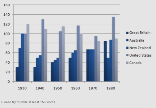
Band 6+: The chart below shows the figures for imprisonment in five countries between 1930 and 1980. Write a report for a university, lecturer describing the information shown below.

Image for topic: The chart below shows the figures for imprisonment in five countries between 1930 and 1980. Write a report for a university, lecturer describing the information shown below.
Our system will evaluate the answer based on this AI-generated description.
The image shows a bar graph with data from 5 countries—Great Britain, Australia, New Zealand, United States, and Canada—across 6 decades—1930, 1940, 1950, 1960, 1970, 1980. Units on Y-axis range from 0 to 160 with intervals of 20. In 1930, Great Britain and Australia have identical highest values at 120, followed by New Zealand at 100, the United States at 80, and Canada at 60. In 1940, Australia leads at 160, Great Britain at 140, New Zealand at 120, the United States at 100, and Canada at 80. For 1950, Australia's value decreases to 140, Great Britain and New Zealand both at 120, the United States at 100, and Canada at 80. In 1960, New Zealand's data rises to 140, Great Britain at 120, Canada increases to 100, Australia drops to 100, and the United States remains at 100. The 1970 data show New Zealand and Great Britain both at 120, the United States at 100, Australia at 80, and Canada at 60. Finally, in 1980, Australia, United States, and Canada are at 100, Great Britain at 80, and New Zealand drops to 60.
Given the complexity of the image, the above description may not be entirely accurate.
Note: Both the topic and the answer were created by one of our users.

The bar chart illustrates the numbers of imprisonment in five regions – Britain, Australia, New Zealand, the United States, and Canada from 1930 to 1980.

Overall, the United States and Canada take the largest numbers of prisoners throughout the years. While Great Britain was relatively lower between 1930 and 1979, in 1980, Britain increased steadily the numbers of imprisonment than before. Other two countries were similar to each other.

It is clearly seen that the United States had the highest number of inmates. Also, Britain had the lowest figure in 4 out of 6 years. For the United States, in 1930, the number of prisoners in the United States was the highest, with 120 thousand prisoners, then this number increased significantly to reach a peak of 140 thousand in 1980.

Canada had the highest number of prisoners in 1930 and 1960, with nearly 140 thousand people each year. In 1970, the number of prisoners in Great Britain, New Zealand, and Australia was the same, about 70 thousand people. In 1980, 50 thousand people in New Zealand were put in prison, which was the lowest figure this year.

Word Count: 187

Answers On The Same Topic:

The chart below shows the figures for imprisonment in five countries between 1930 and 1980. Write a report for a university, lecturer describing the information shown below.

The given bar chart illustrates the number of imprisonment in five different countries for 50 years of period, from 1950 to 1980. Overall, United States had the highest rate of imprisonment, while Great Britain had the lowest. In 1930, Canada had the highest rate of imprisonment with 120 thousand prisoners, at the same time, Great […]

The chart below shows the figures for imprisonment in five countries between 1930 and 1980. Write a report for a university, lecturer describing the information shown below.

The information given in the chart makes comparisons in the number of prisoners in five different countries from 1930 to 1980. While the figures for imprisonment fluctuated over the period shown, it is clear that the United States had the highest number of prisoners overall. Great Britain, on the other hand, had the lowest number […]

The chart below shows the figures for imprisonment in five countries between 1930 and 1980. Write a report for a university, lecturer describing the information shown below.

The table illustrates the number of prisoners, measured in thousands, in five different countries between the years 1930 and 1980. Overall, in all countries, the figures for imprisonment fluctuated throughout the period, except Great Britain. While the United States ranked as the highest country in number of prisoners in 1980, Canada was the highest-ranking country […]

The chart below shows the figures for imprisonment in five countries between 1930 and 1980. Write a report for a university, lecturer describing the information shown below.

The table illustrates the number of prisoners, measured in thousands, in five different countries between the years 1930 and 1980. Overall, in all countries, the figures for imprisonment fluctuated throughout the period, except Great Britain. While the United States ranked as the highest country in number of prisoners in 1980, Canada was the highest-ranking country […]

The chart below shows the figures for imprisonment in five countries between 1930 and 1980. Write a report for a university, lecturer describing the information shown below.

The chart shows the number of people imprisoned, on the scale of the thousands, between 1930 and 1980. The data refer to 5 countries: Great Britain, Australia, New Zealand, the United States, and Canada. The most prominent feature of the table is the clear precedence of Canada and the United States, with the former reaching […]

See All

Other Topics:

The bar chart shows the price of fuel in two states in the USA from 2005 to 2011. Summarise the information by selecting and reporting the main features, and make comparisons where relevant.

The bar chart illustrates the average price of gas in the USA between 2005 and 2011, measured in dollars. Overall, the price of gas fluctuated over the period, reaching a peak in 2011 and a low in 2005. After rising steadily from 2005 to 2008, the figure fell sharply in 2009 before recovering to reach […]

The bar graph shows the total manufacturing production in percentages Asia Europe and the rest of the world

The bar graph compares the total percentages of manufacturing production in Asia ,Europe and the rest of the world from 1840 to 2000. Overall, it is clear that the percentage of manufacturing production in Asia fluctuated over the period, while Europe increased initially and then declined.However, the rest of the world showed an overall increase. […]

The bar chart shows the percentage of people in the united kingdom per age group without any qualifications.

This bar chart shows the percentage of age groups with no qualifications in the UK. Overall, paople of age group of 50 to 59 had 17% men and 20% women. Men bar showed 6% and women bar elaborated 7% in the age group of 17 to 19. In 40 to 49 age group, 10 percent […]

You are advised to spend a maximum of 20 minutes on this task. The bar chart below shows the number of overseas students enrolled in a second year graphic design course in the south of England. Write a report for a university lecturer describing the information shown

The bar chart compares the number of international students from five countries enrolled in a second-year Graphic Design course at a college in southern England and shows whether they chose computer-aided design or photography as their core option. Overall, Sweden has the largest number of students of both genders, while Syria contributes the fewest.Female students […]

The bar chart shows the different modes of transport used to travel to and from work in one city, in 1950, 1970, 1990.

The bar chart compares the travellers choice in the varied forms of transportation from 1950 to 1990. Overall,while the use of cars soared to well above its starting point,the use of bus followed a low-high-low pattern with minor fluctuations,before ending slightly above its original figure.By contrast,both cycling and walking experienced a sharp decline. In 1950, […]

The chart below shows the total amount of money (in billions) of household expenditure in the USA, divided into three categories, from 2000 to 2007. Summarize the information by selecting and reporting the main features, and make comparisons where relevant.

The bar chart illustrates the expense of US household between 2000 and 2007, categorized into 3 groups, namely Groceries, Electricity and Internet. It is clear that the most number of expenditure is Groceries, following by Electricity and Internet respectively every year. The highest point reaches 90 billions US dollar, and the lowest point is below […]

See All
We have detected unusual activity on your device.
Please verify your identity to continue.
Note: This verification step won't sign you in. If you have a premium account, please log in to access the service as usual.
Google/Gmail Verification
Or verify using Email/Code
We've sent a verification code to:
youremail@gmail.com (Not your email?)
Enter it below to complete the verification process.
Ensure your email address is correct, your inbox is not full, and you check your spam folder. If no email arrives, consider using an alternative email.
You will need a Premium plan to perform your action!
Note: If you already have a premium account, please log in to access our services as usual.

Plans & Pricing

Our mission is to make quality education accessible for everyone.
However, to keep our hardworking team running and this service alive, we genuinely need your support!
By opting for a premium plan, not only do you sustain us in achieving the mission, but you also unlock advanced features to enrich your learning experience.

Free

For learners who aren't pressed for time

What's included on Free
100+ Cambridge IELTS Tests
Instant IELTS Writing Task 1 & 2 Evaluation (2 times/month)
Instant IELTS Speaking Part 1, 2, & 3 Evaluation (2 times/month)
Instant IELTS Writing Task 1 & 2 Essay Generator (2 times/month)
500+ Dictation & Shadowing Exercises
100+ Pronunciation Exercises
Flashcards
Other Advanced Tools

Premium

For those serious about advancing their English proficiency, and for IELTS candidates aspiring to boost their band score by 1-2 points (especially in writing & speaking) in just 30 days or less

What's included on Premium
Save Your IELTS Test Progress & Analyze Mistakes By Question Type
Save Your Own Flashcard Sets & Use Them On Any Device
Unlock All Courses, IELTS Tests, Section & Part Practice
Unlimited AI Conversations
Unlimited AI Writing Enhancement Exercises
Unlimited IELTS Writing Task 1 & 2 Evaluation
Unlimited IELTS Speaking Part 1, 2, & 3 Evaluation
Checked Answers Will Not Be Published
Unlimited IELTS Writing Task 1 & 2 Essay Generator
Unlimited IELTS Speaking Part 1, 2, & 3 Sample Generator
Unlimited Usage Of Advanced Tools & AI Features
Priority Support within 24h (12-month plan only)

Due to the nature of our service and the provided free trials, payments are non-refundable.