🔥 Today Only: Save 30% on Premium — Offer Ends Soon! - Upgrade Now!
Bar Chart

Band 6+: The chart below shows the figures for imprisonment in five countries between 1930 and 1980. Write a report for a university, lecturer describing the information shown below.

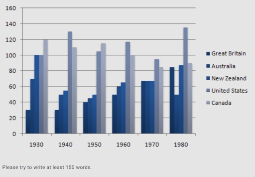
Image for topic: The chart below shows the figures for imprisonment in five countries between 1930 and 1980. Write a report for a university, lecturer describing the information shown below.
Our system will evaluate the answer based on this AI-generated description.
The image shows a bar graph with data from 5 countries—Great Britain, Australia, New Zealand, United States, and Canada—across 6 decades—1930, 1940, 1950, 1960, 1970, 1980. Units on Y-axis range from 0 to 160 with intervals of 20. In 1930, Great Britain and Australia have identical highest values at 120, followed by New Zealand at 100, the United States at 80, and Canada at 60. In 1940, Australia leads at 160, Great Britain at 140, New Zealand at 120, the United States at 100, and Canada at 80. For 1950, Australia's value decreases to 140, Great Britain and New Zealand both at 120, the United States at 100, and Canada at 80. In 1960, New Zealand's data rises to 140, Great Britain at 120, Canada increases to 100, Australia drops to 100, and the United States remains at 100. The 1970 data show New Zealand and Great Britain both at 120, the United States at 100, Australia at 80, and Canada at 60. Finally, in 1980, Australia, United States, and Canada are at 100, Great Britain at 80, and New Zealand drops to 60.
Given the complexity of the image, the above description may not be entirely accurate.
Note: Both the topic and the answer were created by one of our users.

The bar chart illustrates the capacity of prisons in five different countries between 1930 and 1980.

Overall, there was an increase in the confinement of Great Britain and the United States’ prisoners, with the imprisonment of the USA witnessing the most dramatic changes, while the opposite was true for the quantity of prisoners detained in Australia, New Zealand, and Canada. In addition, the highest figure can be seen in the data of the US throughout the period.

Regarding the figures for Great Britain and the US, both experienced an escalation, but to varying extents. Despite registering the lowest position at around 30.000 in 1930, the data of Great Britain grew to a point at more than 80.000 prisoners over the period. This closely resembled the figure of the US, which saw a dramatic rise from 100.000 prisoners in the initial year to nearly 140.000 in the final year.

In Canada, although this figure took the highest position of the chart at 120.000 in 1930, its place was eventually replaced by the US in 1980, when this figure saw a slight decline of 20.000. Besides, the data of Australia and New Zealand just fluctuate in a range of between 40.000 and 90.000.

Word Count: 201

Answers On The Same Topic:

The chart below shows the figures for imprisonment in five countries between 1930 and 1980. Write a report for a university, lecturer describing the information shown below.

The given bar chart illustrates the number of imprisonment in five different countries for 50 years of period, from 1950 to 1980. Overall, United States had the highest rate of imprisonment, while Great Britain had the lowest. In 1930, Canada had the highest rate of imprisonment with 120 thousand prisoners, at the same time, Great […]

The chart below shows the figures for imprisonment in five countries between 1930 and 1980. Write a report for a university, lecturer describing the information shown below.

The information given in the chart makes comparisons in the number of prisoners in five different countries from 1930 to 1980. While the figures for imprisonment fluctuated over the period shown, it is clear that the United States had the highest number of prisoners overall. Great Britain, on the other hand, had the lowest number […]

The chart below shows the figures for imprisonment in five countries between 1930 and 1980. Write a report for a university, lecturer describing the information shown below.

The table illustrates the number of prisoners, measured in thousands, in five different countries between the years 1930 and 1980. Overall, in all countries, the figures for imprisonment fluctuated throughout the period, except Great Britain. While the United States ranked as the highest country in number of prisoners in 1980, Canada was the highest-ranking country […]

The chart below shows the figures for imprisonment in five countries between 1930 and 1980. Write a report for a university, lecturer describing the information shown below.

The table illustrates the number of prisoners, measured in thousands, in five different countries between the years 1930 and 1980. Overall, in all countries, the figures for imprisonment fluctuated throughout the period, except Great Britain. While the United States ranked as the highest country in number of prisoners in 1980, Canada was the highest-ranking country […]

The chart below shows the figures for imprisonment in five countries between 1930 and 1980. Write a report for a university, lecturer describing the information shown below.

The chart shows the number of people imprisoned, on the scale of the thousands, between 1930 and 1980. The data refer to 5 countries: Great Britain, Australia, New Zealand, the United States, and Canada. The most prominent feature of the table is the clear precedence of Canada and the United States, with the former reaching […]

See All

Other Topics:

The bar chart below shows the percentage of food bought by people in a town in different ways during the week in 2009, 2011 and 2013.

The bar graph compares the percentage of food bought by people in town, during the week between 2009, 2011 and 2013. From an overall perspective, it is apparent that the percentage of food bought was generally higher in Friday, Saturday and Sunday, while Wednesday had lower figures. Saturday had highest percentage in 2013. First of […]

The chart below show the result of a survey about people's coffee and tea buying drinking habits in five austrilian cities. Summarise the information by selecting and reporting the main features, and make comparisons where relevant.

The provided bar chart illustrates Australian people’s drinking preferences from five cities. Overall, going to a cafe for a cup of tea or coffee is the most popular option in four cities, except Adelaide. Buying instant coffee was in the second place, albeit, in the exceptional city, it took the first place. The consumption of […]

THE BAR CHART GIVES THE PERCENTAGE OF ENERGY COMSUMPTION IN 2007 in two areas. Summarize the information by selecting and reporting the main features and make comparisons where relevant.

The bar chart illustrate the proportion of energy consumpted in North America and South America in 2007. Overall, oil had consumed the highest portion of energy. Whereas, Nuclear had the lowest consumption rate in both countries. Hydroelectric had been consumed by the lowest rate in North America. South America had dominated in oil consumption by […]

The chart below shows expenditure of two countries on consumer goods in 2010. Summarise and compare the significant factors.

The chart compares the spending on five consumer products of two countries, namely France and the UK, in 2010. Overall, it is clear that the amounts of money spent on cars were the highest in both countries. Additionally, the figures for cameras had the most noticeable gap between France and the UK. UK consumers allocated […]

📆 15 ОСТОВЕR 📊TASK 1: The chart below gives information about adults with education at high school level in six countries in 2010.

The bar chart illustrates information about adults with education at high school level in six countries in 2010. Generally speaking, number of adults with education who was aged 25-34 at high school were the highest in South Korea whereas number of adults with high education who aged 55 – 64 were the highest in the […]

The chart below shows the internet users (in millions) in different countries in the Middle East as of June 2017.

The provided bar diagram illustrates about the users of internet from various countries in 2017 at middle east . The data is provided in millions Overall , it can be viewed that Iran had a major number of users for using internet. However Lebanon had been least among other countries In 2017, the major number […]

See All
We have detected unusual activity on your device.
Please verify your identity to continue.
Note: This verification step won't sign you in. If you have a premium account, please log in to access the service as usual.
Google/Gmail Verification
Or verify using Email/Code
We've sent a verification code to:
youremail@gmail.com (Not your email?)
Enter it below to complete the verification process.
Ensure your email address is correct, your inbox is not full, and you check your spam folder. If no email arrives, consider using an alternative email.
You will need a Premium plan to perform your action!
Note: If you already have a premium account, please log in to access our services as usual.

Plans & Pricing

Our mission is to make quality education accessible for everyone.
However, to keep our hardworking team running and this service alive, we genuinely need your support!
By opting for a premium plan, not only do you sustain us in achieving the mission, but you also unlock advanced features to enrich your learning experience.

Free

For learners who aren't pressed for time

What's included on Free
100+ Cambridge IELTS Tests
Instant IELTS Writing Task 1 & 2 Evaluation (2 times/month)
Instant IELTS Speaking Part 1, 2, & 3 Evaluation (2 times/month)
Instant IELTS Writing Task 1 & 2 Essay Generator (2 times/month)
500+ Dictation & Shadowing Exercises
100+ Pronunciation Exercises
Flashcards
Other Advanced Tools

Premium

For those serious about advancing their English proficiency, and for IELTS candidates aspiring to boost their band score by 1-2 points (especially in writing & speaking) in just 30 days or less

What's included on Premium
Save Your IELTS Test Progress & Analyze Mistakes By Question Type
Save Your Own Flashcard Sets & Use Them On Any Device
Unlock All Courses, IELTS Tests, Section & Part Practice
Unlimited AI Conversations
Unlimited AI Writing Enhancement Exercises
Unlimited IELTS Writing Task 1 & 2 Evaluation
Unlimited IELTS Speaking Part 1, 2, & 3 Evaluation
Checked Answers Will Not Be Published
Unlimited IELTS Writing Task 1 & 2 Essay Generator
Unlimited IELTS Speaking Part 1, 2, & 3 Sample Generator
Unlimited Usage Of Advanced Tools & AI Features
Priority Support within 24h (12-month plan only)

Due to the nature of our service and the provided free trials, payments are non-refundable.