🔥 Today Only: Save 30% on Premium — Offer Ends Soon! - Upgrade Now!
Bar Chart

Band 6+: The chart below shows the number of jobs in tourism-related industries in one UK city between 1989 and 2009 Summarise the information by selecting and reporting the main features, and make comparisons where relevant.

Image for topic: The chart below shows the number of jobs in tourism-related industries in one UK city between 1989 and 2009 Summarise the information by selecting and reporting the main features, and make comparisons where relevant.
Our system will evaluate the answer based on this AI-generated description.
The image presents a bar chart depicting the number of jobs in tourism-related industries in a UK city from 1989 to 2009, with separate bars for restaurants, hotels, sport and leisure, and travel and tours for each year. The chart records figures for the years 1989, 1994, 1999, 2004, and 2009. The values for 1989 are as follows: restaurants with approximately 700 jobs, hotels with about 500, sports and leisure with roughly 200, and travel and tours with slightly over 100 jobs. In 1994, the job numbers increase in all sectors with restaurants at approximately 800, hotels around 600, sport and leisure at nearly 500, and travel and tours just above 300. 1999 sees a further rise: restaurants surpassing 900, hotels around 850, sport and leisure close to 750, and travel and tours at 500. In 2004, there is a mixed trend with restaurants reaching almost 1700, hotels over 700, sport and leisure around 850, but travel and tours declines to approximately 400. The final year, 2009, shows a decrease across all industries except for travel and tours which recover to around 600 jobs, while restaurants drop to just over 1400, hotels to 750, and sport and leisure to roughly 550. All trends are illustrated by multiple bars on the y-axis, rising from zero to a maximum of 1800 jobs, with each bar corresponding to a respective industry in the tourism sector.
Given the complexity of the image, the above description may not be entirely accurate.
Note: Both the topic and the answer were created by one of our users.

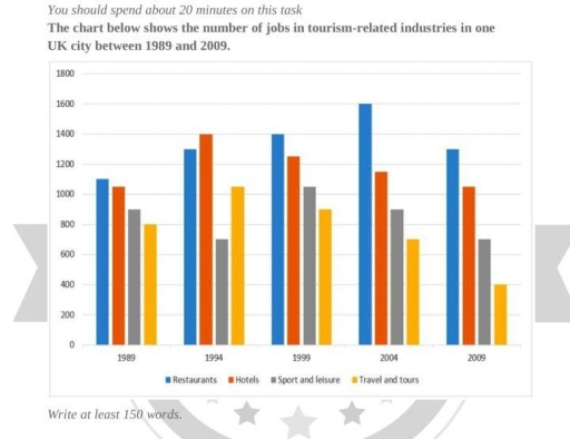
The bar chart compares the amount of employment opportunities in tourism-related industries in a UK city between 1989 and 2009.

Overall, there are 4 categories of tourism-related industries: Restaurants, Hotels, Sport and leisure, and Travel and tours. Restaurant and hotels offered the most jobs compared to sport and leisure or travel and tours. The first group of industries had an increase and a relative stability in the number of jobs respectively, while that of the second group of industries decreased over time.

Focusing on the centers of employment in tourism-related industries, in 1989, the number of job positions in restaurants and hotels was relatively the same, approximately 1100 and 1050. By 1995, the difference rose to 100, with Hotel industry offering 1400 jobs and Restaurants 1300. From 1999 onwards, restaurants had more employment opportunities than hotels, dramatically increasing the gap in 2004, with 1600 and almost 1200 respectively.

In contrast, sport and leisure with travel and tour industries fell into the least job offering classifications; despite offering approximately 900 job positions in 1989, sport and leisure category dramatically cut this number to about 700, which is considerably less than that of the travel and tour category (about 1010). In 1999, sport and leisure category overtook the travel and tours industry in the number of job positions, with the figure of around 1000. Nonetheless, both industries had a gradual decrease in the amount of employment opportunities and reached the following figures in 2009: about 700 jobs were offered by sport and leisure category and 400 by travel and tour industry.

Word Count: 259

Answers On The Same Topic:

The chart below shows the number of jobs in tourism-related industries in one UK city between 1989 and 2009 Summarise the information by selecting and reporting the main features, and make comparisons where relevant.

: The given bar graph compares data about the range of job opportunities in the field of tourism in a UK city from 1989 to 2009. Overall, it can be seen that restaurants were the most popular sector among all the other industries throughout the given period, while travel and tours offered the fewest positions […]

The chart below shows the number of jobs in tourism-related industries in one UK city between 1989 and 2009 Summarise the information by selecting and reporting the main features, and make comparisons where relevant.

The bar chart illustrates the number of jobs related industries (Restaurants, Hotels, Sport and leisure, Travel and tours) in one UK’s urban areas over a twenty- year period between 1989 and 2009. Overall, the restaurants saw remarkable rise, travel and tours witnessed a steady decrease while hotels increased and sport and leisure experienced fluctuation over […]

The chart below shows the number of jobs in tourism-related industries in one UK city between 1989 and 2009 Summarise the information by selecting and reporting the main features, and make comparisons where relevant.

The given bar chart compares the number of jobs in tourism-related industries in a particular city in UK from 1989 to 2009. In general, Uk consistently had the highest number of restaurants, except in 1994, whereas the opposite case was true for travel tours, which recorded lowest number of jobs, with the exception of 1994. […]

The chart below shows the number of jobs in tourism-related industries in one UK city between 1989 and 2009 Summarise the information by selecting and reporting the main features, and make comparisons where relevant.

The bar chart illustrates the employment figures in tourism-relevanted industries within a UK city over a twp-o-decade period, commencing in 1980. Overall, restaurants were the most common career in the majority of the timeframe, except for the year 1994, with the hotel sector having a narrow lead. Notably, the number of jobs in the restaurants […]

See All

Other Topics:

The amount of tea and coffee imported by Canada,Uk,USA,and Germany in 2007

The bar chart presents a comparison between four countries (Canada, the UK, the USA and Germany) in terms of the amount of tea and coffee imported in 2007. Units are measured in tonnes. Overall, the amount of imported tea in the UK was higher than that of other nations, while Canada imported the least amount. […]

You should spend about 20 minutes on this task. The chart below shows estimated world illiteracy rates by region and by gender for the year 2000. Write a report for a university lecturer describing the information below. Write at least 150 words

These bar graphs illustrate approximate world illiteracy ratio by region and gender during the noughties. It is apparent that, in all regions, the level of illiteracy peaks among women, whereas it is lowest among men. In developed countries illiteracy rate was minimal, accounting for 1% for both males and for females showing the smallest proportion. […]

The bar chart below describes the gross domestic spending on research and development in five countries between 2001 and 2011. Summarise the information by selecting and reporting the main features, and make comparisons where relevant.

The bar chart compares how gross domestic expenditure on research and development was allocated across five countries over a ten-year period, commencing in 2001. Overall, the USA recorded the highest percentage throughout the period, whereas Spain consistently had the lowest figures. China and Spain witnessed growth in 2005, while the remaining three countries experienced a […]

The bar chart below describes the gross domestic spending on research and development in five countries between 2001 and 2011. Summarise the information by selecting and reporting the main features, and make comparisons where relevant.

The bar chart compares the proportion of GDP spent on research and development in five countries over a 10-year period commencing in 2011. Overall, the USA consistently allocated the highest proportion of GDP to research and development throughout the period, while Spain spent the least. The figures for China and Spain increased, whereas those of […]

the bar chart shows the number of cars per 1000 people in 5 European countries in 3 years and compares with the European average.

The bar charts display number of cars per 1000 in 5 average. Overall, country 5 showed the most car ownership then the other. However country 1 showed the least number of the cars owners. In 2005, The most car ownership was in country 5 with above than 800 cars owner. It followed by 2 other […]

Bar chart (international graduates from UK universities in 2000 and 2015

The bar chart shows information about the graduates from 6 different British universities in the years 2000 and 2015. It is clear that in every university, the percentage of international graduates increased by 2015 overall. We can see that ‘London’ university dramatically grew, while Bristol university recorded the lowest increase than other universities. Looking at […]

See All
We have detected unusual activity on your device.
Please verify your identity to continue.
Note: This verification step won't sign you in. If you have a premium account, please log in to access the service as usual.
Google/Gmail Verification
Or verify using Email/Code
We've sent a verification code to:
youremail@gmail.com (Not your email?)
Enter it below to complete the verification process.
Ensure your email address is correct, your inbox is not full, and you check your spam folder. If no email arrives, consider using an alternative email.
You will need a Premium plan to perform your action!
Note: If you already have a premium account, please log in to access our services as usual.

Plans & Pricing

Our mission is to make quality education accessible for everyone.
However, to keep our hardworking team running and this service alive, we genuinely need your support!
By opting for a premium plan, not only do you sustain us in achieving the mission, but you also unlock advanced features to enrich your learning experience.

Free

For learners who aren't pressed for time

What's included on Free
100+ Cambridge IELTS Tests
Instant IELTS Writing Task 1 & 2 Evaluation (2 times/month)
Instant IELTS Speaking Part 1, 2, & 3 Evaluation (5 times/month)
Instant IELTS Writing Task 1 & 2 Essay Generator (2 times/month)
500+ Dictation & Shadowing Exercises
100+ Pronunciation Exercises
Flashcards
Other Advanced Tools

Premium

For those serious about advancing their English proficiency, and for IELTS candidates aspiring to boost their band score by 1-2 points (especially in writing & speaking) in just 30 days or less

What's included on Premium
Save Your IELTS Test Progress
Unlock All Courses & IELTS Tests
Unlimited AI Conversations
Unlimited AI Writing Enhancement Exercises
Unlimited IELTS Writing Task 1 & 2 Evaluation
Unlimited IELTS Speaking Part 1, 2, & 3 Evaluation
Checked Answers Will Not Be Published
Unlimited IELTS Writing Task 1 & 2 Essay Generator
Unlimited IELTS Speaking Part 1, 2, & 3 Sample Generator
Unlimited Usage Of Advanced Tools
Priority Support within 24h (12-month plan only)

Due to the nature of our service and the provided free trials, payments are non-refundable.
Nếu bạn là người Việt Nam và không có hoặc không muốn trả bằng credit/debit cards, bạn có thể thanh toán bằng phương thức chuyển khoản:


Chọn gói:
419,000₫ 277,000 ₫ cho gói 1 tháng (chỉ 9,233₫/ngày)
1,239,000₫ 597,000 ₫ cho gói 3 tháng (chỉ 6,633₫/ngày)
2,469,000₫ 1,027,000 ₫ cho gói 6 tháng (chỉ 5,706₫/ngày)
4,929,000₫ 1,417,000 ₫ cho gói 12 tháng (chỉ 3,936₫/ngày)


Sau khi chuyển khoản, vui lòng đợi trình duyệt tự động điều hướng bạn trở lại Engnovate và bạn sẽ ngay lập tức nhận được mã kích hoạt tài khoản premium.
Nếu có lỗi xảy ra, bạn có thể liên hệ với team thông qua một trong các phương thức: email đến helloengnovate@gmail.com hoặc nhắn tin qua facebook.com/engnovate.
Vì toàn bộ công cụ trên website đều có thể sử dụng thử miễn phí, Engnovate không hỗ trợ hoàn tiền.