🔥 Today Only: Save 30% on Premium — Offer Ends Soon! - Upgrade Now!
Bar Chart

Band 6+: The chart below shows the percentage of households in owned and rented accomodation in England and Wales between 1918 and 2011. Summarise the information by selecting and reporting the main features, and make comparisons where relevant.

Image for topic: The chart below shows the percentage of households in owned and rented accomodation in England and Wales between 1918 and 2011. Summarise the information by selecting and reporting the main features, and make comparisons where relevant.
Our system will evaluate the answer based on this AI-generated description.
The image displays a bar chart comparing the percentage of households owning versus renting accommodation in England and Wales from 1918 to 2011. The chart presents data for the years 1918, 1933, 1953, 1961, 1971, 1981, 1991, 2001, and 2011. In 1918, 23% of households owned and 77% rented. The figures for 1933 are 32% owned and 68% rented. In 1953, ownership increased to 42% while renting decreased to 58%. The 1961 data shows a slight increase in ownership at 47% and a decrease in renting at 53%. The trend continues in 1971 with a majority of 51% owning homes and 49% renting. In 1981, the gap widens with 59% owning and 41% renting. The 1991 data shows 67% ownership and 33% rental. The 2001 figures report 69% ownership and 31% rental. The 2011 data marks a slight decrease in ownership at 64% and an increase in rental accommodation at 36%.
Given the complexity of the image, the above description may not be entirely accurate.
Note: Both the topic and the answer were created by one of our users.

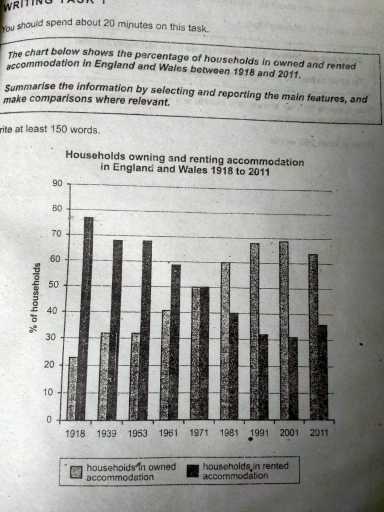
The bar graph compares two different accommodation systems, according to ownership of house and rented house proportion in two big countries from 1918 to 2011.

Overall, it can be seen that the rented accommodation rate decreased gradually year by year whereas house ownership percentage increased rapidly in Britain and Wales except in 2011.

House ownership percentage was lower level in 1918 which was above 20%, and after two decades it rose to around 32%. In 1939 and 1953, this percentage stayed in a similar position. In addition, this household ownership rate risen to a peak in 2001, which is approximately 70%. However, this rate again fell in 2011, then the proportion was just above 60%.

Secondly, the rented accommodation rate was at a peak level in 1918. It’s total opposite to the house ownership rate, it was just below 80%. It decreased around 10% after two decades, and it was the same for 1939 and 1953. Then it started to fall and in 2001 it was approximately 30%. However, in 2011, it can be seen the rented household rate again increased a little bit, and it was just above 35%.

Word Count: 190

Answers On The Same Topic:

The chart below shows the percentage of households in owned and rented accomodation in England and Wales between 1918 and 2011. Summarise the information by selecting and reporting the main features, and make comparisons where relevant.

The bar chart pesent percentages of households in owned accommodation and rented places in England and Wales 1918 to 2021 Overall, In the beginningof the bar chart consistently recored the higher figure of accommodation. where dramatic decline in rented accommodation. In the middle of the period both are following same trande. In the second last […]

The chart below shows the percentage of households in owned and rented accomodation in England and Wales between 1918 and 2011. Summarise the information by selecting and reporting the main features, and make comparisons where relevant.

The graph represents the ratio of families who owned and rented home in England and Wales over 93 years period from 1918 to 2011. At first glance,it is clear that in beginning proportion of households living in rented places were at its peak as compared with those who were living in their own homes .However, […]

The chart below shows the percentage of households in owned and rented accomodation in England and Wales between 1918 and 2011. Summarise the information by selecting and reporting the main features, and make comparisons where relevant.

The percentage of households in owned and rented accommodation in England and Wales between 1918 and 2011 depicted in the bar chart provided In general both of the rented and owned households have risen and dropped through the years from 1918 and 2011. More specifically, households in rented accommodation had dominated in 1918 with 78 […]

The chart below shows the percentage of households in owned and rented accomodation in England and Wales between 1918 and 2011. Summarise the information by selecting and reporting the main features, and make comparisons where relevant.

The percentage of households in owned and rented accommodation in England and Wales between 1918 and 2011 depicted in the bar chart provided In general both of the rented and owned households has raised and dropped through the years from 1918 and 2011. More sppecifically, households in rented accommodation had dominated in 1918 with 78 […]

The chart below shows the percentage of households in owned and rented accomodation in England and Wales between 1918 and 2011. Summarise the information by selecting and reporting the main features, and make comparisons where relevant.

The Provided bar chant illustrates the changes in the proportions of households living in owned and rented accommodation in England and wales from 1928 to 2011. overall, the data reveals that house ownership steadily increased, while rental accommodation decreased throughout the period, with a notable reversal in 2011. Looking at the Chart in more detail, […]

See All

Other Topics:

The chart below give attendance figures for Grandville stadium from which are project in 2030 after a major improvement project.

The bar chart presented below shows the annual attendance at Grandville Stadium from 2017 to 2030 for three different types of events. Overall, attendance is expected to increase over the period for all three categories, namely theater, sporting events, and concerts. In addition, sporting events are expected to remain the category with the highest number […]

The diagram below shows predicted and actual average attendances in football stadiums of some of the biggest clubs in the Premier League. Summarize the information by selecting and reporting the main features and make comparisons where relevant.

The diagram illustrates the ratio of estimated and actual attendance of some of the large clubs in the Premier League at the football stadium. Overall, it is seen that Manchester United’s fans attended more than it was hoped and Aston Villa witnessed the lowest presence, even lower than the expectation at the soccer stadium. Regarding […]

The chart below shows the number of households in the US by their annual income in 2007, 2022 and 2015. Summarise the information by selecting and reporting the main features and make comparisons where relevant.

The bar chart compares the number of households in five different categories in the US by their annual income in 2007,2011 and 2015 . It is clear that the highest number of US households by yearly income in 100000 and more. By contrast, the lowest proportion of expenditure on 75000-99999$ throughout the period. In terms […]

The chart below shows the number of households in the US by their annual income in 2007, 2022 and 2015. Summarise the information by selecting and reporting the main features and make comparisons where relevant.

The bar chart compares the number of households in five different categories in the US by their annual income in 2007 , 2011 and 2015 . It is clear that the highest number of US households by yearly income in 100000 and more. By contrast, the lowest proportion of expenditure on 75000-99999$ throughout the period. […]

The chart below shows the global sales of different kinds of digital games from 2000 to 2006. Summarise and make comparisons wherever necessary.

The supplied bar chart depicts the comparison of the global sales of different kinds of digital games such as mobile phone games and online games , in 07 years from 2000 to 2006. A glance at the graph reveals that most sold games in these seven years is the handheld games , while , the […]

The chart below shows the proportion of survey respondents that showed interest in particular sports in the UK. Summarise the information by selecting, reporting the main features, and make comparison where relevant.

The chart below demonstrates interest in the 6 fanatic sports such as football, tennis, swimming, volleyball, rugby and golf in the UK. It also includes details about three different years from 1995,2000 to 2000 in statistic. According to the chart, football provided the greatest level in three years. However in 2000 it included 45% of […]

See All
We have detected unusual activity on your device.
Please verify your identity to continue.
Note: This verification step won't sign you in. If you have a premium account, please log in to access the service as usual.
Google/Gmail Verification
Or verify using Email/Code
We've sent a verification code to:
youremail@gmail.com (Not your email?)
Enter it below to complete the verification process.
Ensure your email address is correct, your inbox is not full, and you check your spam folder. If no email arrives, consider using an alternative email.
You will need a Premium plan to perform your action!
Note: If you already have a premium account, please log in to access our services as usual.

Plans & Pricing

Our mission is to make quality education accessible for everyone.
However, to keep our hardworking team running and this service alive, we genuinely need your support!
By opting for a premium plan, not only do you sustain us in achieving the mission, but you also unlock advanced features to enrich your learning experience.

Free

For learners who aren't pressed for time

What's included on Free
100+ Cambridge IELTS Tests
Instant IELTS Writing Task 1 & 2 Evaluation (2 times/month)
Instant IELTS Speaking Part 1, 2, & 3 Evaluation (5 times/month)
Instant IELTS Writing Task 1 & 2 Essay Generator (2 times/month)
500+ Dictation & Shadowing Exercises
100+ Pronunciation Exercises
Flashcards
Other Advanced Tools

Premium

For those serious about advancing their English proficiency, and for IELTS candidates aspiring to boost their band score by 1-2 points (especially in writing & speaking) in just 30 days or less

What's included on Premium
Save Your IELTS Test Progress
Unlock All Courses & IELTS Tests
Unlimited AI Conversations
Unlimited AI Writing Enhancement Exercises
Unlimited IELTS Writing Task 1 & 2 Evaluation
Unlimited IELTS Speaking Part 1, 2, & 3 Evaluation
Checked Answers Will Not Be Published
Unlimited IELTS Writing Task 1 & 2 Essay Generator
Unlimited IELTS Speaking Part 1, 2, & 3 Sample Generator
Unlimited Usage Of Advanced Tools
Priority Support within 24h (12-month plan only)

Due to the nature of our service and the provided free trials, payments are non-refundable.
Nếu bạn là người Việt Nam và không có hoặc không muốn trả bằng credit/debit cards, bạn có thể thanh toán bằng phương thức chuyển khoản:


Chọn gói:
419,000₫ 277,000 ₫ cho gói 1 tháng (chỉ 9,233₫/ngày)
1,239,000₫ 597,000 ₫ cho gói 3 tháng (chỉ 6,633₫/ngày)
2,469,000₫ 1,027,000 ₫ cho gói 6 tháng (chỉ 5,706₫/ngày)
4,929,000₫ 1,417,000 ₫ cho gói 12 tháng (chỉ 3,936₫/ngày)


Sau khi chuyển khoản, vui lòng đợi trình duyệt tự động điều hướng bạn trở lại Engnovate và bạn sẽ ngay lập tức nhận được mã kích hoạt tài khoản premium.
Nếu có lỗi xảy ra, bạn có thể liên hệ với team thông qua một trong các phương thức: email đến helloengnovate@gmail.com hoặc nhắn tin qua facebook.com/engnovate.
Vì toàn bộ công cụ trên website đều có thể sử dụng thử miễn phí, Engnovate không hỗ trợ hoàn tiền.