🔥 Today Only: Save 30% on Premium — Offer Ends Soon! - Upgrade Now!
Bar Chart

Band 5+: The chart below shows the percentage of households in owned and rented accomodation in England and Wales between 1918 and 2011. Summarise the information by selecting and reporting the main features, and make comparisons where relevant.

Image for topic: The chart below shows the percentage of households in owned and rented accomodation in England and Wales between 1918 and 2011. Summarise the information by selecting and reporting the main features, and make comparisons where relevant.
Our system will evaluate the answer based on this AI-generated description.
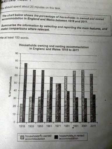
The image displays a bar chart comparing the percentage of households owning versus renting accommodation in England and Wales from 1918 to 2011. The chart presents data for the years 1918, 1933, 1953, 1961, 1971, 1981, 1991, 2001, and 2011. In 1918, 23% of households owned and 77% rented. The figures for 1933 are 32% owned and 68% rented. In 1953, ownership increased to 42% while renting decreased to 58%. The 1961 data shows a slight increase in ownership at 47% and a decrease in renting at 53%. The trend continues in 1971 with a majority of 51% owning homes and 49% renting. In 1981, the gap widens with 59% owning and 41% renting. The 1991 data shows 67% ownership and 33% rental. The 2001 figures report 69% ownership and 31% rental. The 2011 data marks a slight decrease in ownership at 64% and an increase in rental accommodation at 36%.
Given the complexity of the image, the above description may not be entirely accurate.
Note: Both the topic and the answer were created by one of our users.

The graph represents the ratio of families who owned and rented home in England and Wales over 93 years period from 1918 to 2011.

At first glance,it is clear that in beginning proportion of households living in rented places were at its peak as compared with those who were living in their own homes .However, after 1918 a decline was noted in regards of rented places and increase was observed in interest of owning own houses whilst their strength was stabilised in 1971.

Later on, in 1972 until 2001 a similar trend of rise in buying homes and fall in staying on rented places was remarked.Moreover, in 2011 a marginal fall was noted in owning home as well as slight increase in living in rented apartments.

Overall, it is evident from the diagram is that with the passage of time lesser interest was seemed towards rented places while an escalation in the percentages of families who lived in their own houses over that period.

Word Count: 164

Answers On The Same Topic:

The chart below shows the percentage of households in owned and rented accomodation in England and Wales between 1918 and 2011. Summarise the information by selecting and reporting the main features, and make comparisons where relevant.

The chart illustrates the data of households owning and renting accommodation in England and Wales from 1918 to 2011. We can observe that the households in owned accommodation tended to increase gradually until 2001 which then slightly decreased in 2011. On the other hand, the households in rented accommodation seemed gradually decreased until 2001 which […]

The chart below shows the percentage of households in owned and rented accomodation in England and Wales between 1918 and 2011. Summarise the information by selecting and reporting the main features, and make comparisons where relevant.

The bar chart pesent percentages of households in owned accommodation and rented places in England and Wales 1918 to 2021 Overall, In the beginningof the bar chart consistently recored the higher figure of accommodation. where dramatic decline in rented accommodation. In the middle of the period both are following same trande. In the second last […]

The chart below shows the percentage of households in owned and rented accomodation in England and Wales between 1918 and 2011. Summarise the information by selecting and reporting the main features, and make comparisons where relevant.

The percentage of households in owned and rented accommodation in England and Wales between 1918 and 2011 depicted in the bar chart provided In general both of the rented and owned households have risen and dropped through the years from 1918 and 2011. More specifically, households in rented accommodation had dominated in 1918 with 78 […]

The chart below shows the percentage of households in owned and rented accomodation in England and Wales between 1918 and 2011. Summarise the information by selecting and reporting the main features, and make comparisons where relevant.

The percentage of households in owned and rented accommodation in England and Wales between 1918 and 2011 depicted in the bar chart provided In general both of the rented and owned households has raised and dropped through the years from 1918 and 2011. More sppecifically, households in rented accommodation had dominated in 1918 with 78 […]

See All

Other Topics:

The chart shows the number of mobile phones and landlines per 100 people in selected countries. Write a report for a university lecturer describing the information given.

The bar chart compares the number of cell phone and landlines per 100 people in seven nations. In general, Mobile phones are the most popular in Italy, while the figure for fixed telephones in there is the lowest. However, it is clearly apparent that Canada has the smallest number of mobile phone users. In addition, […]

The bar chart shows the percentage of school children learning to play different musical instruments in 2005, 2010, 2015.

The bar chart gives information about the percentage of children learning to play musical instruments including guitar, piano, drums and violin. Overall, while the proportion of students choosing both guitar and piano increased, the figures for the other two instruments followed a growth trend. In addition,guitar maintained the most popular musical instrument in this school […]

The bar chart below compares the nationality of tourists to Corfu in 1995, 2000 and 2005. Summarise the information by selecting and reporting the main features, and make comparisons where relevant.

The given bar chart delineates the three different nationalities visited Corfu in 1995, 2000, and 2005. Focusing on the gist, the percentage of French and Japanese tourist increased, while Russian showed the opposite. Additionally, Russian visitors obtained the highest proportion in the first given year. Delving into specifics, in 1995, Russian dominated the number of […]

the graph below shows the amount of energy generated wind in four countries in the period 1980-2000

The graph illustrates information about the energy from the generators in the period from 1980 to 2000 in 4 countries. Overall, every country shows upward trend, except for USA that started decreasing slightly from 90s. Germany fell from the second place to the least place, while Denmark shot up from third place to the first […]

The bar chart below shows the average annual teaching hours in primary, lower secondary, and upper secondary education in four countries (the USA, Spain, Iceland, and Japan) in 2001. Summarise the information by selecting and reporting the main features, and make comparisons where relevant.

The bar chart compares the number of annual teaching hours per year in four different countries (Japan, Iceland, Spain and USA) through three levels of schooling: primary, lower secondary and upper secondary in 2001. Overall, teachers in USA consistently had the highest number of teaching hours across all three school levels, while teachers in Japan […]

The chart below shows the percentage of the population living in urban areas in the world and in different regions. Summarise the information by selecting and reporting the main features and make comparisons where relevant. Write at least 150 words.

The bar chart illustrates the rates of urbanization across six regions worldwide from 1975 to 2020 and a forecast of the year 2050. Overall, there is a rise in the urban world population as the years pass almost universally, and how much each region contributes to this increase over the years is visualized. First, it […]

See All
We have detected unusual activity on your device.
Please verify your identity to continue.
Note: This verification step won't sign you in. If you have a premium account, please log in to access the service as usual.
Google/Gmail Verification
Or verify using Email/Code
We've sent a verification code to:
youremail@gmail.com (Not your email?)
Enter it below to complete the verification process.
Ensure your email address is correct, your inbox is not full, and you check your spam folder. If no email arrives, consider using an alternative email.
You will need a Premium plan to perform your action!
Note: If you already have a premium account, please log in to access our services as usual.

Plans & Pricing

Our mission is to make quality education accessible for everyone.
However, to keep our hardworking team running and this service alive, we genuinely need your support!
By opting for a premium plan, not only do you sustain us in achieving the mission, but you also unlock advanced features to enrich your learning experience.

Free

For learners who aren't pressed for time

What's included on Free
100+ Cambridge IELTS Tests
Instant IELTS Writing Task 1 & 2 Evaluation (2 times/month)
Instant IELTS Speaking Part 1, 2, & 3 Evaluation (2 times/month)
Instant IELTS Writing Task 1 & 2 Essay Generator (2 times/month)
500+ Dictation & Shadowing Exercises
100+ Pronunciation Exercises
Flashcards
Other Advanced Tools

Premium

For those serious about advancing their English proficiency, and for IELTS candidates aspiring to boost their band score by 1-2 points (especially in writing & speaking) in just 30 days or less

What's included on Premium
Save Your IELTS Test Progress & Analyze Mistakes By Question Type
Save Your Own Flashcard Sets & Use Them On Any Device
Unlock All Courses, IELTS Tests, Section & Part Practice
Unlimited AI Conversations
Unlimited AI Writing Enhancement Exercises
Unlimited IELTS Writing Task 1 & 2 Evaluation
Unlimited IELTS Speaking Part 1, 2, & 3 Evaluation
Checked Answers Will Not Be Published
Unlimited IELTS Writing Task 1 & 2 Essay Generator
Unlimited IELTS Speaking Part 1, 2, & 3 Sample Generator
Unlimited Usage Of Advanced Tools & AI Features
Priority Support within 24h (12-month plan only)

Due to the nature of our service and the provided free trials, payments are non-refundable.