🔥 Today Only: Save 30% on Premium — Offer Ends Soon! - Upgrade Now!
Bar Chart

Band 6+: The chart below shows the percentage of the total us population aged 65 and over between 1900 and 2000.

Image for topic: The chart below shows the percentage of the total us population aged 65 and over between 1900 and 2000.
Our system will evaluate the answer based on this AI-generated description.
The image is a bar chart with eight bars, representing the percentage of the total US population aged 65 and over between 1900 and 2000, at ten-year intervals. Among all bars, three age groups are represented by segmented colors in each bar: 65-74, 75-84, and 85+. In 1900, 65-74 was 3.1%, 75-84 was 0.2%, and 85+ was 0.01%. In 1910, 65-74 was 3.2%, 75-84 was 0.3%, and 85+ was 0.02%. In 1920, 65-74 was 3.5%, 75-84 was 0.4%, and 85+ was 0.02%. In 1930, 65-74 was 4.1%, 75-84 was 0.6%, and 85+ was 0.03%. In 1940, 65-74 was 4.5%, 75-84 was 0.7%, and 85+ was 0.04%. In 1950, 65-74 was 5.0%, 75-84 was 1.0%, and 85+ was 0.07%. In 1960, 65-74 was 6.0%, 75-84 was 1.4%, and 85+ was 0.1%. In 1970, 65-74 was 7.1%, 75-84 was 2.0%, and 85+ was 0.2%. In 1980, 65-74 was 8.3%, 75-84 was 2.7%, and 85+ was 0.4%. In 1990, 65-74 was 9.6%, 75-84 was 3.4%, and 85+ was 0.7%. In 2000, 65-74 was 10.1%, 75-84 was 3.5%, and 85+ was 1.2%. Overall, the trend shows an increase in the percentage of the population aged 65 and over, with significant growth in the older age groups, especially 85+.
Given the complexity of the image, the above description may not be entirely accurate.
Note: Both the topic and the answer were created by one of our users.

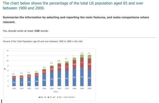
The chart illustrates changes in the total number of people from 65 years for one century./over the period from

Overall, it is clear that the highest percent of population was in 1990 and the lowest in 1900. Additionally, it can be seen that the biggest percent of people was by group aged 65-74 in every year.

Looking at the first years from 1900 to 1930, we can notice that population growth was not extremely increasing, and then, in 1940 percent started to rise more. By 1990 it reached more than 12 percent in total, which is the highest percent of population.

Another noticeable feature is that the least percent of population was given by people aged 85 and more, the growth over the all period increased only for 1.3 percent. In contrast, people aged 65-74 showed significantly opposite numbers. From 1900 this population rose for 4.4 percent, took a peak in 1990 with overall population of 7.3 percent, and then decreased to 6.5 percent.

Word Count: 164

Answers On The Same Topic:

The chart below shows the percentage of the total us population aged 65 and over between 1900 and 2000.

The bar chart illustrates the percentage of the US population aged 65 and over for each decade spanning from 1900 to 2000. Overall, there was a substantial increase in all three age groups within the US population over the century. Notably, the percentage of individuals aged 65 to 74 was consistently the highest among the […]

The chart below shows the percentage of the total us population aged 65 and over between 1900 and 2000.

The bar chart illustrates the percentage of the entire US population from 65 years old to 85 over between 1900 and 2000, The figure calculated in percentage. Overall, both 75 to 84 years old and over 85 years old age group shown a simmilar condition with gradual increased while in 65 to 74 years old […]

The chart below shows the percentage of the total us population aged 65 and over between 1900 and 2000.

The given chart illustrates information about the total percentage of the USA population aged 65 and over between the two time period, fron 1990 to 2000. Overall, there are three age groups that’s number had been increasing over the decades. Excluding the one group that’s age is from 65 to 74. The percentage of people […]

The chart below shows the percentage of the total us population aged 65 and over between 1900 and 2000.

The bar chart provided illustrates changes in the percentage of the US population aged 65 and over from 1900 to 2000. Overall, there was a significant increase in the proportion of individuals aged 65 and above in the US population. The percentage of those aged 65-74 was consistently the highest compared to the other age […]

See All

Other Topics:

Task 1: The chart below shows the number of households in the US by their annual income in 2007, 2011 and 2015. Summarize the information by selecting and reporting the main features and make comparisons where relevant. Write at least 150 words.

The bar chart compares the houshold annual income in three years (2007, 2011, and 2015) in America. Overall, it can be observed that there is an upward trends throughout the period, even though there is a slight dip in the second year, especially for the family with the lower and highest income. At the same […]

The graph below shows the daily water consumption for Americans in their homes.

The gragh showes the volume of water that used from American people in different fields, and showed these consumptions with conservation methods and without. Overall, conservation methods have reached its goals which their volumes were less than without using them in all water fields. People used water in their houses for flushing toilet more than […]

The chart shows the percentage of the population in the UK who consumed the recommended daily amoun of fruit and vegetables in 2002 , 2006 and 2010.

The chart compares the proportion of different people groups who consumed recommended daily amount of fruit and vegetables in various separate years 2002, 2006 and 2010 in the UK. Overall, women domenated to eat fruit and vegetables over the given years, while children showed the least result. Additionally, in 2006, the figure for all people […]

The bar chart shows donations given to 6 different charity by one company from 2012 to 2014.

The bar chart displays the donations given to 6 different varieties of charity by a single company between the year 2012 and 2014. Overall, the company has given social welfare the highest amount of money across the given period. On the other hand, arts is the category that has recieved little to no support between […]

The number of vehicles registered for use between 1996 and 2006 in a European country. Summarize the information by selecting and reporting the main features, and make comparisons where relevant.

The bar graph illustrates the number of vehicles registered for use from 1996 and 2006 in a European nation. Overall, it can be obviously seen from the chart, the number of private Cars was higher over the period, while the number of Buses were lower. In detail, In 1996, the numbers of other types vehicles […]

See All
We have detected unusual activity on your device.
Please verify your identity to continue.
Note: This verification step won't sign you in. If you have a premium account, please log in to access the service as usual.
Google/Gmail Verification
Or verify using Email/Code
We've sent a verification code to:
youremail@gmail.com (Not your email?)
Enter it below to complete the verification process.
Ensure your email address is correct, your inbox is not full, and you check your spam folder. If no email arrives, consider using an alternative email.
You will need a Premium plan to perform your action!
Note: If you already have a premium account, please log in to access our services as usual.

Plans & Pricing

Our mission is to make quality education accessible for everyone.
However, to keep our hardworking team running and this service alive, we genuinely need your support!
By opting for a premium plan, not only do you sustain us in achieving the mission, but you also unlock advanced features to enrich your learning experience.

Free

For learners who aren't pressed for time

What's included on Free
100+ Cambridge IELTS Tests
Instant IELTS Writing Task 1 & 2 Evaluation (2 times/month)
Instant IELTS Speaking Part 1, 2, & 3 Evaluation (5 times/month)
Instant IELTS Writing Task 1 & 2 Essay Generator (2 times/month)
500+ Dictation & Shadowing Exercises
100+ Pronunciation Exercises
Flashcards
Other Advanced Tools

Premium

For those serious about advancing their English proficiency, and for IELTS candidates aspiring to boost their band score by 1-2 points (especially in writing & speaking) in just 30 days or less

What's included on Premium
Save Your IELTS Test Progress
Unlock All Courses & IELTS Tests
Unlimited AI Conversations
Unlimited AI Writing Enhancement Exercises
Unlimited IELTS Writing Task 1 & 2 Evaluation
Unlimited IELTS Speaking Part 1, 2, & 3 Evaluation
Checked Answers Will Not Be Published
Unlimited IELTS Writing Task 1 & 2 Essay Generator
Unlimited IELTS Speaking Part 1, 2, & 3 Sample Generator
Unlimited Usage Of Advanced Tools
Priority Support within 24h (12-month plan only)

Due to the nature of our service and the provided free trials, payments are non-refundable.
Nếu bạn là người Việt Nam và không có hoặc không muốn trả bằng credit/debit cards, bạn có thể thanh toán bằng phương thức chuyển khoản:


Chọn gói:
419,000₫ 277,000 ₫ cho gói 1 tháng (chỉ 9,233₫/ngày)
1,239,000₫ 597,000 ₫ cho gói 3 tháng (chỉ 6,633₫/ngày)
2,469,000₫ 1,027,000 ₫ cho gói 6 tháng (chỉ 5,706₫/ngày)
4,929,000₫ 1,417,000 ₫ cho gói 12 tháng (chỉ 3,936₫/ngày)


Sau khi chuyển khoản, vui lòng đợi trình duyệt tự động điều hướng bạn trở lại Engnovate và bạn sẽ ngay lập tức nhận được mã kích hoạt tài khoản premium.
Nếu có lỗi xảy ra, bạn có thể liên hệ với team thông qua một trong các phương thức: email đến helloengnovate@gmail.com hoặc nhắn tin qua facebook.com/engnovate.
Vì toàn bộ công cụ trên website đều có thể sử dụng thử miễn phí, Engnovate không hỗ trợ hoàn tiền.