24 Hours Only: Get 39% OFF on Our Premium Plan - Check Out Now!
Bar Chart

Band 5+: the chart below shows the places visited by different people libing in Canada.

Image for topic: the chart below shows the places visited by different people libing in Canada.
Our system will evaluate the answer based on this AI-generated description.
The image shows a bar graph comparing the percentage of participation in various activities by three groups: new migrants born in other countries, new migrants born in English-speaking countries, and those born in Canada. For the Cinema category: approximately 65% for new migrants born in other countries, around 50% for new migrants born in English-speaking countries, and about 70% for those born in Canada. In the Theatre category: about 10% for new migrants born in other countries, approximately 30% for new migrants born in English-speaking countries, and around 12% for those born in Canada. For Library use: around 55% for new migrants born in other countries, about 47% for new migrants born in English-speaking countries, and approximately 37% for those born in Canada. In the Zoo category: about 27% for new migrants born in other countries, around 42% for new migrants born in English-speaking countries, and approximately 45% for those born in Canada.
Given the complexity of the image, the above description may not be entirely accurate.
Note: Both the topic and the answer were created by one of our users.

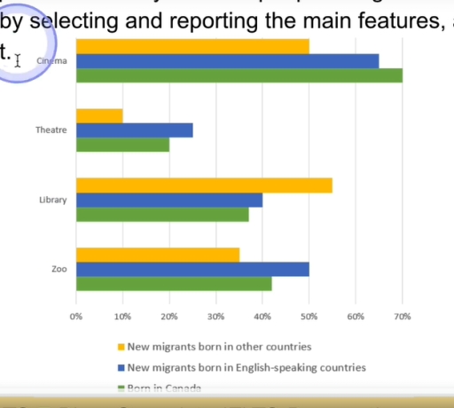
The chart above illustrates the various places (cinema, theatre, library, and zoo) that visited by citizen of Canada.

Based on the data, the amount of visiting those places are vary as cinema is considered as the most visited place by Canadians and new English native migrants. As for non-English countries people, they prefer spending their most time on library than other visiting sites. Conversely, Theatre is picked by all of the reseidents as the most less place they visited.

In cinema, 70% canadians spend their free time there, while only 50% outsiders choose this site because more of them tend to go to places that full of books. Furthermore, many migrants who born in English-speaking nations are likely to go theatre ( more than 20%) and zoo (50%) than those who born in canada and other countries.

To sum up, the chart of people who live in Canada come to those places is showing a fluctuate as Cinema is being the highest frequency site they go.

Word Count: 166

Answers On The Same Topic:

the chart below shows the places visited by different people libing in Canada.

The provided bar chart illustrates the places visited by different people living in Canada, categorized into three different categories of migrants born in either English-speaking countries, Canada or other countries. For cinema, people who have visited the most are born in Canada with 70%, making it’s way to second place are new migrants born in […]

the chart below shows the places visited by different people libing in Canada.

The given bar chart demonstrates the distribution of people who live in Canada across four different types of areas. Overall, the bar chart displays tha data according to whether migrants or citizens, and it is evident that cinema is the most popular places among all people, expect migrants who born in non-English-speaking counties, whereas theatre […]

See All

Other Topics:

The graph shows the different ice cream flavours preferred by boys and girls. (%)

The given chart, illustrates the different ice cream flavours preferred by boys and girls. Overall, it is notable that, the chocolate flavours was the most preferred by the girls, and the mint flavour comparing to the others flavouras was the worst. On the other hand, the vanilla flavour was the most preferred by the boys […]

the graph shows the sales of five types items in four different seasons at a departmental store in the us in 2011

The given bar chart compares the information about the five item varieties in four different seasons at the departments store in the US in 2011 Overall, it is clear that women’s clothes were the best-selling item in all seasons, while the sales of other items were significantly lower, compared to women’s clothes. The least popular […]

The chart shows the average number of hours each day that Chinese, American, Turkish and Brazilian tourists spent doing leisure activities while on holiday in Greece in August 2015. Summarise the chart by selecting and reporting the main features and make comparisons where relevant.

The bar chart illustrates the typical number of durations every day that four international tourists waste on leisure activities, whilst they are on holiday in Greece in August 2019. Overall, it can be clearly seen that the amount of numbers all tourists spent on their leisure activities had changed throughout the period. Most notably, the […]

The graph below shows the types of transport used by tourists from five countries who visited New Zealand in 2004. Summarise the information by selecting and reporting the main features, and make comparisons where relevant.

The chart shows the types of transport used by tourists in 2004, in New Zealand, for visitors from 5 countries. Looking from an overall perspective, it is readily apparent that the most popular mode of transport is the coach, except for tourists in Japan and Korea, while the reverse is true for the ferry, except […]

You should spend about 20 minutes on this task. The graph below shows the destinations of holiday makers from a particular Asian country in 2012. Summarise the information by selecting and reporting the main features, and make comparisons where relevant. » You should write at least 150 words.

The above graph illustrates people going on vacation from mostly Asia in the year 2012. though Australia is not a country in Asia, but it was mentioned above. It shows that holiday migrants from different countries in Asia ranged from about 200000 to 1000000. There are seven nations mentioned in this illustration; Australia, Malaysia, Korea, […]

The chart below shows the percentage of households in four conutries with internet access between 2000 and 2020.

The bar chart illustrates the percentage of households in four countries with internet access: USA, UK, Canada, Australia between 2000 and 2020. Overall, all four countries present an increase over the twenty year period, with Australia consistently having the highest rate which is shown on the diagram. In 2000, from 40% to 60% of households […]

See All
We have detected unusual activity on your device.
Please verify your identity to continue.
Note: This verification step won't sign you in. If you have a premium account, please log in to access the service as usual.
Google/Gmail Verification
Or verify using Email/Code
We've sent a verification code to:
youremail@gmail.com (Not your email?)
Enter it below to complete the verification process.
Ensure your email address is correct, your inbox is not full, and you check your spam folder. If no email arrives, consider using an alternative email.
You will need a Premium plan to perform your action!
Note: If you already have a premium account, please log in to access our services as usual.

Plans & Pricing

Our mission is to make quality education accessible for everyone.
However, to keep our hardworking team running and this service alive, we genuinely need your support!
By opting for a premium plan, not only do you sustain us in achieving the mission, but you also unlock advanced features to enrich your learning experience.

Free

For learners who aren't pressed for time

What's included on Free
100+ Cambridge IELTS Tests
Instant IELTS Writing Task 1 & 2 Evaluation (2 times/month)
Instant IELTS Speaking Part 1, 2, & 3 Evaluation (5 times/month)
Instant IELTS Writing Task 1 & 2 Essay Generator (2 times/month)
500+ Dictation & Shadowing Exercises
100+ Pronunciation Exercises
Flashcards
Other Advanced Tools

Premium

For those serious about advancing their English proficiency, and for IELTS candidates aspiring to boost their band score by 1-2 points (especially in writing & speaking) in just 30 days or less

What's included on Premium
Save Your IELTS Test Progress
Unlock All Courses & IELTS Tests
Unlimited AI Conversations
Unlimited AI Writing Enhancement Exercises
Unlimited IELTS Writing Task 1 & 2 Evaluation
Unlimited IELTS Speaking Part 1, 2, & 3 Evaluation
Checked Answers Will Not Be Published
Unlimited IELTS Writing Task 1 & 2 Essay Generator
Unlimited IELTS Speaking Part 1, 2, & 3 Sample Generator
Unlimited Usage Of Advanced Tools

Due to the nature of our service and the provided free trials, payments are non-refundable.
Nếu bạn là người Việt Nam và không có hoặc không muốn trả bằng credit/debit cards, bạn có thể thanh toán bằng phương thức chuyển khoản:


Chọn gói:
279,000₫ 157,000 ₫ cho gói 1 tháng (chỉ 5,233₫/ngày)
819,000₫ 397,000 ₫ cho gói 3 tháng (chỉ 4,411₫/ngày)
1,649,000₫ 667,000 ₫ cho gói 6 tháng (chỉ 3,706₫/ngày)
3,299,000₫ 857,000 ₫ cho gói 12 tháng (chỉ 2,381₫/ngày)


Sau khi chuyển khoản, vui lòng đợi trình duyệt tự động điều hướng bạn trở lại Engnovate và bạn sẽ ngay lập tức nhận được mã kích hoạt tài khoản premium.
Nếu có lỗi xảy ra, bạn có thể liên hệ với team thông qua một trong các phương thức: email đến helloengnovate@gmail.com hoặc nhắn tin qua facebook.com/engnovate.
Vì toàn bộ công cụ trên website đều có thể sử dụng thử miễn phí, Engnovate không hỗ trợ hoàn tiền.