🔥 Today Only: Save 30% on Premium — Offer Ends Soon! - Upgrade Now!
Bar Chart

Band 6+: The chart below shows the total number of minutes (in billions) of telephone calls in the UK, divided into the three categories, from 1995-2002.

Image for topic: The chart below shows the total number of minutes (in billions) of telephone calls in the UK, divided into the three categories, from 1995-2002.
Our system will evaluate the answer based on this AI-generated description.
The image shows a bar graph with data from 1995 to 2002 in increments of one year; it presents three categories of bars for each year with values in minutes (billions). The first category starts at approximately 70 billion minutes in 1995, increasing to around 85 billion in 1996, decreasing to approximately 75 billion in 1997, and then steadily decreasing each year to around 35 billion in 2002. The second category begins at about 45 billion minutes in 1995, rises to around 55 billion in 1996, holds steady in 1997, increases to a peak of approximately 60 billion in 1998, and then decreases each year to about 15 billion in 2002. The third category starts at roughly 15 billion minutes in 1995, increases to about 35 billion in 1998, jumps to approximately 55 billion in 1999, and rises each year to a maximum of nearly 70 billion in 2002. The vertical axis ranges from 0 to 90 in increments of 10, and the horizontal axis lists the years from 1995 to 2002.
Given the complexity of the image, the above description may not be entirely accurate.
Note: Both the topic and the answer were created by one of our users.

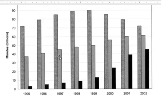
The bar chart illustrates the total number of calls in the UK in billions of minutes, with three call types over an eight year period from 1995 to 2002.

On the whole, local fixed line calls reached a peak by the middle of the period, then gradually declined. National and international calls showed a gradual rise over the whole period with mobile calls rising considerably toward the end of the period.

With regards to national and international fixed calls along with mobile calls, mobile calls stood at around two billion minutes in 1995. Over the next four years, they showed a gradual increase, with a marked increase in call numbers from 2000 to 2002. National and international fixed calls showed a similar pattern, starting at just under 40 billion minutes of calls in 1995, then rising steadily to around 60 billion minutes of calls in 2002.

Turning to local fixed line calls, in 1995 they began at slightly over 70 billion minutes and rose steadily to a peak of 90 billion minutes by 1999. However, from 2000, the trend showed a gradual decline in numbers of calls, ending in 2002 at the same amount as the start of the period.

Word Count: 200

Answers On The Same Topic:

The chart below shows the total number of minutes (in billions) of telephone calls in the UK, divided into the three categories, from 1995-2002.

the table graph shows category of 3 different call types in UK calls from 1995 toO Overall, almost all of the call types were increased and had a lot of changes. Also The main methods of communication in UK were local-fixed line, national and international-fixed line and mobiles. The most popular calls are local calls […]

The chart below shows the total number of minutes (in billions) of telephone calls in the UK, divided into the three categories, from 1995-2002.

The given chart demonstrates the total number of minutes (in billions) of mobile phone calls which are classified into three types in the UK between 1995 to 2002. In general, both national and international – fixed line and mobiles in call experienced an increase while there was a fluctuation trend in local – fixed line. […]

The chart below shows the total number of minutes (in billions) of telephone calls in the UK, divided into the three categories, from 1995-2002.

The bar chart illustrates the number of minutes spent in telephones calls categorized into local, international and mobiles in UK from 1995 to 2002. The minutes of calls calculated in billions. Overall it can be observed that citizens of UK spent most of their time on local calls throughout the period of 8 years. While […]

The chart below shows the total number of minutes (in billions) of telephone calls in the UK, divided into the three categories, from 1995-2002.

The line graph gives information about the number of minutes of telephone calls in the UK between 1995 and 2002. Overall, it can be seen that the number of minutes of telephone calls showed a significant increase in national, and international fixed lines and mobiles during the period, while the minutes of local fixed lines […]

The chart below shows the total number of minutes (in billions) of telephone calls in the UK, divided into the three categories, from 1995-2002.

The bar chart illustrates the total number of telephone calls in the UK. The data is divided into three categories(Local-fixed line, National and international-fixed line, Mobiles with all calls) between 1995 and 2002. From an overall perspective, the most highest percentage was local line. while the mobiles was the lowest percentage from 1995 to 2002. […]

See All

Other Topics:

The graph shows changes in meat production worldwide between 2010 and 2020.Summarise the information by selecting and reporting the main features, and make comparisons where relevant.

The diagram illustrates differences in meat production worldwide between 2010 and 2020. Overall, in this chart the most popular meat type is pork and beef, while sheep meat is least popular. Beef increased and dominated constantly 8 years, while poultry increased significantly only in 2020. In 2010, Beef had the highest production, maintaining 25 million […]

The chart below shows the destinations of students graduating from Physics and from Arts Design in one European country in 2007. Summarize the information by selecting and reporting the main features, and make comparisons where relevant. Write at least 150 words.

The chart illustrates the destinations of scholars advancing from Physics and from Arts and Design in one European country in a given year (2007). Overall, the majority of the pupils after graduating with Arts and Design are likely to get employed immediately, while in the case of Physics, many students are rather also focusing on […]

The chart below shows the main reasons why agricultural land becomes less productive in three regions of the world. Summarise the information by selecting and reporting the main features, and make comparisons where relevant.

The chart illustrates the information about the important causes of low production of agriculture. The data comapare figures about 3 continents which is North America, Europe and Oceania. Overall, the higest reason for degradation of land crop is over grazing, followed by deforestation and over cultivation. However, the uncommon reasons are unknowns. In detail, the […]

The chart below shows the destinations of students graduating from Physics and from Arts Design in one European country in 2007. Summarize the information by selecting and reporting the main features, and make comparisons where relevant. Write at least 150 words.

The chart illustrates the destinations of scholars advancing from Physics and from Arts Design in one European country in given year(2007). Overall, majority of the pupils after graduating with Arts and Design are likely to get employed immediately, while in the case of Physics many students are rather also focusing on further study and training […]

The bar chart below shows figures of annual coffee and meat consumption.

The bar chart depicts the consumption of coffee and meat anually in 7 developed countries. It can be clearly seen from the chart that meat consumption is the highest among 7 countries, while coffee is the lowest. USA occupies the top rank of meat consumption by 122 kilograms per person. Furthermore, the consumption of meat […]

The graph shows the percentage of males aged 16-25 in a particular country who prefer watching sports to males who prefer participating in sports. Summarise the information by selecting and reporting the main features and make comparisons where relevant.

The diagram depicts the preferences of males aged 16-25 concerning viewing versus participating in various sports. It is evident that the proportion of males preferring watching is larger than that of spectators, whereas fishing stands out as a notable exception with the participation rate far surpassing the viewership. Another notable pattern is that football as […]

See All
We have detected unusual activity on your device.
Please verify your identity to continue.
Note: This verification step won't sign you in. If you have a premium account, please log in to access the service as usual.
Google/Gmail Verification
Or verify using Email/Code
We've sent a verification code to:
youremail@gmail.com (Not your email?)
Enter it below to complete the verification process.
Ensure your email address is correct, your inbox is not full, and you check your spam folder. If no email arrives, consider using an alternative email.
You will need a Premium plan to perform your action!
Note: If you already have a premium account, please log in to access our services as usual.

Plans & Pricing

Our mission is to make quality education accessible for everyone.
However, to keep our hardworking team running and this service alive, we genuinely need your support!
By opting for a premium plan, not only do you sustain us in achieving the mission, but you also unlock advanced features to enrich your learning experience.

Free

For learners who aren't pressed for time

What's included on Free
100+ Cambridge IELTS Tests
Instant IELTS Writing Task 1 & 2 Evaluation (2 times/month)
Instant IELTS Speaking Part 1, 2, & 3 Evaluation (2 times/month)
Instant IELTS Writing Task 1 & 2 Essay Generator (2 times/month)
500+ Dictation & Shadowing Exercises
100+ Pronunciation Exercises
Flashcards
Other Advanced Tools

Premium

For those serious about advancing their English proficiency, and for IELTS candidates aspiring to boost their band score by 1-2 points (especially in writing & speaking) in just 30 days or less

What's included on Premium
Save Your IELTS Test Progress & Analyze Mistakes By Question Type
Save Your Own Flashcard Sets & Use Them On Any Device
Unlock All Courses, IELTS Tests, Section & Part Practice
Unlimited AI Conversations
Unlimited AI Writing Enhancement Exercises
Unlimited IELTS Writing Task 1 & 2 Evaluation
Unlimited IELTS Speaking Part 1, 2, & 3 Evaluation
Checked Answers Will Not Be Published
Unlimited IELTS Writing Task 1 & 2 Essay Generator
Unlimited IELTS Speaking Part 1, 2, & 3 Sample Generator
Unlimited Usage Of Advanced Tools & AI Features
Priority Support within 24h (12-month plan only)

Due to the nature of our service and the provided free trials, payments are non-refundable.