24 Hours Only: Get 39% OFF on Our Premium Plan - Check Out Now!
Bar Chart

Band 7+: The chart below shows the total number of Olympic medals won by twelve different countries. Write a report for a university, lecturer describing the information shown below. Summarise the information by selecting and reporting the main features and make comparisons where relevant.

Image for topic: The chart below shows the total number of Olympic medals won by twelve different countries. Write a report for a university, lecturer describing the information shown below. Summarise the information by selecting and reporting the main features and make comparisons where relevant.
Our system will evaluate the answer based on this AI-generated description.
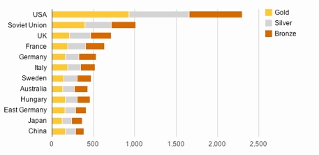
The image is a horizontal bar graph depicting the total number of Gold, Silver, and Bronze medals won by different countries, arranged in descending order of total medals won. The USA has the highest number of Gold medals (approximately 1,000) and total medals (close to 2,500), followed by the Soviet Union with Gold medals (around 500) and total medals (slightly over 1,000). The UK, France, Germany, Italy, Sweden, Australia, Hungary, East Germany, Japan, and China follow, respectively, with decreasing numbers of Gold and total medals. The UK has Gold medals (about 250) and total medals (around 750), France has Gold medals (just over 200) and total medals (nearly 700), Germany has Gold medals (approximately 175) and total medals (about 600), Italy has Gold medals (just under 175) and total medals (slightly over 500), Sweden has Gold medals (around 150) and total medals (close to 500), Australia has Gold medals (about 125) and total medals (nearly 500), Hungary has Gold medals (over 150) and total medals (just under 500), East Germany has Gold medals (around 150) and total medals (over 400), Japan has Gold medals (just under 100) and total medals (about 350), and China has the least with Gold medals (about 75) and total medals (approximately 300). Each country also has varying amounts of Silver and Bronze medals, with the Silver medals always being less than or equal to the Gold and Bronze medals often being the highest or equal to the Gold medals for each country.
Given the complexity of the image, the above description may not be entirely accurate.
Note: Both the topic and the answer were created by one of our users.

The chart illustrates the quantity of Olympic medals achieved by athletes in twelve countries. Overall, the greatest number of medals was won by American athletes, whereas Japan stood out as the country with the fewest number of Olympic medals. Additionally, the figures for medals won by countries exhibited similarity across most countries.

To begin with, American athletes were incomparably more successful than athletes from other countries, with approximately a total of 2,300 medals, which comprised 1000 gold, around 700 silver, and about 600 bronze medals throughout history. The success of the USA was followed by the Soviet Union which had a total of 1000 medals in Olympic games, with an equal distribution among the type of medals. Moreover, athletes from the UK and France managed to obtain relatively the same number of medals, they had a total of around 750 and 650 Olympic medals, relatively.

Regarding to the remaining countries’ Olympic medal figures, European countries had more Olympic medals than Asian countries. While a maximum of just over 500 medals were gained by European countries’ athletes, Japan and China remained this figure behind over the years.

Word Count: 186

Answers On The Same Topic:

The chart below shows the total number of Olympic medals won by twelve different countries. Write a report for a university, lecturer describing the information shown below. Summarise the information by selecting and reporting the main features and make comparisons where relevant.

The chart illustrates the total number of Olympic medals like ; Gold medals, Silver medals and Bronze medals won by twelve different countries such as : USA, Soviet Union, UK, France, Germany, Italy,Sweden, Australia, Hungary, East Germany, Japan and China. Overall, USA has the highest numbers of Olympic medals then all the other countries.Conversly, Japan […]

The chart below shows the total number of Olympic medals won by twelve different countries. Write a report for a university, lecturer describing the information shown below. Summarise the information by selecting and reporting the main features and make comparisons where relevant.

The bar chart illustrates the total number of gold, silver, and bronze medals earned by twelve nations. Overall, the United States achieves the highest number of medals, both in total and per medal. In contrast, Japan, China, East Germany win medals less than any other country. The United States collects approximately 2,3000 medals, including around […]

The chart below shows the total number of Olympic medals won by twelve different countries. Write a report for a university, lecturer describing the information shown below. Summarise the information by selecting and reporting the main features and make comparisons where relevant.

The provided bar chart depicts the total number of Olympic medals achieved by athletes from twelve different countries. Generally, the American athletes dominated the medal count (gold, silver, and bronze), while Japanese athletes had the lowest number. The rest of the countries (the Soviet Union, the UK, France, Germany, Italy, Sweden, Hungary, Australia, East Germany, […]

The chart below shows the total number of Olympic medals won by twelve different countries. Write a report for a university, lecturer describing the information shown below. Summarise the information by selecting and reporting the main features and make comparisons where relevant.

The chart illustrates the total quantity of Olympic medals won by twelve different nations. Overall, the U.S.A. has the highest number of medals compared to other countries. Additionally, the U.S.A. has the most medals in the three categories (gold, silver, and bronze). On the other hand, Japan has the fewest medals among the nations. First […]

The chart below shows the total number of Olympic medals won by twelve different countries. Write a report for a university, lecturer describing the information shown below. Summarise the information by selecting and reporting the main features and make comparisons where relevant.

The chart illustrates the total quantity of olympic medals won by twelve different nations. Overall, the U.S.A has the highest number of medals compared to other countries. Additionally, the U.S.A has the most medals in the three categories (gold, silver, and bronze). On the other hand, Japan has the fewest medals among the nations. First […]

See All

Other Topics:

You should spend about 20 minutes on this task. The graph below shows the average growth in domestic products in wealthy countries, countries that have adopted a global approach to business and countries that have not. Write a a report for a university lecturer describing the information below. Write at least 150 words.

The bar chart illustrates the average growth in domestic products in three different categories like wealthy countries, globalisers and non-globalisers. Overall, it is evident that in 1960s the average of wealthy countries was the highest. However, it has experienced significant change since the period. In 1960s, average of wealthy countries had the highest proportion at […]

The chart illustrates the percentage of male and female executives in six different types of profession across the UK in 2007. Summarise the information by selecting and reporting the main features, and make comparisons where necessary.

The bar chart compares the percentages of male and female executives across different professions in the UK in 2017. Overall, women dominate several fields, particularly teaching and therapy, while men are more prevalent in construction, science and law. Journalism is the only sector with equal representation. In the professions where women account for a higher […]

You should spend about 20 minutes on this task. The graph below shows the destinations of holiday makers from a particular Asian country in 2012. Summarise the information by selecting and reporting the main features, and make comparisons where relevant. » You should write at least 150 words.

The bar chart illustrates 2012 vacation distribution among some nations located in Asia. In the graph, population is plotted against Nations participating in thestudy. The country of Malaysia had the highest number of one million persons, with India trailing close to it with a total number of individuals slightly below the population of Malaysia. A […]

The chart shows the percentage of individuals living alone across five distinet age categories in the United States from 1850 to 2000. Provide an overview of the information by identifying and describing the key details, and include comparisons where appropriate.

The provided bar chart illustrates the percentage of US single-person households across five age cohorts from 1850 to 2000. Overall, an upward trend was observed across all age groups over time. While the older groups experienced the most significant increase and remained the highest, the figures for younger people remained comparatively lower until 2000. In […]

The charts shows air pollution levels by different causes among four countries in 2021. Summaries the information by selecting and reporting the main features, and make comparisons where relevant.

The charts illustrates about the amount of air pollution in some countries which due to three reasons in 2021. From the given information, we could see that China had the most air pollution than other countries in 2021. The reasons of air pollution itself, such as electricity generation, transportion, and industry was dominated by China […]

The chart below shows tea and coffee consumption in 2015. Write a summary of the information. Select and report the main features, and make comparisons where necessary.

The given diagram depicts the consumption of tea and coffee in different countries in 2015. Overall, the consumption of the two beverages was completely different across various nations. Initially, in Australia the coffee consumption was about 1 kilogram per person, whereas tea was 3 kilograms per individual. In Canada there was an enormous distinction between […]

See All
We have detected unusual activity on your device.
Please verify your identity to continue.
Note: This verification step won't sign you in. If you have a premium account, please log in to access the service as usual.
Google/Gmail Verification
Or verify using Email/Code
We've sent a verification code to:
youremail@gmail.com (Not your email?)
Enter it below to complete the verification process.
Ensure your email address is correct, your inbox is not full, and you check your spam folder. If no email arrives, consider using an alternative email.
You will need a Premium plan to perform your action!
Note: If you already have a premium account, please log in to access our services as usual.

Plans & Pricing

Our mission is to make quality education accessible for everyone.
However, to keep our hardworking team running and this service alive, we genuinely need your support!
By opting for a premium plan, not only do you sustain us in achieving the mission, but you also unlock advanced features to enrich your learning experience.

Free

For learners who aren't pressed for time

What's included on Free
100+ Cambridge IELTS Tests
Instant IELTS Writing Task 1 & 2 Evaluation (2 times/month)
Instant IELTS Speaking Part 1, 2, & 3 Evaluation (5 times/month)
Instant IELTS Writing Task 1 & 2 Essay Generator (2 times/month)
500+ Dictation & Shadowing Exercises
100+ Pronunciation Exercises
Flashcards
Other Advanced Tools

Premium

For those serious about advancing their English proficiency, and for IELTS candidates aspiring to boost their band score by 1-2 points (especially in writing & speaking) in just 30 days or less

What's included on Premium
Save Your IELTS Test Progress
Unlock All Courses & IELTS Tests
Unlimited AI Conversations
Unlimited AI Writing Enhancement Exercises
Unlimited IELTS Writing Task 1 & 2 Evaluation
Unlimited IELTS Speaking Part 1, 2, & 3 Evaluation
Checked Answers Will Not Be Published
Unlimited IELTS Writing Task 1 & 2 Essay Generator
Unlimited IELTS Speaking Part 1, 2, & 3 Sample Generator
Unlimited Usage Of Advanced Tools

Due to the nature of our service and the provided free trials, payments are non-refundable.
Nếu bạn là người Việt Nam và không có hoặc không muốn trả bằng credit/debit cards, bạn có thể thanh toán bằng phương thức chuyển khoản:


Chọn gói:
279,000₫ 157,000 ₫ cho gói 1 tháng (chỉ 5,233₫/ngày)
819,000₫ 397,000 ₫ cho gói 3 tháng (chỉ 4,411₫/ngày)
1,649,000₫ 667,000 ₫ cho gói 6 tháng (chỉ 3,706₫/ngày)
3,299,000₫ 857,000 ₫ cho gói 12 tháng (chỉ 2,381₫/ngày)


Sau khi chuyển khoản, vui lòng đợi trình duyệt tự động điều hướng bạn trở lại Engnovate và bạn sẽ ngay lập tức nhận được mã kích hoạt tài khoản premium.
Nếu có lỗi xảy ra, bạn có thể liên hệ với team thông qua một trong các phương thức: email đến helloengnovate@gmail.com hoặc nhắn tin qua facebook.com/engnovate.
Vì toàn bộ công cụ trên website đều có thể sử dụng thử miễn phí, Engnovate không hỗ trợ hoàn tiền.