🔥 Today Only: Save 30% on Premium — Offer Ends Soon! - Upgrade Now!
Bar Chart

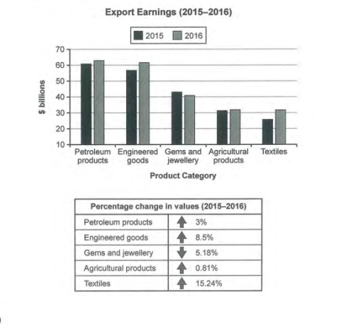
Band 6+: The chart below shows the value of one country's exports in various categories during 2015 and 2016. The table shows the percentage change in each category of exports in 2018 compared with 2015.

Image for topic: The chart below shows the value of one country's exports in various categories during 2015 and 2016. The table shows the percentage change in each category of exports in 2018 compared with 2015.
Our system will evaluate the answer based on this AI-generated description.
The image is a bar graph and a table depicting export earnings from 2015 to 2016. The bar graph shows 5 product categories: Petroleum products, Engineered goods, Gems and jewellery, Agricultural products, and Textiles. For 2015 and 2016, Petroleum products earn approximately $60 billion and $58 billion respectively, Engineered goods earn approximately $50 billion and $54 billion respectively, Gems and jewellery earn about $42 billion and $38 billion respectively, Agricultural products earn roughly $22 billion and $22 billion respectively, and Textiles earn around $18 billion and $20 billion respectively. The table below the bar graph shows the percentage change in values from 2015 to 2016 for each category: a 3% decrease for Petroleum products, an 8.5% increase for Engineered goods, a 5.18% decrease for Gems and jewellery, a 0.81% increase for Agricultural products, and a 15.24% increase for Textiles.
Given the complexity of the image, the above description may not be entirely accurate.
Note: Both the topic and the answer were created by one of our users.

The bar graph displays the value of a country’s exports in several categories in the years 2015 and 2016 while the table presents the change in proportion of each category of exports in 2016 when compared with the year 2015.

We can clearly see from the bar graph that the petroleum products make the highest earnings from export in both the years. The export earnings of the categories has increased in 2016 except for the gems and jewellery group, the percentage change of which is shown in the table. Also, we can observe from the table that the textile group has the greatest percentage change.

The bar graph shows that the highest earnings in the years 2015 and 2016 is from petroleum products class with just above 60 billion dollars and around 63 billion dollars respectively. All the categories have seen a rise in earnings in the year 2016 except for the gems and jewellery group which has fallen from around $43 billion to just above $40 billion, the percentage change of which is -5.18% as shown in the table.

We can see from the table that the textile category has the highest change in proportion at +15.24%. This is followed by Engineered goods class with +8.5% percentage change.

Word Count: 209

Answers On The Same Topic:

The chart below shows the value of one country’s exports in various categories during 2015 and 2016. The table shows the percentage change in each category of exports in 2018 compared with 2015.

The bar chart illustrates the export earnings of a country across five different product categories for the years 2015 and 2016, while the table provides the percentage change in the value of these exports. Overall, with an exception of gems and jewelry, there was an increase in export earnings for all product categories in 2016 […]

The chart below shows the value of one country’s exports in various categories during 2015 and 2016. The table shows the percentage change in each category of exports in 2018 compared with 2015.

The bar graph and accompanying table illustrate the export revenues of a country across five distinct product categories for the years 2015 and 2016, alongside the percentage changes experienced within this period. Overall, there was a notable variation in export values, with the most significant increase recorded in textiles, while agricultural products exhibited minimal change. […]

The chart below shows the value of one country’s exports in various categories during 2015 and 2016. The table shows the percentage change in each category of exports in 2018 compared with 2015.

The provided bar graph and accompanying table delineate the export values of a specific country in five distinct categories for the years 2015 and 2016. Overall, petroleum products consistently represented the most significant source of export revenue during both years, whereas textiles remained the category with the lowest earnings. Notably, there were substantial fluctuations in […]

The chart below shows the value of one country’s exports in various categories during 2015 and 2016. The table shows the percentage change in each category of exports in 2018 compared with 2015.

The provided chart illustrates the export earnings of a specific country across various categories from 2015 to 2016, while the accompanying table delineates the percentage fluctuations in each category over the same period. Overall, engineered goods emerged as the top-performing export category, whereas gems and jewellery experienced the most significant decline in value. Other categories […]

The chart below shows the value of one country’s exports in various categories during 2015 and 2016. The table shows the percentage change in each category of exports in 2018 compared with 2015.

The bar chart illustrates the value of one country’s exports between 2015 and 2016 across five categories. The table below compares the percentage change in exports per category between 2015 and 2016. In summary, almost all of the categories experienced an increase in export value in 2016, with only one category showing a decline. While […]

See All

Other Topics:

The chart below shows the number of different types of vehicles registered in European use from 1996 to 2006. Summarise the information by selecting and reporting the main features and make comparison where relevant.

The bar chart illustrates information about the registration trends in different types of vehicles in Europe, over a decade between 1996 and 2006. Overall, the vehicle registrations in almost all categories experienced shifts of varying extents, apart from “bus, coach and taxi”, with its figure showing no changes. Additionally, while personal car use dominated throughout […]

The table and chart illustrate the percentage of total consumer spending across three distinct categories in Turkey, Ireland, and Sweden in the year 2025. Summarise the information by selecting and reporting the main features, and make comparisons where relevant.

The following bar graph shows the distribution of consumption of their income on 3 distinct groups in Turkey, Ireland and Sweden. Firstly, ‘Food, Drinks and Tobacco’ relatively makes up most of the income spent. In Turkey it accounts for one-third of the income, similar to Ireland’s 29%, whereas for Sweden, it merely contributes to less […]

The graph below shows the percentage of self employed workers of the total workforce in five countries in 1998 and 2008. Summarise the information by selecting and reporting the main features and make comparisons where relevant.

The bar chart illustrates the percentage of self-employed workers as a proportion of the total workforce in five countries in 1998 and 2000. Overall, Turkey recorded the highest percentage of self-employed workers in both years, whereas the Russian Republic had lowest figures. Moreover, the percentages increased in the Russian Republic, Slovakia and the Czech Republic, […]

You should spend about 20 minutes on this task. The chart below shows the top ten countries with the highest spending on travel in 2014. Summarise the information by selecting and reporting the main features, and make comparisons where relevant. You should write at least 150 words.

The bar chart illustrates the amount of money spent on travel by the top ten countries in 2014, measured in billions of US dollars. Overall, China recorded the highest expenditure on travel, whereas Taiwan had the lowest figure. Moreover, the United States and Germany had almost identical levels of spending, while the remaining countries recorded […]

The chart below shows employment levels in three countries at different stages of economic development.

The given chart below compares employment ranks in the UK, Brazil, and India at different stages of economic development. Overall, the trends for the different groups showed no similarities. The service has the highest percentage of the workforce in the three countries. On the other hand, the industrial sector has the least percentage of the […]

The chart below shows the percentage of men and women in different age groups who believe their personal appearance is important to their cultural identity. Summarise the information by selecting and reporting the main features, and make comparisons where relevant.

The given bar chart compares the proportions of both genders from different age groups who think their personal looks is crucial to their cultural identity. Overall, it is clear that women tend to belive that their physical look is more important comapred to men. In addition, personal appearance became less significant with older generation. looking […]

See All
We have detected unusual activity on your device.
Please verify your identity to continue.
Note: This verification step won't sign you in. If you have a premium account, please log in to access the service as usual.
Google/Gmail Verification
Or verify using Email/Code
We've sent a verification code to:
youremail@gmail.com (Not your email?)
Enter it below to complete the verification process.
Ensure your email address is correct, your inbox is not full, and you check your spam folder. If no email arrives, consider using an alternative email.
You will need a Premium plan to perform your action!
Note: If you already have a premium account, please log in to access our services as usual.

Plans & Pricing

Our mission is to make quality education accessible for everyone.
However, to keep our hardworking team running and this service alive, we genuinely need your support!
By opting for a premium plan, not only do you sustain us in achieving the mission, but you also unlock advanced features to enrich your learning experience.

Free

For learners who aren't pressed for time

What's included on Free
100+ Cambridge IELTS Tests
Instant IELTS Writing Task 1 & 2 Evaluation (2 times/month)
Instant IELTS Speaking Part 1, 2, & 3 Evaluation (2 times/month)
Instant IELTS Writing Task 1 & 2 Essay Generator (2 times/month)
500+ Dictation & Shadowing Exercises
100+ Pronunciation Exercises
Flashcards
Other Advanced Tools

Premium

For those serious about advancing their English proficiency, and for IELTS candidates aspiring to boost their band score by 1-2 points (especially in writing & speaking) in just 30 days or less

What's included on Premium
Save Your IELTS Test Progress & Analyze Mistakes By Question Type
Save Your Own Flashcard Sets & Use Them On Any Device
Unlock All Courses, IELTS Tests, Section & Part Practice
Unlimited AI Conversations
Unlimited AI Writing Enhancement Exercises
Unlimited IELTS Writing Task 1 & 2 Evaluation
Unlimited IELTS Speaking Part 1, 2, & 3 Evaluation
Checked Answers Will Not Be Published
Unlimited IELTS Writing Task 1 & 2 Essay Generator
Unlimited IELTS Speaking Part 1, 2, & 3 Sample Generator
Unlimited Usage Of Advanced Tools & AI Features
Priority Support within 24h (12-month plan only)

Due to the nature of our service and the provided free trials, payments are non-refundable.