24 Hours Only: Get 39% OFF on Our Premium Plan - Check Out Now!
Bar Chart

Band 8+: The chart below shows the value of one country's exports in various categories during 2015 and 2016. The table shows the percentage change in each category of exports in 2018 compared with 2015.

Image for topic: The chart below shows the value of one country's exports in various categories during 2015 and 2016. The table shows the percentage change in each category of exports in 2018 compared with 2015.
Our system will evaluate the answer based on this AI-generated description.
The image is a bar graph and a table depicting export earnings from 2015 to 2016. The bar graph shows 5 product categories: Petroleum products, Engineered goods, Gems and jewellery, Agricultural products, and Textiles. For 2015 and 2016, Petroleum products earn approximately $60 billion and $58 billion respectively, Engineered goods earn approximately $50 billion and $54 billion respectively, Gems and jewellery earn about $42 billion and $38 billion respectively, Agricultural products earn roughly $22 billion and $22 billion respectively, and Textiles earn around $18 billion and $20 billion respectively. The table below the bar graph shows the percentage change in values from 2015 to 2016 for each category: a 3% decrease for Petroleum products, an 8.5% increase for Engineered goods, a 5.18% decrease for Gems and jewellery, a 0.81% increase for Agricultural products, and a 15.24% increase for Textiles.
Given the complexity of the image, the above description may not be entirely accurate.
Note: Both the topic and the answer were created by one of our users.

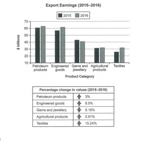
The bar chart illustrates the export values in 5 categories in 2015 and 2016, whereas the table compares the percentage change over the period.

Looking at the chart, it is immediately obvious that most of the export earnings came from petroleum products and engineered goods. From the table, it is clear that all the categories, except for gems and jewellery, experienced an upward trend over the timescale.

In 2015, the total values earned from exporting petroleum products was around $60 billion, the highest earnings in this year. After one year, this figure saw a growth of 3%, maintaining its position as the most valuable category. Similarly, engineered goods also continued its status quo as the second most one after a 8.5% increase to north of $60 billion. The most significant rise could be seen in the textiles category where its value went up by 15.24% in 2016.

Regarding agricultural products, the country gained roughly around $30 billion for exporting products from this sector in both the years. Finally, as the only category with a negative increase, gems and jewellery experienced a decrease of 5.18% in its export earnings, dropping from about $43 billion to only $40 billion over the given period.

Word Count: 201

Answers On The Same Topic:

The chart below shows the value of one country’s exports in various categories during 2015 and 2016. The table shows the percentage change in each category of exports in 2018 compared with 2015.

The bar chart illustrates the export earnings of a country across five different product categories for the years 2015 and 2016, while the table provides the percentage change in the value of these exports. Overall, with an exception of gems and jewelry, there was an increase in export earnings for all product categories in 2016 […]

The chart below shows the value of one country’s exports in various categories during 2015 and 2016. The table shows the percentage change in each category of exports in 2018 compared with 2015.

The bar graph and accompanying table illustrate the export revenues of a country across five distinct product categories for the years 2015 and 2016, alongside the percentage changes experienced within this period. Overall, there was a notable variation in export values, with the most significant increase recorded in textiles, while agricultural products exhibited minimal change. […]

The chart below shows the value of one country’s exports in various categories during 2015 and 2016. The table shows the percentage change in each category of exports in 2018 compared with 2015.

The provided bar graph and accompanying table delineate the export values of a specific country in five distinct categories for the years 2015 and 2016. Overall, petroleum products consistently represented the most significant source of export revenue during both years, whereas textiles remained the category with the lowest earnings. Notably, there were substantial fluctuations in […]

The chart below shows the value of one country’s exports in various categories during 2015 and 2016. The table shows the percentage change in each category of exports in 2018 compared with 2015.

The provided chart illustrates the export earnings of a specific country across various categories from 2015 to 2016, while the accompanying table delineates the percentage fluctuations in each category over the same period. Overall, engineered goods emerged as the top-performing export category, whereas gems and jewellery experienced the most significant decline in value. Other categories […]

The chart below shows the value of one country’s exports in various categories during 2015 and 2016. The table shows the percentage change in each category of exports in 2018 compared with 2015.

The bar chart illustrates the value of one country’s exports between 2015 and 2016 across five categories. The table below compares the percentage change in exports per category between 2015 and 2016. In summary, almost all of the categories experienced an increase in export value in 2016, with only one category showing a decline. While […]

See All

Other Topics:

The chart below shows the results of a European survey into young people's expectations for change in five different areas of life in the next 20 years. They were asked if they thought things would improve or get worse.

The bar graph illustrates an information which is about the result of survey that carried out among European young people. The result regards intended increase or decrease of quality of five particular field of life in the next 20 years. According to bar chart, the most of people considered that the communication between people are […]

The chart below shows the amount of time that 10 to 15-year-olds spend chatting on the Internet and playing on games consoles on an average school day in the UK. Summarise the information by selecting and reporting the main features, and make comparisons where relevant.

The bar chart compares the proportions of boys and girls aged 10 to 15 in the UK who spend time chatting online and playing games on a typical school day, in terms of the amount of time spent on these activities. Overall, it is clear that girls tend to spend more time chatting online, whereas […]

The bar chart below shows the popularity of well-known Instagram accounts in 2018 and 2021. Summarise the information by selecting and reporting the main features, and make comparisons where relevant.

The chart compares the popularity of five different well-known instagram accounts between 2018 and 2021. Overall, the Cristiano Ronaldo account became very popular over the given preiod, while others accounts were followed by an upper trand. In 2018 , Cristiano Ronaldo account started from just ower than 100 millions subscribes , after which it was […]

The chart below shows how four European countries deal with their cities waste in four different ways.

The bar chart illustrate the propotion of four type waste disposal in Netherlands, Italy, the UK, and Spain in the same time. In the UK, Italy And Spain landfill disposal way to at 50% and above it, while in the Netherlands this way to 10%. The percentage of the recycling is equal in the UK […]

The bar chart below shows the number of people who visited different museums in London during different months in 2015. Summarise the information by selecting and reporting the main features, and make comparisons where relevant.

The bar chart illustrates how many people visited three different museums in London in the year 2015. Overall, according to the graph, the British Museum was a very popular place in London for many people. The information illustrates that people visited this place five million times in the year 2015. If we look at the […]

the world production output from Asia, Europa and the rest of the world in the period 1840 and 2000

The bar chart compares the percentages of production from Asia, Europe and rest of the world in the years of 1840 and 2000. Overall, it is clear that the highest amount of production came from Asia at the beginning of the period, but this figure declined significantly the period of the time, while rest of […]

See All
We have detected unusual activity on your device.
Please verify your identity to continue.
Note: This verification step won't sign you in. If you have a premium account, please log in to access the service as usual.
Google/Gmail Verification
Or verify using Email/Code
We've sent a verification code to:
youremail@gmail.com (Not your email?)
Enter it below to complete the verification process.
Ensure your email address is correct, your inbox is not full, and you check your spam folder. If no email arrives, consider using an alternative email.
You will need a Premium plan to perform your action!
Note: If you already have a premium account, please log in to access our services as usual.

Plans & Pricing

Our mission is to make quality education accessible and free for everyone.
However, to keep our hardworking team running and this service alive, we genuinely need your support!
By opting for a premium plan, not only do you sustain us in achieving the mission, but you also unlock advanced features to enrich your learning experience.

Free

For learners who aren't pressed for time

What's included on Free
1000+ IELTS Tests & Samples
Instant IELTS Writing Task 1 & 2 Evaluation (2 times/month)
Instant IELTS Speaking Part 1, 2, & 3 Evaluation (5 times/month)
Instant IELTS Writing Task 1 & 2 Essay Generator (2 times/month)
500+ Dictation & Shadowing Exercises
100+ Pronunciation Exercises
Flashcards
Other Advanced Tools

Premium

For those serious about advancing their English proficiency, and for IELTS candidates aspiring to boost their band score by 1-2 points (especially in writing & speaking) in just 30 days or less

What's included on Premium
Save Your IELTS Test Progress
Unlock All Courses & Content
Unlimited AI Conversations
Unlimited AI Writing Enhancement Exercises
Unlimited IELTS Writing Task 1 & 2 Evaluation
Unlimited IELTS Speaking Part 1, 2, & 3 Evaluation
Checked Answers Will Not Be Published
Unlimited IELTS Writing Task 1 & 2 Essay Generator
Unlimited IELTS Speaking Part 1, 2, & 3 Sample Generator
Unlimited Usage Of Advanced Tools

Due to the nature of our service and the provided free trials, payments are non-refundable.
Nếu bạn là người Việt Nam và không có hoặc không muốn trả bằng credit/debit cards, bạn có thể thanh toán bằng phương thức chuyển khoản:


Chọn gói:
279,000₫ 157,000 ₫ cho gói 1 tháng (chỉ 5,233₫/ngày)
819,000₫ 397,000 ₫ cho gói 3 tháng (chỉ 4,411₫/ngày)
1,649,000₫ 667,000 ₫ cho gói 6 tháng (chỉ 3,706₫/ngày)
3,299,000₫ 857,000 ₫ cho gói 12 tháng (chỉ 2,381₫/ngày)


Sau khi chuyển khoản, vui lòng đợi trình duyệt tự động điều hướng bạn trở lại Engnovate và bạn sẽ ngay lập tức nhận được mã kích hoạt tài khoản premium.
Nếu có lỗi xảy ra, bạn có thể liên hệ với team thông qua một trong các phương thức: email đến helloengnovate@gmail.com hoặc nhắn tin qua facebook.com/engnovate.
Vì toàn bộ công cụ trên website đều có thể sử dụng thử miễn phí, Engnovate không hỗ trợ hoàn tiền.