🔥 Today Only: Save 30% on Premium — Offer Ends Soon! - Upgrade Now!
Line Graph

Band 7+: The chart graph shows the percentage of tourists to Scotland who visited four different types of attractions from 1980 to 2010.

Image for topic: The chart graph shows the percentage of tourists to Scotland who visited four different types of attractions from 1980 to 2010.
Our system will evaluate the answer based on this AI-generated description.
The image shows a line graph illustrating the percentage of tourists to Scotland who visited different attractions from 1980 to 2010. The graph has four lines representing the Aquarium (blue), Castle (red), Zoo (yellow), and Festival (purple) attractions. In 1980, the castle had the highest percentage of visitors at approximately 30%, followed by the festival at around 25%, the aquarium at 20%, and the zoo at 15%. By 1985, the castle and festival were both around 35%, the aquarium at 25% and the zoo at 20%. In 1990 the trend remained similar to 1985. By 1995, the castle reached its peak at 45%, while the festival saw a slight decrease to 30%, the aquarium remained steady at 25%, and the zoo dropped to 15%. In 2000, the castle had a slight dip to just below 45%, the festival increased to nearly 35%, the aquarium rose to 30%, and the zoo remained at 15%. In 2005, the castle decreased to around 40%, the festival went up to 40%, the aquarium stayed at 30%, and the zoo had a slight increase to just over 15%. By 2010, the castle was at 40%, the festival decreased to 35%, the aquarium slightly increased to just above 30%, and the zoo went up to just below 20%.
Given the complexity of the image, the above description may not be entirely accurate.
Note: Both the topic and the answer were created by one of our users.

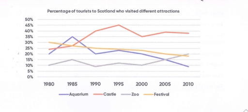
The line graph illustrates the changes involved in the proportions of foreign visitors to Scotland who went to four famous tourist destinations-namely Aquarium, Castle, Zoo, and Festival-from 1980 to 2010.

Overall, it is notable that while the Castle and Zoo followed upward trends, Aquarium and Festival exhibited downward patterns. In addition, the figure for the Castle was highest over most of the surveyed period.

In 1980, the rate of Festival was highest at over 30%, followed by that of Castle at around 23%. The figures for Aquarium and Zoo were lower at around 20% and 10%, respectively.

From that point on, the figures for all the surveyed tourist sites followed different patterns. The percentage of Festival gradually decreased to less than 20% in 2010, whereas that of Aquarium, after increasing to more than 35% in 1985, declined rapidly to under 10% in the end of the period. By contrast, Castle and Zoo showed upward trends. The figure for Castle considerably rose to over 45% in 1995 and then gradually dropped to over 35% in 2010. Regarding the rate of Zoo, it fluctuated between 9% and 15% from 1980 to 2000 before increasing to its highest point at around 22% in the end of the period.

Word Count: 205

Answers On The Same Topic:

The chart graph shows the percentage of tourists to Scotland who visited four different types of attractions from 1980 to 2010.

The line chart illustrates the percentage of visitors to four places in scotland including Aquarium, Castle, Z00 and Festival over a period of 30 years. Overall, it is clear that while the percentage of tourists visiting Castle and Z00 increased, the opposite was true for Aquarium and Festival over the period. It is also notable […]

The chart graph shows the percentage of tourists to Scotland who visited four different types of attractions from 1980 to 2010.

The line graph illustrates how many travellers visited four different types of attractions, namely Aquarium, Castle, Zoo and Festival in Scotland between 1980 and 2010. Overall, there was an increase in the number of tourists visiting Castle and Zoo, while the opposite was true for Festival and Aquarium attractions. It was also notable that Castle […]

The chart graph shows the percentage of tourists to Scotland who visited four different types of attractions from 1980 to 2010.

The line graph shows how many people visit four different destinations aquarium, castle, zoo, and festival in Scotland from 1980 to 2010 Overall, despite some fluctuations, there was an increase in the number of visitors who went to the castle and zoo in Scotland. In contrast, the people went to the aquarium, and the festival […]

The chart graph shows the percentage of tourists to Scotland who visited four different types of attractions from 1980 to 2010.

The line graph shows how many people visited four different destinations – aquarium, castle, zoo, and festival – in Scotland from 1980 to 2010. Overall, despite some fluctuations, there was an increase in the number of visitors who went to the castle and zoo in Scotland. In contrast, the number of people who went to […]

The chart graph shows the percentage of tourists to Scotland who visited four different types of attractions from 1980 to 2010.

The line graph shows how much people visits to four different destination about aquarium, castle, zoo and festival in Scotland from 1980 to 2010 Overall, despite some fluctuations, there was an increase in the mount of visitors who went to castle and zoo in Scotland. In contrast, the people went to the aquarium and the […]

See All

Other Topics:

The chart shows the percentage of tourists to Scotland who visited four different types of attractions from 1980 to 2010.

The given line graph illustrates the fraction of foreign visitors in attractions in different sites such as aquarium, castle, zoo and festival in Edinburgh, Scotland. In overall, there is sligh increment and decrement of visitors in attractions. In two places, visitors increased throughout the year whereas decreased in two. Aquarium and castle shows the most […]

The line graph below shows the population size, birth rate and the death rate of England and Wales from 1700 to 2000. Summarise the information by selecting and reporting the main features and make comparisons where relevant.

The line graph illustrates the information about three demographics (population size, the birth rate and death rate) of English and Wales between 1700 and 2000. Overall, it can be clearly seen that throughout the given period the birth was more than death rate. Also, the population size rose with time, while the death rate and […]

the line graph below gives informTION BOUT THE NUMBER OF JOBS IN FOUR SECTORS OF THE ECONOMY IN THE US BETWEEN 1960 AND 2020

The given line graph illustrates the number of professions in four sectors of the economy in the US from 1960 to 2020. Overall, it can be clearly observed that healthcare and retail indicated the highest rate while agriculture represented the lowest level. According to the given data, at the beginning of the period manufacturing showed […]

The graph below gives information about the number of jobs in four sectors of the economy in the US between 1960 and 2020. Summarise the information by selecting and reporting the main features, and make comparisons where relevant.

The given line graph demonstrates the details about the amount of career opportunities in four sectors of the economy in United States from 1960 to 2020. Overall, while two trends had the highest figures over the given period, the number of jobs in manufacturing and agriculture recorded the lowest proportion throughout the period. In addition, […]

The graph shows monthly trends of three product of tablets, laptop, desktop.

The figure shows monthly trends of three product of tablets, laptop, desktop. Overall, the highest level among the products were tablets over the five-month period. They rose consistently without any decline. The lowest figure is the desktop, it was showed a continuous downward trend. Looking at the diagram, the sales of tablets commenced in January […]

The graph below shows the gross domestic products (GDP) in four selected countries between 2010 and 2015

the graph provides the gross domestic products among four countries over a 5 years of period, from 2010 to 2015. Overall, it is evident that the USA experienced the highest amount of products, while the UK recorded the lowest figures. It witnessed that the USA and China showed a significant upward trend throughout the period. […]

See All
We have detected unusual activity on your device.
Please verify your identity to continue.
Note: This verification step won't sign you in. If you have a premium account, please log in to access the service as usual.
Google/Gmail Verification
Or verify using Email/Code
We've sent a verification code to:
youremail@gmail.com (Not your email?)
Enter it below to complete the verification process.
Ensure your email address is correct, your inbox is not full, and you check your spam folder. If no email arrives, consider using an alternative email.
You will need a Premium plan to perform your action!
Note: If you already have a premium account, please log in to access our services as usual.

Plans & Pricing

Our mission is to make quality education accessible for everyone.
However, to keep our hardworking team running and this service alive, we genuinely need your support!
By opting for a premium plan, not only do you sustain us in achieving the mission, but you also unlock advanced features to enrich your learning experience.

Free

For learners who aren't pressed for time

What's included on Free
100+ Cambridge IELTS Tests
Instant IELTS Writing Task 1 & 2 Evaluation (2 times/month)
Instant IELTS Speaking Part 1, 2, & 3 Evaluation (5 times/month)
Instant IELTS Writing Task 1 & 2 Essay Generator (2 times/month)
500+ Dictation & Shadowing Exercises
100+ Pronunciation Exercises
Flashcards
Other Advanced Tools

Premium

For those serious about advancing their English proficiency, and for IELTS candidates aspiring to boost their band score by 1-2 points (especially in writing & speaking) in just 30 days or less

What's included on Premium
Save Your IELTS Test Progress
Unlock All Courses & IELTS Tests
Unlimited AI Conversations
Unlimited AI Writing Enhancement Exercises
Unlimited IELTS Writing Task 1 & 2 Evaluation
Unlimited IELTS Speaking Part 1, 2, & 3 Evaluation
Checked Answers Will Not Be Published
Unlimited IELTS Writing Task 1 & 2 Essay Generator
Unlimited IELTS Speaking Part 1, 2, & 3 Sample Generator
Unlimited Usage Of Advanced Tools
Priority Support within 24h (12-month plan only)

Due to the nature of our service and the provided free trials, payments are non-refundable.
Nếu bạn là người Việt Nam và không có hoặc không muốn trả bằng credit/debit cards, bạn có thể thanh toán bằng phương thức chuyển khoản:


Chọn gói:
419,000₫ 277,000 ₫ cho gói 1 tháng (chỉ 9,233₫/ngày)
1,239,000₫ 597,000 ₫ cho gói 3 tháng (chỉ 6,633₫/ngày)
2,469,000₫ 1,027,000 ₫ cho gói 6 tháng (chỉ 5,706₫/ngày)
4,929,000₫ 1,417,000 ₫ cho gói 12 tháng (chỉ 3,936₫/ngày)


Sau khi chuyển khoản, vui lòng đợi trình duyệt tự động điều hướng bạn trở lại Engnovate và bạn sẽ ngay lập tức nhận được mã kích hoạt tài khoản premium.
Nếu có lỗi xảy ra, bạn có thể liên hệ với team thông qua một trong các phương thức: email đến helloengnovate@gmail.com hoặc nhắn tin qua facebook.com/engnovate.
Vì toàn bộ công cụ trên website đều có thể sử dụng thử miễn phí, Engnovate không hỗ trợ hoàn tiền.