24 Hours Only: Get 39% OFF on Our Premium Plan - Check Out Now!
Bar Chart

Band 5+: The chart shows British Emigration to selected destinations between 2004 and 2007.

Image for topic: The chart shows British Emigration to selected destinations between 2004 and 2007.
Our system will evaluate the answer based on this AI-generated description.
The image depicts a bar graph illustrating British emigration to selected destinations between 2004-2007, with thousands on the y-axis and destination countries on the x-axis. Each country has four bars representing the years, with blue for 2004, red for 2005, green for 2006, and yellow for 2007. Australia had the highest emigration numbers, starting around 50,000 in 2004, decreasing steadily each year to just over 30,000 in 2007. Spain's numbers ranged from just over 40,000 in 2004 to around 35,000 in 2007. New Zealand saw a consistent decrease from just over 20,000 in 2004 to around 10,000 in 2007. The USA had an increase from 20,000 in 2004 to nearly 30,000 in 2006 before dropping to around 20,000 in 2007. France's numbers remained relatively stable, starting at just over 10,000 in 2004, peaking at around 15,000 in 2005, and settling at just under 10,000 in 2007. The data source is the International Passenger Survey/ONS.
Given the complexity of the image, the above description may not be entirely accurate.
Note: Both the topic and the answer were created by one of our users.

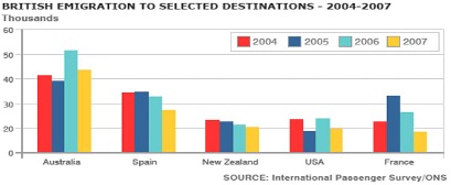
The given bar chart illustrates British Immigration to five different states between 2004 and 2007.

Overall, Australia remained as the first destination during this period. Although France nearly converged with USA and New Zealand at the same level in 2004, there was an huge jump in 2005.

As can be seen in the graph, all the countries except from Australia went down at the end of the period compared to initial proportion. The amount of individuals who wanted to immigrate to New Zealand steadily and slowly decreased during the period while USA and France fluctuated. Spain had also downward trend with a plateau from 2004 to 2005. After Australia went down from 2004 to 2005, It exhibited an increase in 2006.

Furthermore, New Zealand, Usa and France initially had the almost same proportion. Then, in 2005, France outnumbered these two countries and reached approximately Spain while New Zealand also surpassed USA.

Word Count: 151

Answers On The Same Topic:

The chart shows British Emigration to selected destinations between 2004 and 2007.

The provided bar graph illustrates the patterns of British emigration to various selected countries over a four-year period from 2004 to 2007. Overall, it is evident that while Australia consistently led in the number of emigrants, most other destinations experienced varying trends, either declining or remaining stable throughout the timeframe. Specifically, Australia saw the highest […]

The chart shows British Emigration to selected destinations between 2004 and 2007.

The bar chart shows the number of British people who emigrated to five destinations over the period 2004 to 2007. It is evident from the chart that throughout the period, the most popular place to move to was Australia. Emigration to Australia stood at just over 40,000 people in 2004, which was approximately 6,000 higher […]

The chart shows British Emigration to selected destinations between 2004 and 2007.

The bar chats illustrates number of British masses are emigration from five different nations between 2004 to 2007. After analyzing the bar ghaph, In 2004 and 2005, there was negligible difference by people to Australia.Moreover, the noticably different by 7000 individuals are emigration to first country.furthermore,the second major nation is Spain with almost identical percent […]

See All

Other Topics:

the chart below shows the average daily sales of selected food items at the Brisk Cafe, by season

The bar chart illustrates a comparison between winter and summer in terms of selected food items, namely Hot coffee, Iced coffee, Ice cream, Soup, and Salad in particular brisk cafe. Overall, it is immediately apparent that winter recorded higher figures in most categories, while summer remained lower comparatively lower. Additionally, both seasons followed a broadly […]

"The chart below shows the expenditure of two individuals on five different consumer goods in 2010 (in thousands of taka).

The bar chart illustrates a comparison between the expenditure of pavel and rubel on five different consumers goods, namely cars, computers, books, perfume, and cameras in 2010. The figures are presented in thousands. Overall, it is immediately apparent that ruble recorded higher figures in most categories, while pavel remained comparatively lower. Additionally, both groups followed […]

The chart below shows the number of jobs in tourism-related industries in on UK city between 1989 and 2009. (

The bar chart illustrates the number of tourism-related jobs in a specific city in the United Kingdom over the course of 20 years, starting from 1989. Overall, there was an upward trend in the amount of employment generated by the tourism-related Restaurants industry, as opposed to the data for Sport and leisure, as well as […]

The chart below shows the percentage of graduates from a UK university who found full-time employment, part-time employment, or further study within one year of completing their bachelor's degree in 2023, summarised by faculty. Summarise the information by selecting and reporting the main features, and make comparisons where relevant.

The UK university bachelor’s degree students from different faculties, who have ended their education in 2023 and then found a job or continued their studies within one year are shown on the chart. There are three kinds of graduates and their involvement in work and education. Overall, there exist two types of emploited humans after […]

The bar chart shows the typical weekday for students in three different countries.

The bar chart illustrates how the students of three diffent countries do on the typical weekday, categorized into three sections. Overall, it is clear that Japanese students spend a significant amount of time on studying among three different countries, whereas they use the least time on relaxing. By contrast, English students use more time on […]

percentage change in places where students lived over five decades between 1960 and 2000.

The bar chart illustrate proportions of students’ accomodation from 1980 to 2000 with the number measured in percentage. Overall, most of the students preferred room in a share house, while fewer number of students lived with family at home. At the beginning of the first decade, most students lived in a room in a shared […]

See All
We have detected unusual activity on your device.
Please verify your identity to continue.
Note: This verification step won't sign you in. If you have a premium account, please log in to access the service as usual.
Google/Gmail Verification
Or verify using Email/Code
We've sent a verification code to:
youremail@gmail.com (Not your email?)
Enter it below to complete the verification process.
Ensure your email address is correct, your inbox is not full, and you check your spam folder. If no email arrives, consider using an alternative email.
You will need a Premium plan to perform your action!
Note: If you already have a premium account, please log in to access our services as usual.

Plans & Pricing

Our mission is to make quality education accessible for everyone.
However, to keep our hardworking team running and this service alive, we genuinely need your support!
By opting for a premium plan, not only do you sustain us in achieving the mission, but you also unlock advanced features to enrich your learning experience.

Free

For learners who aren't pressed for time

What's included on Free
100+ Cambridge IELTS Tests
Instant IELTS Writing Task 1 & 2 Evaluation (2 times/month)
Instant IELTS Speaking Part 1, 2, & 3 Evaluation (5 times/month)
Instant IELTS Writing Task 1 & 2 Essay Generator (2 times/month)
500+ Dictation & Shadowing Exercises
100+ Pronunciation Exercises
Flashcards
Other Advanced Tools

Premium

For those serious about advancing their English proficiency, and for IELTS candidates aspiring to boost their band score by 1-2 points (especially in writing & speaking) in just 30 days or less

What's included on Premium
Save Your IELTS Test Progress
Unlock All Courses & IELTS Tests
Unlimited AI Conversations
Unlimited AI Writing Enhancement Exercises
Unlimited IELTS Writing Task 1 & 2 Evaluation
Unlimited IELTS Speaking Part 1, 2, & 3 Evaluation
Checked Answers Will Not Be Published
Unlimited IELTS Writing Task 1 & 2 Essay Generator
Unlimited IELTS Speaking Part 1, 2, & 3 Sample Generator
Unlimited Usage Of Advanced Tools

Due to the nature of our service and the provided free trials, payments are non-refundable.
Nếu bạn là người Việt Nam và không có hoặc không muốn trả bằng credit/debit cards, bạn có thể thanh toán bằng phương thức chuyển khoản:


Chọn gói:
279,000₫ 157,000 ₫ cho gói 1 tháng (chỉ 5,233₫/ngày)
819,000₫ 397,000 ₫ cho gói 3 tháng (chỉ 4,411₫/ngày)
1,649,000₫ 667,000 ₫ cho gói 6 tháng (chỉ 3,706₫/ngày)
3,299,000₫ 857,000 ₫ cho gói 12 tháng (chỉ 2,381₫/ngày)


Sau khi chuyển khoản, vui lòng đợi trình duyệt tự động điều hướng bạn trở lại Engnovate và bạn sẽ ngay lập tức nhận được mã kích hoạt tài khoản premium.
Nếu có lỗi xảy ra, bạn có thể liên hệ với team thông qua một trong các phương thức: email đến helloengnovate@gmail.com hoặc nhắn tin qua facebook.com/engnovate.
Vì toàn bộ công cụ trên website đều có thể sử dụng thử miễn phí, Engnovate không hỗ trợ hoàn tiền.