24 Hours Only: Get 39% OFF on Our Premium Plan - Check Out Now!
Multiple Graphs

Band 6+: The charts below show changes in the cost of visiting a national park in the country from 2011 to 2018 as well as the number of visitors to national parks each year.

Image for topic: The charts below show changes in the cost of visiting a national park in the country from 2011 to 2018 as well as the number of visitors to national parks each year.
Our system will evaluate the answer based on this AI-generated description.
The image contains two graphs related to national parks from 2011 to 2018. The first graph, titled "Price for Entry to National Parks (2011 – 2018)," shows price on the y-axis, ranging from $0.00 to $20.00 in $2.00 increments, and years on the x-axis. In 2011, the entry price is at $10.00, it decreases slightly in 2012 to just below $10.00, remains steady in 2013, rises in 2014 to $12.00, stays consistent in 2015, increases in 2016 to $14.00, climbs in 2017 to $16.00, and peaks in 2018 at $18.00. The second graph titled "Number of Visitors to National Parks (2011 – 2018)," depicts the number of visitors in millions on the y-axis, ranging from 0.00 to 0.55 in 0.05 increments, and years on the x-axis. The number of visitors in 2011 is at 0.35 million, rises slightly in 2012 to just above 0.35 million, drops in 2013 to 0.30 million, increases in 2014 to 0.35 million, jumps in 2015 to 0.45 million, maintains in 2016, slightly decreases in 2017 to below 0.45 million, and remains steady in 2018.
Given the complexity of the image, the above description may not be entirely accurate.
Note: Both the topic and the answer were created by one of our users.

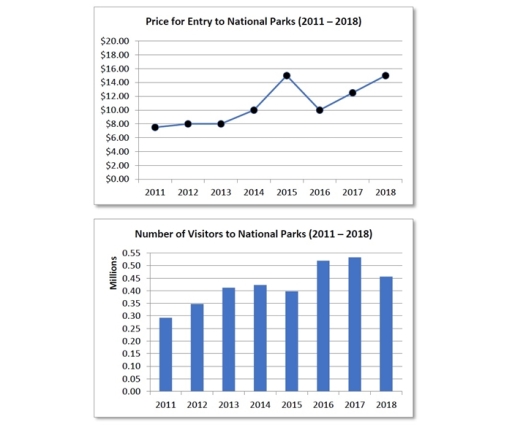
The two charts illustrate the relations between the entry fee for national parks in the country and numbers of thier visitors from 2011 to 2018.

Overall, the trend regarding the numbers of tourists at the national park were corresponded with the changes in the price for entry. It could be stated that the more expentive the fee was, the lower number of people visited.

Regarding the first four years, the figures of people coming to nation parks consistently rose from rought 0.30 to 0.40 million. This trend related to the slight change in amount of money for entering the parks, ranging from 8 to 19 US dollars.

In 2015, while the cost dramatically increased to reach about 15$, the number of visitors dropped corresponingly. Moreover, the same connection was seen in 2018, where the price again rose to approximately 15 dollars and the tourists also dropped from about 0.55 to 0.45 million.

Word Count: 152

Answers On The Same Topic:

The charts below show changes in the cost of visiting a national park in the country from 2011 to 2018 as well as the number of visitors to national parks each year.

The line graphs elucidate changes in the cost of visiting a national park in the country between 2011 and 2018 as well as the number of visitors to national parks each year. Overall, the number of visitors to national parks increased steadily with some fluctuations, while the price for entry to national parks increased significantly […]

The charts below show changes in the cost of visiting a national park in the country from 2011 to 2018 as well as the number of visitors to national parks each year.

The line graph provides data on the price for entry to national parks between 2011 and 2018. While the bar chart illustrates data on the number of visitors to national parks in the same eight-year period of time. Overall, the price of visiting the national park had increased from 2011 to 2018, obtaining more visits […]

See All

Other Topics:

The graph and chart show the average monthly maximum temperatures and the average monthloy rainfall in two australian cities, Darwin and Sydney. Summarise the information by selecting and reporting the main features, and make comparisons where relevant.

When we talk about Australia usually its wheater is something to highlight, it is most known for being one of the warmest countries in the world. Today we will analize the average temperture monthly report in Sydney and Darwin. To start, The months of September, October, November and december were the hottest ones with an […]

The charts below show the reasons of students to studya particular in a UK university in the year 1987 snd 2007.

The two pie charts provide information about the key criterions which have an impact on students’ decision in choosing a particular university in the UK in 1997 and 2007. Overall, while quality of teaching, proximity to parental home and suitable degree courses gained more attention, the other reasons witnessed failed. Besides that, suitable degree courses […]

The pie chart below shows the worldwide distribution of private insurance policies. The table shows the private insurance policy ownership of three countries. Summarise the information by selecting and reporting the main features, and make comparisons where relevant.

The pie chart illustrates the worldwide distribution of private insurance policies. The table depicts the private insurance policy ownership of India, England and Australia. Overall ,the distribution of private insurance policies auto has the highest rate, in addition compared with the rate of other is lowest. England has the largest number of population than other […]

The graph below shows the demand for electricity in England during typical days in winter and summer. The pie chart shows how electricity is used in an average English home. Summarise the information by selecting and reporting the main features, and make comparisons where relevant.

The graph illustrates the variation in electricity demand between winter and summer in England for different hours of a day, while the pie chart depicts the primary sources of electricity consumption in typical English household. Overall, the consumption of electricity in winter is significantly higher than in summer at all times of the day, peaking […]

The graphs below show the number of men and women in full and part-time employment in Australia between 1973 and 1993. Summarise the information by selecting and reporting the main features, and make comparisons where relevant.

The line graph illustrates the distribution of employments by gender in Australia, over a two decades period, from 1973 to 1993. In addition, they are seperated on the basis of the full-time and part-time jobs. Generally speaking, in 1973, fill-time females outnumbered the full-time males, whereas part-time womens and mens were notable to be similar. […]

The charts below show the workforce profile at the top management jobs by ethnicity and race in South Africa based on a 2015/16 report.

The pie chart and bar chart illustrate the workforce profile at top management jobs level and race in South Africa in 2015. Overall, it can be clearly seen that the highest level workforce at top management was white race, while the smallest proportion accounted for foreign nationals. Africans made up the highest level in the […]

See All
We have detected unusual activity on your device.
Please verify your identity to continue.
Note: This verification step won't sign you in. If you have a premium account, please log in to access the service as usual.
Google/Gmail Verification
Or verify using Email/Code
We've sent a verification code to:
youremail@gmail.com (Not your email?)
Enter it below to complete the verification process.
Ensure your email address is correct, your inbox is not full, and you check your spam folder. If no email arrives, consider using an alternative email.
You will need a Premium plan to perform your action!
Note: If you already have a premium account, please log in to access our services as usual.

Plans & Pricing

Our mission is to make quality education accessible and free for everyone.
However, to keep our hardworking team running and this service alive, we genuinely need your support!
By opting for a premium plan, not only do you sustain us in achieving the mission, but you also unlock advanced features to enrich your learning experience.

Free

For learners who aren't pressed for time

What's included on Free
1000+ IELTS Tests & Samples
Instant IELTS Writing Task 1 & 2 Evaluation (2 times/month)
Instant IELTS Speaking Part 1, 2, & 3 Evaluation (5 times/month)
Instant IELTS Writing Task 1 & 2 Essay Generator (2 times/month)
500+ Dictation & Shadowing Exercises
100+ Pronunciation Exercises
Flashcards
Other Advanced Tools

Premium

For those serious about advancing their English proficiency, and for IELTS candidates aspiring to boost their band score by 1-2 points (especially in writing & speaking) in just 30 days or less

What's included on Premium
Save Your IELTS Test Progress
Unlock All Courses & Content
Unlimited AI Conversations
Unlimited AI Writing Enhancement Exercises
Unlimited IELTS Writing Task 1 & 2 Evaluation
Unlimited IELTS Speaking Part 1, 2, & 3 Evaluation
Checked Answers Will Not Be Published
Unlimited IELTS Writing Task 1 & 2 Essay Generator
Unlimited IELTS Speaking Part 1, 2, & 3 Sample Generator
Unlimited Usage Of Advanced Tools

Due to the nature of our service and the provided free trials, payments are non-refundable.
Nếu bạn là người Việt Nam và không có hoặc không muốn trả bằng credit/debit cards, bạn có thể thanh toán bằng phương thức chuyển khoản:


Chọn gói:
279,000₫ 157,000 ₫ cho gói 1 tháng (chỉ 5,233₫/ngày)
819,000₫ 397,000 ₫ cho gói 3 tháng (chỉ 4,411₫/ngày)
1,649,000₫ 667,000 ₫ cho gói 6 tháng (chỉ 3,706₫/ngày)
3,299,000₫ 857,000 ₫ cho gói 12 tháng (chỉ 2,381₫/ngày)


Sau khi chuyển khoản, vui lòng đợi trình duyệt tự động điều hướng bạn trở lại Engnovate và bạn sẽ ngay lập tức nhận được mã kích hoạt tài khoản premium.
Nếu có lỗi xảy ra, bạn có thể liên hệ với team thông qua một trong các phương thức: email đến helloengnovate@gmail.com hoặc nhắn tin qua facebook.com/engnovate.
Vì toàn bộ công cụ trên website đều có thể sử dụng thử miễn phí, Engnovate không hỗ trợ hoàn tiền.