🔥 Today Only: Save 30% on Premium — Offer Ends Soon! - Upgrade Now!
Multiple Graphs

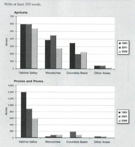
Band 5+: The charts below show the amount of area used for growing fruits between 1993 and 2006 in Washington State (USA). Summarise the information by selecting and reporting the main features, and make comparisons where relevant.

Image for topic: The charts below show the amount of area used for growing fruits between 1993 and 2006 in Washington State (USA). Summarise the information by selecting and reporting the main features, and make comparisons where relevant.
Our system will evaluate the answer based on this AI-generated description.
The image contains two bar graphs comparing the acreage for apricots and prunes and plums across different regions in three years. For apricots, Yakima Valley shows around 600 acres in 1993, slightly below 600 acres in 2001, and approximately 500 acres in 2006. Wenatchee has about 400 acres in 1993, decreasing to slightly below 300 in 2001 and 2006. Columbia Basin is around 300 acres in 1993 and rises to nearly 400 in 2001, with a slight decrease to about 350 in 2006. Other Areas start at approximately 50 acres in 1993, grow to roughly 100 in 2001, and decrease slightly in 2006. For prunes and plums, Yakima Valley shows 1,400 acres in 1993, dropping to just above 800 acres in 2001 and 2006. Wenatchee data starts below 100 in 1993 and remains consistent through 2001 and 2006. Columbia Basin remains under 100 acres for all years. Other Areas follow a similar pattern, consistently under 100 acres across all three years.
Given the complexity of the image, the above description may not be entirely accurate.
Note: Both the topic and the answer were created by one of our users.

The graphs illustrate the size of farmlands in Washington, USA used to cultivate fruits in years between 1993 to 2006.

Overall, a 3 main areas were studied along side with the other areas in Washington: Yakima valley, Wenatchee and Columbia basin. Yakima Valley showed the highest acres of cultivated apricots, prunes and plums in the period of 13 years. The rest of the areas showed lower sizes of cultivated areas in apricots, and a significant decrease in farming prunes and plums in the same time period.

Although Wenatchee scored averages of: 380, 430, 280 acres in 1993, 2001 and 2006 consecutively in growing apricots plants, it decreased dramatically in growing prunes and plums. It used only about 100 acres in 1993 and 200 acres in the years 2001 and 2006.

In addition to that, Other areas in Washington scored the least in both: apricots and prunes and plums with almost 60 and 100 acres in 1993 and 2001 respectively. And about 10 acres only farming apricots in 2006.

Word Count: 168

Answers On The Same Topic:

The charts below show the amount of area used for growing fruits between 1993 and 2006 in Washington State (USA). Summarise the information by selecting and reporting the main features, and make comparisons where relevant.

The bar charts illustrate the amount of land used for growing fruits between 1993 and 2006 in Washington State. Overall, Apricots took up the most amount of area, however prunes and plums can be seen to take up significantly less area throughout almost all years. The amount of area used for growing apricots in Yakima […]

The charts below show the amount of area used for growing fruits between 1993 and 2006 in Washington State (USA). Summarise the information by selecting and reporting the main features, and make comparisons where relevant.

The two bar charts illustrate how much acreage was occupied for growing apricots, prunes and plums in regions of Washington State over a 14-year period from 1993 to 2006. Overall, downward trends occurred in both kinds of fruits among nearly all areas except for prunes and plums in Wenatchee and the fruits were mostly planted […]

See All

Other Topics:

The chart below shows the changes in ownership of electrical appliances and amount of time spend doing homework in households in one country between 1920 and 2019 in one country.

The diagramms illustrate the percentage of households with electrical appliances and the number of hours of housework per week between 1920 and 2019 in a particular country. Overall, the percentage of ownership of electrical appliances increased, while the amount of time that people spend on cleaning decreased throughout the given period. In the beginning, the […]

Pie charts below show the average household expenditures between 2000 and 2025

The pie chart illustrates the percentage of houshold expenses in Japan and Malaysia in 2010. Overall, other goods and services were the most popular means of expenditures in Japan, while the housing expenses were the most costable in Malaysia in the given period of time. Whereas the proportion of health care spending was the least […]

The charts show the proportion of different modes of transportation used by city residents in 2010 and 2020. Summarise the information by selecting and reporting the main features, and make comparisons where relevant.

The two pie charts compare the proportion of different vehicle used by citizens in 2010 with that in 2020 Overall, car accounted for the largest percentage of the chart in both years, whereas others category remained the smallest figure. Meanwhile, public transport had increasingly been preferred by citizens over time. In terms of car and […]

The graph and chart below give information about the number of new graduates and their employment in the UK from 1992 to 2002.

The graph and chart above illustrate the number of new graduates and their employment in the UK between 1992 and 2002. Overall, there was a fluctuation in the figure for new graduates. Besides, the percentage of professional employment took the lead over the period. Moreover, the rate of professional employment and managerial and administrative employment […]

The charts below show the performance of a bus company in terms of punctuality, both actual and target (what actually happened compared to what the company was trying to achieve), and the number of complaints and passengers.

The bar charts illustrates the performamce of bus transport service in the form of their time management ,simultaneously compared number of complaints appears during their services . Overall ,rate of of bus time managemnt highest in both year 1999 and 2000 as well as got huge number complaints aginst bus service in 2003. First of […]

The graph below shows unemployment levels in Ireland and the number of people leaving the country between 1988 and 2008. Summarise the information by selecting and reporting the main features of the graph, and make comparisons where relevant.

The chart illustrates the level of unemployment in Ireland and the proportion of migrants between 1988 and 2008. Overall, while the unemployment levels remained unchanged over the 10-year period, the number of people leaving the country showed a significant decrease at the end of the period. In 1988, the number of people leaving Ireland was […]

See All
We have detected unusual activity on your device.
Please verify your identity to continue.
Note: This verification step won't sign you in. If you have a premium account, please log in to access the service as usual.
Google/Gmail Verification
Or verify using Email/Code
We've sent a verification code to:
youremail@gmail.com (Not your email?)
Enter it below to complete the verification process.
Ensure your email address is correct, your inbox is not full, and you check your spam folder. If no email arrives, consider using an alternative email.
You will need a Premium plan to perform your action!
Note: If you already have a premium account, please log in to access our services as usual.

Plans & Pricing

Our mission is to make quality education accessible for everyone.
However, to keep our hardworking team running and this service alive, we genuinely need your support!
By opting for a premium plan, not only do you sustain us in achieving the mission, but you also unlock advanced features to enrich your learning experience.

Free

For learners who aren't pressed for time

What's included on Free
100+ Cambridge IELTS Tests
Instant IELTS Writing Task 1 & 2 Evaluation (2 times/month)
Instant IELTS Speaking Part 1, 2, & 3 Evaluation (2 times/month)
Instant IELTS Writing Task 1 & 2 Essay Generator (2 times/month)
500+ Dictation & Shadowing Exercises
100+ Pronunciation Exercises
Flashcards
Other Advanced Tools

Premium

For those serious about advancing their English proficiency, and for IELTS candidates aspiring to boost their band score by 1-2 points (especially in writing & speaking) in just 30 days or less

What's included on Premium
Save Your IELTS Test Progress & Analyze Mistakes By Question Type
Save Your Own Flashcard Sets & Use Them On Any Device
Unlock All Courses, IELTS Tests, Section & Part Practice
Unlimited AI Conversations
Unlimited AI Writing Enhancement Exercises
Unlimited IELTS Writing Task 1 & 2 Evaluation
Unlimited IELTS Speaking Part 1, 2, & 3 Evaluation
Checked Answers Will Not Be Published
Unlimited IELTS Writing Task 1 & 2 Essay Generator
Unlimited IELTS Speaking Part 1, 2, & 3 Sample Generator
Unlimited Usage Of Advanced Tools & AI Features
Priority Support within 24h (12-month plan only)

Due to the nature of our service and the provided free trials, payments are non-refundable.