🔥 Today Only: Save 30% on Premium — Offer Ends Soon! - Upgrade Now!
Multiple Graphs

Band 6+: The charts below show the internet use in different purposes in Australia in 2010,2011 and the percentage by users. Summarise the information by selecting and reporting the main features and make comparisons where relevant.

Image for topic: The charts below show the internet use in different purposes in Australia in 2010,2011 and the percentage by users. Summarise the information by selecting and reporting the main features and make comparisons where relevant.
Our system will evaluate the answer based on this AI-generated description.
The image includes 5 bar charts depicting the percentage of internet use for different purposes in Australia during 2010 and 2011. The first bar chart shows Social media use: 2010: 18-25 (80), 26-40 (70), 40-60 (50), 60-65 (40), Above (20); and 2011: 18-25 (90), 26-40 (80), 40-60 (60), 60-65 (50), Above (30). The second bar chart shows Paying bills online use: 2010: 18-25 (30), 26-40 (40), 40-60 (60), 60-65 (70), Above (80); and 2011: 18-25 (40), 26-40 (50), 40-60 (70), 60-65 (80), Above (90). The third chart shows Emailing use: 2010: 18-25 (70), 26-40 (80), 40-60 (90), 60-65 (80), Above (80); and 2011: 18-25 (80), 26-40 (90), 40-60 (90), 60-65 (90), Above (90). The fourth chart illustrates Social media use with age brackets corresponding to the following percentages: 18-25 (90), 26-40 (80), 40-60 (60), 60-65 (50), Above (30). The fifth chart depicts Emailing use with the following age-wise percentages: 18-25 (80), 26-40 (90), 40-60 (90), 60-65 (90), Above (90).
Given the complexity of the image, the above description may not be entirely accurate.
Note: Both the topic and the answer were created by one of our users.

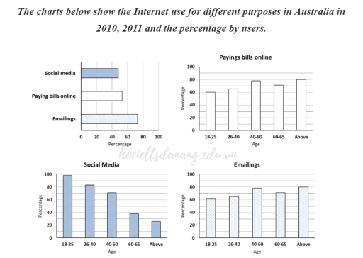
The provided chart illustrates the information about the Internet usage by five age groups over the two-year period. The data demonstrates three purposes for utilizing the global network such as paying bills online, social media and emailing.

Overall, it is evident that sending emails was the dominant online activity, followed by paying bills online. Surprisingly, social media was the least popular reason for using online resources.

To begin with, social media platforms had the highest number of users aged 18-25 accounting for almost 100%. In contrast, around 80% and 70% of middle-aged people from 26 to 60 years preferred this type of online networking over the others. Additionally, only 40% of older individuals in their sixties used social media.

It is noticeable, that the percentage of people using Internet for paying bills and emailing is similar. The proportion of users from 18-25 and 26-40-years accounted for approximately 60% and 70% respectively. In comparison, almost 80% of 40-60-year individuals used the Internet to pay utilities and send electronic letters. Retirees had the second place in percentage of users in both graphs, at nearly 75%.

Word Count: 183

Answers On The Same Topic:

The charts below show the internet use in different purposes in Australia in 2010,2011 and the percentage by users. Summarise the information by selecting and reporting the main features and make comparisons where relevant.

The given charts illustrate the purposes of internet usage in Australia for the years 2010 and 2011, along with the percentage of users in different age groups. The internet activities include social media, paying bills online, and emailing. Overall, social media usage had the highest percentage of users, followed by emailing and paying bills online. […]

The charts below show the internet use in different purposes in Australia in 2010,2011 and the percentage by users. Summarise the information by selecting and reporting the main features and make comparisons where relevant.

The bar charts elucidate a comparative analysis of Internet-using reasons, categorized into age cohorts and measured in percentages across Australia, during the years 2010 and 2011. Overall, whilst social media recorded transparent age disparities in usage rates, favoring the younger demographics, the remaining categories exhibited higher proportions by older users. Notably, emailings registered the most […]

The charts below show the internet use in different purposes in Australia in 2010,2011 and the percentage by users. Summarise the information by selecting and reporting the main features and make comparisons where relevant.

The bar charts elucidate a comparative analysis of Internet-using reasons, categorized in age cohorts and measured in percentages across Australia, during the years 2010 and 2011. Overall, whilst social media recorded transparent age disparities in usage rates, favoring the younger groups, the remaining categories exhibited higher proportion by older users. Moreover, emailings registered the most […]

The charts below show the internet use in different purposes in Australia in 2010,2011 and the percentage by users. Summarise the information by selecting and reporting the main features and make comparisons where relevant.

The charts juxtapose four different purposes for which the Internet is used, specifically social media, online bill payment and emailings, at the same time comparing those three categories, in Australia. What is most striking when looking at the charts is that the majority of social media usage is concentrated in the younger age brackets, while […]

See All

Other Topics:

The charts below show the percentage of electricity consumed by different sectors in Eastern Australia in 2007 and 2010.

The two pie charts illustrate the proportions of electricity consumption across various sectors in Eastern Australia in 2007 and 2010. Overall, the residential sector was the largest consumer of electricity in both years, while transport and agriculture were the smallest contributors. Commercial and residential usage remained stable over the perios, as did minin, transport, and […]

IELTS Writing Task 1 Sample Answer: Percentages of Sodium, Saturated Fats, Sugars in Meals The charts below show the average percentages in typical meals of three types of nutrients, all of which may be unhealthy if eaten too much. Summarise the information by selecting and reporting the main features, and make comparisons where relevant.

The pie charts depict the average percentages of sodium, saturated fats and added sugars in the typical meals consumed in the USA, and there is a notion that these may prove unhealthy when consumed in unlimited quantities. Looking from an overall perspective, it is apparent that sodium and saturated fats constituted a major portion of […]

The charts below show changes in the proportion of energy produced from different resources in the country in 1985 and 2003. Summarise the information by selecting and reporting the main features and comparison where relevant.

There are two charts depicting the proportion of energy produced from different sources. Both charts belong to the same country but represent different years. When comparing the years 1985 and 2003, it is evident that the percentage of energy derived from natural gas was consistently the highest, while hydrogen usage was the lowest. However, it […]

The table below shows how many people visited the Memphis Museum during the year before and the year after its refurbishment. The charts illustrate survey results on how visitors experienced their visit to the museum during those two periods. Summarise the information by selecting and reporting the main features, and make comparisons where relevant.

The table compares the number of visitors to the Memphis Museum in the year before and after its refurbishment, while the charts illustrate how visitors rated their experience during these two periods. Overall, the refurbishment appears to have had a positive impact on both visitor numbers and satisfaction levels. The total number of visitors increased […]

The chart and table below give information about tourists at a particular holiday resort in Australia. Summarize the information by selecting and reporting the main features, and make comparisons where relevant.

The graph and table provide information about tourists at a peculiar holiday resort in Australia. Overall, the pie chart illustrates that Europe and US were leading figures. Additionally, European tourists preferred to stay longer but simply, while the reverse was true for Asian tourists. Looking at tourists from Europe, they show the highest interest in […]

The chart and table below give information about tourists at a particular holiday resort in Australia. Summarize the information by selecting and reporting the main features, and make comparisons where relevant.

The pie chart illustrates the tourist information regarding the origin region, and the table gives details about the visitor stay including average length of stay, accommodation, and activities they partook in. Overall, it is clear that the highest percentage of visitors is from Europe, followed by the US. Additionally, most visitors engage in various activities […]

See All
We have detected unusual activity on your device.
Please verify your identity to continue.
Note: This verification step won't sign you in. If you have a premium account, please log in to access the service as usual.
Google/Gmail Verification
Or verify using Email/Code
We've sent a verification code to:
youremail@gmail.com (Not your email?)
Enter it below to complete the verification process.
Ensure your email address is correct, your inbox is not full, and you check your spam folder. If no email arrives, consider using an alternative email.
You will need a Premium plan to perform your action!
Note: If you already have a premium account, please log in to access our services as usual.

Plans & Pricing

Our mission is to make quality education accessible for everyone.
However, to keep our hardworking team running and this service alive, we genuinely need your support!
By opting for a premium plan, not only do you sustain us in achieving the mission, but you also unlock advanced features to enrich your learning experience.

Free

For learners who aren't pressed for time

What's included on Free
100+ Cambridge IELTS Tests
Instant IELTS Writing Task 1 & 2 Evaluation (2 times/month)
Instant IELTS Speaking Part 1, 2, & 3 Evaluation (5 times/month)
Instant IELTS Writing Task 1 & 2 Essay Generator (2 times/month)
500+ Dictation & Shadowing Exercises
100+ Pronunciation Exercises
Flashcards
Other Advanced Tools

Premium

For those serious about advancing their English proficiency, and for IELTS candidates aspiring to boost their band score by 1-2 points (especially in writing & speaking) in just 30 days or less

What's included on Premium
Save Your IELTS Test Progress
Unlock All Courses & IELTS Tests
Unlimited AI Conversations
Unlimited AI Writing Enhancement Exercises
Unlimited IELTS Writing Task 1 & 2 Evaluation
Unlimited IELTS Speaking Part 1, 2, & 3 Evaluation
Checked Answers Will Not Be Published
Unlimited IELTS Writing Task 1 & 2 Essay Generator
Unlimited IELTS Speaking Part 1, 2, & 3 Sample Generator
Unlimited Usage Of Advanced Tools
Priority Support within 24h (12-month plan only)

Due to the nature of our service and the provided free trials, payments are non-refundable.
Nếu bạn là người Việt Nam và không có hoặc không muốn trả bằng credit/debit cards, bạn có thể thanh toán bằng phương thức chuyển khoản:


Chọn gói:
419,000₫ 277,000 ₫ cho gói 1 tháng (chỉ 9,233₫/ngày)
1,239,000₫ 597,000 ₫ cho gói 3 tháng (chỉ 6,633₫/ngày)
2,469,000₫ 1,027,000 ₫ cho gói 6 tháng (chỉ 5,706₫/ngày)
4,929,000₫ 1,417,000 ₫ cho gói 12 tháng (chỉ 3,936₫/ngày)


Sau khi chuyển khoản, vui lòng đợi trình duyệt tự động điều hướng bạn trở lại Engnovate và bạn sẽ ngay lập tức nhận được mã kích hoạt tài khoản premium.
Nếu có lỗi xảy ra, bạn có thể liên hệ với team thông qua một trong các phương thức: email đến helloengnovate@gmail.com hoặc nhắn tin qua facebook.com/engnovate.
Vì toàn bộ công cụ trên website đều có thể sử dụng thử miễn phí, Engnovate không hỗ trợ hoàn tiền.