🔥 Today Only: Save 30% on Premium — Offer Ends Soon! - Upgrade Now!
Multiple Graphs

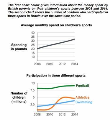
Band 5+: The first chart below gives information about the money spent by British parents on their children’s sports between 2008 and 2014. The second chart shows the number of children who participated in three sports in Britain over the same time period.

Image for topic: The first chart below gives information about the money spent by British parents on their children’s sports between 2008 and 2014. The second chart shows the number of children who participated in three sports in Britain over the same time period.
Our system will evaluate the answer based on this AI-generated description.
The image contains two charts displaying data from 2008 to 2014. The first chart, "Average monthly spend on children's sports," shows a steady increase in spending in pounds, starting at approximately 20 in 2008, rising to about 25 in 2010, around 30 in 2012, and reaching just over 35 in 2014. The second chart, "Participation in three different sports," illustrates the number of children in millions participating in Football, Athletics, and Swimming. Football participation starts at roughly 8.75 million in 2008, decreases slightly to approximately 8.5 million in 2010, then increases to just over 8.75 million in 2012, and maintains that level in 2014. Athletics begins at about 2.75 million in 2008, rises to nearly 5 million in 2010, then shows a slight decline to slightly under 5 million in 2012, and decreases to around 4 million in 2014. Swimming displays a constant participation of roughly 2.75 million from 2008 to 2014.
Given the complexity of the image, the above description may not be entirely accurate.
Note: Both the topic and the answer were created by one of our users.

The first line graph demonstrates the fee spent on the children sports by their parent in England from 2008 to 2014, while the second one illustrates the amount of young age groups who practically in 3 different activities in the same period.

Overall, the first one illustrates the increased trend from 2008 and reach a peak of the graph in 2014. On the other hand, football has the highest amount of children with a stability growth record while the athletics show a fluctuation.

According to the first graph, the amount of money spent on children sports was 20 pounds in 2008 which was the lowest in the line. After 2 years, it show a slowly growth to 25 and keep increased in the next 2 years with 28 pounds in 2012. The line reach to the highest point in 2014 with 30.

In the second line graph, the football show the steadiness increased from 2008 to 2014 with 8 to 9 millions of children respectively. While the athletics illustrated a fluctuation trend with no fluctuate in the first 2 years and increased dramatically from 2010 to 2012. The swimming demonstrate an upward trend since it start from 2.5 in 2008 and reach to the highest in 2014 with approximately 5 millions.

Word Count: 211

Answers On The Same Topic:

The first chart below gives information about the money spent by British parents on their children’s sports between 2008 and 2014. The second chart shows the number of children who participated in three sports in Britain over the same time period.

The line graphs show the average monthly amount that parents in Britain spent on their children’s sporting activities and the number of British children who took part in three di¬erent sports from 2008 to 2014. It is clear that parents spent more money each year on their children’s participation in sports over the six-year period. […]

The first chart below gives information about the money spent by British parents on their children’s sports between 2008 and 2014. The second chart shows the number of children who participated in three sports in Britain over the same time period.

The provided charts elucidate the financial expenditures of British parents on their children’s sports and the concurrent participation levels in three specific sports from 2008 to 2014. Overall, there is a discernible upward trend in parental spending on children’s sports, while football consistently emerged as the most participated sport, despite fluctuations in the numbers for […]

The first chart below gives information about the money spent by British parents on their children’s sports between 2008 and 2014. The second chart shows the number of children who participated in three sports in Britain over the same time period.

The first line chart depict information about the money expenditure by the UK parents on their children’s exercise measured in pounds. The next chart gives information about the children participated in three categories of sports in the United Kingdom measured in millions. Overall, the lines of spending increased over the time, while the children participation […]

The first chart below gives information about the money spent by British parents on their children’s sports between 2008 and 2014. The second chart shows the number of children who participated in three sports in Britain over the same time period.

The line graphs illustrate the average monthly amount spent by British parents on their children’s sporting activities and the number of British children parttaking in three different sports from 2008 to 2014. Overall, parents spent more money each year on their children’s participation in sports over the six-year period. In terms of the number of […]

The first chart below gives information about the money spent by British parents on their children’s sports between 2008 and 2014. The second chart shows the number of children who participated in three sports in Britain over the same time period.

The charts below illustrate the amount of money that British parents spent on their children’s sporting activities and the count of British children taking part in three sports over a period of 7 years, starting from 2008. Overall, British parents’ spending on sports for their children increased consistently throughout the period. It can also be […]

See All

Other Topics:

Prompt: The charts give information about the average amount of time per day spent on two common leisure activities of different age groups in New Zealand. Summarize the information by selecting and reporting the main features, and make comparisons where relevant.

The bar charts illustrate how much spent time per day for popular leisure activities for different aged groups in New Zealand. Overall, the average minutes spent on reading book was the most popular in older aged groups more than that of young people. Mean while, the figure for listening to music was the most common […]

The three charts below show the value in Australian dollars of Australian trade with three different countries from 2004 to 2009. Write a report for a university lecturer describing the information below.

The three line graphs compare the value of Australian imports and exports with China, India, and the USA between 2004 and 2009, measured in billions of Australian dollars. Overall, import values were consistently higher than export values in all three countries throughout the period examined. Of particular note is that China experienced by far the […]

The pie charts show the proportion of water used for six products and income levels in 2004

The pie chart compares to water usages and profits for 6 different things in 2004. Overall, the main water was used for vegetables, instead the main income was obtained from fruits. Based on 2 charts there was similar relationship between income of the products and the water supply usage. The main water sources were used […]

The bar chart and pie chart show the amount of carbon dioxide (CO₂) emitted by three different income groups in 1990 and 2000, and the proportion of the world's population represented by each income group in 2000.

The bar chart illustrates the amount of carbon dioxide released into the atmosphere by different income groups – high, middle, and low – in 1990 and 2000, measured in metric tons, while the accompanying pie chart provides data on the proportion of the world’s population represented by each income group in 2000. Overall, it is […]

IELTS Academic Writing Task 1/ Graph Writing - Line Graphs: » You should spend about 20 minutes on this task. The line graphs below show the production and demand for steel in million tonnes and the number of workers employed in the steel industry in the UK in 2010. Summarize the information by selecting and reporting the main features, and make comparisons where relevant. You should write at least 150 words.

The line graphs illustrate production, demand, and workforce levels in the UK steel industry throughout the year 2010, measured in million tonnes and thousands of workers respectively. Overall, all three metrics exhibited notable fluctuations over the 12-month period, following a general downward trajectory toward the end of the year. Throughout most of the year, steel […]

the charts below show the average number of tourist visiting Fairmont Island each season and the main advantage and disadvantages of the island according to a tourist survey. summarize the information by selecting and Reporting the main features and make comparisons where relevant

The bar chart illustrates the average number of tourists visiting a certain Island, which is called Fairmot each season and the main advantages and disadvantages of the island according to a tourist survey on the pie charts. Overall, the most common mounth was recorded in summer with 600 thousand of tourists, while the most common […]

See All
We have detected unusual activity on your device.
Please verify your identity to continue.
Note: This verification step won't sign you in. If you have a premium account, please log in to access the service as usual.
Google/Gmail Verification
Or verify using Email/Code
We've sent a verification code to:
youremail@gmail.com (Not your email?)
Enter it below to complete the verification process.
Ensure your email address is correct, your inbox is not full, and you check your spam folder. If no email arrives, consider using an alternative email.
You will need a Premium plan to perform your action!
Note: If you already have a premium account, please log in to access our services as usual.

Plans & Pricing

Our mission is to make quality education accessible for everyone.
However, to keep our hardworking team running and this service alive, we genuinely need your support!
By opting for a premium plan, not only do you sustain us in achieving the mission, but you also unlock advanced features to enrich your learning experience.

Free

For learners who aren't pressed for time

What's included on Free
100+ Cambridge IELTS Tests
Instant IELTS Writing Task 1 & 2 Evaluation (2 times/month)
Instant IELTS Speaking Part 1, 2, & 3 Evaluation (2 times/month)
Instant IELTS Writing Task 1 & 2 Essay Generator (2 times/month)
500+ Dictation & Shadowing Exercises
100+ Pronunciation Exercises
Flashcards
Other Advanced Tools

Premium

For those serious about advancing their English proficiency, and for IELTS candidates aspiring to boost their band score by 1-2 points (especially in writing & speaking) in just 30 days or less

What's included on Premium
Save Your IELTS Test Progress & Analyze Mistakes By Question Type
Save Your Own Flashcard Sets & Use Them On Any Device
Unlock All Courses, IELTS Tests, Section & Part Practice
Unlimited AI Conversations
Unlimited AI Writing Enhancement Exercises
Unlimited IELTS Writing Task 1 & 2 Evaluation
Unlimited IELTS Speaking Part 1, 2, & 3 Evaluation
Checked Answers Will Not Be Published
Unlimited IELTS Writing Task 1 & 2 Essay Generator
Unlimited IELTS Speaking Part 1, 2, & 3 Sample Generator
Unlimited Usage Of Advanced Tools & AI Features
Priority Support within 24h (12-month plan only)

Due to the nature of our service and the provided free trials, payments are non-refundable.