🔥 Today Only: Save 30% on Premium — Offer Ends Soon! - Upgrade Now!
Multiple Graphs

Band 5+: THE GRAPH AND TABLE GIVEN BELOW GIVES INFORMATION ABOUT WATER USE WORLD WIDE AND WATER CONSUMPTION IN TWO DIFFERENT COUNTRIES

Image for topic: THE GRAPH AND TABLE GIVEN BELOW GIVES INFORMATION ABOUT WATER USE WORLD WIDE AND WATER CONSUMPTION IN TWO DIFFERENT COUNTRIES
Our system will evaluate the answer based on this AI-generated description.
The image contains a line graph and a table. The graph plots global water use by sector from 1900 to 2000 in Km³, with three lines labeled: Agriculture, Industrial use, and Domestic use. Agriculture starts just below 500 in 1900, crosses 1,000 around 1950, climbs to approximately 1,500 by 1960, surpasses 2,000 between 1970-1980, and ends just above 3,000 in 2000. Industrial use starts near 1900 at nearly zero, rises steadily to around 1,000 by 2000. Domestic use also begins near zero, with a gradual increase to about 200 by 2000. The table titled "Water consumption in Brazil and Congo in 2000" lists two countries: Brazil and Democratic Republic of Congo. For Brazil: Population: 176 million, Irrigated land: 26,500 Km², Water consumption: 359 m³. For Democratic Republic of Congo: Population: 5.2 million, Irrigated land: 100 Km², Water consumption: 8 m³.
Given the complexity of the image, the above description may not be entirely accurate.
Note: Both the topic and the answer were created by one of our users.

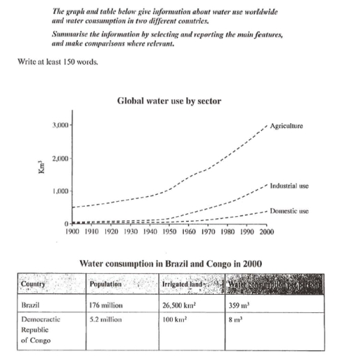
The line graph and table charts provide the information about water uses of world wide consumption in different two countries.

overall, it is clear that the agriculture sector experienced growth over the ten year period .while,both countries divorce trend had some fluctuations.

In 1900, Agriculture accounted for 500 km3 of global water , making it the highest peaked sector they rose sightly to 3,000 km3 in 2000. forming a majority part of the water. while, Industrial use and domestic use had identical trend in the beginning of the period , the figure stood at zero km3 followed by a slight increase to about 11,000 km3 in 2000. however, The domestic use had consistently trough trend over the period accounted for 400 km3 in 2000, making it one of the lowest sector.

In 2000, Brazil’s population stood at 176 millions, while that of congo was much smaller , at only 5.2 million. on the other hand, The Irrigated land in brazil was 26,500 km2, which was enoromously greater than congo’s 100km2. similarly, the amount of water used in brazil was 359m3, far higher than the 8m3 recorded in cango.

Word Count: 188

Answers On The Same Topic:

THE GRAPH AND TABLE GIVEN BELOW GIVES INFORMATION ABOUT WATER USE WORLD WIDE AND WATER CONSUMPTION IN TWO DIFFERENT COUNTRIES

The provided graph illustrates information about global water consumption divided into three main areas (Domestic use, Industrial use, and Agriculture) over the period from 1900 to 2000. Additionally, the table compares water use in Agriculture in Brazil and the Democratic Republic of Congo for the year 2000. Overall, all three areas showed an upward trend; […]

THE GRAPH AND TABLE GIVEN BELOW GIVES INFORMATION ABOUT WATER USE WORLD WIDE AND WATER CONSUMPTION IN TWO DIFFERENT COUNTRIES

THE GIVEN LINE GRAPH DEPICS THE INFORMATION ABOUT WATER USAGE IN AGRICULTURE, INDUSTRIAL AND DOMESTIC AREA ALL OVER THE GLOBE. MOREOVER, THE TABULAR DATA REPRESENT THE WATER USAGE IN BRAZIL AND CONGO IN YEAR 2000. OVERALL, IT CAN BE STATED THAT AGRICULTURE SECTOR AND BRAZIL WERE THE HIGHEST CONSUMER OF WATER. AS REPRESENTED IN THE […]

See All

Other Topics:

The charts below illustrate the proportions of American students at a university in the United States who were able to speak languages other than English, in 2005 and 2015. Summarise the information by selecting and reporting the main features, and make comparisons where relevant.

The two pie charts compare percentages of American university students in the United States who were proficient in languages other than English over the 10-year-period, specifically in 2005 and 2015. Overall, it is evident that the percentages of students speaking no additional languages decreased significantly, while Spanish witnessed the biggest increase nearly doubling, and French […]

The charts below show the percentages of men and women aged 60-64 in employment in four countries in 1970 and 2000.

The charts illustrate the percentages of male and female aged 60-64 in employment in four countries from 1970 to 2000. Overal, number of men was higher than women in two charts. In first and second chart Japan hit the highest point and the Australia hit the lowest point. In first chart after Japan, the USA […]

Part 1: The graph below shows the weekly working hours or men and women omen in in government institutions and private institutions.

The pie charts illustrate how much time men and women work every week in private and governmental organizations. Overall, men usually work more than women in both governmental and private sectors. Meanwhile, the share of women working different hours is almost the same in both sectors, the share of men working longer hours is higher […]

The pie chart below shows the breakdown of revenue streams for an average international football team. The table shows the age distribution of football fans attending the matchs of three teams. Summarise the information by selecting and reporting the main features, and make comparisons where relevant

The pie chart given below demonstrates the total distribution of the income sources for international football teams. And the table underneath illustrates the given statistics for age distributions of the fans who attends the competitions of the three respective teams. Overall, income values of the international football teams and age groups attending to the matches […]

The table and pie chart give info about population in Australia according to different nationalities and areas.

The given pie chart and table provide data related to residents of Australia categorized by ethnicity and region. In summary, the information reveals that majority of citizens are Australian and other nationalities. Notably, most of the individuals of any nationality live in urban areas and almost all chinese residents live in the city. Out of […]

The pie charts below show the main reasons why students chose a particular university in the UK in 2010 and 2020. Summarise the information by selecting and reporting the main features, and make comparisons where relevant.

The pie charts display why children select a specific university in the UK in 2010 and 2020. Overall, while the three criterias such as academic reputation and course availability decreased by same rate, location and facilities seeking group increased by same rate during the time phase. Tution fees seeking group remained the same. In 2010, […]

See All
We have detected unusual activity on your device.
Please verify your identity to continue.
Note: This verification step won't sign you in. If you have a premium account, please log in to access the service as usual.
Google/Gmail Verification
Or verify using Email/Code
We've sent a verification code to:
youremail@gmail.com (Not your email?)
Enter it below to complete the verification process.
Ensure your email address is correct, your inbox is not full, and you check your spam folder. If no email arrives, consider using an alternative email.
You will need a Premium plan to perform your action!
Note: If you already have a premium account, please log in to access our services as usual.

Plans & Pricing

Our mission is to make quality education accessible for everyone.
However, to keep our hardworking team running and this service alive, we genuinely need your support!
By opting for a premium plan, not only do you sustain us in achieving the mission, but you also unlock advanced features to enrich your learning experience.

Free

For learners who aren't pressed for time

What's included on Free
100+ Cambridge IELTS Tests
Instant IELTS Writing Task 1 & 2 Evaluation (2 times/month)
Instant IELTS Speaking Part 1, 2, & 3 Evaluation (5 times/month)
Instant IELTS Writing Task 1 & 2 Essay Generator (2 times/month)
500+ Dictation & Shadowing Exercises
100+ Pronunciation Exercises
Flashcards
Other Advanced Tools

Premium

For those serious about advancing their English proficiency, and for IELTS candidates aspiring to boost their band score by 1-2 points (especially in writing & speaking) in just 30 days or less

What's included on Premium
Save Your IELTS Test Progress
Unlock All Courses & IELTS Tests
Unlimited AI Conversations
Unlimited AI Writing Enhancement Exercises
Unlimited IELTS Writing Task 1 & 2 Evaluation
Unlimited IELTS Speaking Part 1, 2, & 3 Evaluation
Checked Answers Will Not Be Published
Unlimited IELTS Writing Task 1 & 2 Essay Generator
Unlimited IELTS Speaking Part 1, 2, & 3 Sample Generator
Unlimited Usage Of Advanced Tools
Priority Support within 24h (12-month plan only)

Due to the nature of our service and the provided free trials, payments are non-refundable.
Nếu bạn là người Việt Nam và không có hoặc không muốn trả bằng credit/debit cards, bạn có thể thanh toán bằng phương thức chuyển khoản:


Chọn gói:
419,000₫ 277,000 ₫ cho gói 1 tháng (chỉ 9,233₫/ngày)
1,239,000₫ 597,000 ₫ cho gói 3 tháng (chỉ 6,633₫/ngày)
2,469,000₫ 1,027,000 ₫ cho gói 6 tháng (chỉ 5,706₫/ngày)
4,929,000₫ 1,417,000 ₫ cho gói 12 tháng (chỉ 3,936₫/ngày)


Sau khi chuyển khoản, vui lòng đợi trình duyệt tự động điều hướng bạn trở lại Engnovate và bạn sẽ ngay lập tức nhận được mã kích hoạt tài khoản premium.
Nếu có lỗi xảy ra, bạn có thể liên hệ với team thông qua một trong các phương thức: email đến helloengnovate@gmail.com hoặc nhắn tin qua facebook.com/engnovate.
Vì toàn bộ công cụ trên website đều có thể sử dụng thử miễn phí, Engnovate không hỗ trợ hoàn tiền.