🔥 Today Only: Save 30% on Premium — Offer Ends Soon! - Upgrade Now!
Bar Chart

Band 4+: The graph below gives information about the technology that households in one US city used for watching television between 2004 and 2014

Image for topic: The graph below gives information about the technology that households in one US city used for watching television between 2004 and 2014
Our system will evaluate the answer based on this AI-generated description.
The image contains a line graph depicting the number of households, in thousands, using satellite, cable, internet, or broadcast technology for watching television in a US city from 2004-2014. Satellite usage started at just over 40,000 households in 2004, steadily increased to peak at just below 120,000 in 2008, and declined to below 100,000 by 2014. Cable began as the most popular method with over 120,000 households in 2004, fluctuated slightly, but maintained a general decline to just above 60,000 by 2014. Internet usage showed a gradual incline from about 20,000 households in 2004 to just below 80,000 in 2014. Broadcast technology started at just under 60,000 households in 2004, experienced a decline until 2010, and increased to nearly 70,000 by 2014. Cable was consistently the most used technology until 2010 when it was surpassed by satellite; however, by 2014, satellite again fell below cable usage. Broadcast remained the least used technology from 2004-2008, after which internet usage dropped below it until 2010.
Given the complexity of the image, the above description may not be entirely accurate.
Note: Both the topic and the answer were created by one of our users.

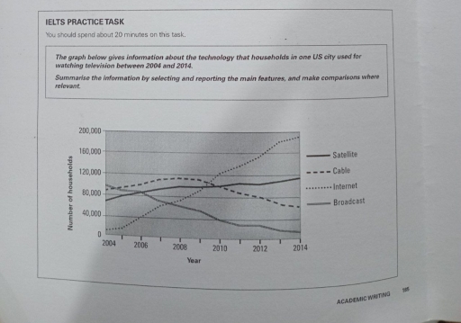
The line graph represents the information about the consumption of US families of four different types of technologies :satellite,cable,internet and broadcast from 2004 to 2014.

Overall,internet usage experienced significant growth during the period.Whereas cable,broadcast, satellite eventually declined.

In 2004, brodcast was mostly used approximately 100,000 households,followed by cable and satellite which made up 80,000 households.While internet accounted only for 20,000.However,over the decades the users of internet rose rapidly,overpacing all the other technologies by 2010,and by 2014 it hit its highest point almost 200,000 households

Moreover,over the period broadcast usage decreased for 20,000 households.In contrast,setellite experienced stability,rising from 70,000 to 120,000 by the end of the period.Furthermore,cable started to reduce in 2010 and in 2014 it accounted for 60,000 households.

Word Count: 119

Answers On The Same Topic:

The graph below gives information about the technology that households in one US city used for watching television between 2004 and 2014

The graph presented talks about the technology that households in one US city used for watching television between 2004 and 2014. The graph projected provides various number of informations regarding the topic. Information discussed in the graph may be useful and beneficial for the government. Overall, all households experienced a significant increase and decrease in […]

The graph below gives information about the technology that households in one US city used for watching television between 2004 and 2014

The line visualises data about various connections utilllised by the residents of a certain city in the US to watch television over a period from 2004 to 2014. Overall, the number of internet connections increased exponentially over this period while broadcasting services have declined. However, the figures for satellite connections observed an upward trend as […]

The graph below gives information about the technology that households in one US city used for watching television between 2004 and 2014

The line graph provides data on four kinds of ways ( satellite, cable, internet ,and broadcast) that families used for watching television in one city from 2004 to 2014 . Overall , the number of watching television by on internet was the most popular while the number of users was the least large by the […]

The graph below gives information about the technology that households in one US city used for watching television between 2004 and 2014

The line graph represents information about the consumption of four different types of technologies – satellite, cable, internet, and broadcast – by U.S. families from 2004 to 2014. Overall, internet usage experienced significant growth during this period, while cable, broadcast, and satellite services saw a decline. In 2004, broadcast was the most widely used technology, […]

See All

Other Topics:

The chart shows the changes in car ownership in a counrty between 1971 and 2001

the provided bar chart delineates the evolution of car ownership in a specific country over a thirty-year period from 1971 to 2001. Overall, there is a notable decline in the percentage of non-car owners, alongside an increase in individuals possessing two or more cars by the end of the period. In 1971, 48% of the […]

The bar graph below shows the stock price of four different technology companies from 2011 to 2016. Summarise the information by selecting and reporting the main features and make comparisons where relevant.

The illustration presents the stock cost of Facebook, Google, Apple, and Yahoo between 2011 and 2016. Overall, the numbers for Facebook increased steadily, whilst that of Yahoo increased. Apple company experienced dramatic fluctuations. Google stocks remained stable. In 2011, Facebook and Yahoo started off at approximately the same price at around 5500. Both companies exhibited […]

The chart below shows the proportions of the world's oil resources held in different areas, together with the proportions consumed annually in the same areas. Summarise the information by selecting and reporting the main features, and make comparisons where relevant. Write at least 150 words.

The provided chart displays information regarding the percentage of total world oil resources and annual oil consumption. Overall, it is clear that the Middle East is the highest in oil resources, far outstripping its oil consumption. Moreover, in oil consumption, Asia is the highest, while Australia and New Zealand are the lowest in both oil […]

The graph shows the sales of five types items in four different seasons at a departmental store in the US in 2011 Summarize the information by selecting and reporting the main features, and make comparisons where relevant.

The graph shows the sale of five different types of items in different seasons. In winter the women’s clothes clocked 40000 US dollars. The sports equipment had 30000 usd dollars whereas men’s clothes had 25000usd followed by cosmetics and lastly jewellery with 20000 usd. All this was winter sales. In Spring women’s clothes rose in […]

The bar graph shows the average hours of daily sunshine throughout the year in two cities of Australia. Summarise the information by selecting and reporting the main features, and make comparisons where relevant.

The bar chart compares the average hours of daily sunshine throughout the year in Sydney and Perth. Overall, Perth had the highest number of sunshine hour in january and december, while it was the lowest number of sunshine hour in june and september. In terms of sunshine, Perth had the highest number of sunshine in […]

The graph below shows the number of three types of visitors to a museum between 1997 and 2012.

The bar chart presents data on the number of three categories of visitors – adults, visitors aged under 15 and special exhibition visitors – who attended a museum over a 15-year period, spanning from 1997 to 2012. Overall, the majority of museum visitors were adults throughout the period, while special exhibition visitors represented a relatively […]

See All
We have detected unusual activity on your device.
Please verify your identity to continue.
Note: This verification step won't sign you in. If you have a premium account, please log in to access the service as usual.
Google/Gmail Verification
Or verify using Email/Code
We've sent a verification code to:
youremail@gmail.com (Not your email?)
Enter it below to complete the verification process.
Ensure your email address is correct, your inbox is not full, and you check your spam folder. If no email arrives, consider using an alternative email.
You will need a Premium plan to perform your action!
Note: If you already have a premium account, please log in to access our services as usual.

Plans & Pricing

Our mission is to make quality education accessible for everyone.
However, to keep our hardworking team running and this service alive, we genuinely need your support!
By opting for a premium plan, not only do you sustain us in achieving the mission, but you also unlock advanced features to enrich your learning experience.

Free

For learners who aren't pressed for time

What's included on Free
100+ Cambridge IELTS Tests
Instant IELTS Writing Task 1 & 2 Evaluation (2 times/month)
Instant IELTS Speaking Part 1, 2, & 3 Evaluation (5 times/month)
Instant IELTS Writing Task 1 & 2 Essay Generator (2 times/month)
500+ Dictation & Shadowing Exercises
100+ Pronunciation Exercises
Flashcards
Other Advanced Tools

Premium

For those serious about advancing their English proficiency, and for IELTS candidates aspiring to boost their band score by 1-2 points (especially in writing & speaking) in just 30 days or less

What's included on Premium
Save Your IELTS Test Progress
Unlock All Courses & IELTS Tests
Unlimited AI Conversations
Unlimited AI Writing Enhancement Exercises
Unlimited IELTS Writing Task 1 & 2 Evaluation
Unlimited IELTS Speaking Part 1, 2, & 3 Evaluation
Checked Answers Will Not Be Published
Unlimited IELTS Writing Task 1 & 2 Essay Generator
Unlimited IELTS Speaking Part 1, 2, & 3 Sample Generator
Unlimited Usage Of Advanced Tools
Priority Support within 24h (12-month plan only)

Due to the nature of our service and the provided free trials, payments are non-refundable.
Nếu bạn là người Việt Nam và không có hoặc không muốn trả bằng credit/debit cards, bạn có thể thanh toán bằng phương thức chuyển khoản:


Chọn gói:
419,000₫ 277,000 ₫ cho gói 1 tháng (chỉ 9,233₫/ngày)
1,239,000₫ 597,000 ₫ cho gói 3 tháng (chỉ 6,633₫/ngày)
2,469,000₫ 1,027,000 ₫ cho gói 6 tháng (chỉ 5,706₫/ngày)
4,929,000₫ 1,417,000 ₫ cho gói 12 tháng (chỉ 3,936₫/ngày)


Sau khi chuyển khoản, vui lòng đợi trình duyệt tự động điều hướng bạn trở lại Engnovate và bạn sẽ ngay lập tức nhận được mã kích hoạt tài khoản premium.
Nếu có lỗi xảy ra, bạn có thể liên hệ với team thông qua một trong các phương thức: email đến helloengnovate@gmail.com hoặc nhắn tin qua facebook.com/engnovate.
Vì toàn bộ công cụ trên website đều có thể sử dụng thử miễn phí, Engnovate không hỗ trợ hoàn tiền.