🔥 Today Only: Save 30% on Premium — Offer Ends Soon! - Upgrade Now!
Line Graph

Band 6+: The graph Below gives information about U.S government spending on research Between 1980 and 2008

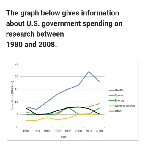
Image for topic: The graph Below gives information about U.S government spending on research Between 1980 and 2008
Our system will evaluate the answer based on this AI-generated description.
The image contains a line graph detailing U.S. government spending on research from 1980 to 2008 across five categories: Health, Space, Energy, General Science, and Other. The y-axis represents expenditure in US dollars (billions), ranging from 0 to 25, and the x-axis symbolizes years, progressing from 1980 to 2008 in 4-year intervals. Health spending shows a stable increase from approximately 5 billion in 1980 to just under 10 billion in 1992, then a sharp rise to nearly 25 billion in 2004, before slightly declining in 2008. Space expenditure remains constant around 15 billion from 1980 until a peak at just over 15 billion in 1996, followed by a decline to approximately 5 billion in 2008. Energy spending starts close to 10 billion in 1980, declining to just under 5 billion in 1984, then fluctuates between 3 to 5 billion until 2008. General Science expenditure begins around 2 billion in 1980, gradually increasing to approximately 7 billion in 2008. The Other category shows a steady incline from around 2 billion in 1980 to 7 billion in 2008, with slight fluctuations.
Given the complexity of the image, the above description may not be entirely accurate.
Note: Both the topic and the answer were created by one of our users.

The line graph illustrates the amount of money that America government spend on research in Health, space, energy, general science and other over the period from 1980 to 2008.

It is clear that while all the mentioned fields had a rise in their budgets, except for the category of other. it is noteworthy that the health research division incurred the highest expenses for the U.S.

Starting at 8 billion in 1980, the national leader expenditure on research into Health slightly dropped over the next 4 years before continually rising again to a peak of 22 billion in 2004. Despite declining back down to approximately 18 billion in 2008, expenditure on Health research was by far the highest. Contrary to health, general science researchers always received the lowest budget allocation. This figure ranged from 3 to 4 billion in the first two decades, subsequently climbed to 5 billion in 2000 and remained unchanged throughout the rest of the period.

By contrast, there was an increase in the money that was spent on research into Energy and Space, from approximately 5 billion and 6 billion in 1980 to around 7.5 billion and 9 billion in 2008, respectively. The field that experienced an overall decrease in expenditure was that of research into other areas, which fell from approximately 7.5 billion in 1980 to about 5 billion by 2008.

Word Count: 225

Answers On The Same Topic:

The graph Below gives information about U.S government spending on research Between 1980 and 2008

The line graph illustrates how much money the US government spent on research over a 28-year period (1980-2008). Overall, the graph indicates that government expenditure on research in nearly all given domains grew, with the most notable rise being observed in the health sector. Additionally, it is worth noting that general science received the least […]

The graph Below gives information about U.S government spending on research Between 1980 and 2008

The line graph illustrates the U.S. government funding on five distinct research fields over the period from 1980 to 2008. Overall, while the money spent on four of the five kinds of research underwent overall growth, Other research experienced a downward trend with fluctuation. Throughout the period, Health and General Science were the highest and […]

The graph Below gives information about U.S government spending on research Between 1980 and 2008

The line graph compares U.S. government spending on research across five sectors – health, space, energy, general science, and other fields – between 1980 and 2008. Overall, funding for health research was significantly higher than for the other sectors and increased markedly over time, despite a slight decline at the end of the period. By […]

The graph Below gives information about U.S government spending on research Between 1980 and 2008

The line graph shows U.S. government spending on five areas—health, space, energy, general science and “other”—between 1980 and 2008. Overall, health received by far the most money and rose to a peak in the mid-2000s. Space increased steadily, energy fluctuated with a sharp fall around 2000, “other” rose then fell, while general science settled at […]

The graph Below gives information about U.S government spending on research Between 1980 and 2008

The line graph illustrates how much money U.S government spend on various areas between 1980 and 2008 In 1980, U.S. government allocated nearly 18 billion dollars. It was decreased to approximately 7 billion dollars in 1984. Nevertheless, it shows a significant growth from 1984 to 2004.Below 20 billion dollars budgeted for health in 2008. Space […]

See All

Other Topics:

the line graph shows the average cost of monthly contract of four different cellular companies in one european country from january to september in 2012 measured in euros.

The graph explains the average contract monthly price of four different cellular companies in a particular European country which is measured in euro between January to September 2012. Overall, Domo rised a bit form 15 euro to almost 20 euro but it kept fluctuating before dropping slightly below 20 by September. While Lex rised substantially […]

You should spend about 20 minutes on this task. The graph below shows the percentage of the Australian workforce in five industries between 1962 and 2012.Summarise the information by selecting and reporting the main features, and make comparisons where relevant.Write at least 150 words.

The diagrams illustrate some changes to a small island which has been developed for tourism. It is clear that the island has changed considerably with the introduction of tourism, and six new features can be seen in the second diagram. The main developments are that the island is accessible and visitors have somewhere to stay. […]

The graph shows the percentage of households with different kinds of technology in the UK from 1997 to 2001.

The graph shows the percentage of households with different kinds of technology in the UK from 1997 to 2001. Overall, as a general trend, there was an upward movement in five categories. Furthermore, the percentage of households with CD players had the highest figure, whereas the percentage of households with DVD players had the lowest […]

The graph shows the percentage of households with different kinds of technology in the UK from 1997 to 2001.

The graph shows the percentage of households with different kinds of technology in the UK from 1997 to 2001. Overall, as a general trend, there was an upward movement with five categories. Furthermore, the percentage of household with CD players had the highest figure, whereas the percentage of household with DVD players had the lowest […]

The graph shows how elderly people in the United States spent their free time between 1980 and 2010.

The line graph illustrates the number of older people that spent their leisure time with different activities in the USA between 1980 and 2010. The units are presented in percentages. Overall, it is clear that the hiking experienced a substantial increase over the period, whilst the remaining activities witnessed fluctuations. It is also noteworthy that […]

The graph below shows the percentage of tourist who used different types of transport to travel within a particular nation between 1989 and 2009. Each tourist may have used more than one type of transport.

The chart illustrates the percentage of travellers that used different modes of transportation from 1989 to 2009 within a particular country. Overall, rail and coach were preferred more by visitors over the years compared to other modes of transport. Air had a significant decline in transport since the start without any recovery. However car and […]

See All
We have detected unusual activity on your device.
Please verify your identity to continue.
Note: This verification step won't sign you in. If you have a premium account, please log in to access the service as usual.
Google/Gmail Verification
Or verify using Email/Code
We've sent a verification code to:
youremail@gmail.com (Not your email?)
Enter it below to complete the verification process.
Ensure your email address is correct, your inbox is not full, and you check your spam folder. If no email arrives, consider using an alternative email.
You will need a Premium plan to perform your action!
Note: If you already have a premium account, please log in to access our services as usual.

Plans & Pricing

Our mission is to make quality education accessible for everyone.
However, to keep our hardworking team running and this service alive, we genuinely need your support!
By opting for a premium plan, not only do you sustain us in achieving the mission, but you also unlock advanced features to enrich your learning experience.

Free

For learners who aren't pressed for time

What's included on Free
100+ Cambridge IELTS Tests
Instant IELTS Writing Task 1 & 2 Evaluation (2 times/month)
Instant IELTS Speaking Part 1, 2, & 3 Evaluation (2 times/month)
Instant IELTS Writing Task 1 & 2 Essay Generator (2 times/month)
500+ Dictation & Shadowing Exercises
100+ Pronunciation Exercises
Flashcards
Other Advanced Tools

Premium

For those serious about advancing their English proficiency, and for IELTS candidates aspiring to boost their band score by 1-2 points (especially in writing & speaking) in just 30 days or less

What's included on Premium
Save Your IELTS Test Progress & Analyze Mistakes By Question Type
Save Your Own Flashcard Sets & Use Them On Any Device
Unlock All Courses, IELTS Tests, Section & Part Practice
Unlimited AI Conversations
Unlimited AI Writing Enhancement Exercises
Unlimited IELTS Writing Task 1 & 2 Evaluation
Unlimited IELTS Speaking Part 1, 2, & 3 Evaluation
Checked Answers Will Not Be Published
Unlimited IELTS Writing Task 1 & 2 Essay Generator
Unlimited IELTS Speaking Part 1, 2, & 3 Sample Generator
Unlimited Usage Of Advanced Tools & AI Features
Priority Support within 24h (12-month plan only)

Due to the nature of our service and the provided free trials, payments are non-refundable.
Nếu bạn là người Việt Nam và không có hoặc không muốn trả bằng credit/debit cards, bạn có thể thanh toán bằng phương thức chuyển khoản:


Chọn gói:
419,000₫ 277,000 ₫ cho gói 1 tháng (chỉ 9,233₫/ngày)
1,239,000₫ 597,000 ₫ cho gói 3 tháng (chỉ 6,633₫/ngày)
2,469,000₫ 1,027,000 ₫ cho gói 6 tháng (chỉ 5,706₫/ngày)
4,929,000₫ 1,417,000 ₫ cho gói 12 tháng (chỉ 3,936₫/ngày)


Sau khi chuyển khoản, vui lòng đợi trình duyệt tự động điều hướng bạn trở lại Engnovate và bạn sẽ ngay lập tức nhận được mã kích hoạt tài khoản premium.
Nếu có lỗi xảy ra, bạn có thể liên hệ với team thông qua một trong các phương thức: email đến helloengnovate@gmail.com hoặc nhắn tin qua facebook.com/engnovate.
Vì toàn bộ công cụ trên website đều có thể sử dụng thử miễn phí, Engnovate không hỗ trợ hoàn tiền.